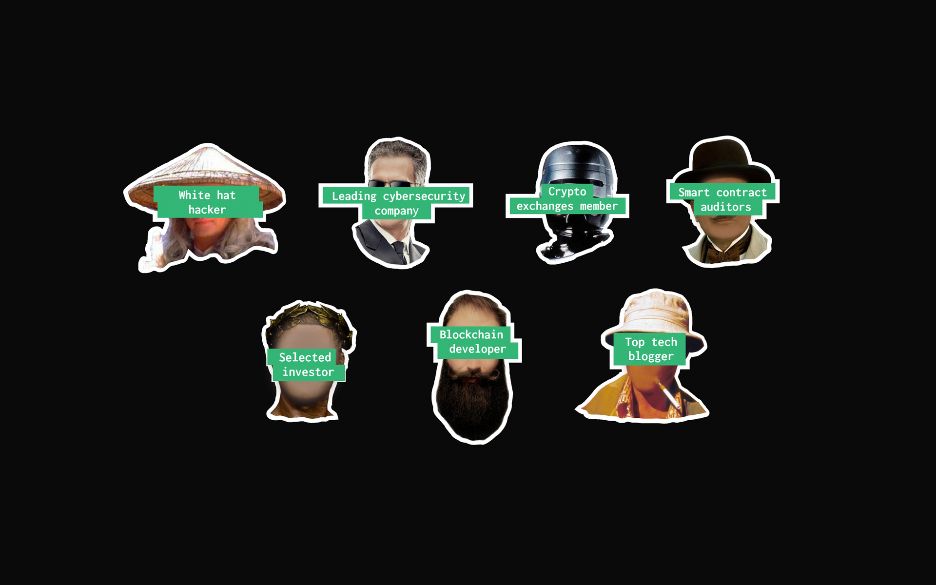
The international HACKIT conference, dedicated to cybersecurity, brings together a large number of white hackers, investors and companies specializing on security. HACKIT has gone international and on a larger scale. Our team’s task was to develop an identity, website and video that would simultaneously make people from different countries interested in the conference.
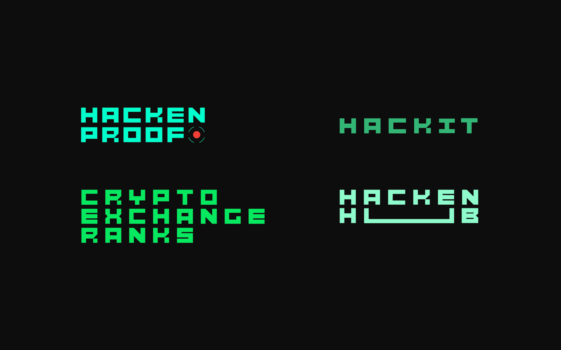
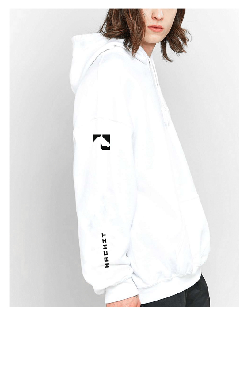
We have developed a font, based on which you can easily create logos for the new Hacken projects. The HACKIT conference is no exception. We have created an interactive logo that can interact with the audience and engage it in a game.

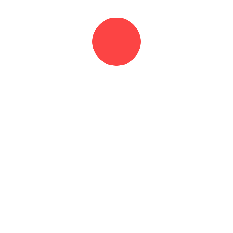
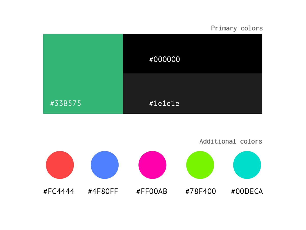
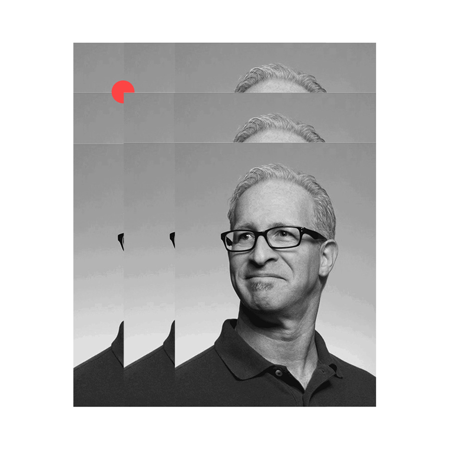
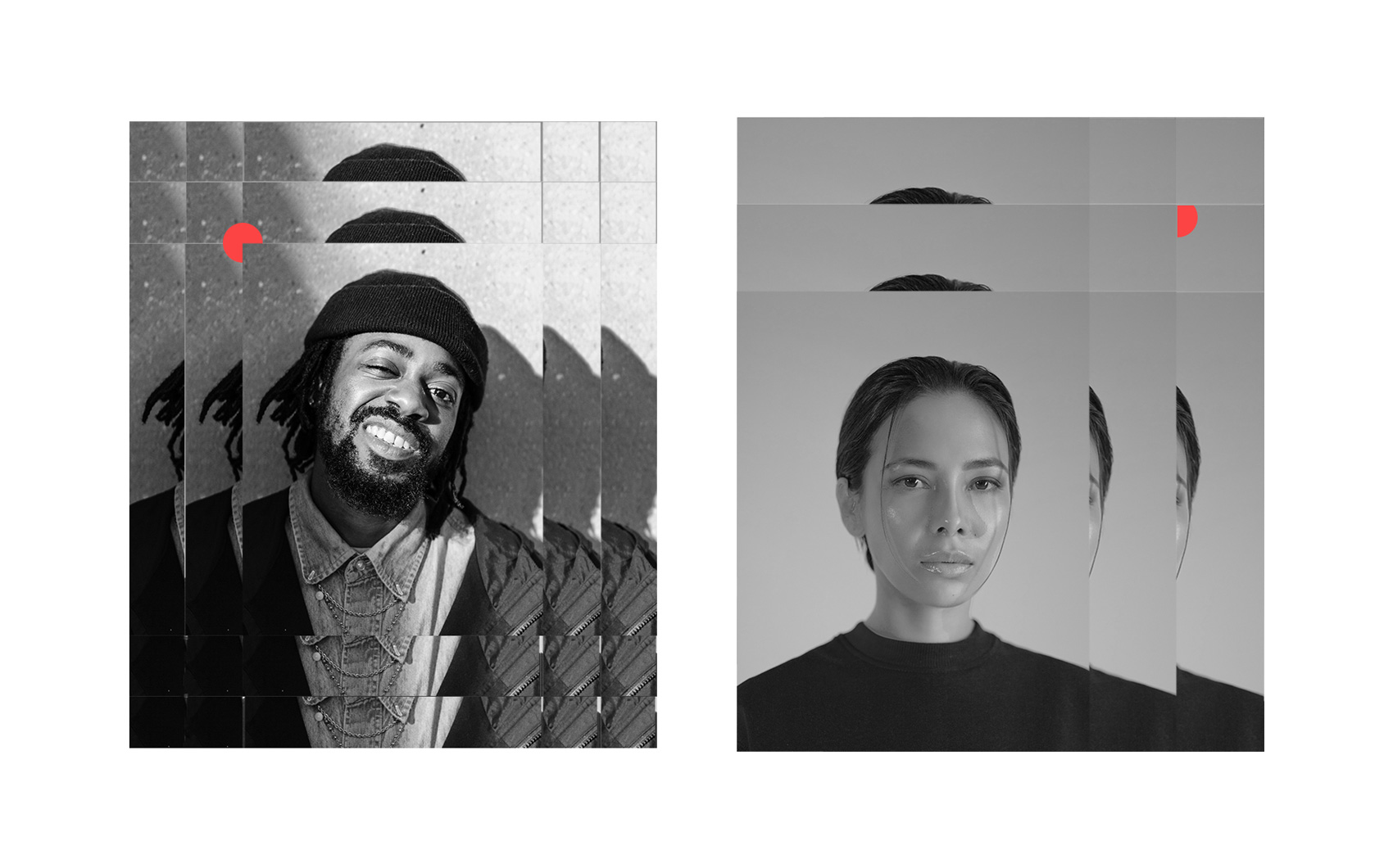
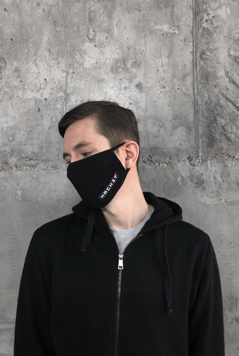
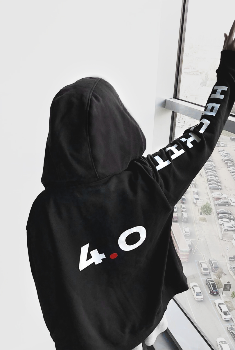
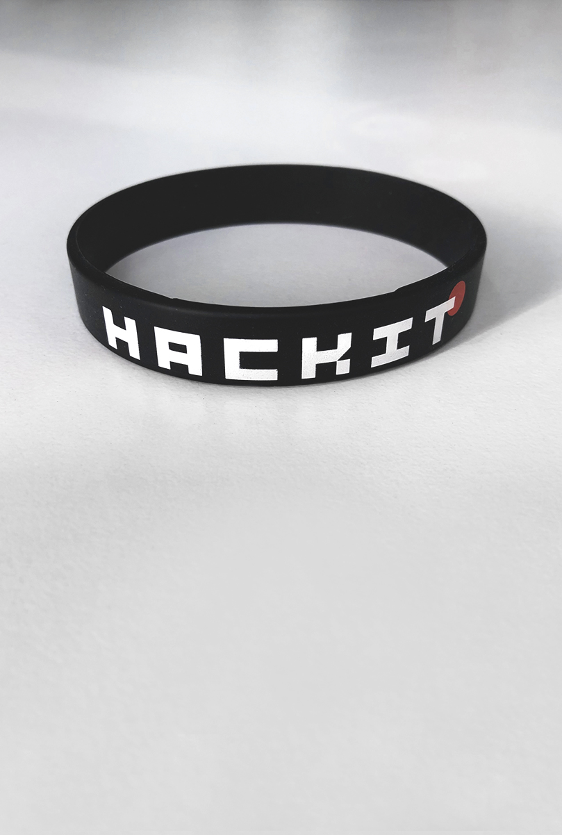
The red dot, one of the main elements used in corporate style and on the website, is associated with a sniper aim or with a recording/surveillance sign (REC). It symbolizes a weak spot in a complex, multi-stage system.
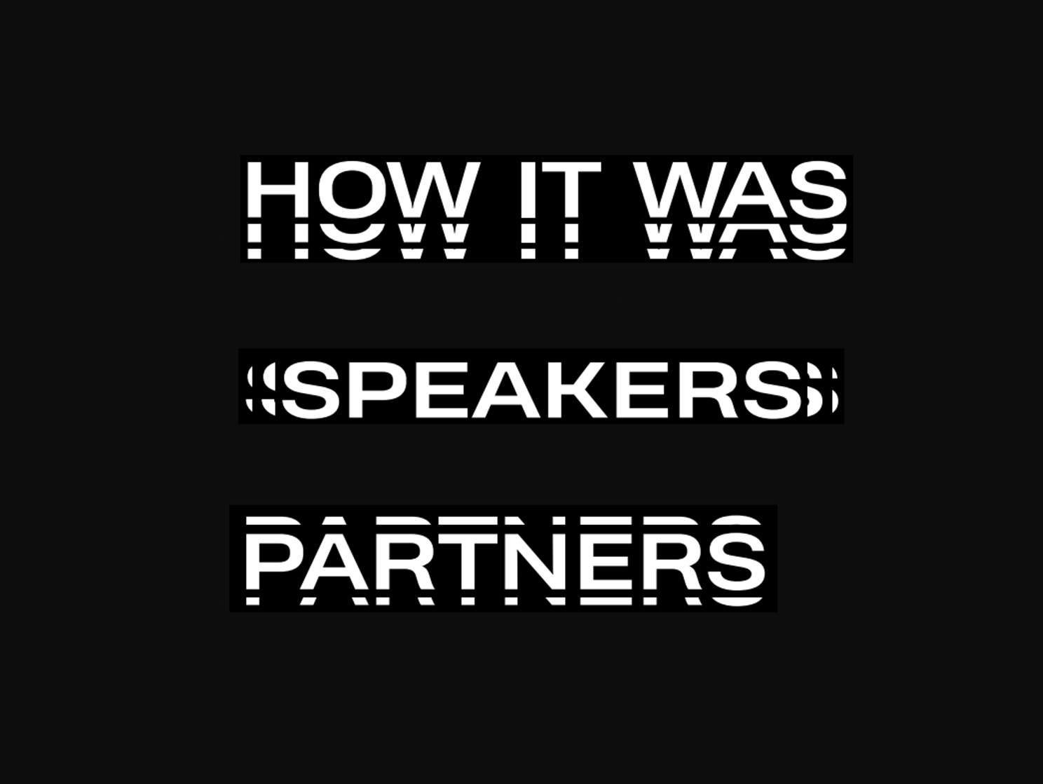
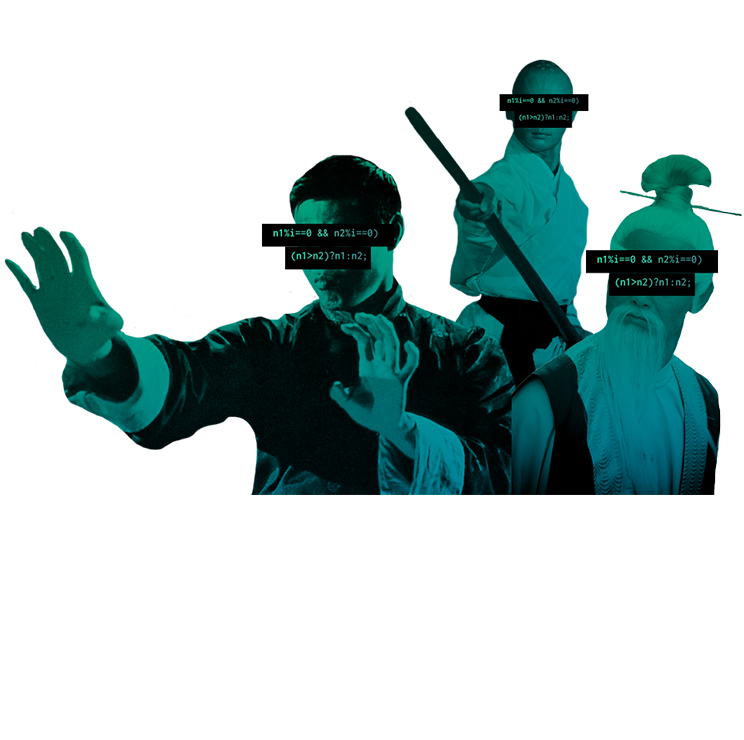
While working with the text, everything is built on a contrast: the title and the main text. For the design of the text we use the method of duplication. This is due both to the visualization of errors and to the fact that we show the layered essence of the elements, which allows us to hide the red dot between the layers.
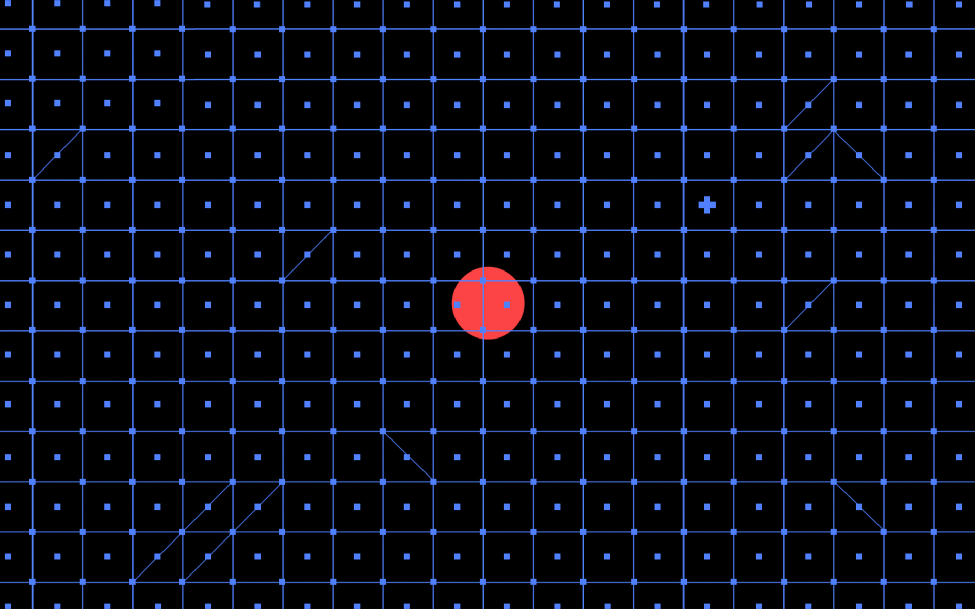
The pattern is built based on a modular grid by moving individual elements across it. Used for background images and visuals. It takes us back to the style of the Bauhaus. We turned to it because the fundamentals, which Bauhaus is based on, are close to the qualities that are characteristic for a hacker audience — focus on the main point, rejection of the unnecessary and unjustified, constructiveness. At the same time, the style of the Bauhaus often resembles logical charades - and this is exactly what hackers are dealing with.
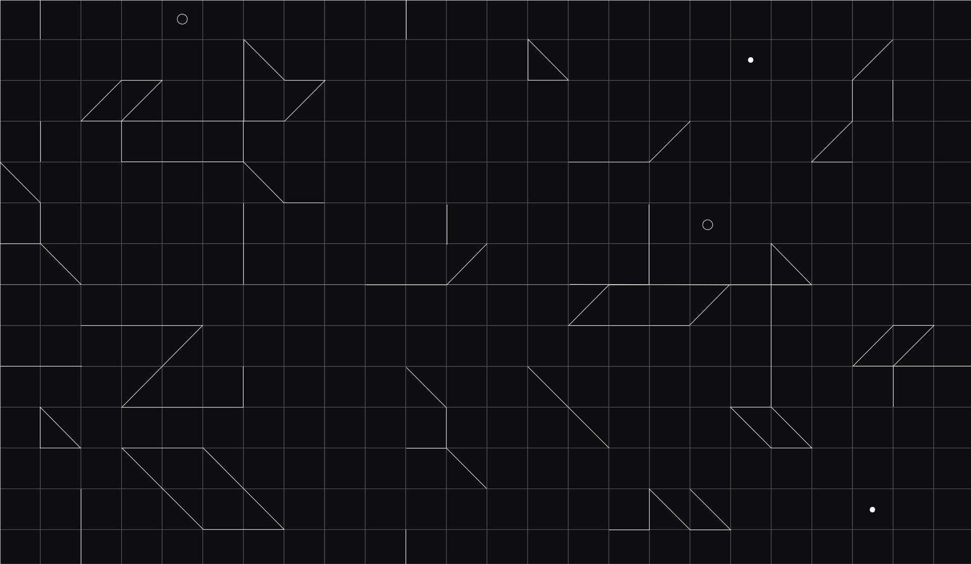
The grid symbolizes the process of scanning the system to identify vulnerabilities. This grid helps to identify a vulnerability — the red dot.
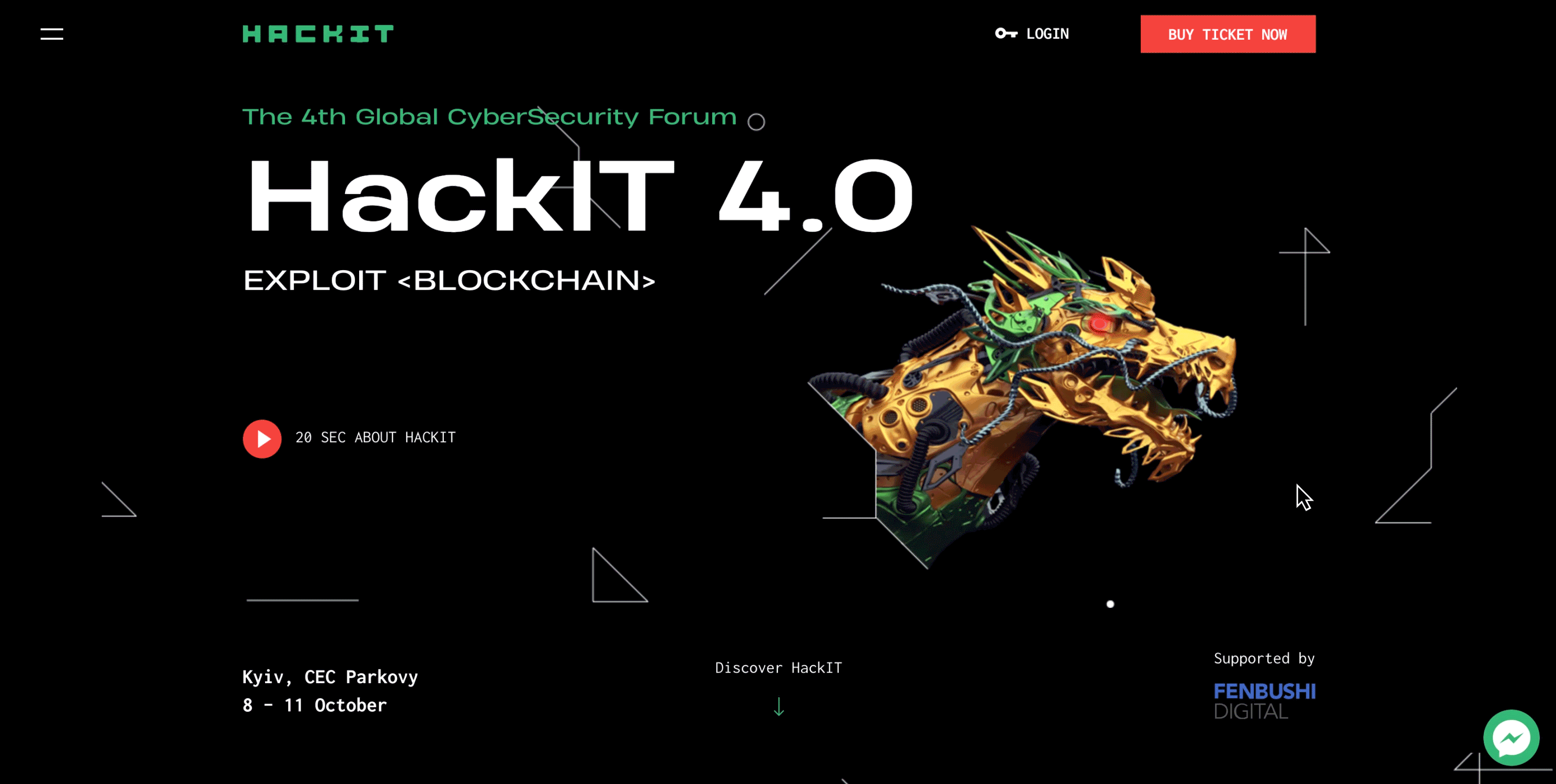
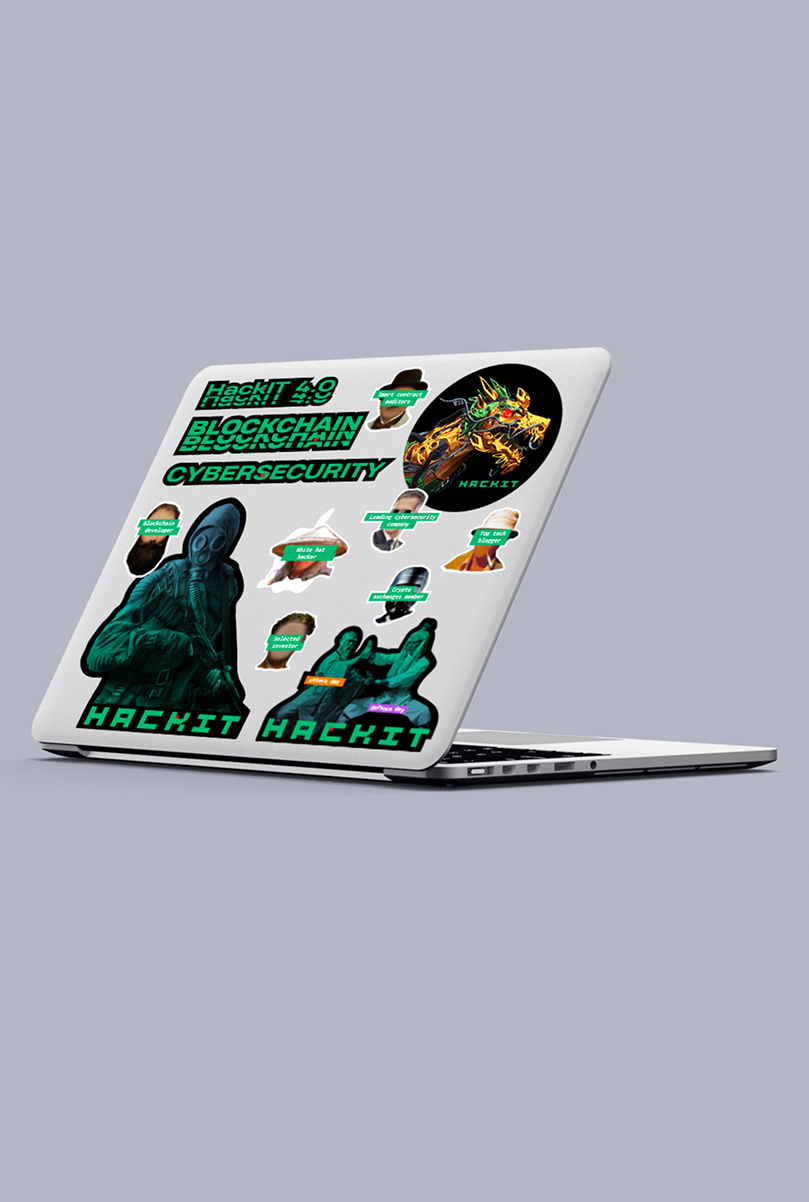
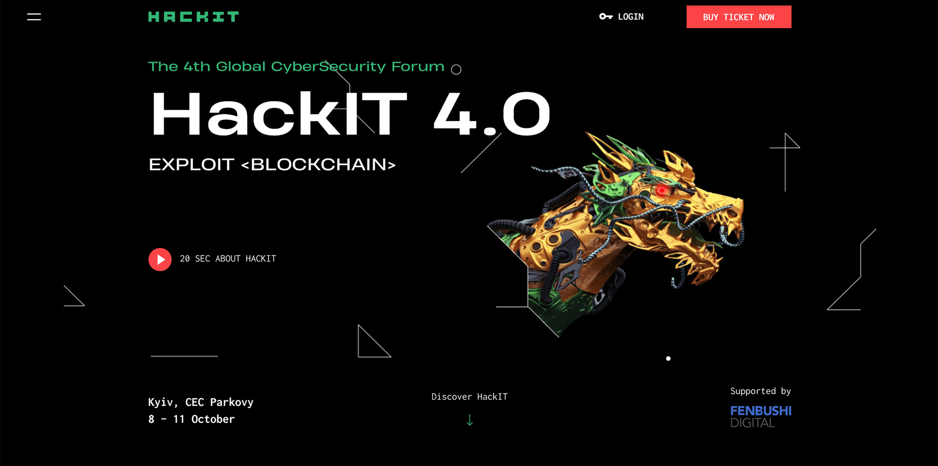
The image of the dragon is key to HACKIT 2018. The dragon symbolizes the enemy, the challenge, the rebus that needs to be solved, and, more literally — the service, the website, the network, in which the hacker is searching for vulnerabilities.
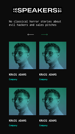
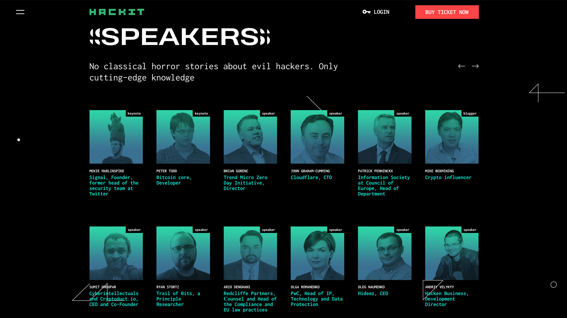
For the photo design we use the image duplication method; such an intentional glitch effect is associated with bugs and errors. We also use layering to hide the red dots within the layers.
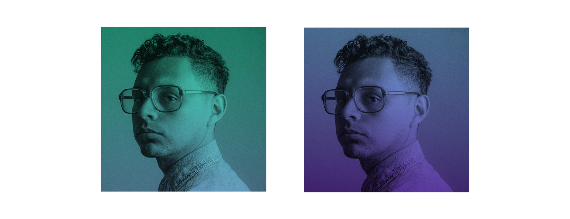
For the design of the visuals, we use a color gradient overlay.
We have created a recognizable expressive style, developed a number of new, bright, emotional images that interact well with the target audience.
In the website design, we tried to convey the aesthetics of the world of hackers using non-trivial methods. The website contains a number of hidden effects that add elements of gamification, which encourage the audience to interact more closely with the website.
The teaser video talks about the content of the conference. We have set a goal to catch the viewer’s interest within the first 5 seconds with a spectacular and emotional image, and then at the most intensive pace to show all the key moments. The clip tempo of the video allows us to put hidden messages in it, which contain various bonuses for the viewer and encourage you to watch it repeatedly.