Prior to Crypto Exchange Ranks, we've developed brand identity for the large Hacken.io holding using a custom-made font based on the previously designed logo. You can find case description on our website, but long story short – Hacken is an innovative cryptocurrency that aims to bring together "white hat hackers".
So we used Hacken to launch the analytical platform for Crypto Exchange Ranks, and our task was to create brand identity, a website and an explainer video. We started out by designing a logo based on the already existing font.
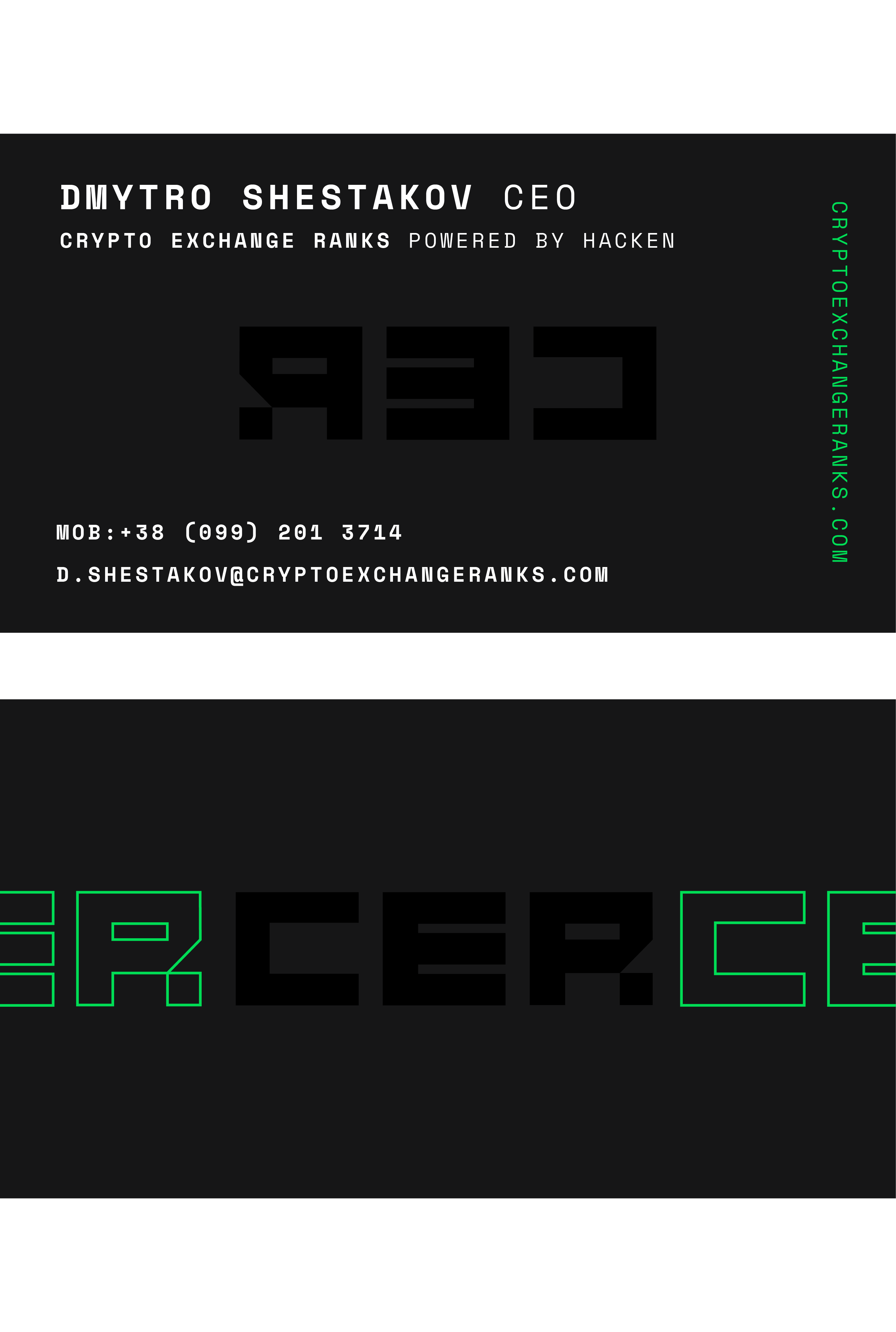
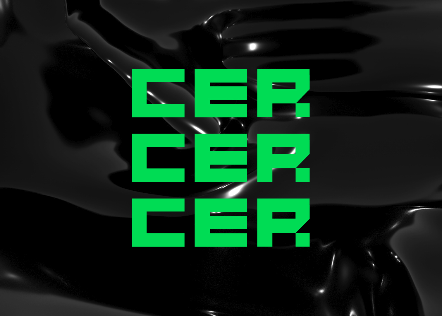
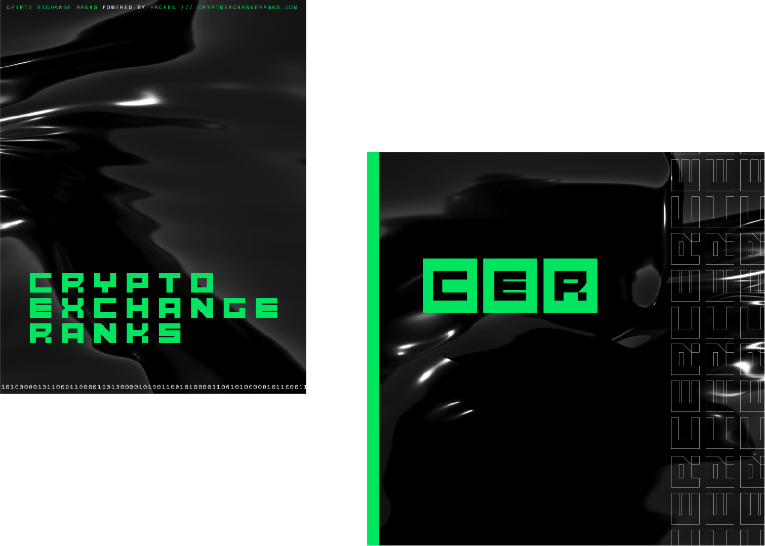
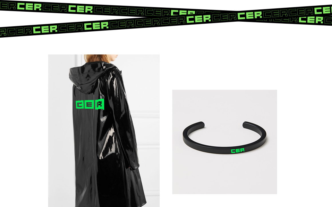
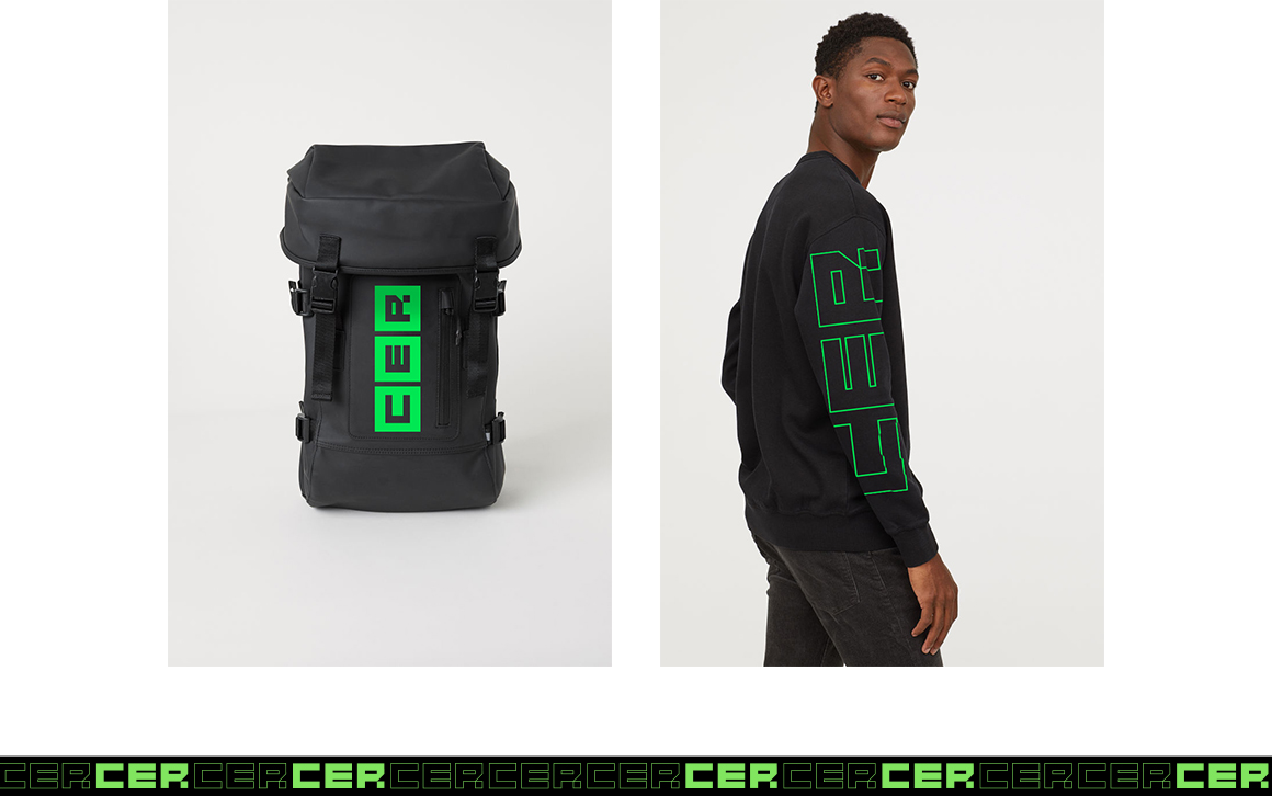
Because the name is rather long and it wasn't always a great idea to use it in its entirety, we've decided to introduce the CER abbreviation.
During the design stage, several variations have been made, which we are now combining depending on the context.
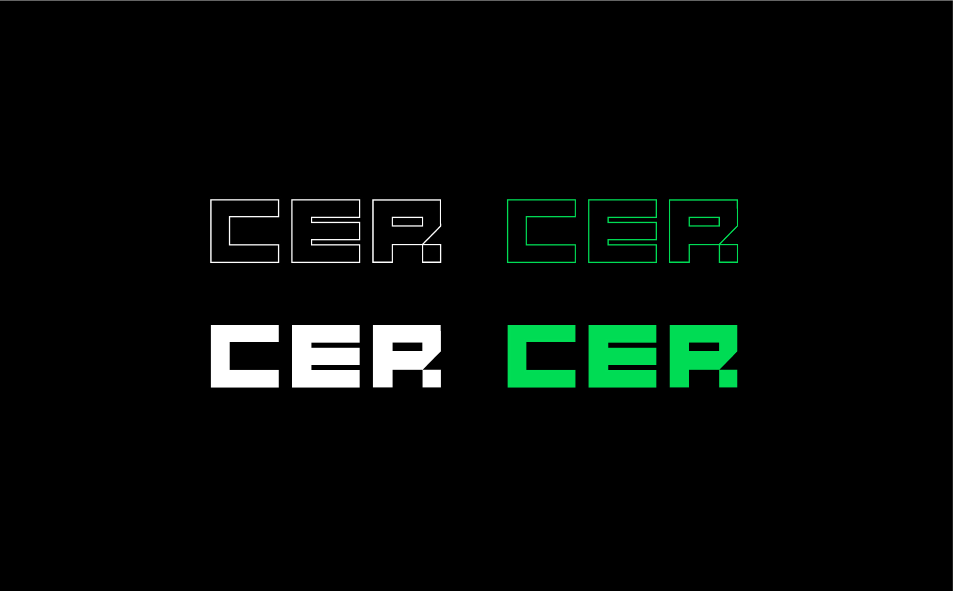
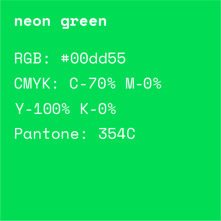
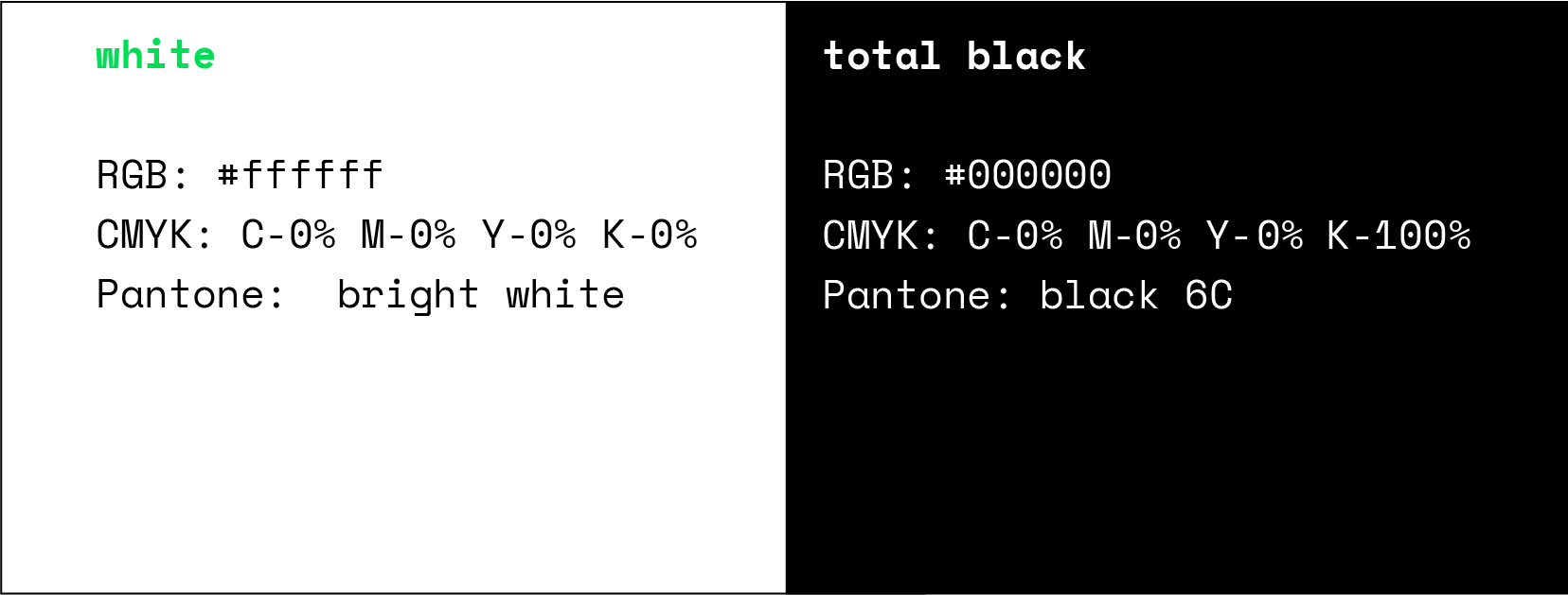
The brand identity uses three contrasting colors: neon green – as the main color that reminds one of screens, display panels and graphs. Black and white – as an uncluttered base for a multitude of numbers, text and tables.
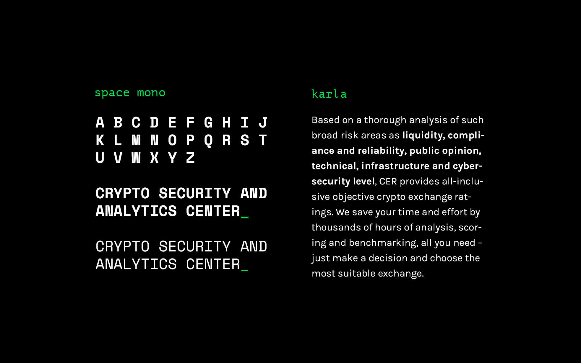
Font selection was an important task for this project, as we are talking about working with data. Space Mono and Karla made the final selection: the first – reminds users of technology and coding due to its build, while the second one is visually more simple and is perfect for large text blocks.
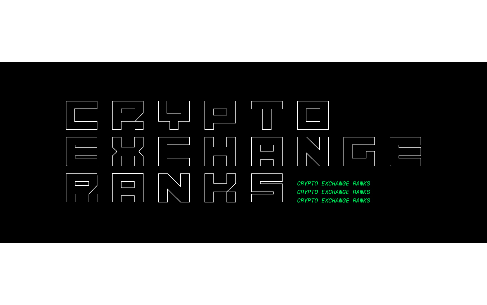
For the pattern, we've developed a square-based modular mesh. This mesh makes it easy to build graphs and tables, creating precise structures and placing elements exactly where they need to be.

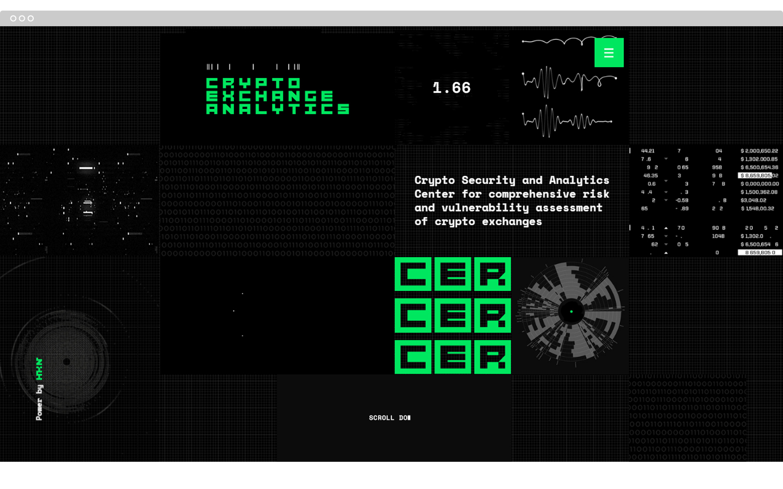
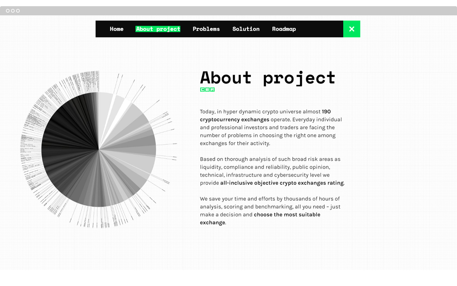
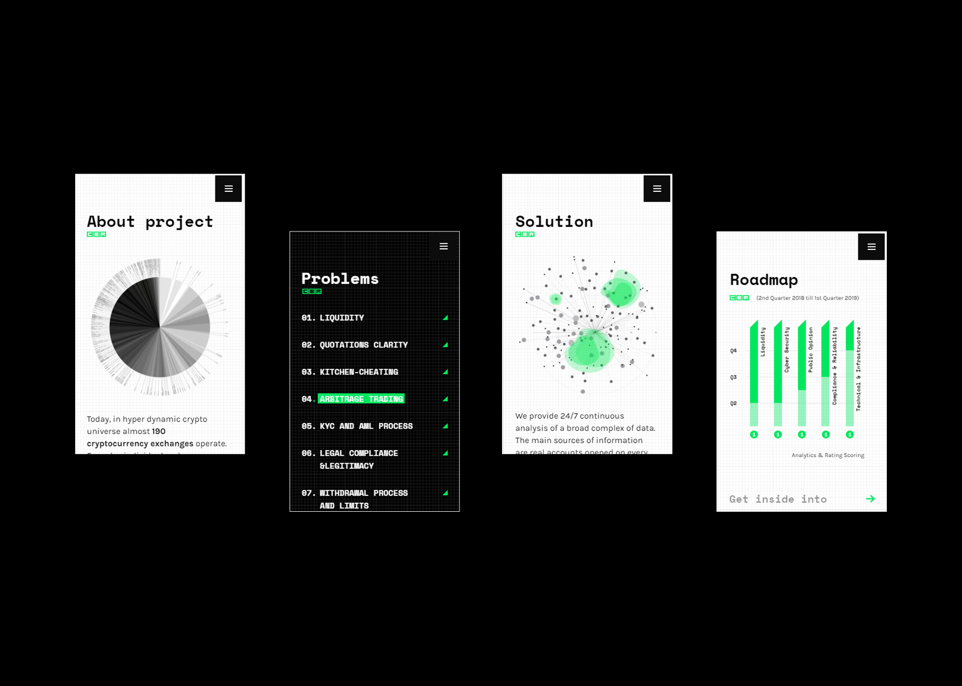
The next stage was website development, namely, the home page that would immerse users in project atmosphere, inform them about the platform's key directions and goals.
