We got to play with something awesome – revamping the vibe for Neurons Lab. Think of them as the cool nerds leading the AI-meets-science revolution. They're all about digging deep into R&D, and so are we.

Neurons Lab wasn't new, but their brand needed some extra zing. Entering at the second stage of their brand development, our task was to create an identity that balanced technological advancement with a scientific, serene demeanor – reflecting the dual nature of Neurons Lab as a hub of technology and science.
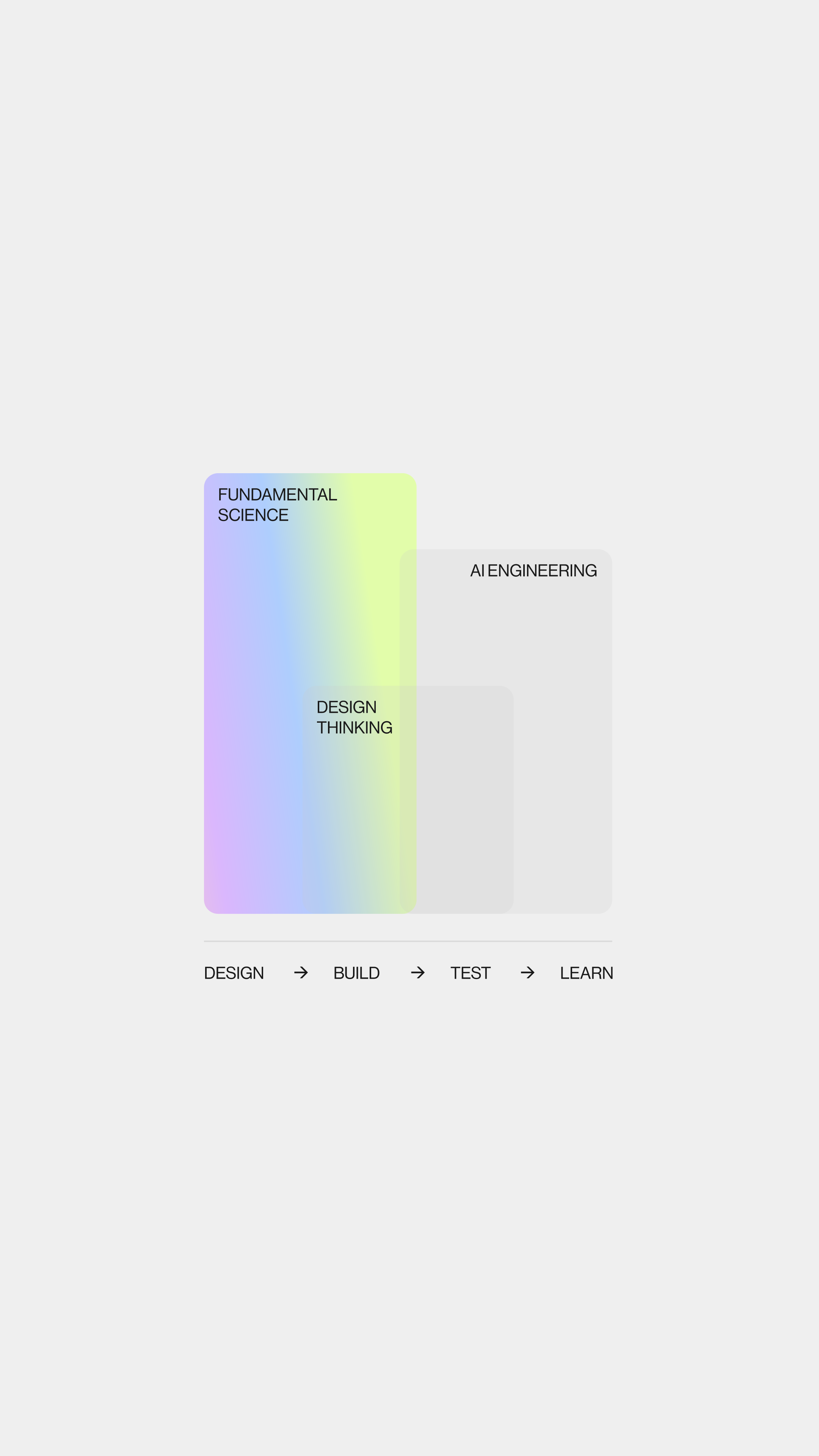
We rolled up our sleeves and gave Neurons Lab a visual language that speaks volumes – it's smart, it's techy, and has just a dash of romance. Who says science can't be poetic? Our methods were non-traditional and at times radical, particularly in how we handled brand materials, storytelling, and presentation – adding a distinct edge to the brand.
The new logo, with the first letter subtly positioned below the baseline. It's a nod to the quirky world of science formulas. The logo's variation, resembling a formulaic symbol, enhances this scientific association.
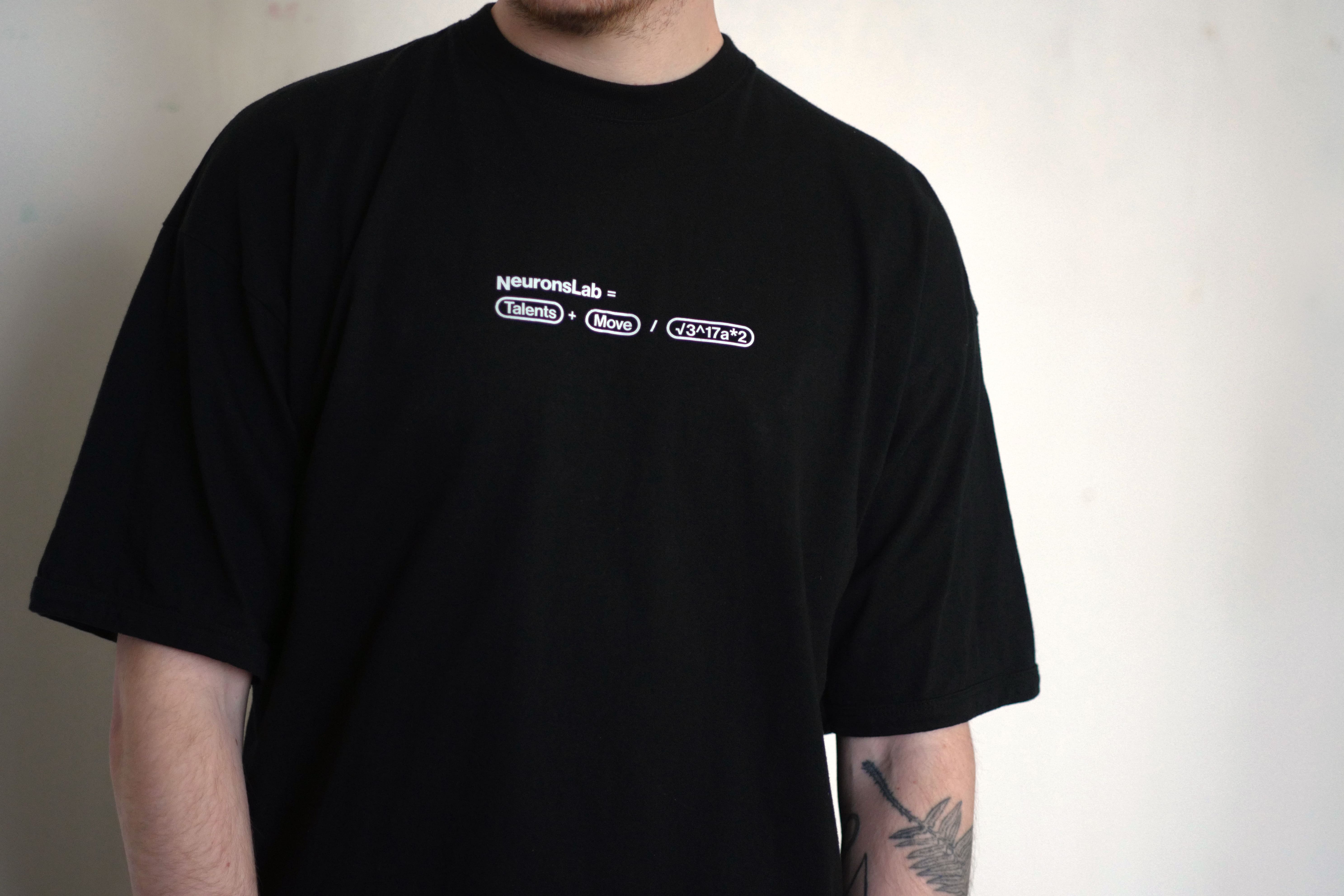
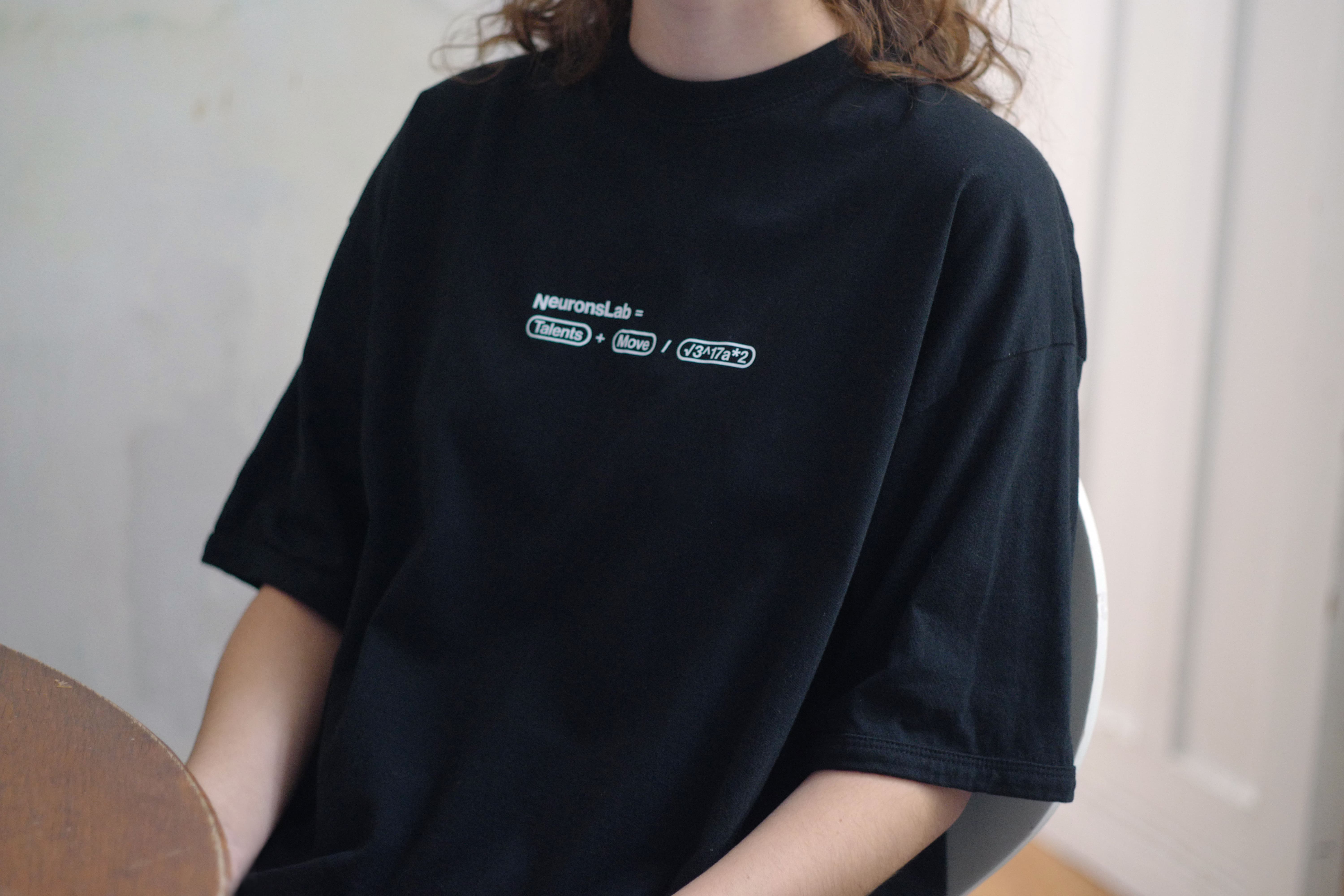
Blurring the lines between design and copywriting. This approach, while not immediately obvious, appeals to the intellectually curious audience Neurons Lab engages with. It's part design, part wordplay – and totally grabs your attention.
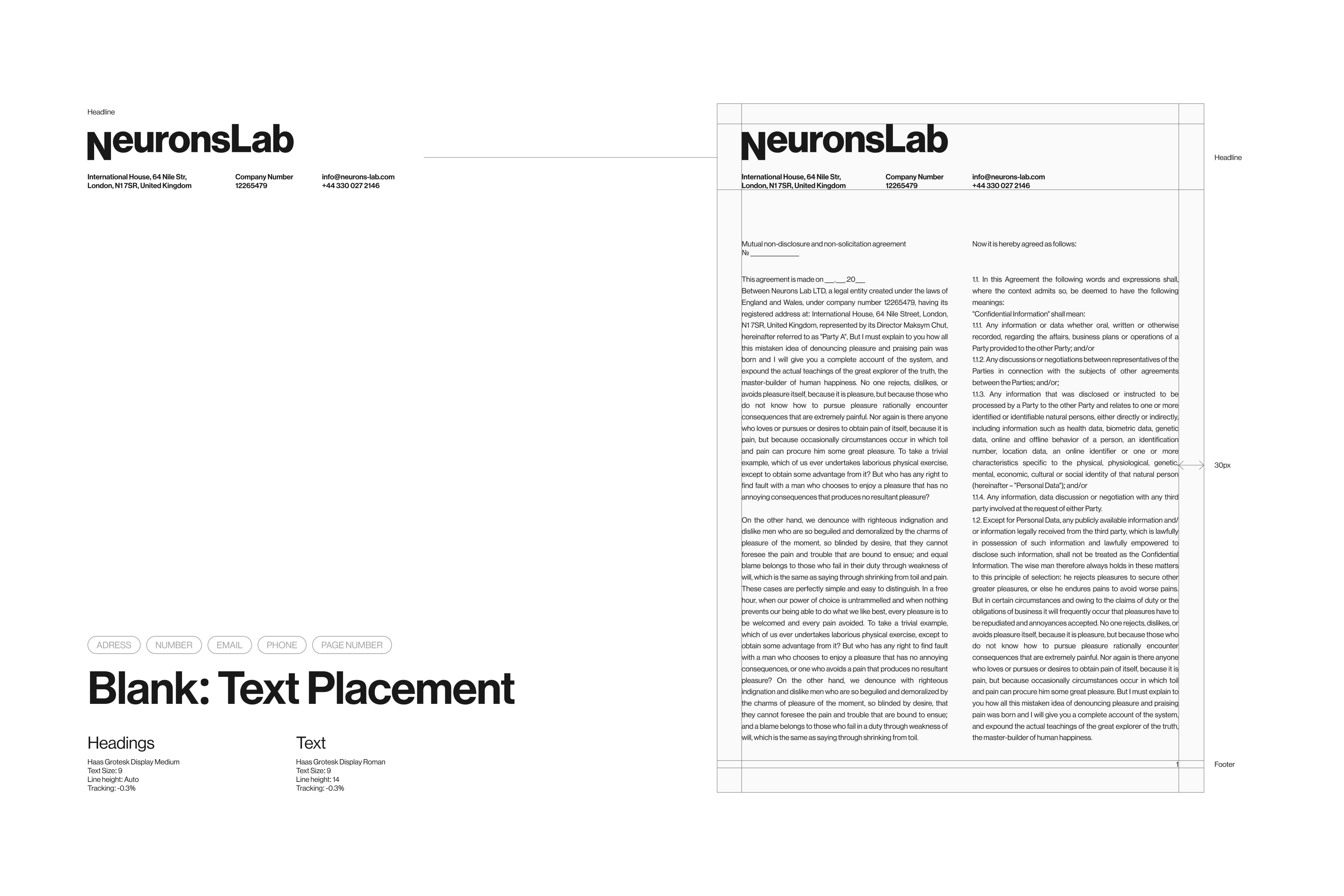
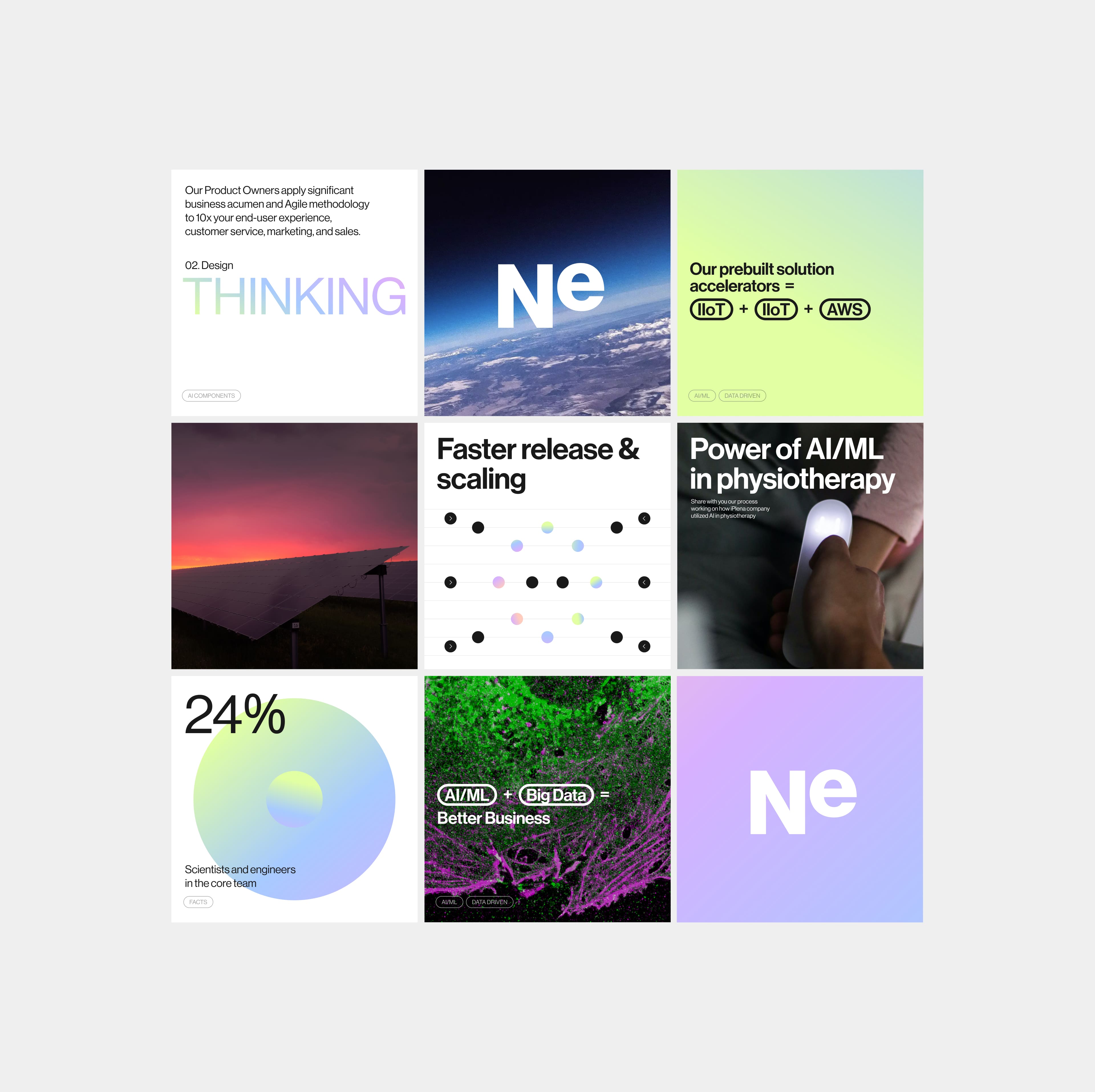
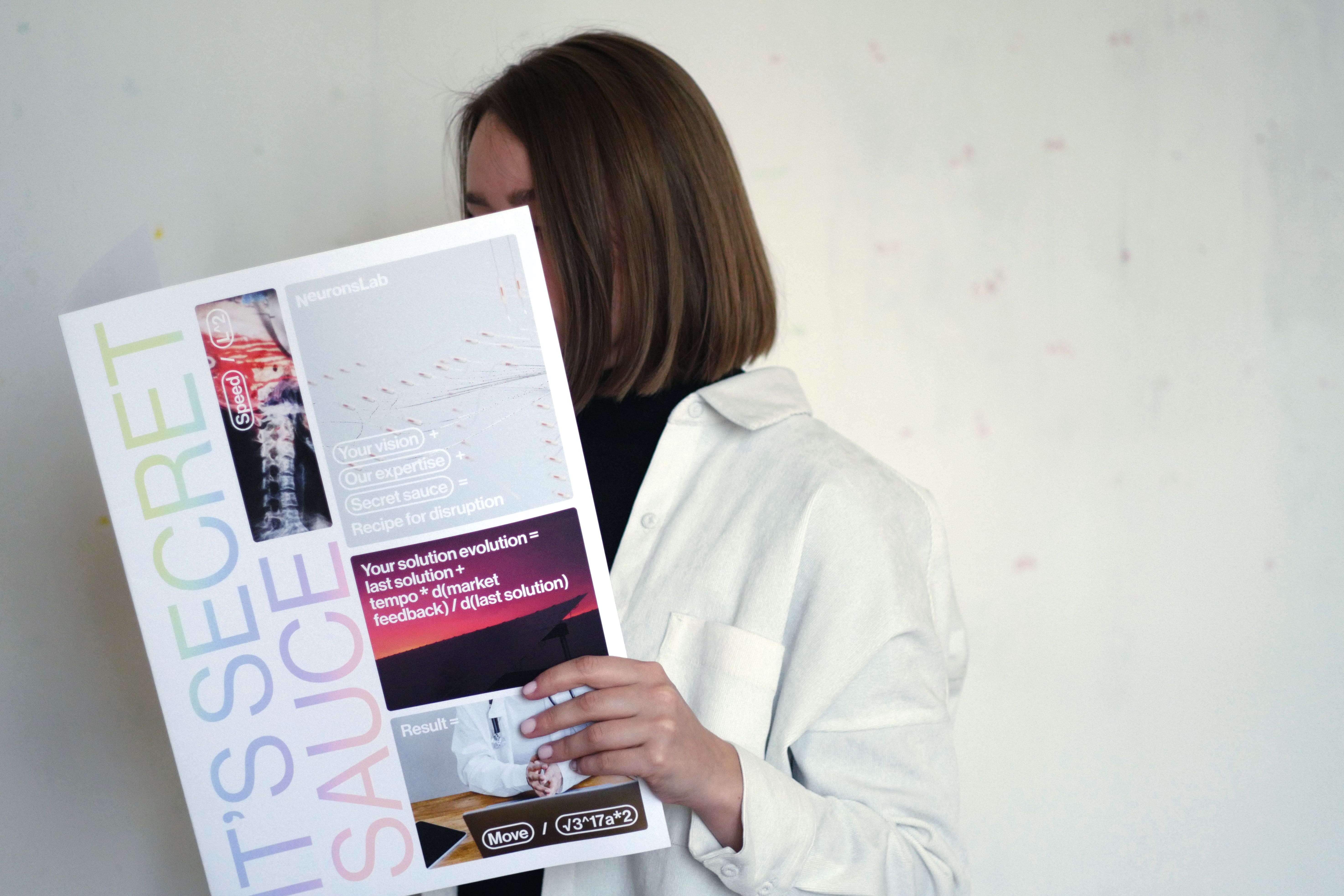
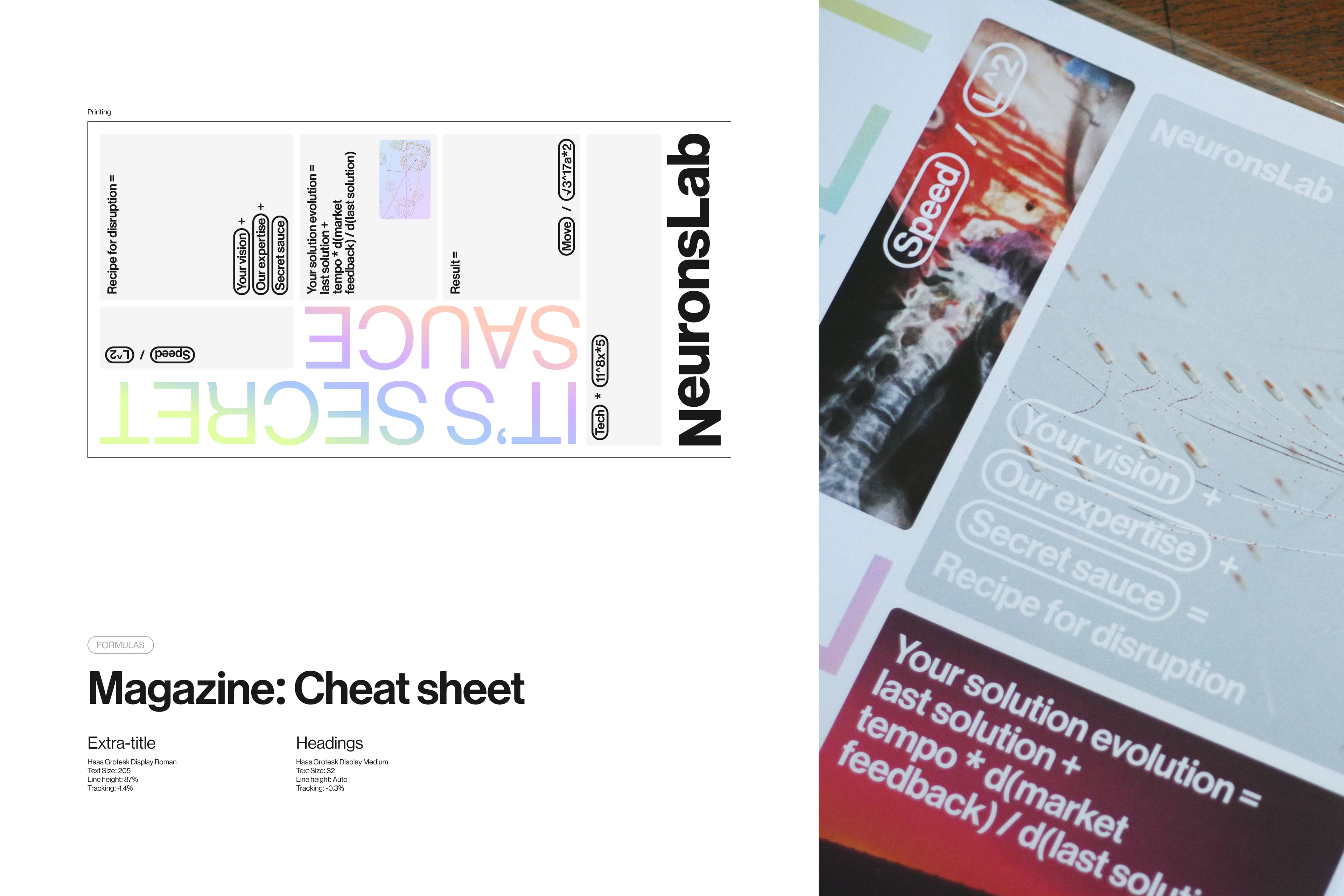
The striking use of gradients against a monochrome backdrop emphasizes innovation and scientificity. The typography, paired with elements like gradient and blur, evokes a futuristic, spaceship-like vibe. The wide text blocks, unusual in technical domains, amplify the brand's innovative spirit.
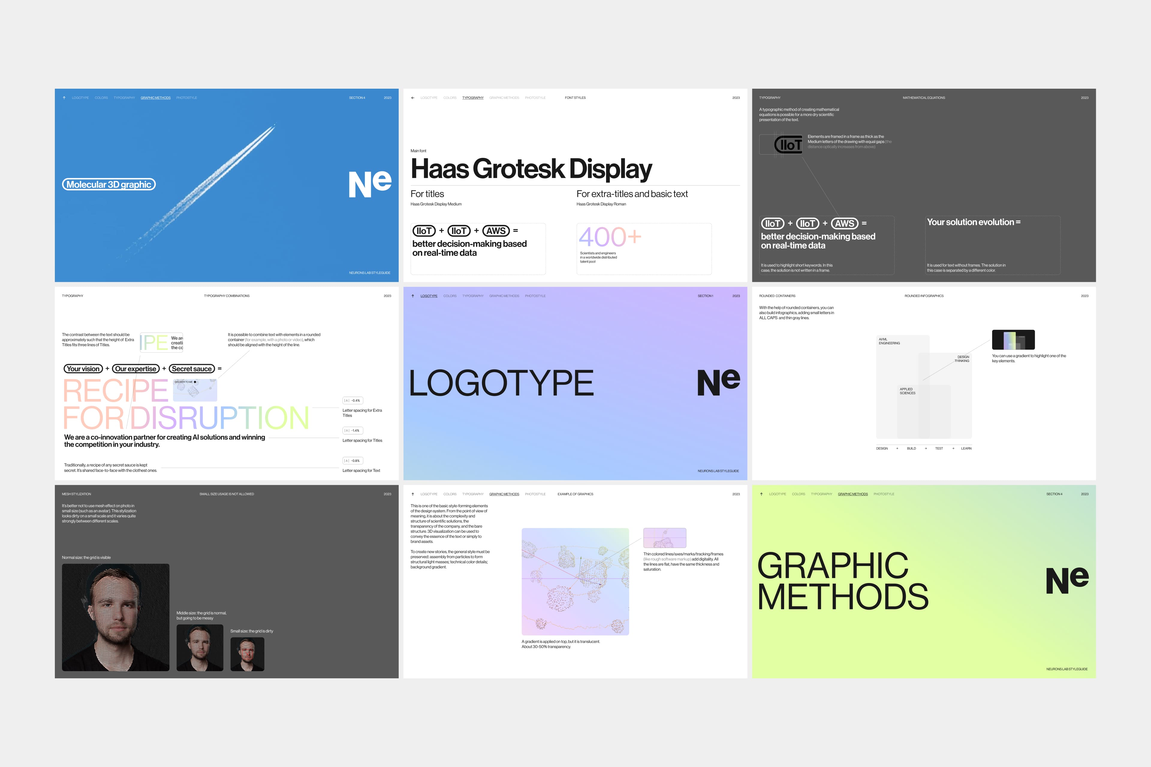
The graphics, both generative and traditional, delve into the complex structures behind Neurons Lab's simple products, visually narrating the depth of their scientific and technological solutions. The 3D graphics, designed to be digital and slightly imperfect, depict a transparent, molecular world, while the 2D graphics are cleaner and more precise, moving in a mathematically coordinated fashion.
The website wasn't just built; it was born. We started with a blank page and let the design identity grow from there, leading to some wild and wonderful design choices. This approach, while complex, allowed for a more scalable visual language. Functional needs on the website, like the use of blurred dies, evolved into strong aesthetic elements of the overall style.
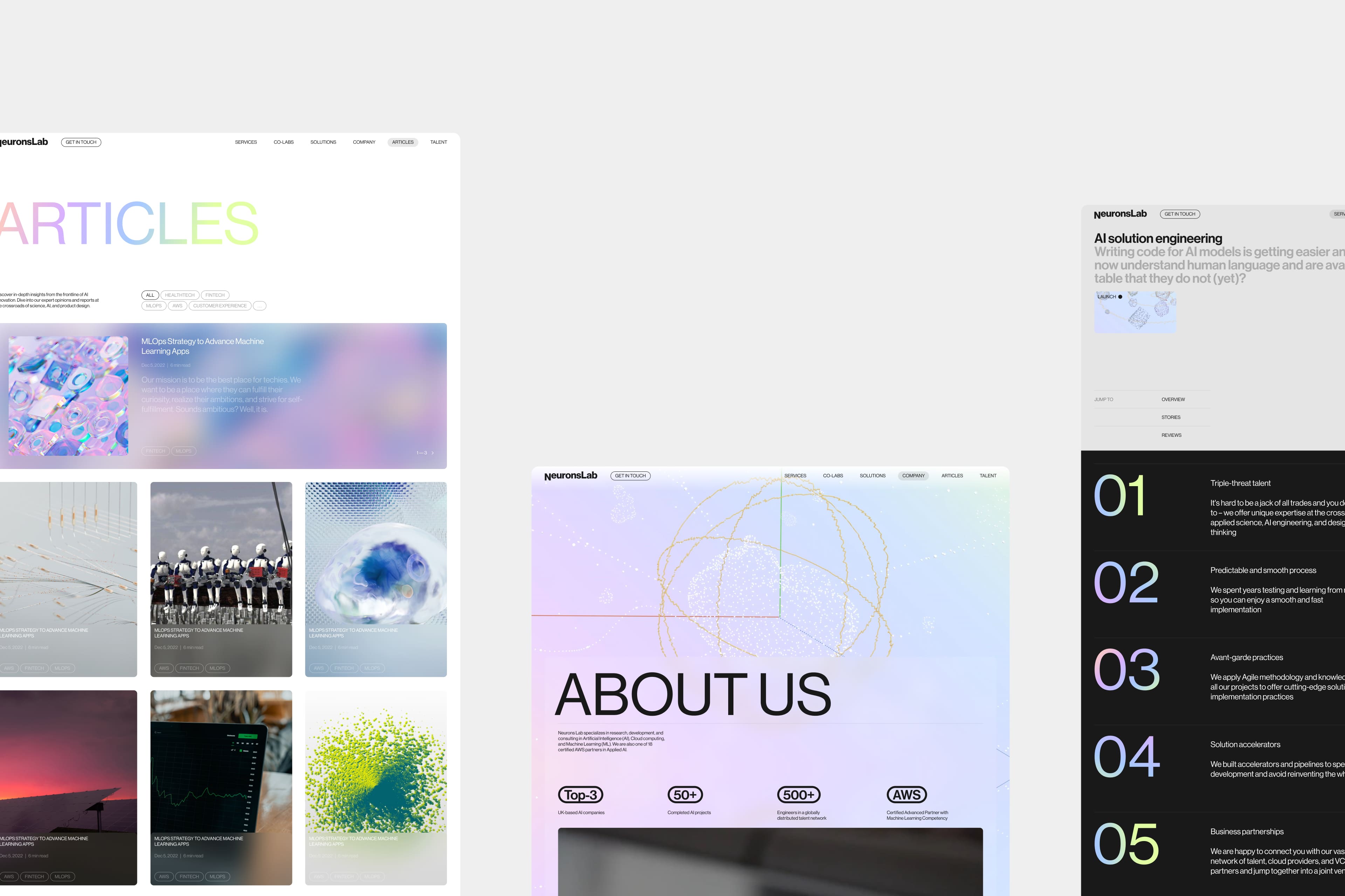
In reimagining Neurons Lab's brand identity, we has crafted a visual narrative that is as multifaceted as the company itself – technologically advanced, scientifically grounded, and aesthetically captivating.
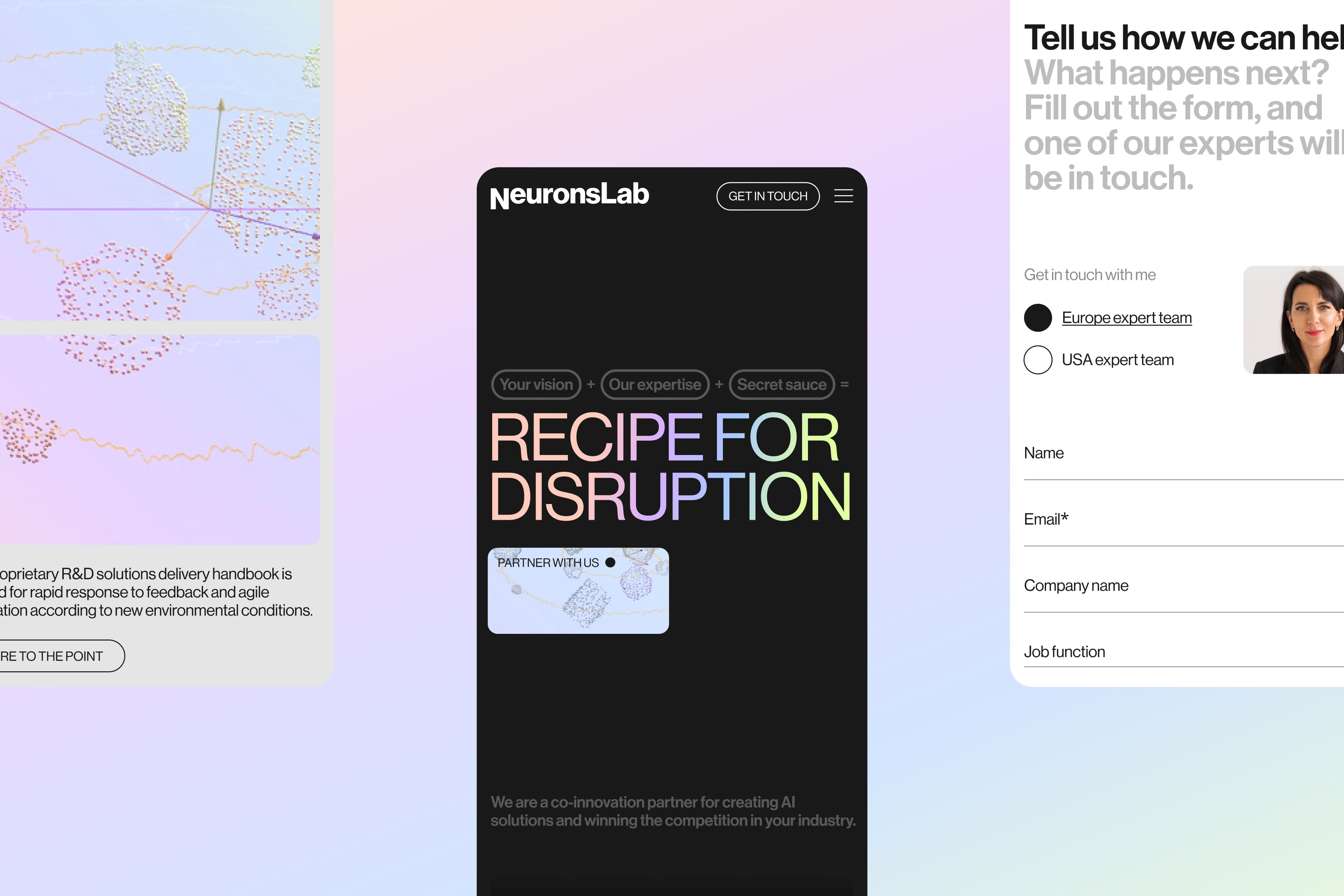
Тeam
Creative director - Alex Twista
Account Director - Viktoria Nutsal
Design director - Mariia Bystrova
Creative Copywriter — Kostiantyn Kaliukin
3D & motion - Olexii Boiev
![薇閣薇恩 – [Wēi gé wēi ēn]](https://twid.studio/wp-content/uploads/Untitled-1.png)
