Are you fascinated by the fact that machines are capable of learning? And artificial intelligence, which can write a symphony, paint a masterpiece? We and the Roosh team certainly are. They create and invest in pioneering projects with machine learning and artificial intelligence. And we create a visual identity and sites for their projects. Such as Pawa, Zibra and Roosh Ventures website.
And now we've done it for the parent brand.
During the brand session, we realized that our goal is to find a visual language for communicating with knowledgeable experts and future partners. In the spirit of innovation.
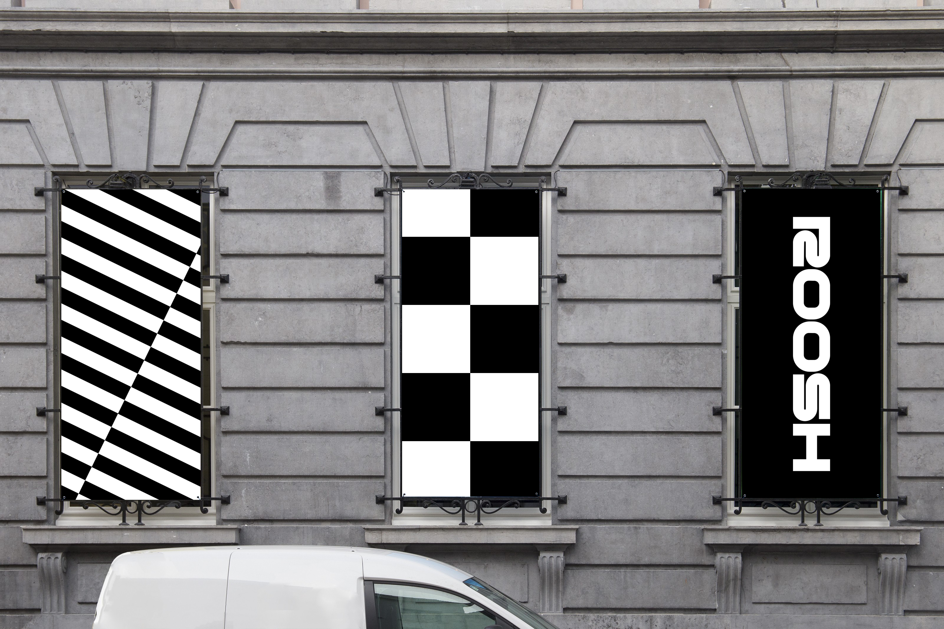
Roosh and Roosh Ventures are related brands. We decided to reflect this connection in the visuals as well. The look of racing games was taken as a basis. There are speed booster arrows in Roosh Ventures, so in Roosh the starting line checker becomes the key visual which is where the game starts.
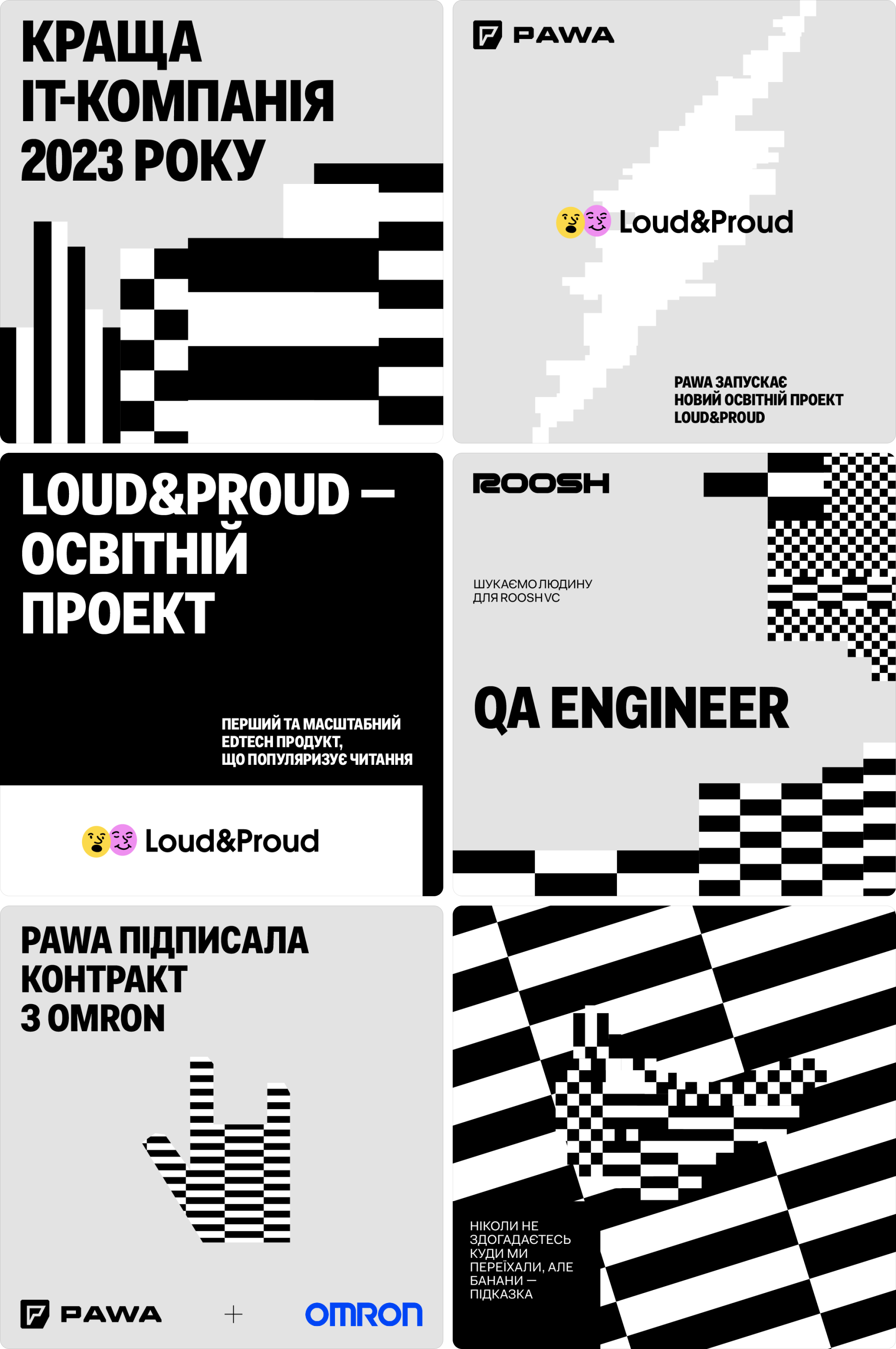
We broke the checker into white and black blocks to use as a building material. If you want, you can stretch, enlarge as well as build images and patterns. It can be scaled to any format. So how about some optical illusions?
As an option, you can use a torn pattern. It is always recognizable and easily adapted. Just stretch the format and attach the unbroken edge to either side of the layout. And a set of icons will help to add some feeling to the message.
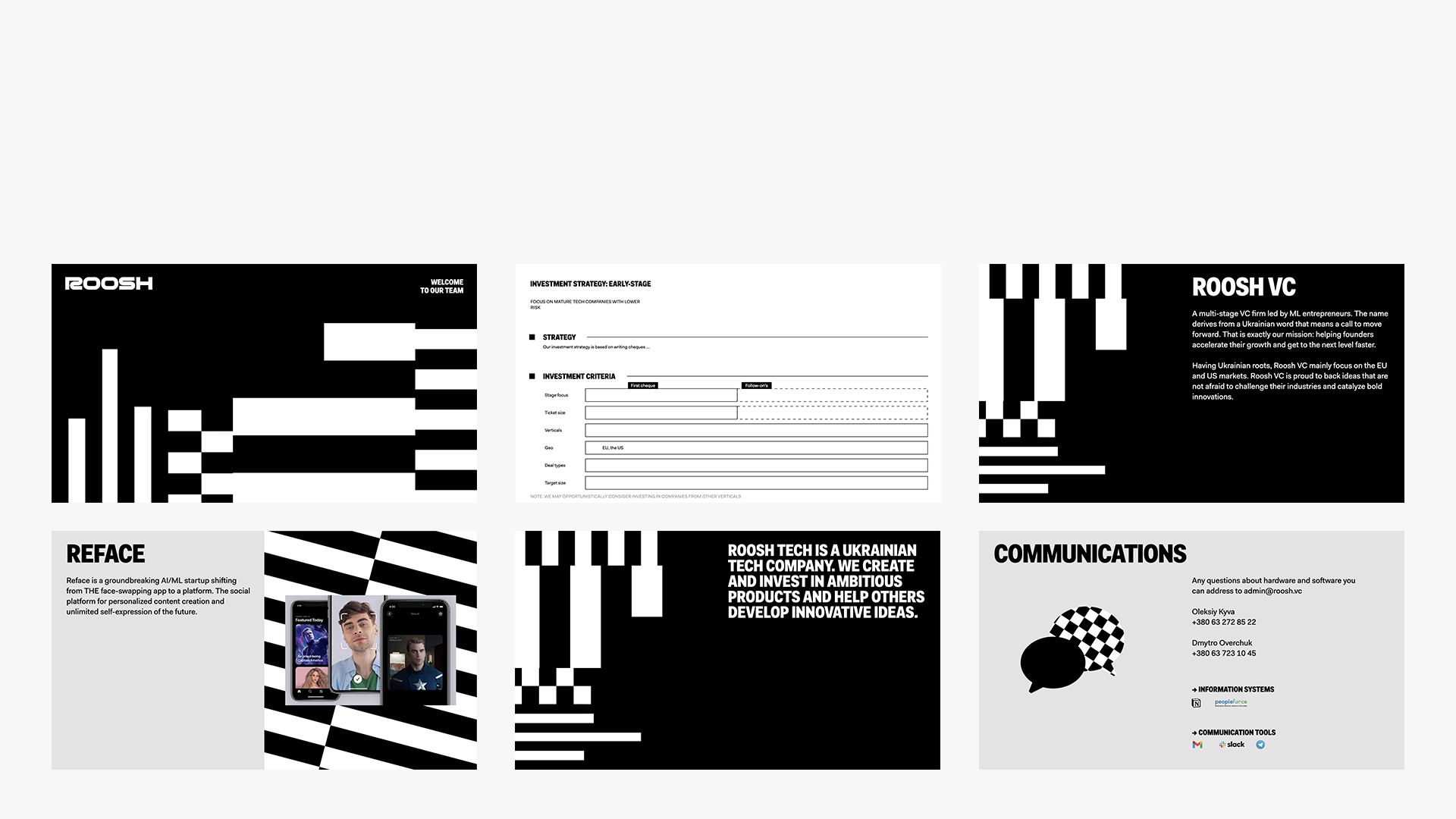
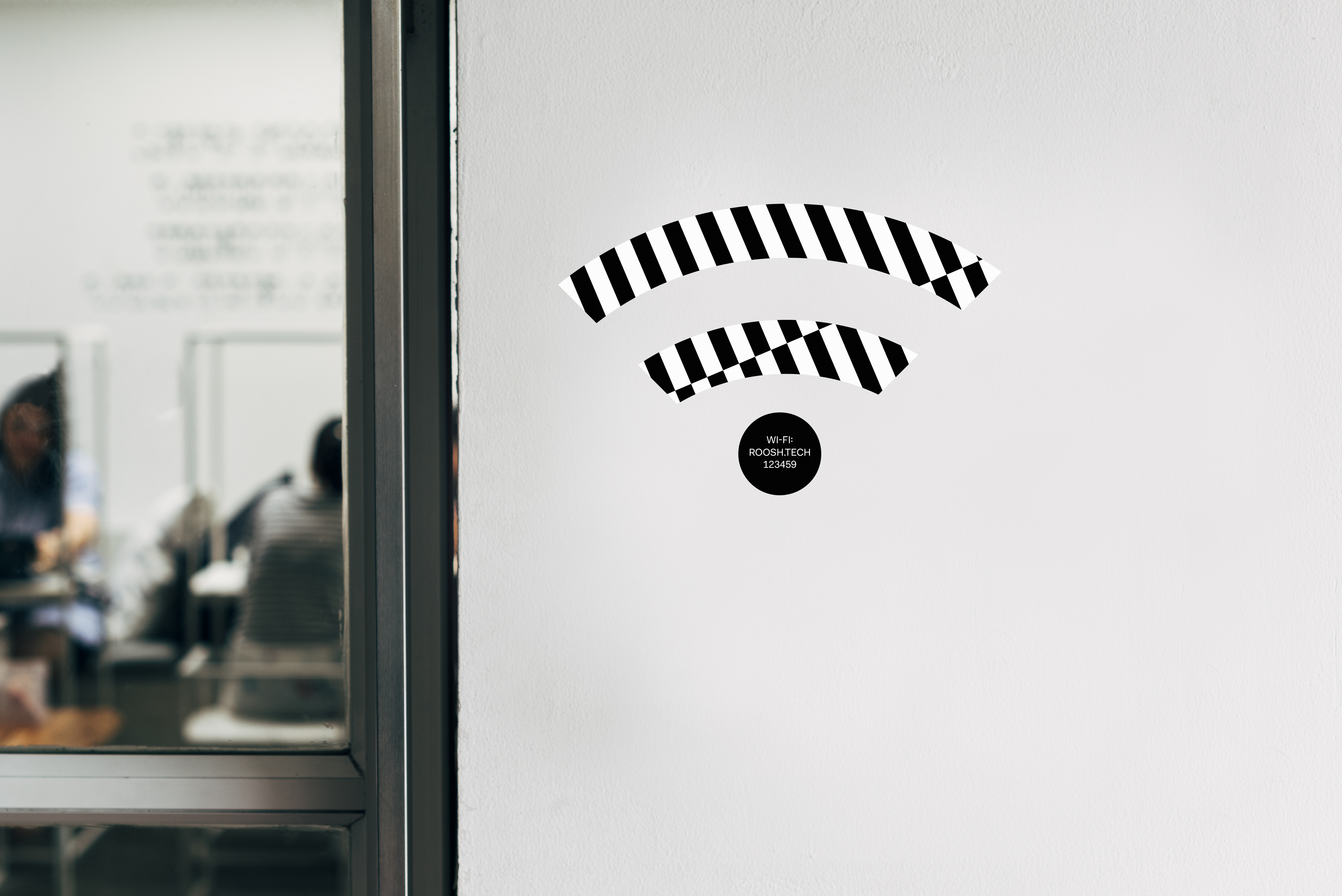
Based on the sense of composition and balance, you can create unique checkerboard compositions. The main thing is not to interfere with the perception of the text.
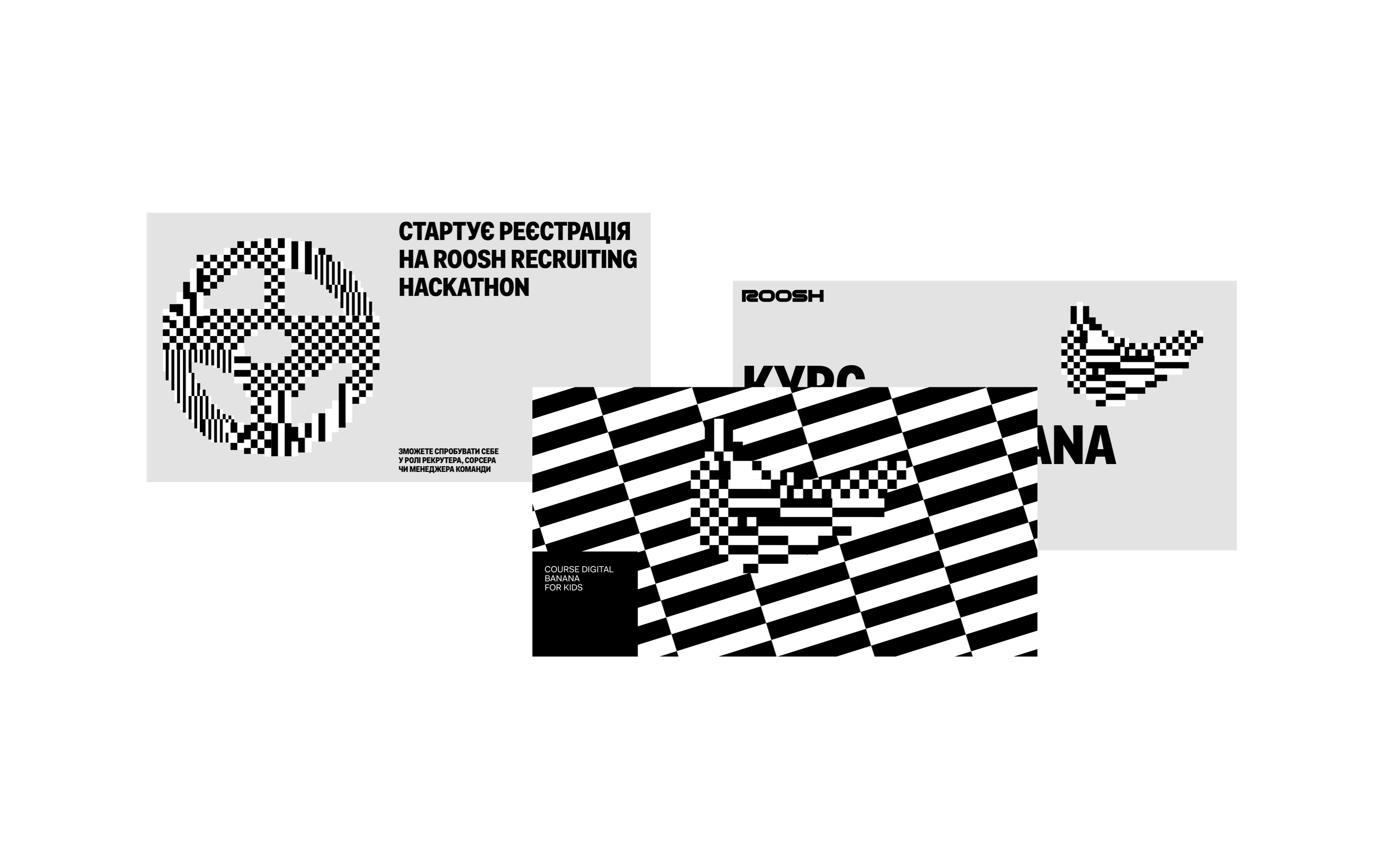
With a checkerboard you can build simple objects and distort parts of the illustration. This technique is suitable for special cases where you need an eye-catching element.
If you combine such illustrations with a checkered background, you can get an abstraction on the verge of an optical illusion!
These animations work as calm dividing compositions, active navigation elements or eye-catching scenes.
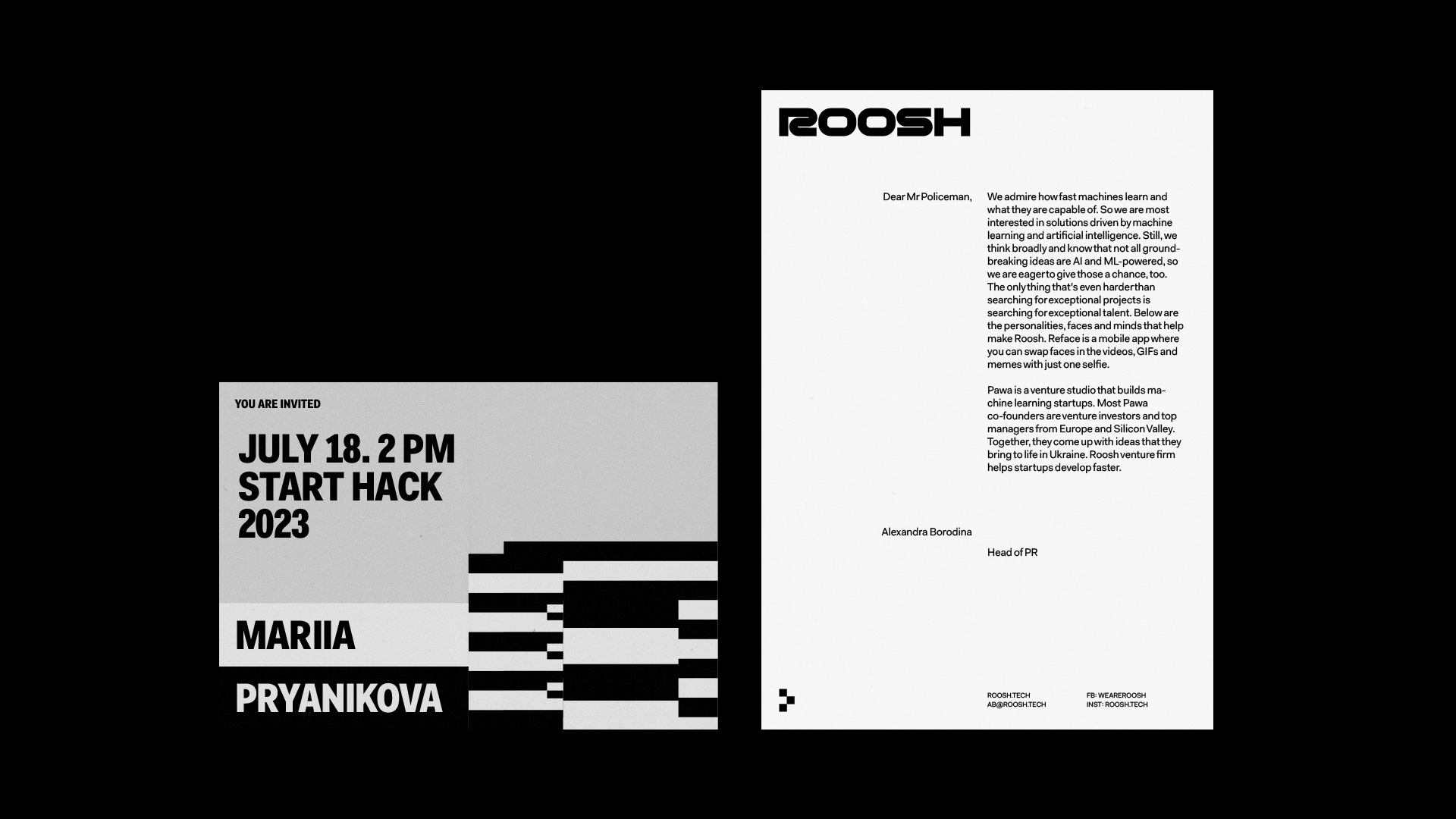
The main criterion was not to be distracted by information. Therefore, we used a consistent block layout, which gives storytelling more space.
In addition, we have prepared template packs for each section. Vertical format for Facebook, square for Instagram. Classic.
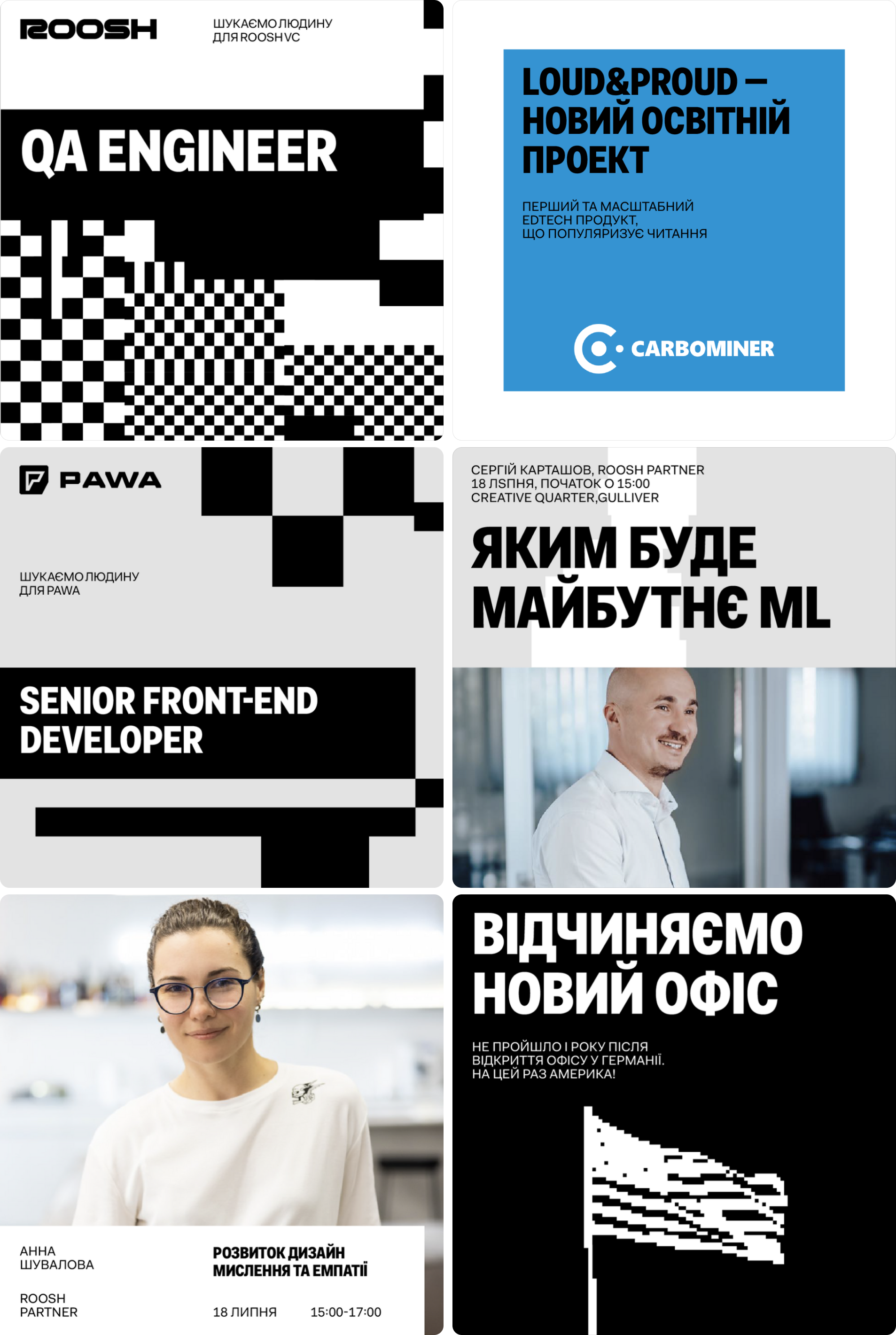
‘Our approach to checkers has evolved with new iterations. There were many of them. However, they helped to create an interesting variety of identities, with a bunch of tricks that the client can resort to'.
Masha Bystrova, Art director of the project

