"Nash Kesh" (Our Cash) is a national Ukrainian program aimed at getting citizens involved in the distribution of local budgets. Few people are aware that the state allocates money for community budgets, where spending is actually up to the local citizens. That said, everyone has the right to come up with an idea and the probability of its implementation is rather high. For us, it was especially important to convey this message to the young generation, which usually distances itself from these issues.
Out task was to develop naming architecture and tone of voice that help bridge the gap between the program and its target audience. Most people, especially youth, approach state programs with mistrust, so it was important that we dispel this attitude. The very name "Nash Kesh" contains elements that speak personally to everyone. The use of the cool slang word "cash" brings the program closer to real people, while the word itself represents accessible money that is up for grabs.
For our messages we used simple and clear wording, and also included slang.
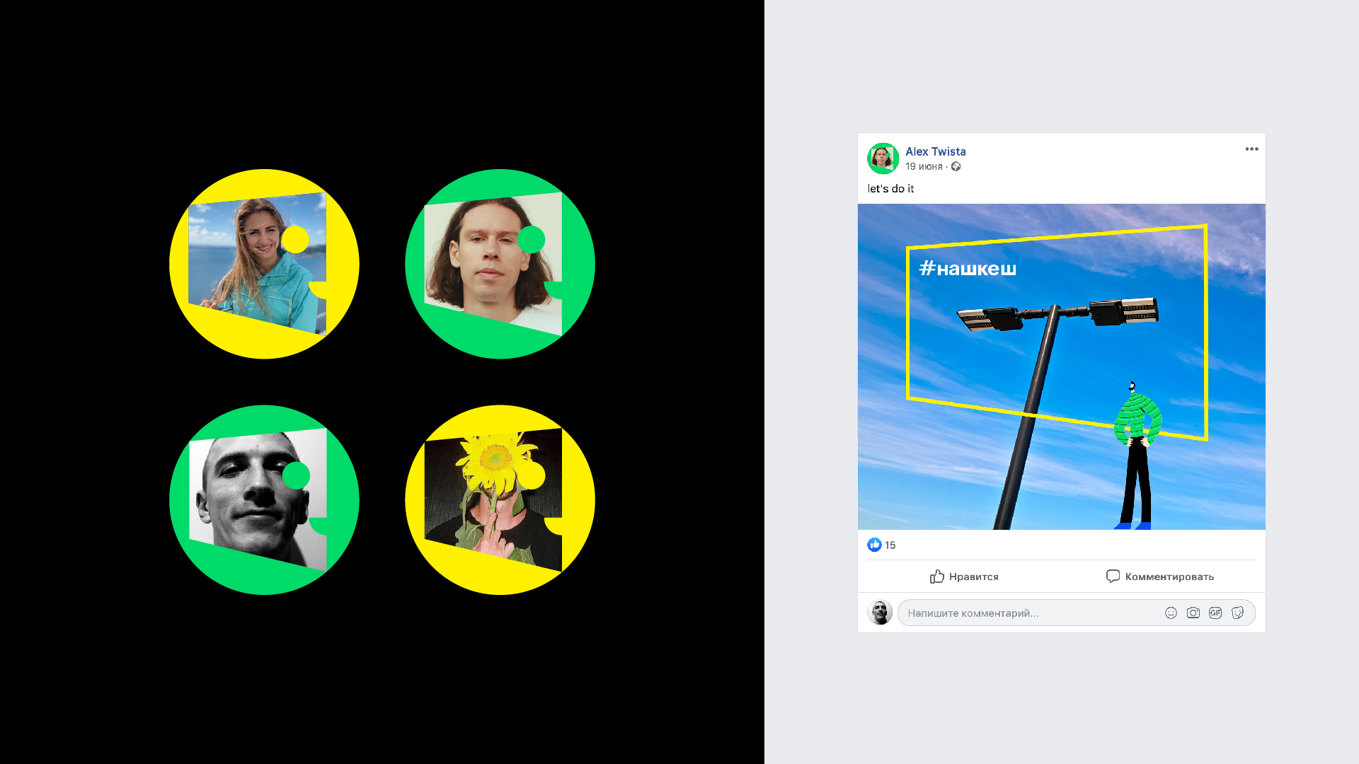
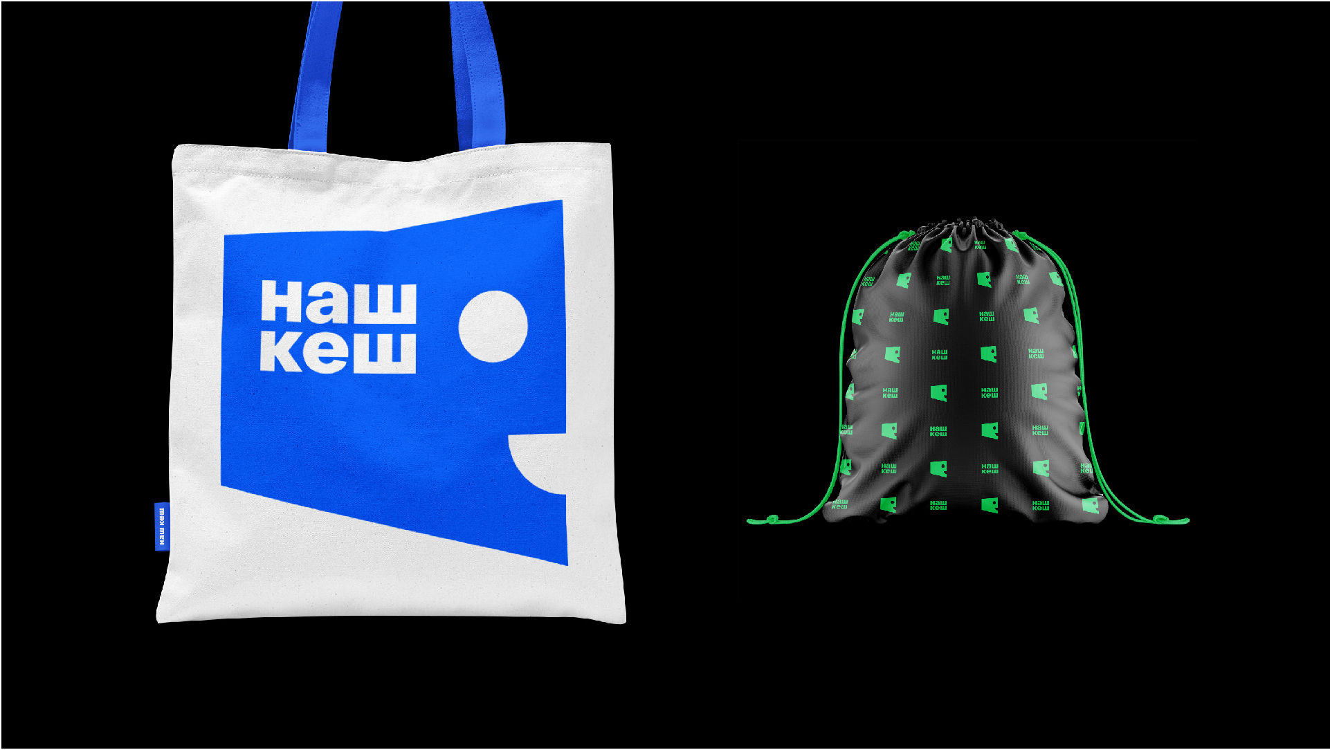
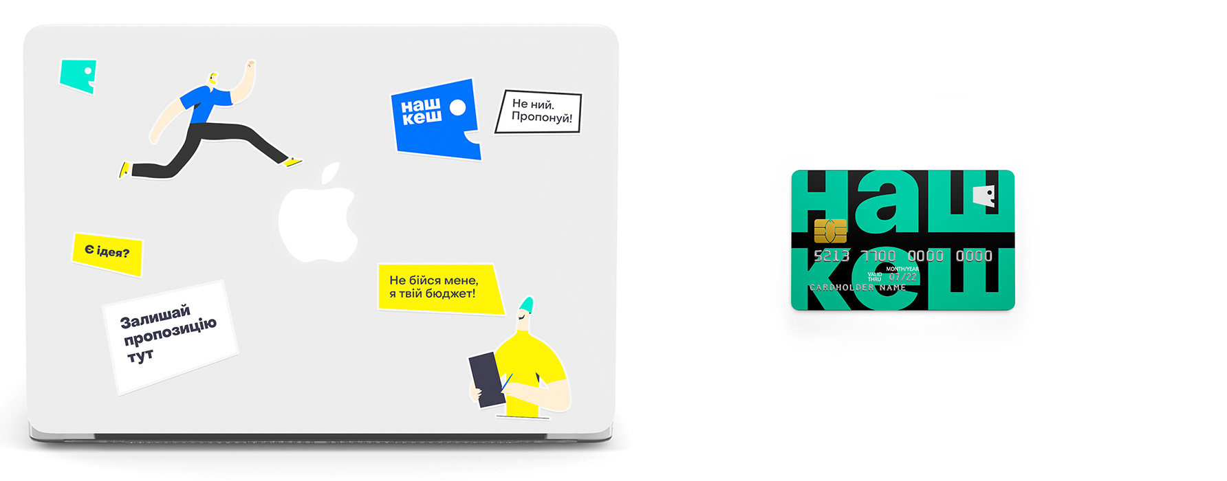
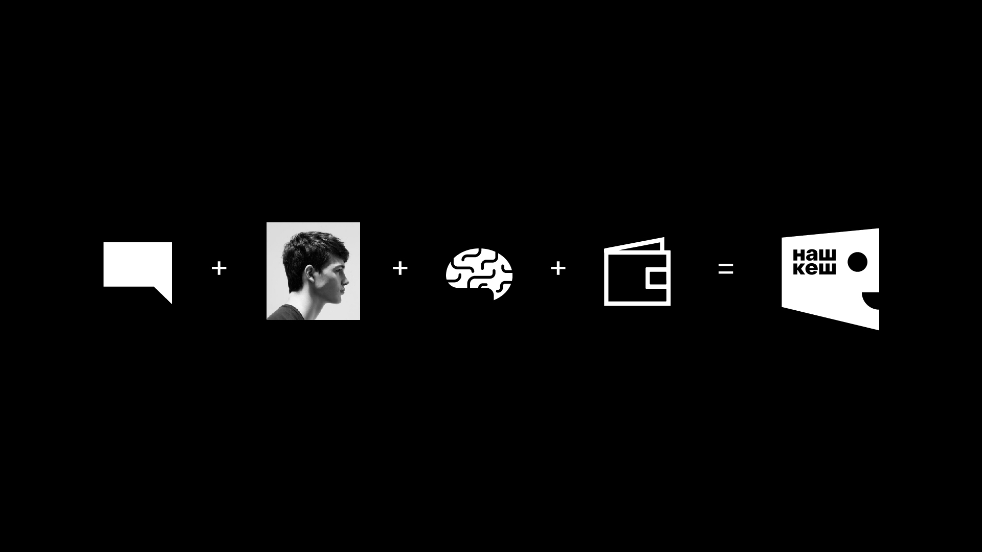
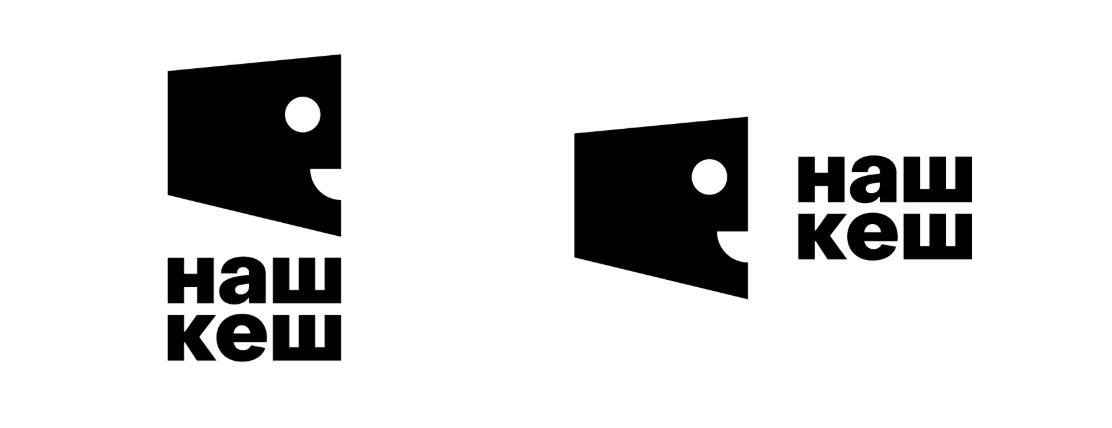
The symbol includes several images. The main ones are the speech box and the talking face. The logo can be used as a standalone image, or include text.
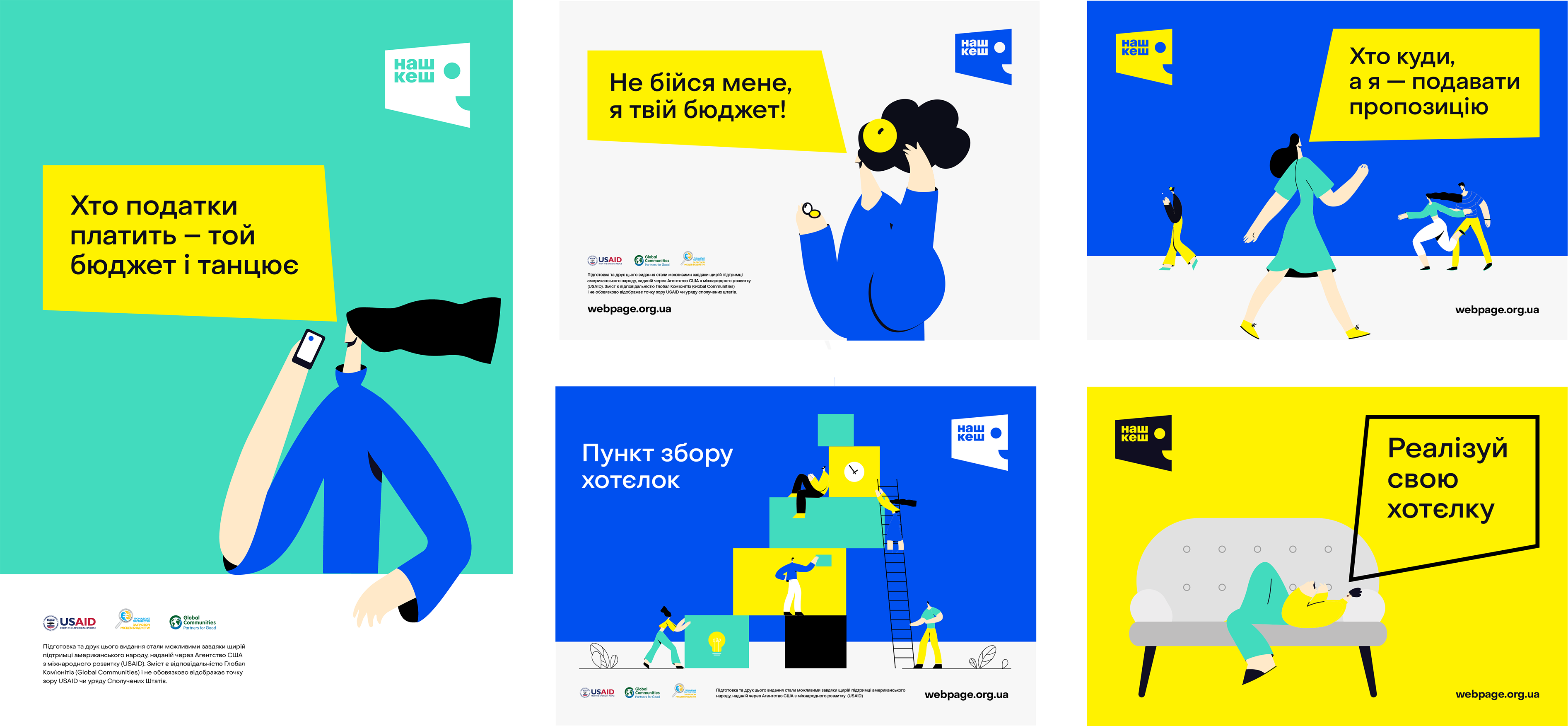
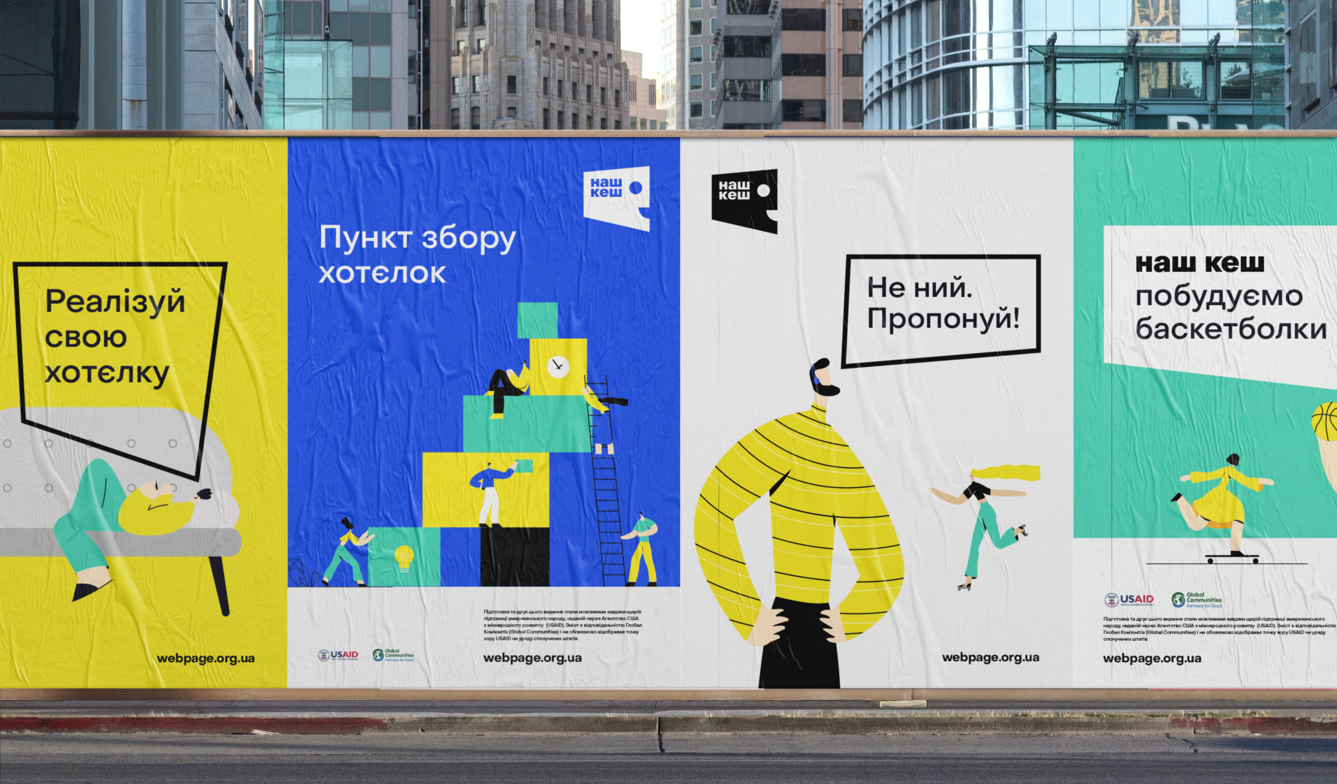
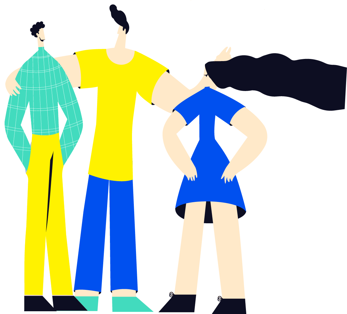
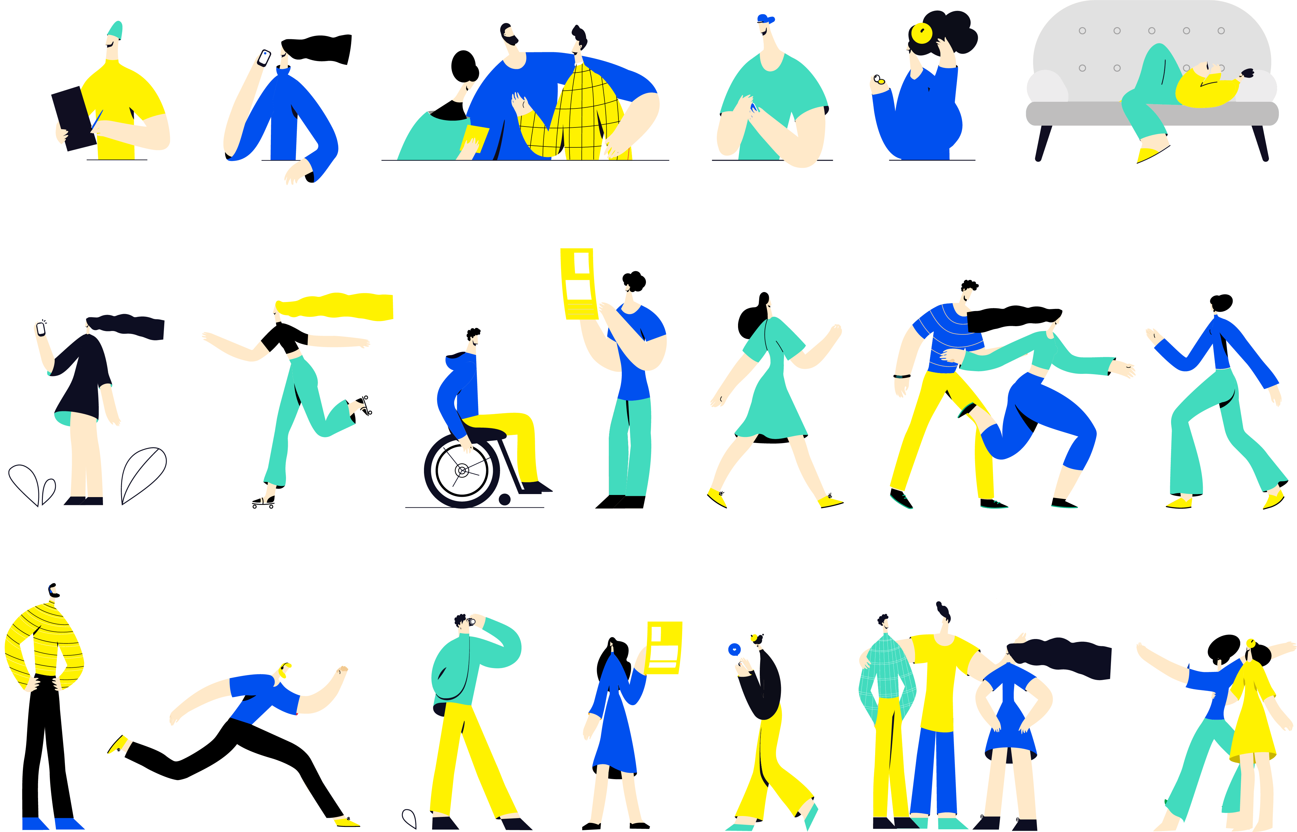
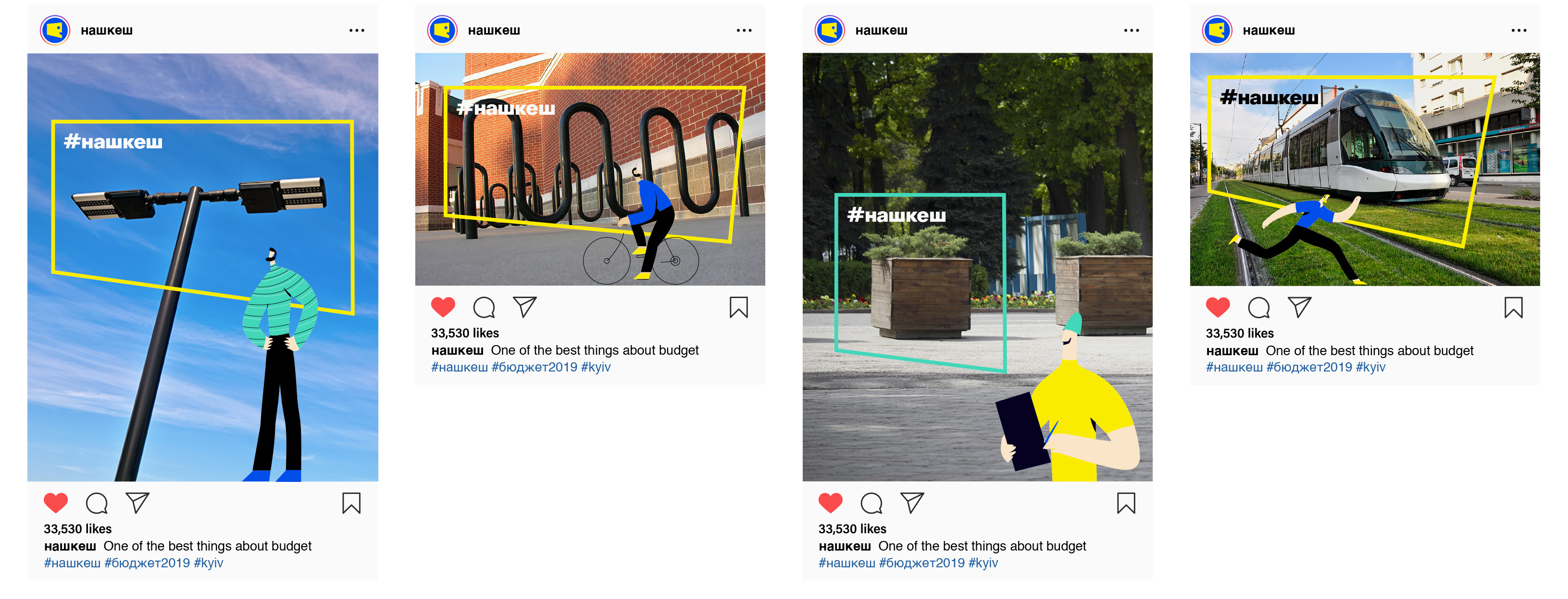
For the system of visual communications, we've developed a series of unique illustrations that help visualize our messages and create a matching easy vibe.
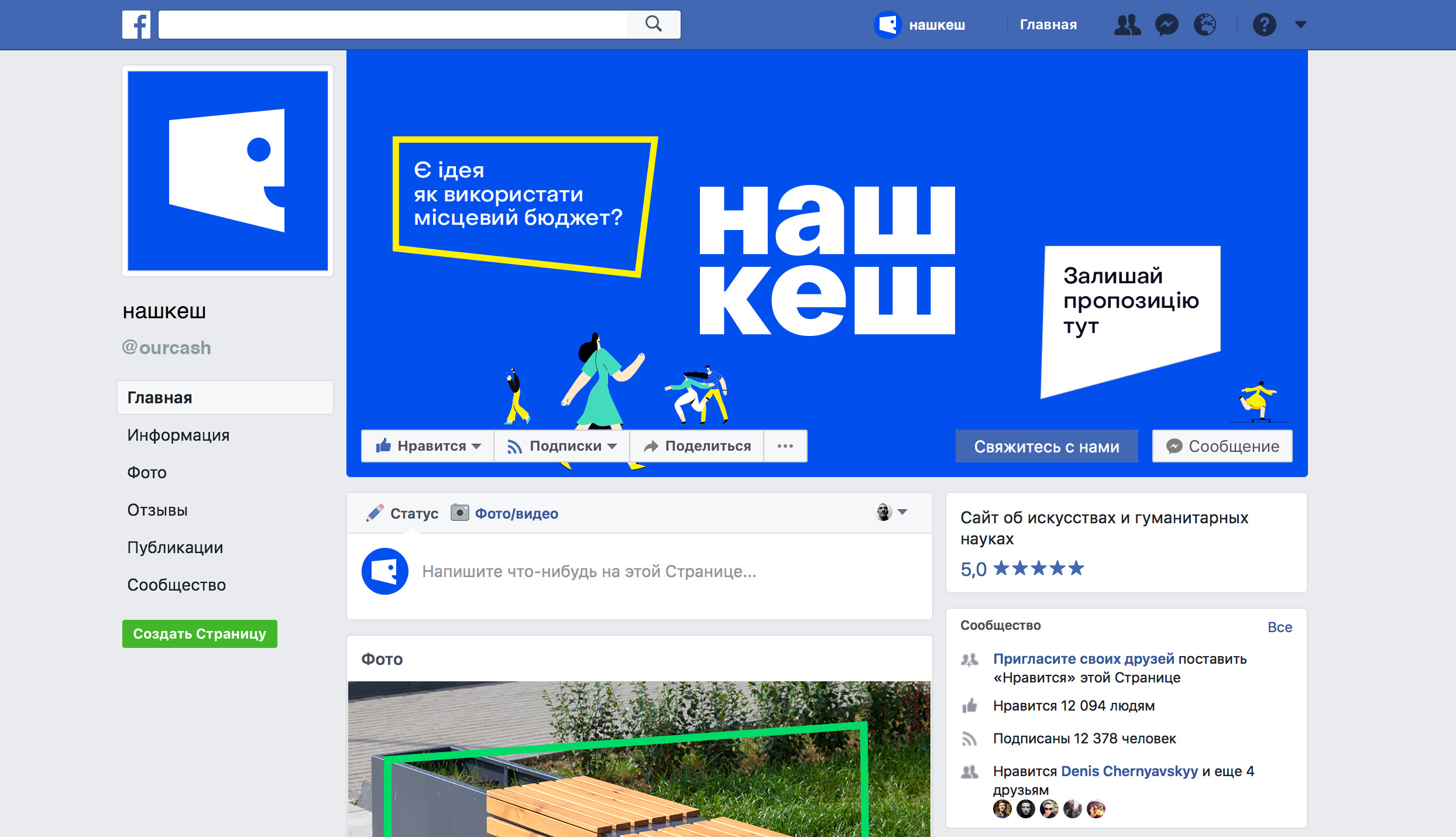
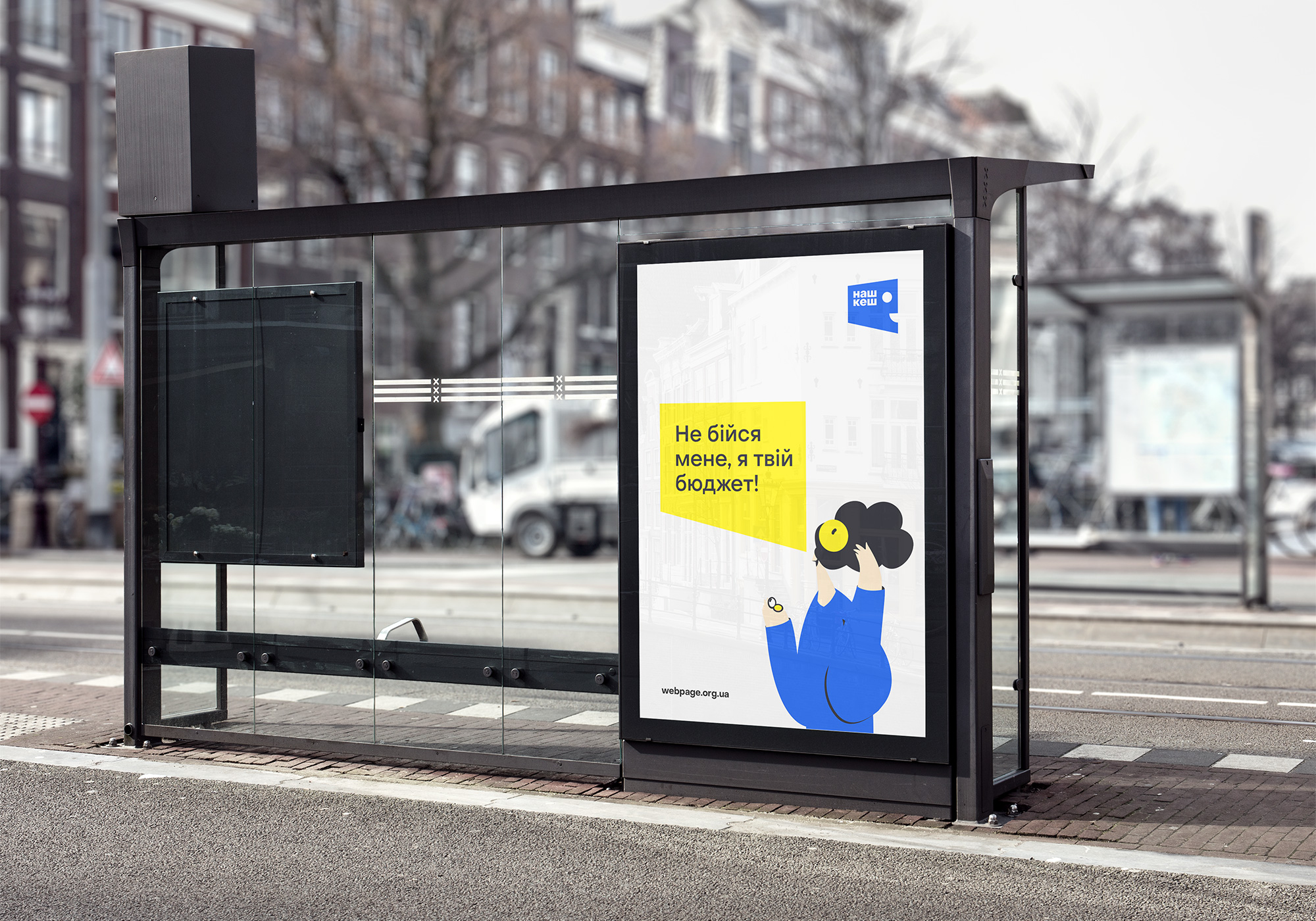
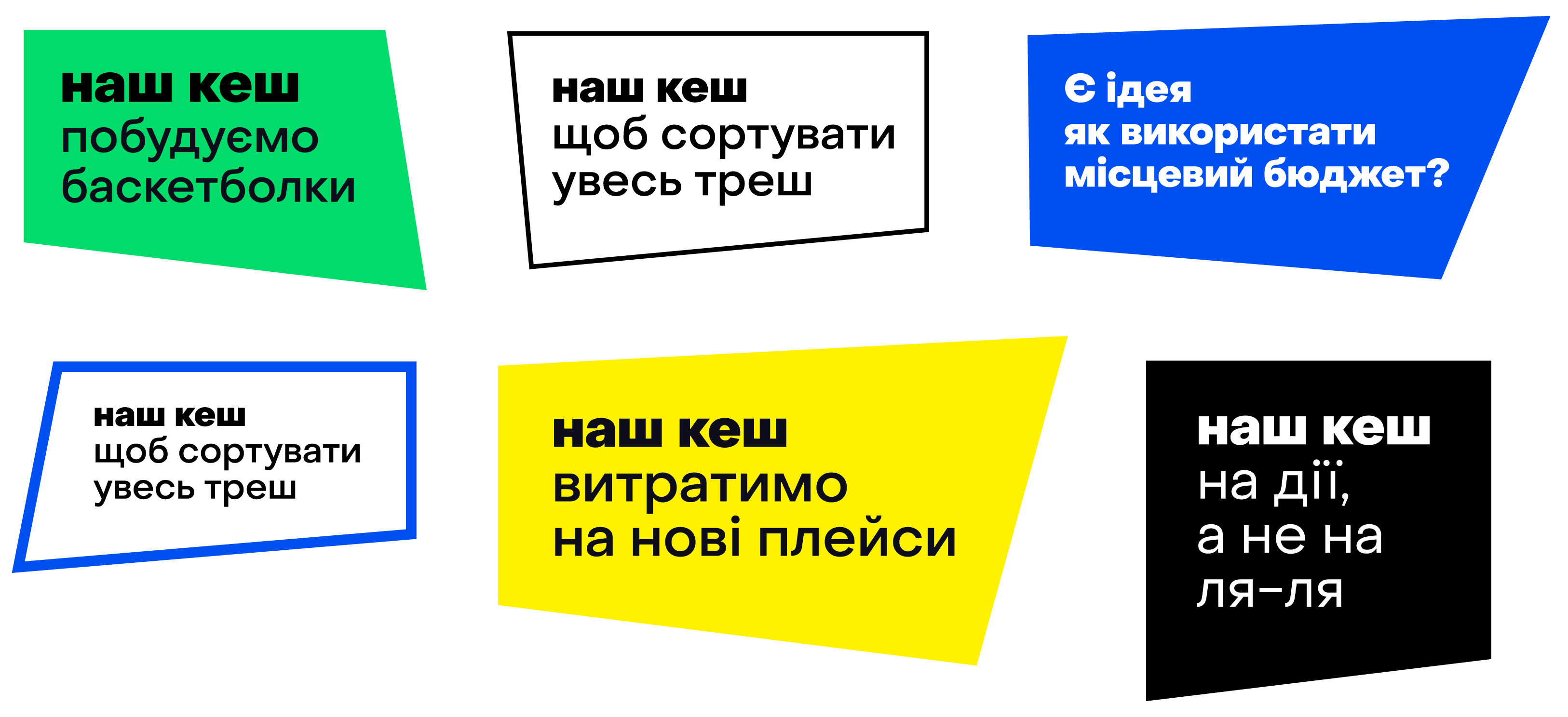
The speech boxes started from the logo. They present proposals that come from our characters.
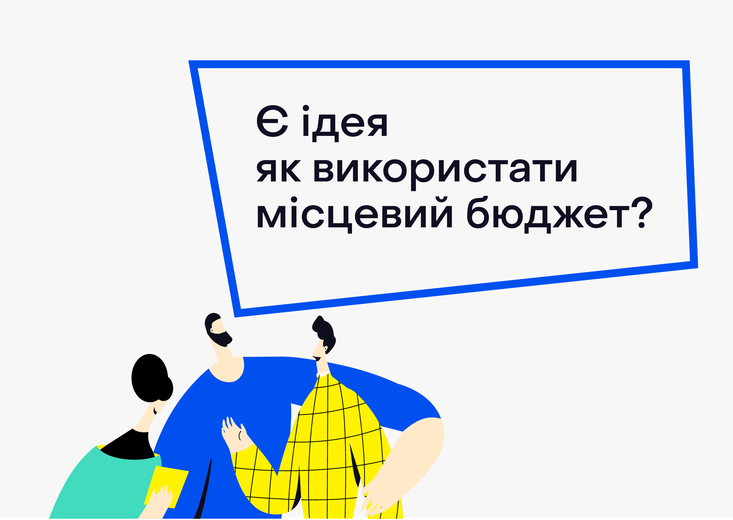
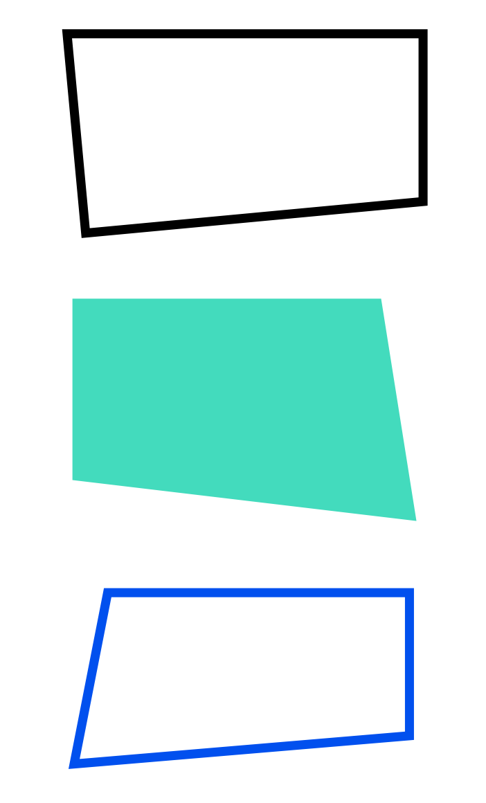
Also, using a speech box is our way of emphasizing certain objects in visual communications.
This set of components, together with our modular mesh design allow for easy handling of brand identity elements and creating new compilations as necessary.
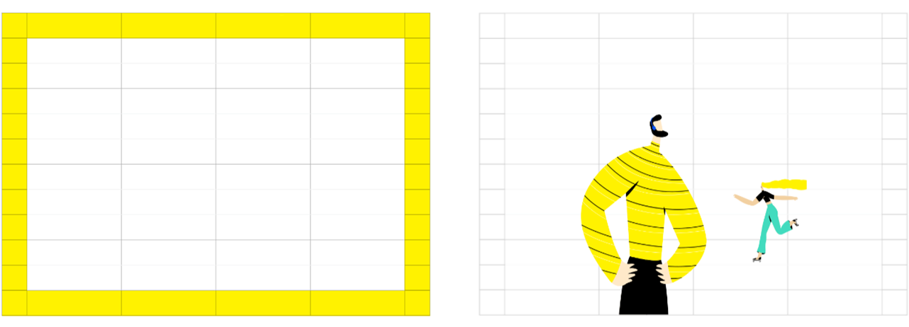
Here's how this works:
