''It was expected that business offices with managers and salespeople would work in Denmark and Western Europe. And the development team would be in Ukraine, '' – Project Manager Anna Partyn.
''The head office was based in Ukraine. New brand, new company. Fresh and growing at a high pace. Quite traditional IT outsourcing with a broad profile. They came in order to create an identity, the website was the main carrier and indicator of this.'' said Alex Twista, Art Director of the project and Creative Director.
''We had focused on 2 audiences with polar characters. The first was serious large potential clients and investors. We had to show them reliability.
The second was developers who did not want to work in boring offices, but wanted a friendly brand'' – Project Manager Anna Partyn.
“We decided to make a quick version of the site for _tacans on Tilda with further customization. However, this first version turned out to be self-sufficient and has been successfully indexed in search for a year ” – UI/UX designer, Anya Poly.
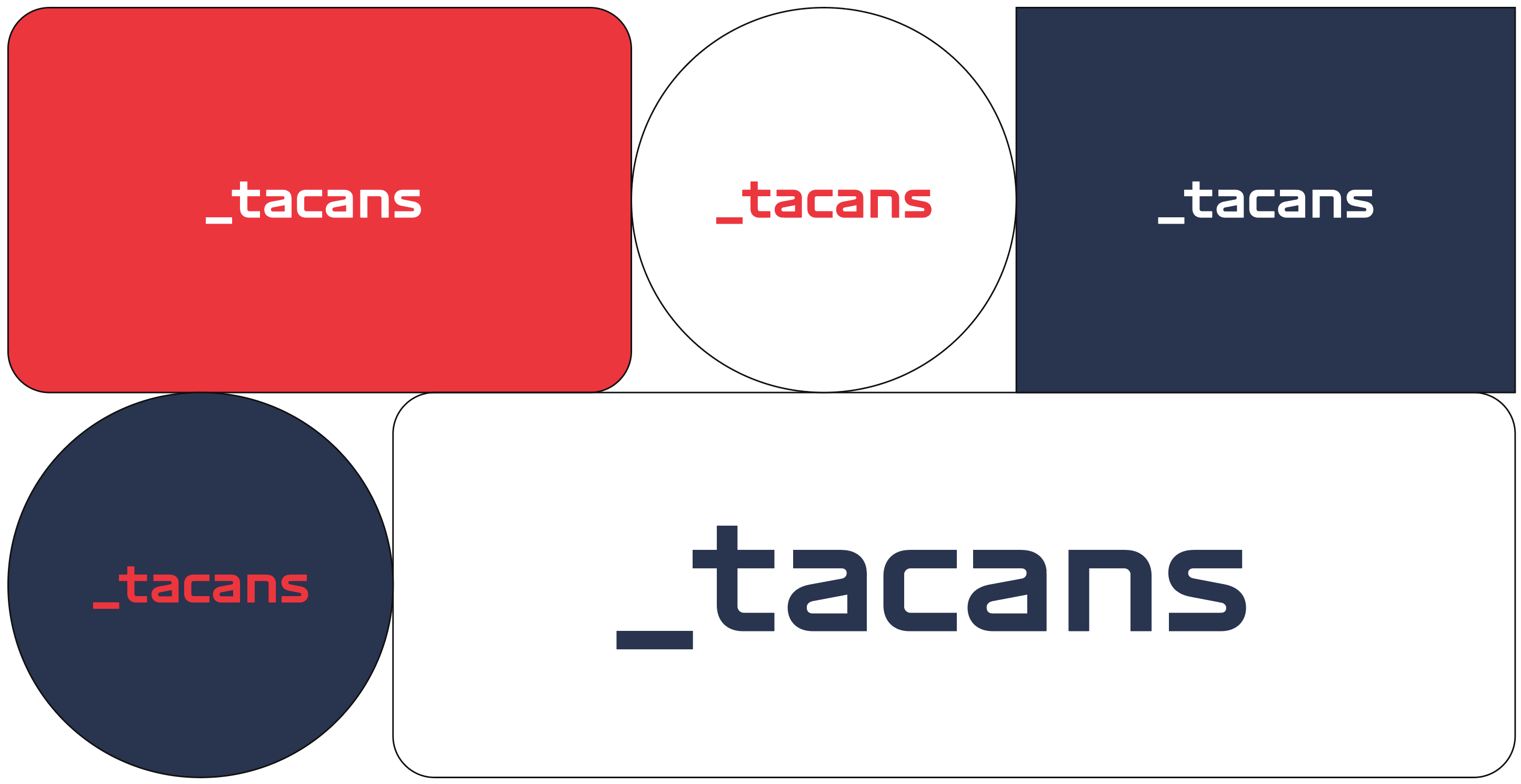
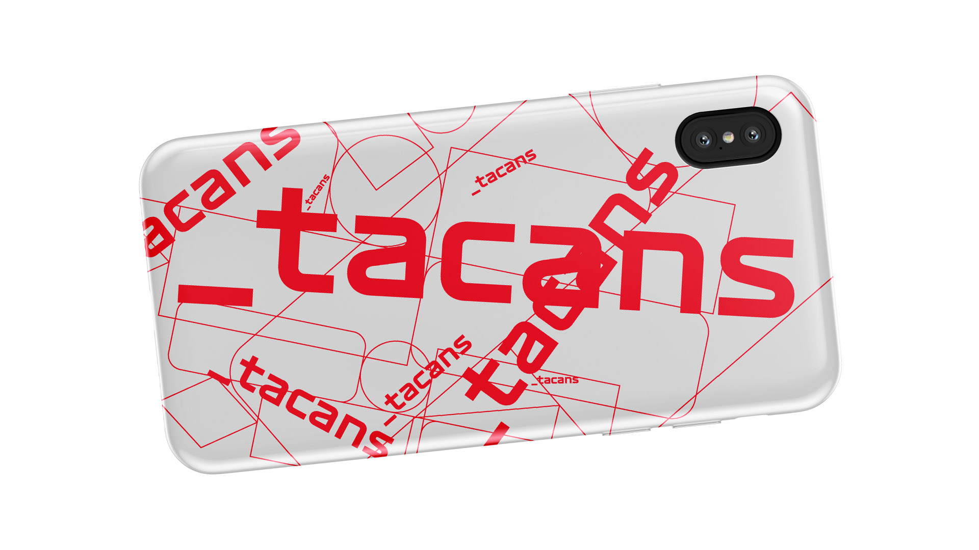
"Anderscore was chosen as a key symbol, it was often found in programming.. Interestingly, we founded any brand nearby in the category that had used this technique.
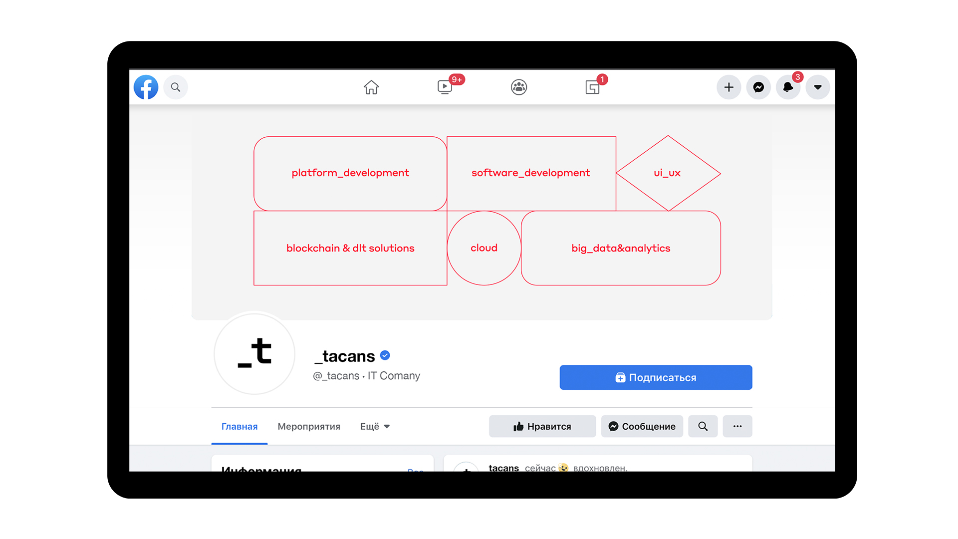
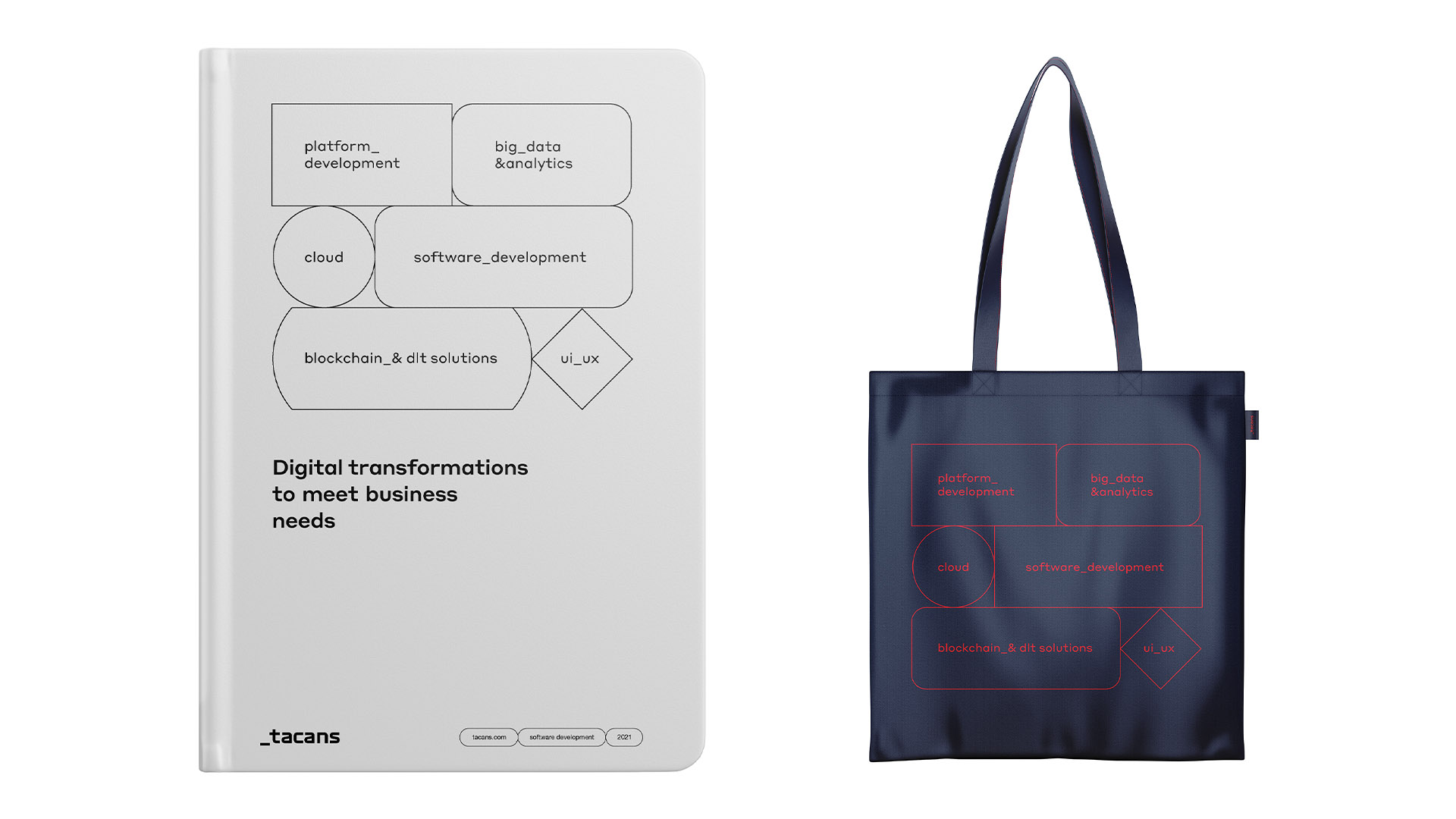
They also chose the Swiss approach to layout. Clarity, accuracy, symmetry, authoritarianism. And we had used flowcharts as containers." – Project Art Director, Creative Director, Alex Twista.

‘’The idea of using a mask in photos and videos worked great. That's how the source of content generation appeared. And a way to separate from the category while maintaining a smart mood. At the same time, the degree of design didn't go beyond Swiss restraint'' – UI/UX designer Anya Polly.
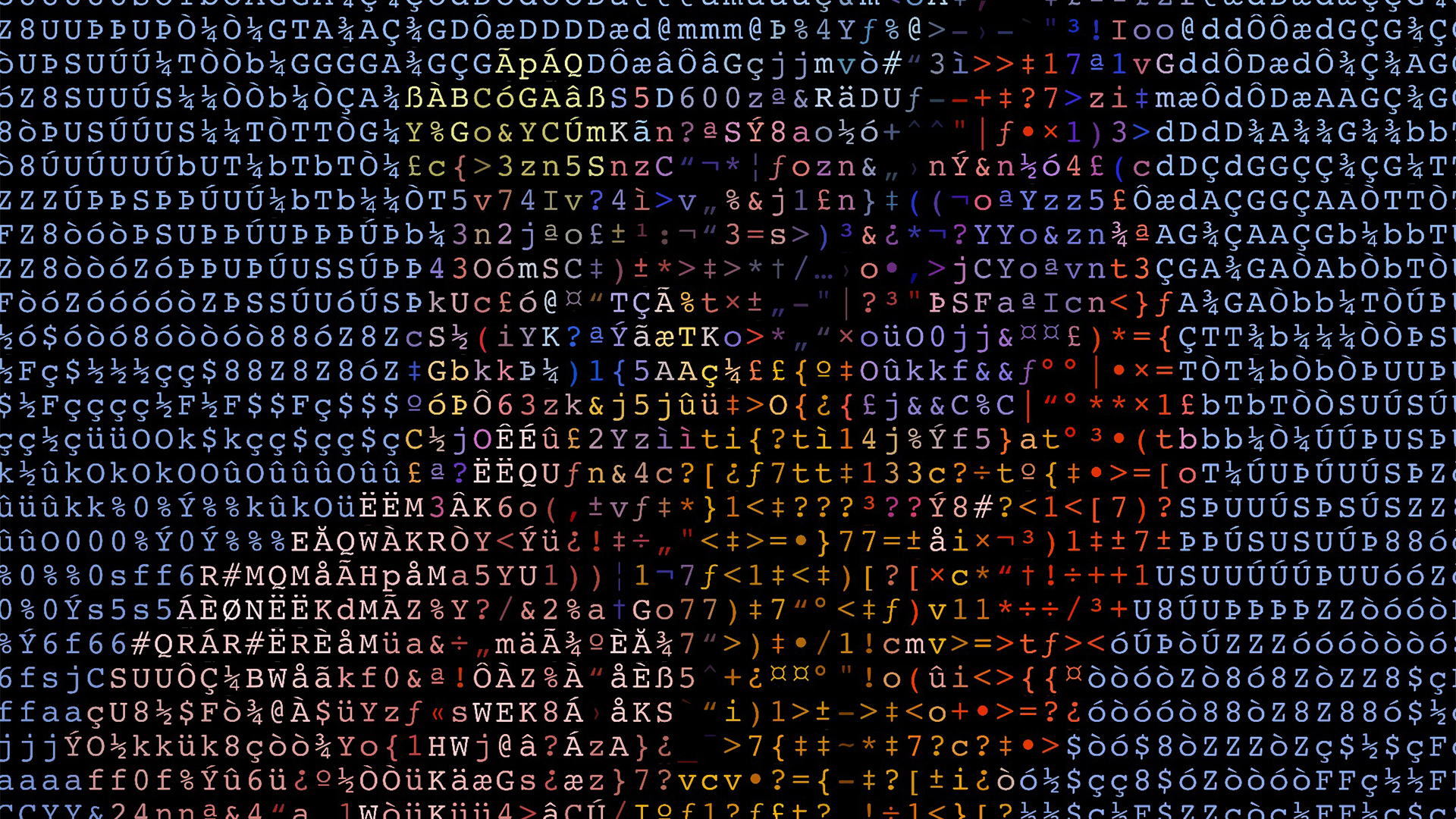
''Characteristically, we used a coding technique with the Glitché application. It was best to throw abstract animated compositions at the entrance and control their rhythm and character of the animation, which was based on ASCII characters. This way you could create your own content and clear the copyright'' – project Art Director, Creative Director Alex Twista.
Project Manager – Anna Partyn
Strategist – Diana Kudasheva
Creative Director, Art director – Alex Twista
UI/UX designer – Anya Polly
Graphic Designer – Sergey Gorelov
