“’I had been doing a doc flow when I found out that the new website was a jubilee project for UNIT. We had already made an identity for them (it won the red dot award), videos, ad campaign, merch and had helped with the concept of the application. Other projects we have to keep in secret for now'' – Project manager, Darina Panisheva.
''At first sight, the previous site was OK. But when I wanted to learn something specific about UNIT, it was difficult to find. The site had changed many times and became confusing. In addition, we updated the identity, so then we had to pull up the site for it'' – Creative director, Alex Twista.
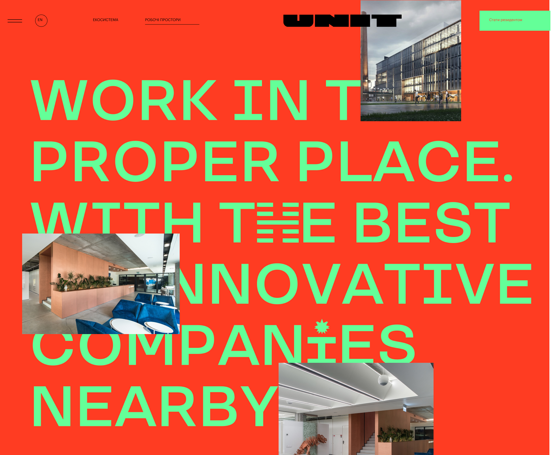
''Our task was to reflect the updated positioning and focus on the key value of UNIT – ecosystems. We had laid out everything on a clear logic, emphasized accents and made it conducive to interaction. Also we paid special attention to that behind every reflected value there had been a real fact"- Creative director, Alex Twista.
“UNIT, it is about innovation, technology, thirst for knowledge, smartness and futures. There are lots of dynamics in visual language. We had created it mainly from the content, instead of complex mechanics, so the site loaded quickly. Plus many decisions came from the identity that had been developed earlier.
UNIT is most proud of its ecosystem. So we gave her a whole page and an honorary block on the main page. Here you can find training, laboratory, service, etc. in almost any field. Or you can find talent in your startup or study at the University of Berkeley" – UI/UX designer Anya Polly.
"In addition, we had a request for flexibility of the site. That's why we made a constructor on WordPress so that the UNIT could create different pages from a wide range of variable blocks" – Creative director Alex Twista.
“Apart from the usual technical task, I set myself 2 big goals in this project: the fastest site and the most convenient admin panel. I think we completed the challenge successfully.
The constructor in the constructor worked out! Each page of the site is a set of custom blocks. In total there are about 20 variants of such blocks and each still has its own set of parameters. This allows content managers to work flexibly with content and create pages with unique designs right from the admin! This was a clear decision, but also quite difficult to implement.
You don't need to write code now, everything works on an intuitive level. For example, a custom context menu under the right mouse click. In two clicks, the content manager can insert a link to any page or form on the site. Or past glyphs created specifically for this site anywhere on the page. In short, we had managed a really innovative admin panel"– Backend developer Petro Shlemko.
"The font, characteristic layout and wide color palette were fully revealed on the site. The story of asymmetry and easy work with rectangles made everything simple and effective at the same time. Plus we had added animated 3D in the spirit of innovation, futurism. And some new branded 3D animations of the letter U" – Creative director Alex Twista.
“We selected abstract animated compositions, each of which conveyed the essence of the section. For example, in the scene with the space station, we turned to the effect of printing details worked out in another project. And for another frame, we used a member of our team and added compositions, repeating the angle and lighting" – 3D designer Alex Ross.
“Many images were abstract, so we worked to make them understandable and not distracting. We tried to make each piece of content so that it could be posted on Instagram" – Motion designer, Yura Khomovsky.
"The thing that I’m most proud of is the General Plan in the footer. UNIT became a large area with a huge number of different entities: housing, university, coworking, cafes, sports, accelerators…The city in the city, in short. Therefore, it was necessary to depict the navigation scheme for all locations. On the Google map you can see how to get to the park, and to find out where the building was, taped on the General Plan tab. By clicking on any house, you will learn all the information about it" – UI/UX designer Anya Polly.
“I’m especially pleased with how we made the General Plan. It had always been a mystery to me what would be built at UNIT in the end. Not only for me. So we had made the General Plan together with the Chief architect " – Creative director Alex Twista.
“The difficulty was the point that most of the houses on the map didn't exist in life at all, and their visualizations had differed. And here we must constantly maintain a philosophical balance between existing and non-existent. There was even an expedition to UNIT to explore the area. I was helped by Darina, Naruto and "The Flowering Trees Map of Podil". Darina described to me all the details of UNIT. Naruto was an example of endurance. And "The Map of Flowering Trees of Podil" was my first experience in creating maps. This was a personal project that nurtured attention to detail and a thirst for research, which were very useful in reproducing reality" – Graphic designer Lina-Maria Shlapak.
Creative director – Alex Twista
Project manager – Darina Panisheva
UX/UI designer – Anna Polly
Graphic designer – Lina-Maria Shlapak
3D designer – Alex Ross
Motion designer – Yura Khomovsky
Frontend-developer – Yura Peregudov
Backend developer – Petro Shlemko
SEO and optimization – Denis Kylymchuk