We were faced with a task of reinventing the GODDESS beauty store brand. The previously used identity was rather faceless and was a poor representation of the brand's core. We started out by taking time to research GODDESS customers – learning about them, and then constructing brand image and communications in a way that would bring them closer together.
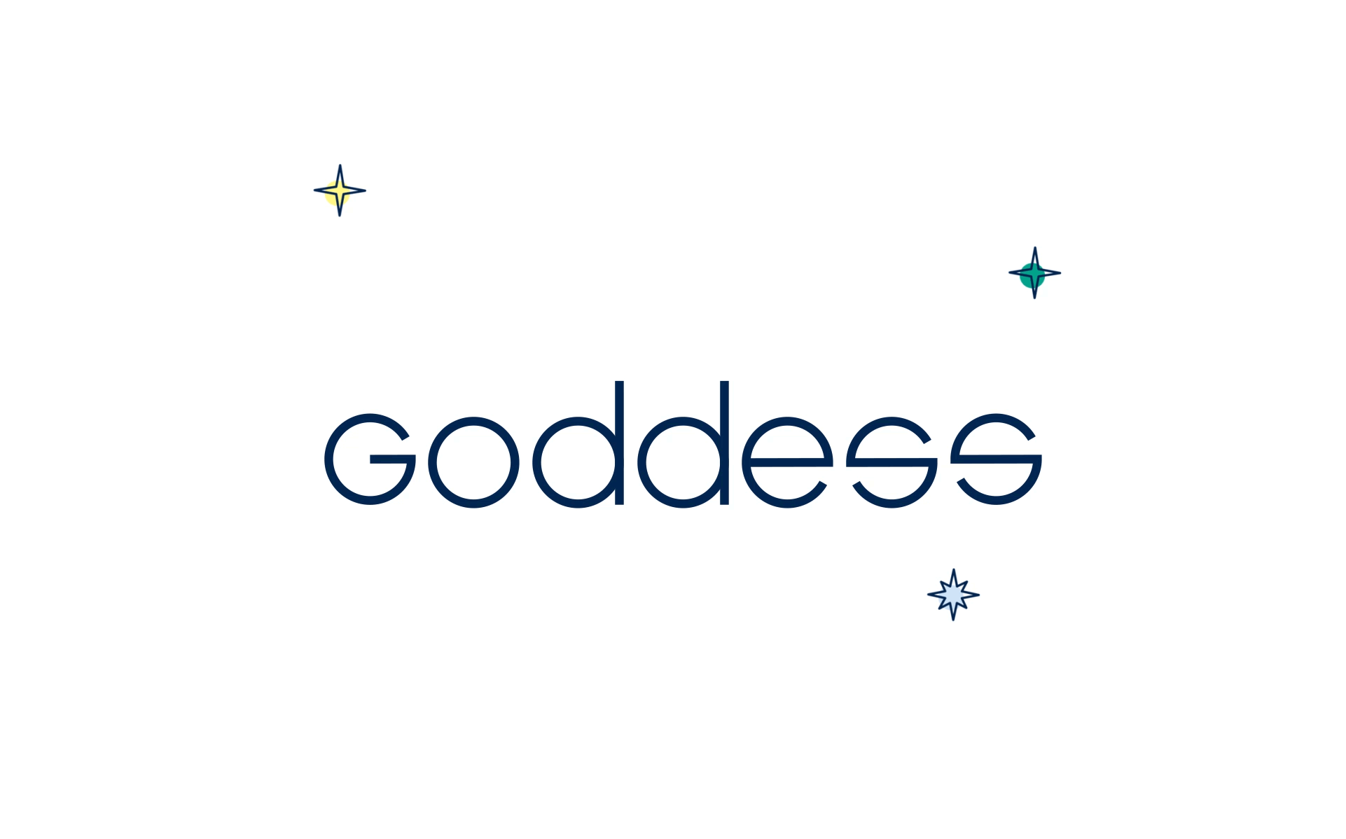
The logo is constructed using a typographic solution. Each letter is using circle-based form.
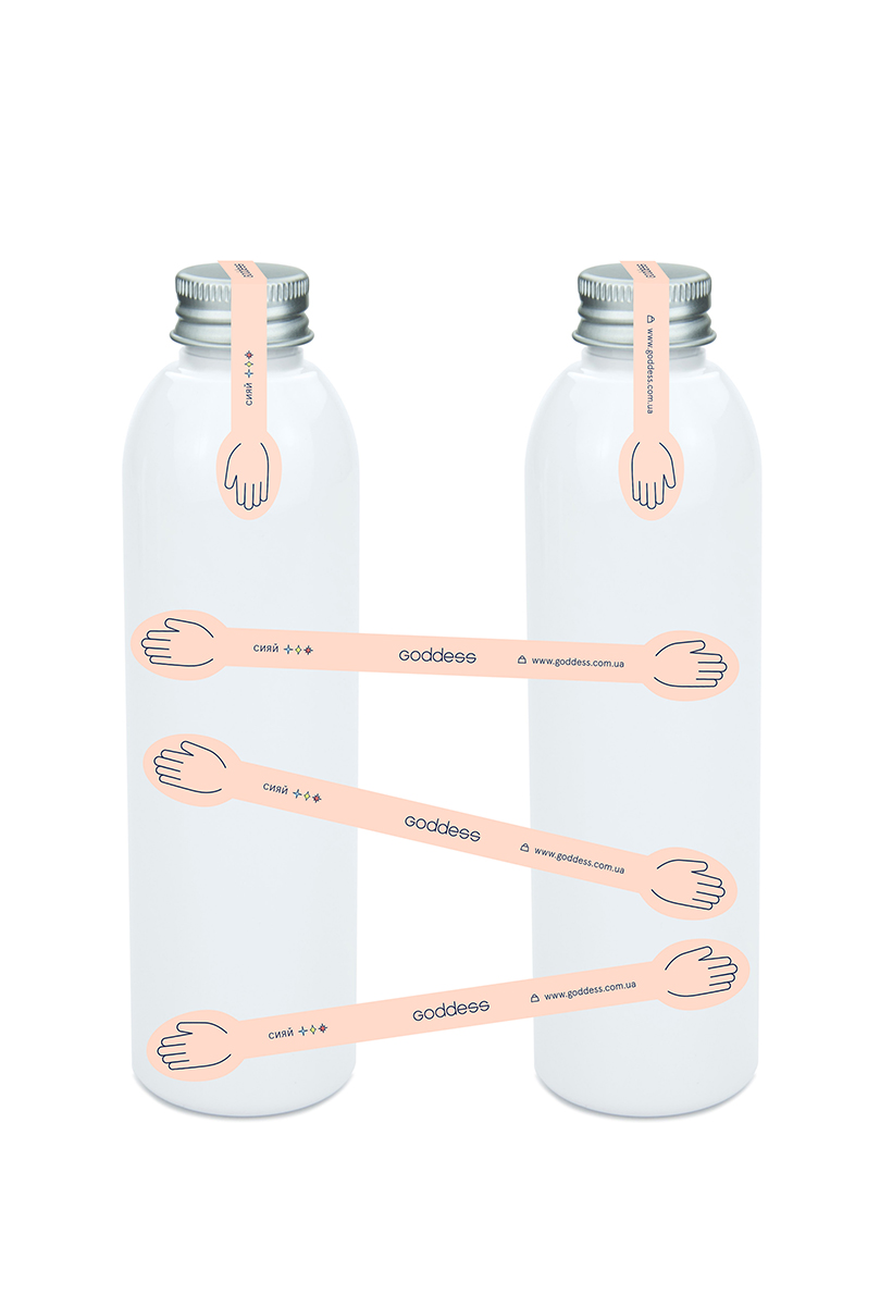
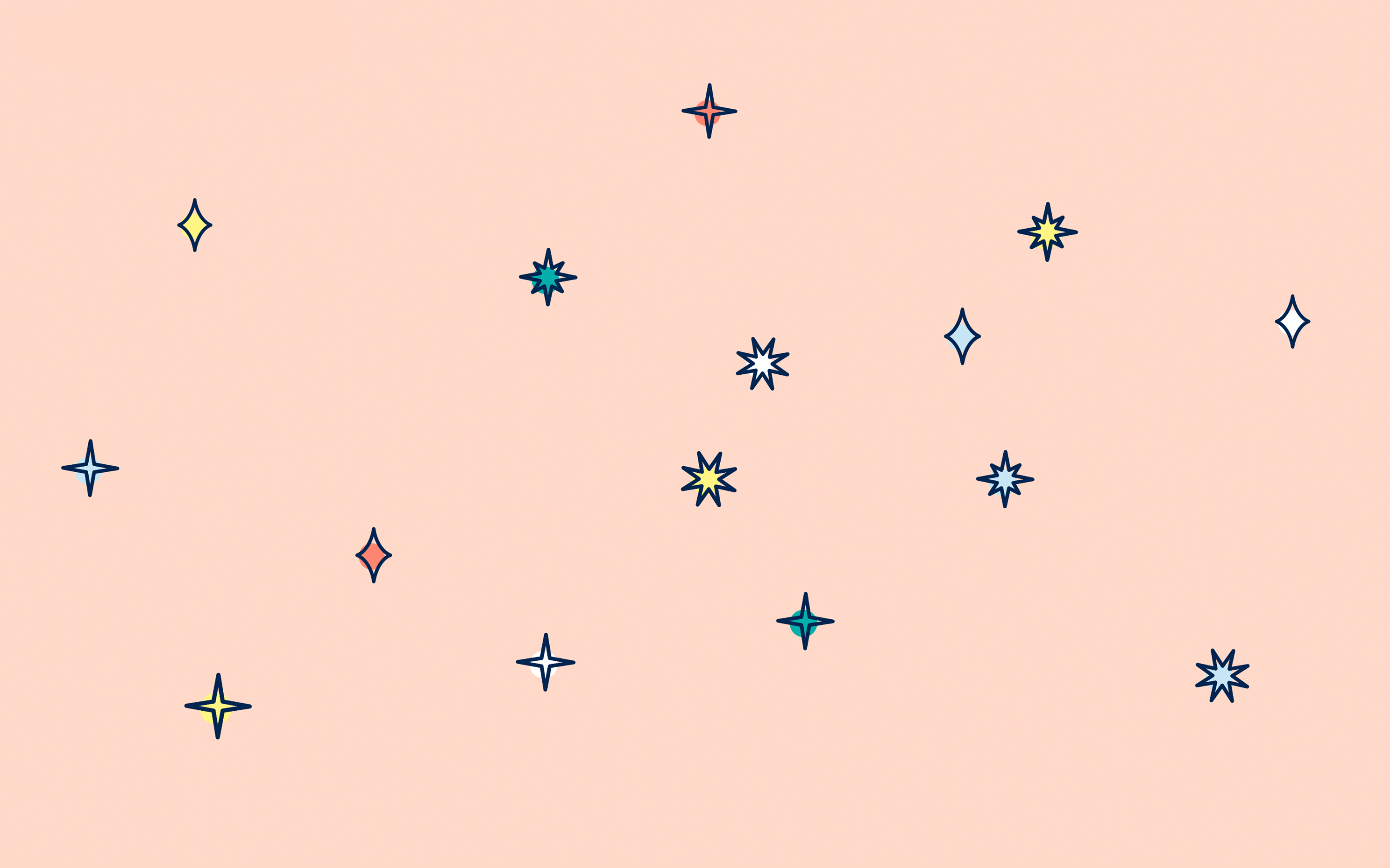
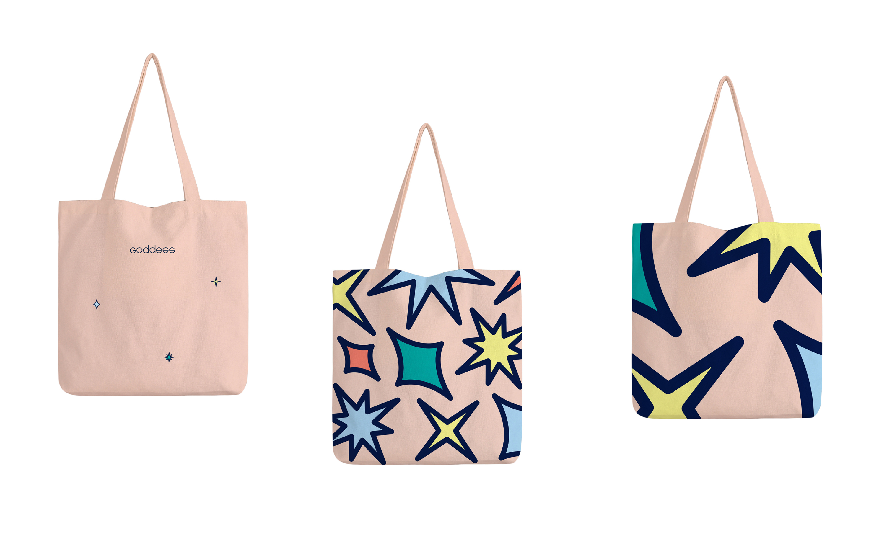
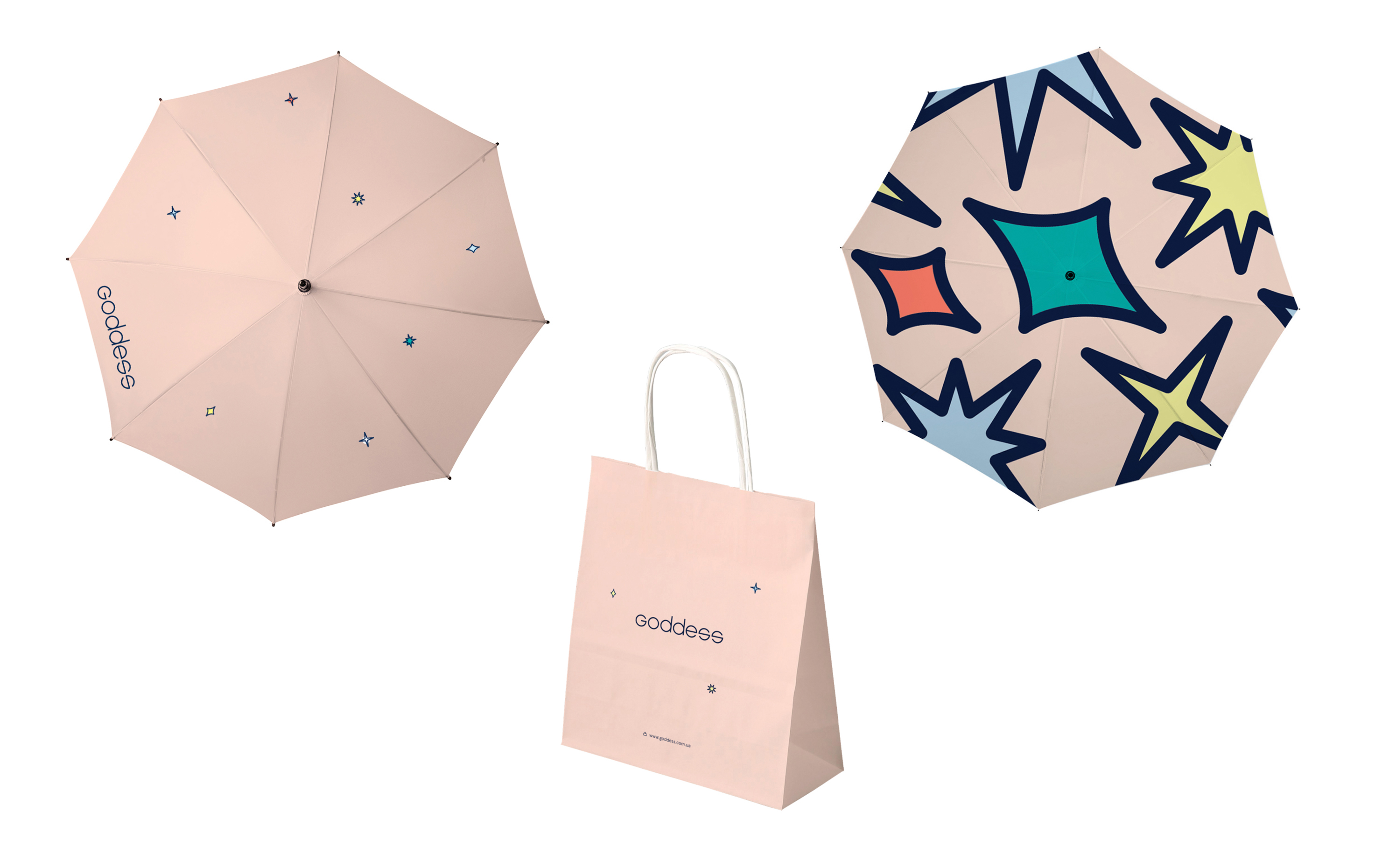
We decided that the brand identity should be built around naturality, and what can be more natural in the beauty sphere than the nude color? It serves as a foundation for adding extra colors, which is exactly what GODDESS does.

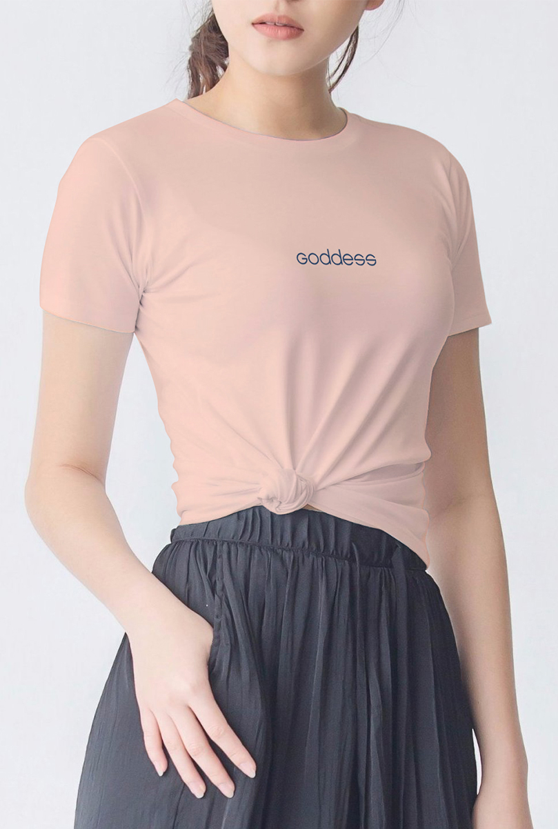
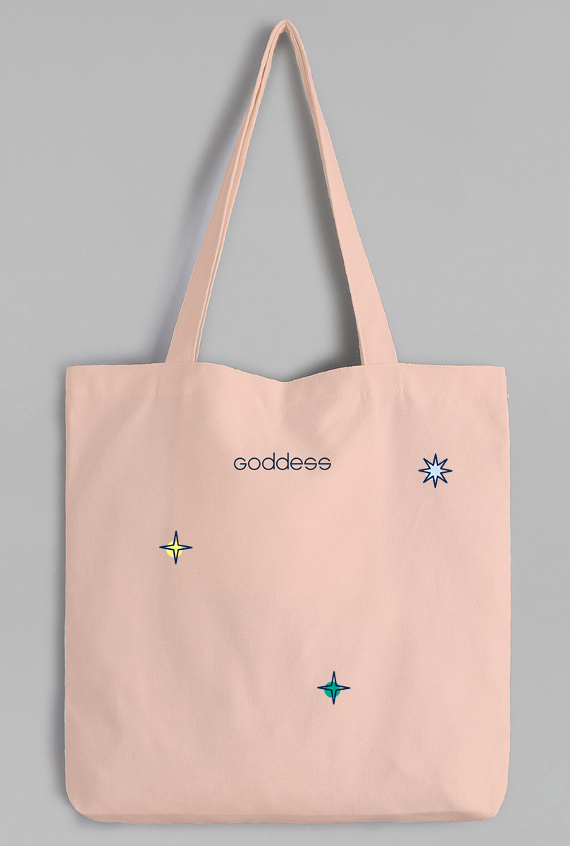
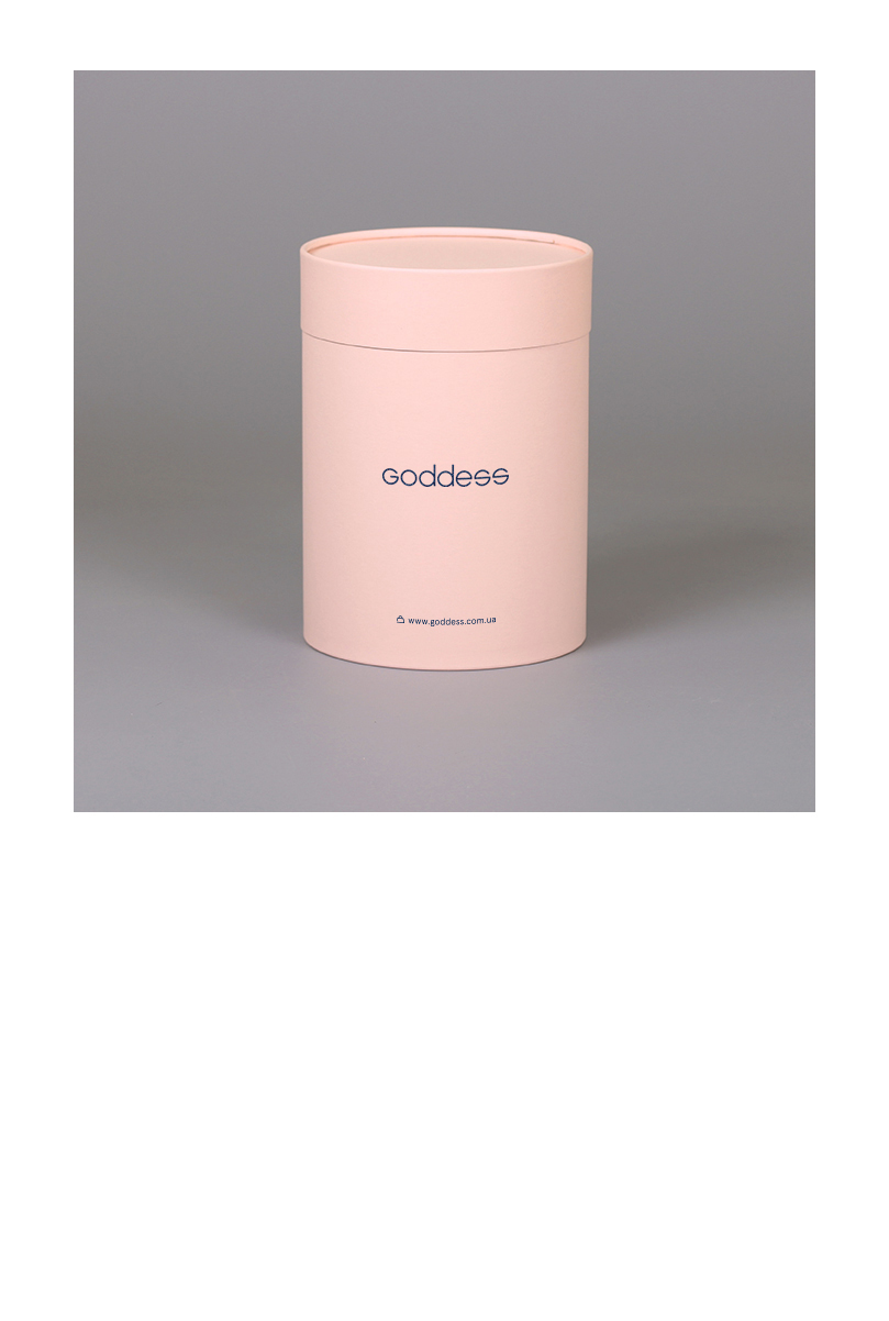
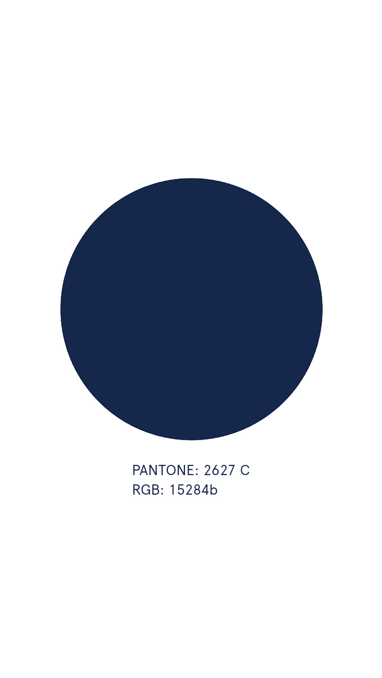
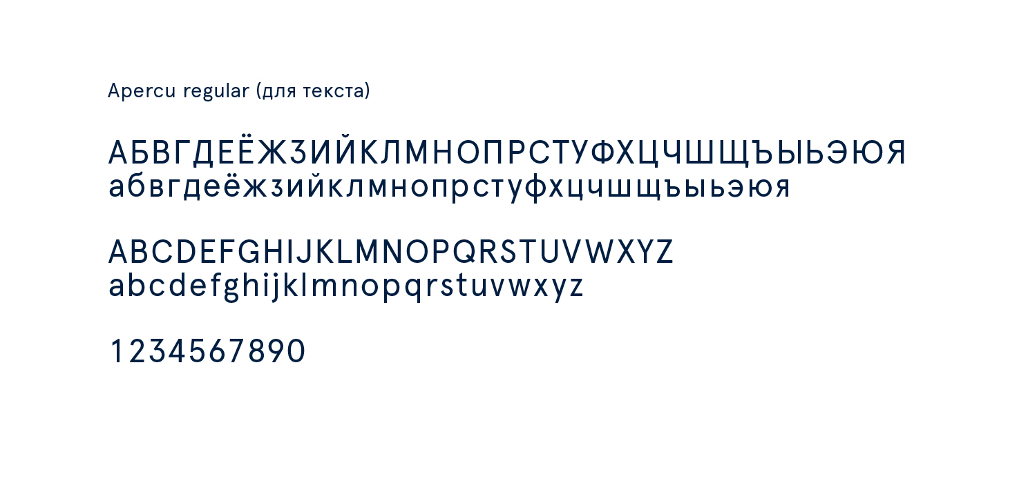
In most cases, our text uses dark blue color, which provides good contrast to the nude color and ensures a more organic combination with the nude, than the black.
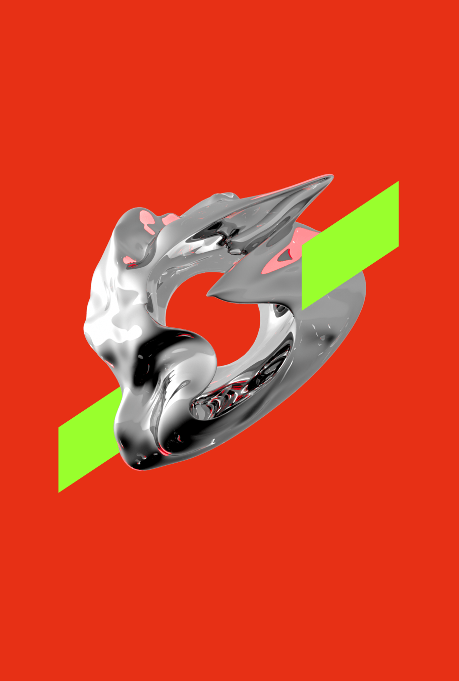
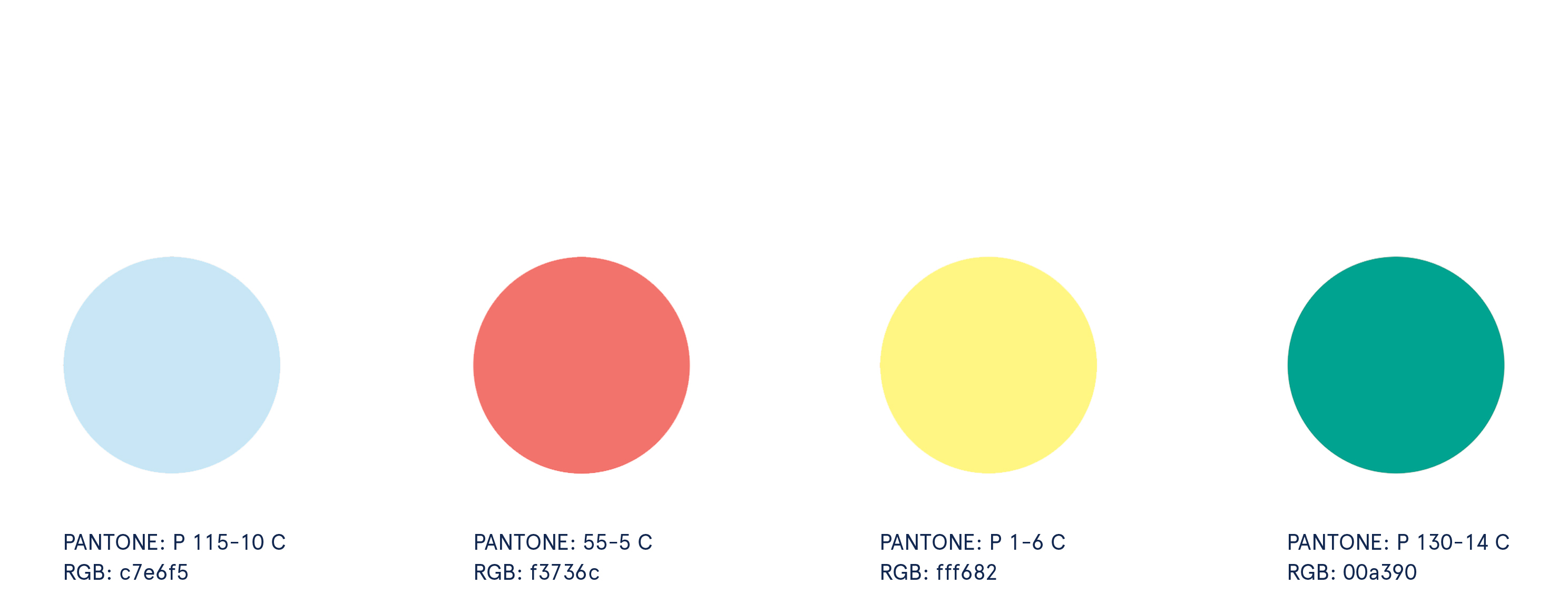
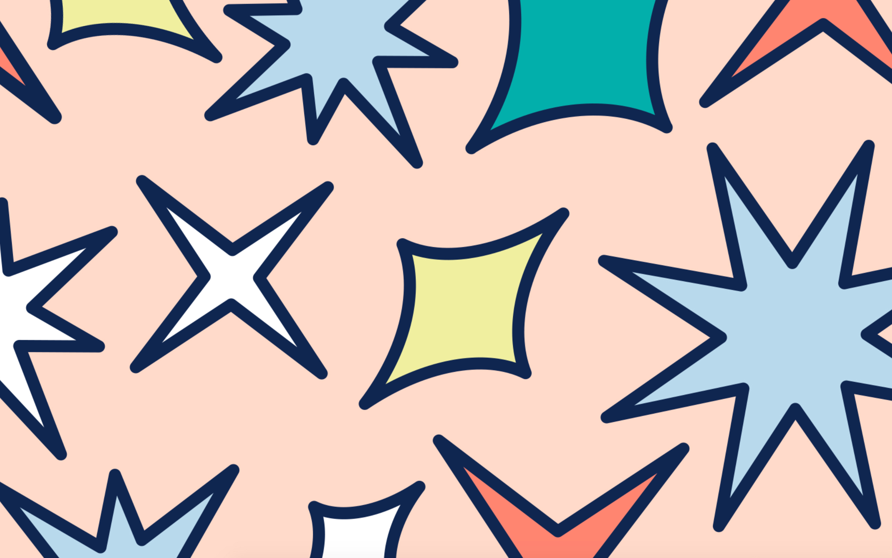
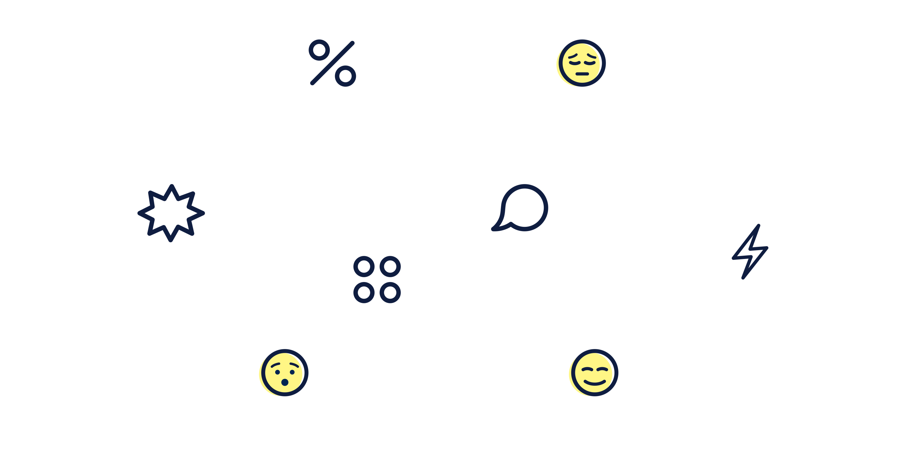
Besides, we have introduced a number of bright colors to be able to create color accents. The selected palette matches the color of stars, but we'll talk about this later.
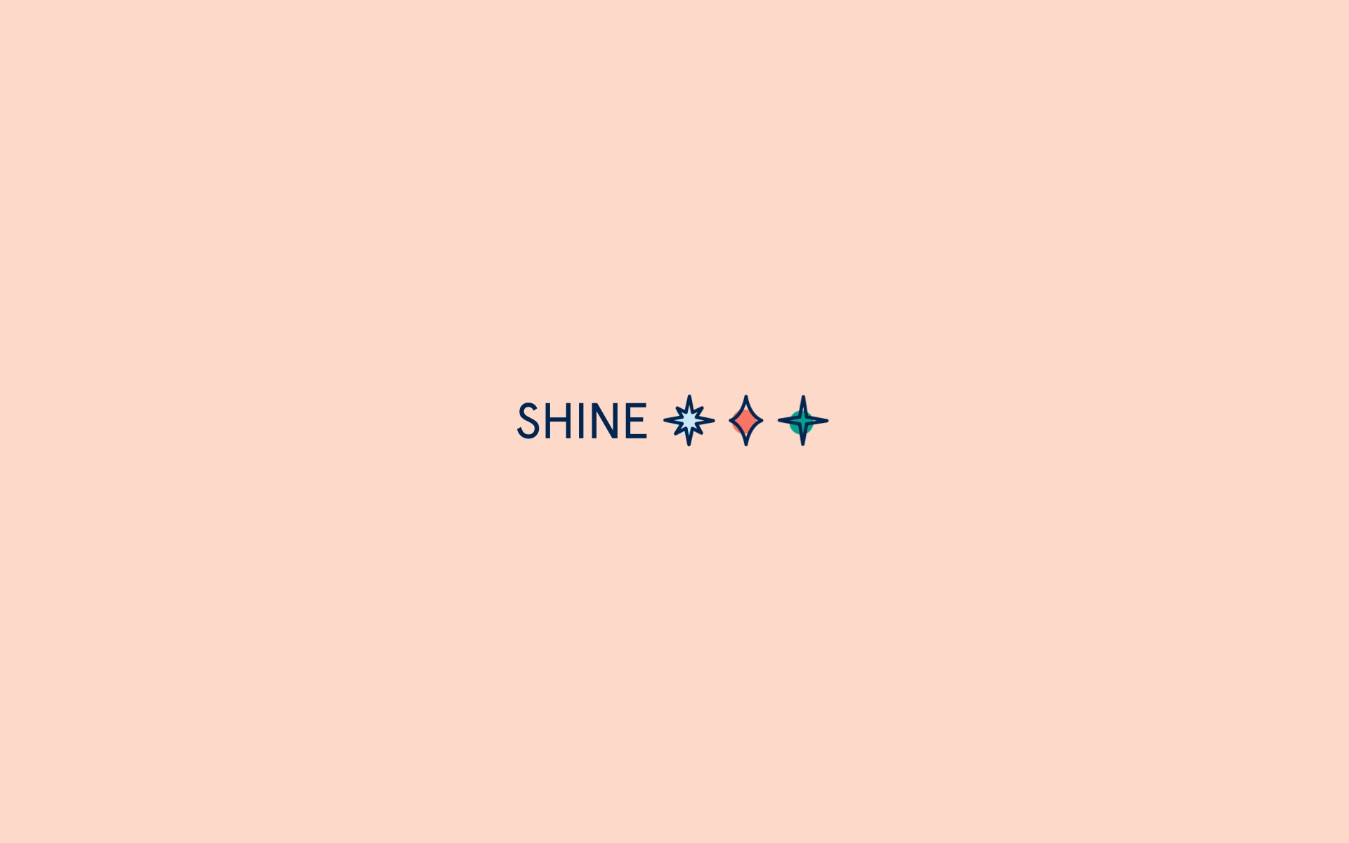
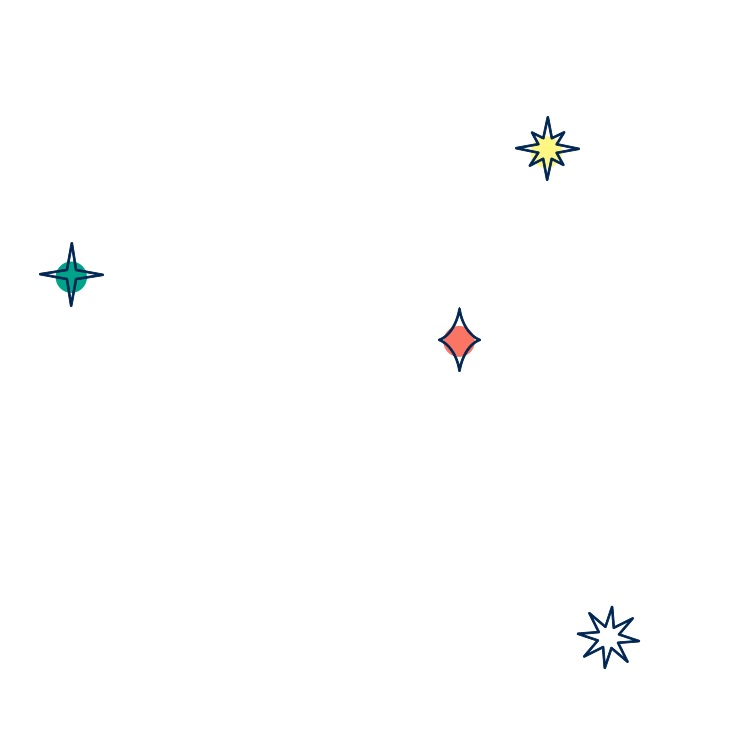
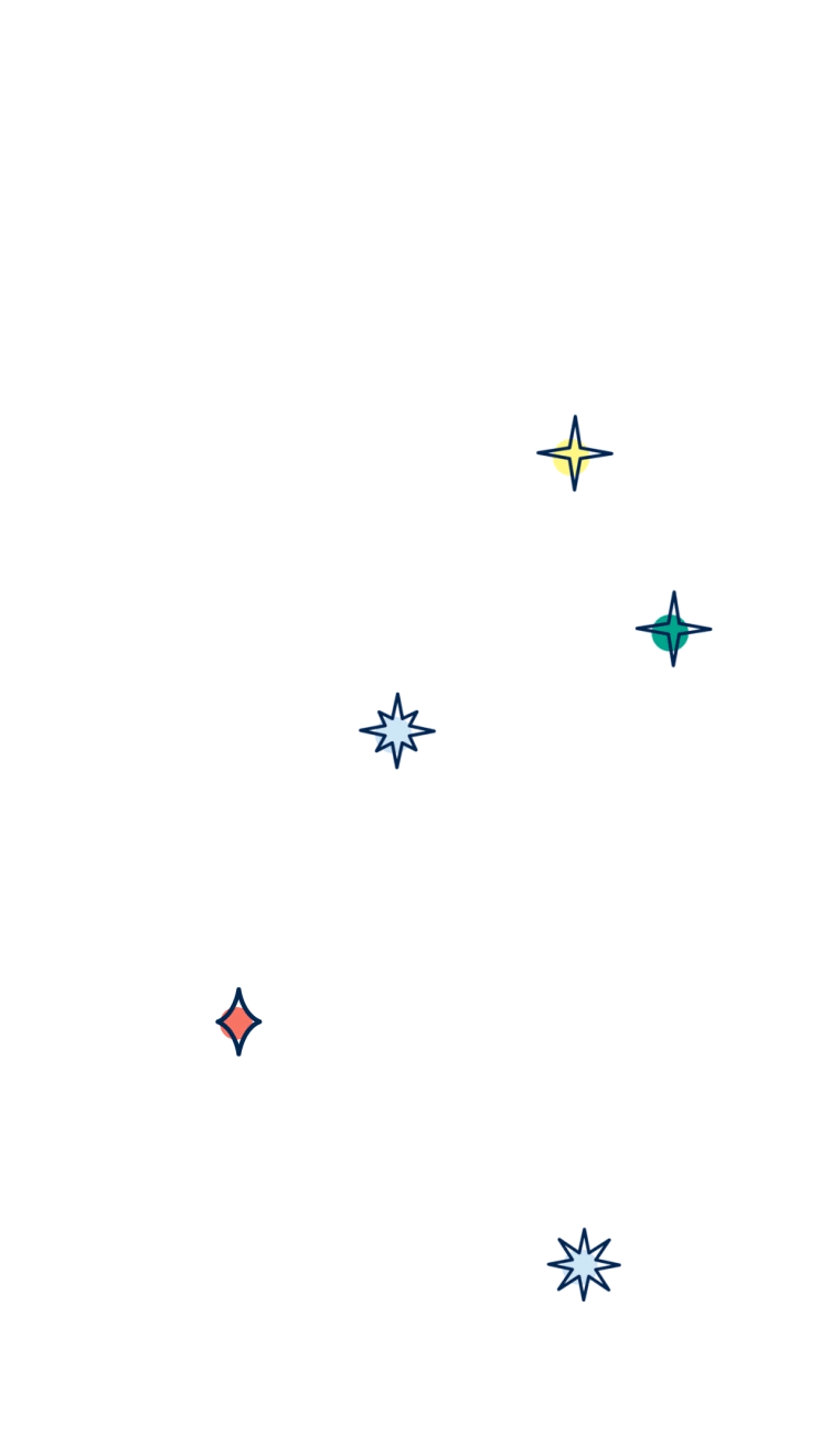
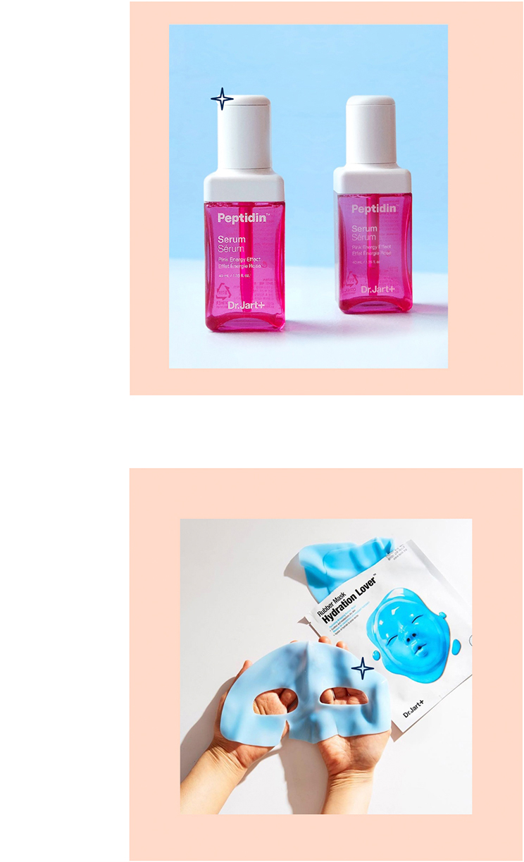
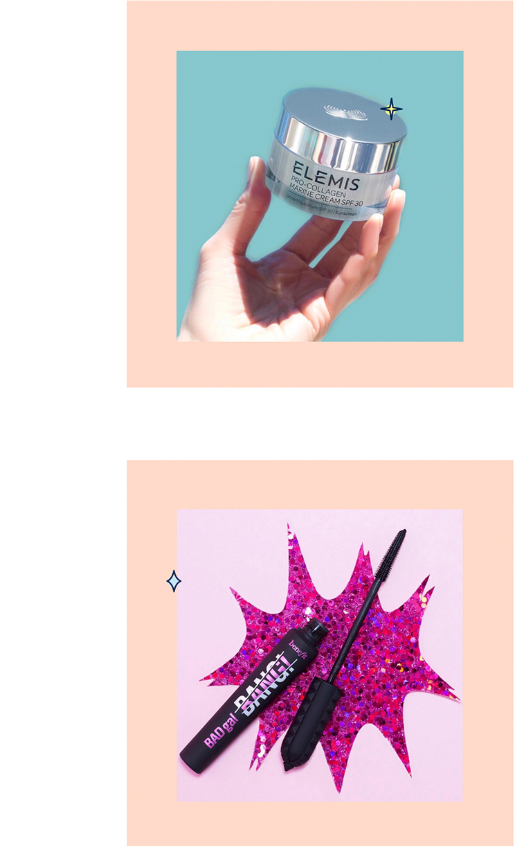
As a pattern and a generally recognized identity element, we have introduced "the shinies" – star-shaped elements that represent divine shining. We combine them with the "SHINE!" slogan.
We've chosen Apercu as the main font. This is a grotesque font with circular lowercase letters, which is a perfect match for the logo. Uppercase letters with somewhat elongated form provide a welcome contrast.


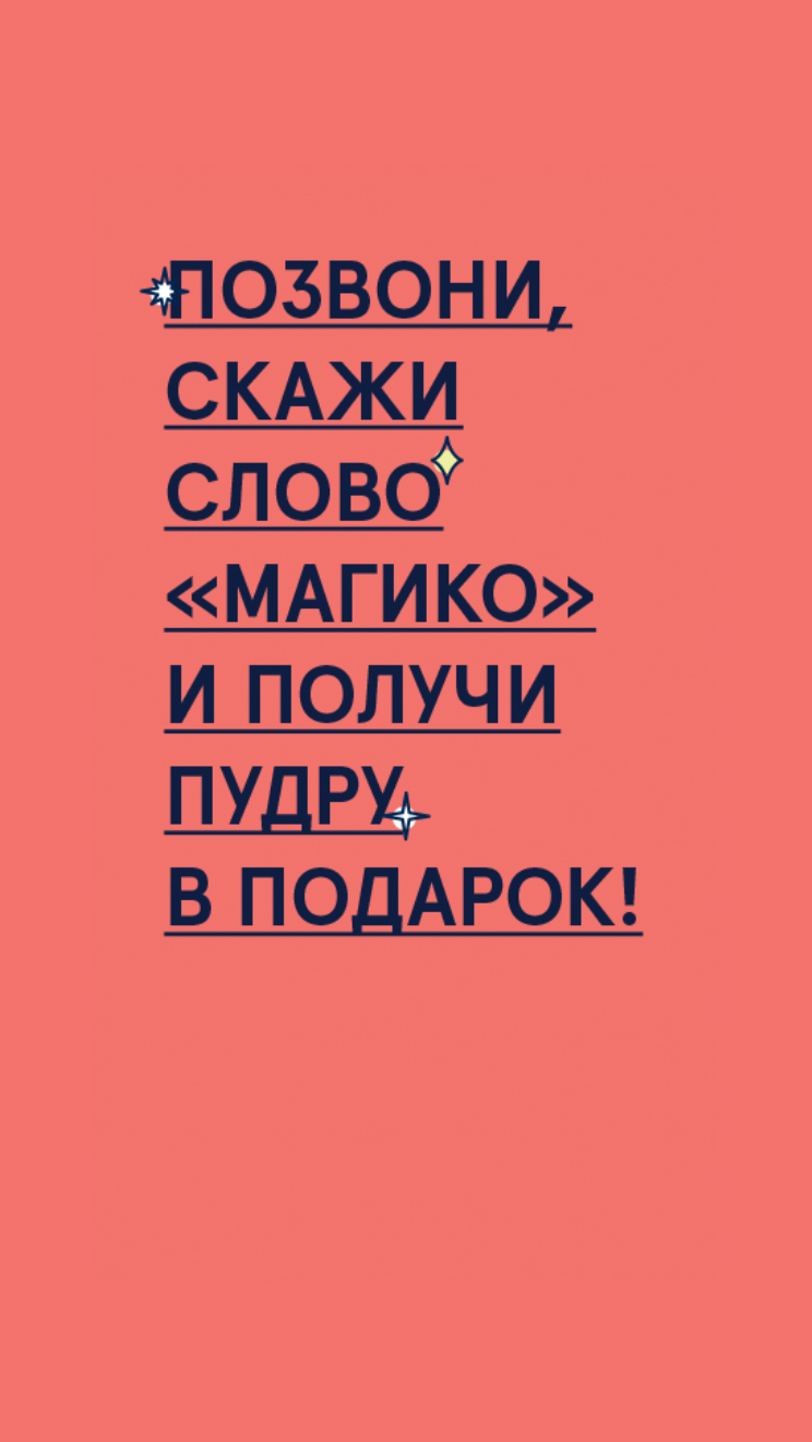
The main channel for GODDESS communications with its audience is social media, so in creating our guidelines, we've made a special emphasis on posting and post design. Our guidelines strive to be universally applicable and easy-to-use.
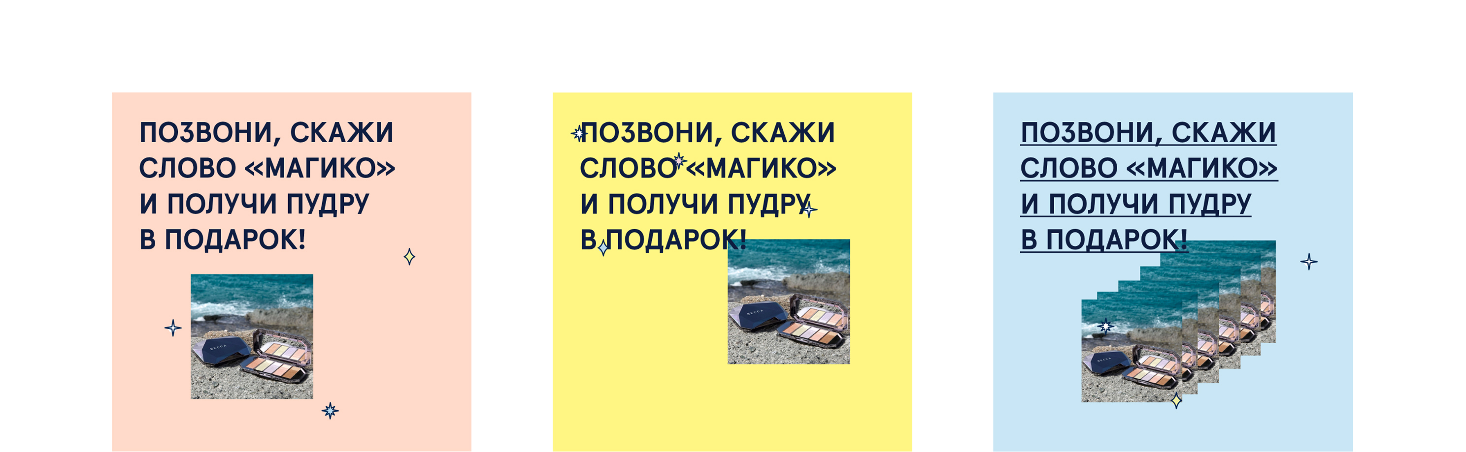
Our graphics use both the primary nude color, as well as additional colors. We make extensive use of the "shinies", which kickstarted the development of icon graphics. These techniques leave plenty of room for creativity and allow to place the emphasis on the content itself.
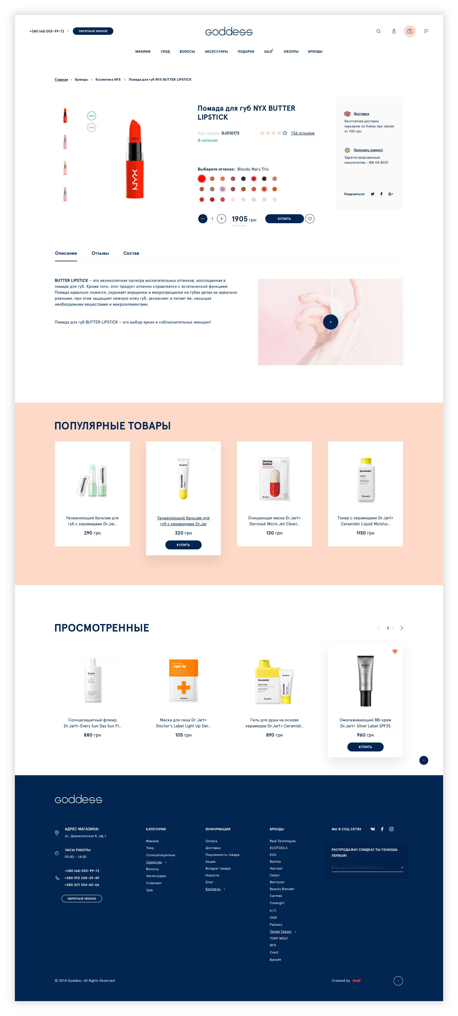
Goddess –– это онлайн-магазин, поэтому сайт в данном случае является основным инструментом бизнеса и ключевой формой проявления бренда. Перед нами появилась задача внедрить новую айдентику на сайт и улучшить его с точки зрения UX.
Для интернет-магазина ключевыми страницами являются стартовая, каталог и карточка товара. На их юзабилити мы делали особый акцент.
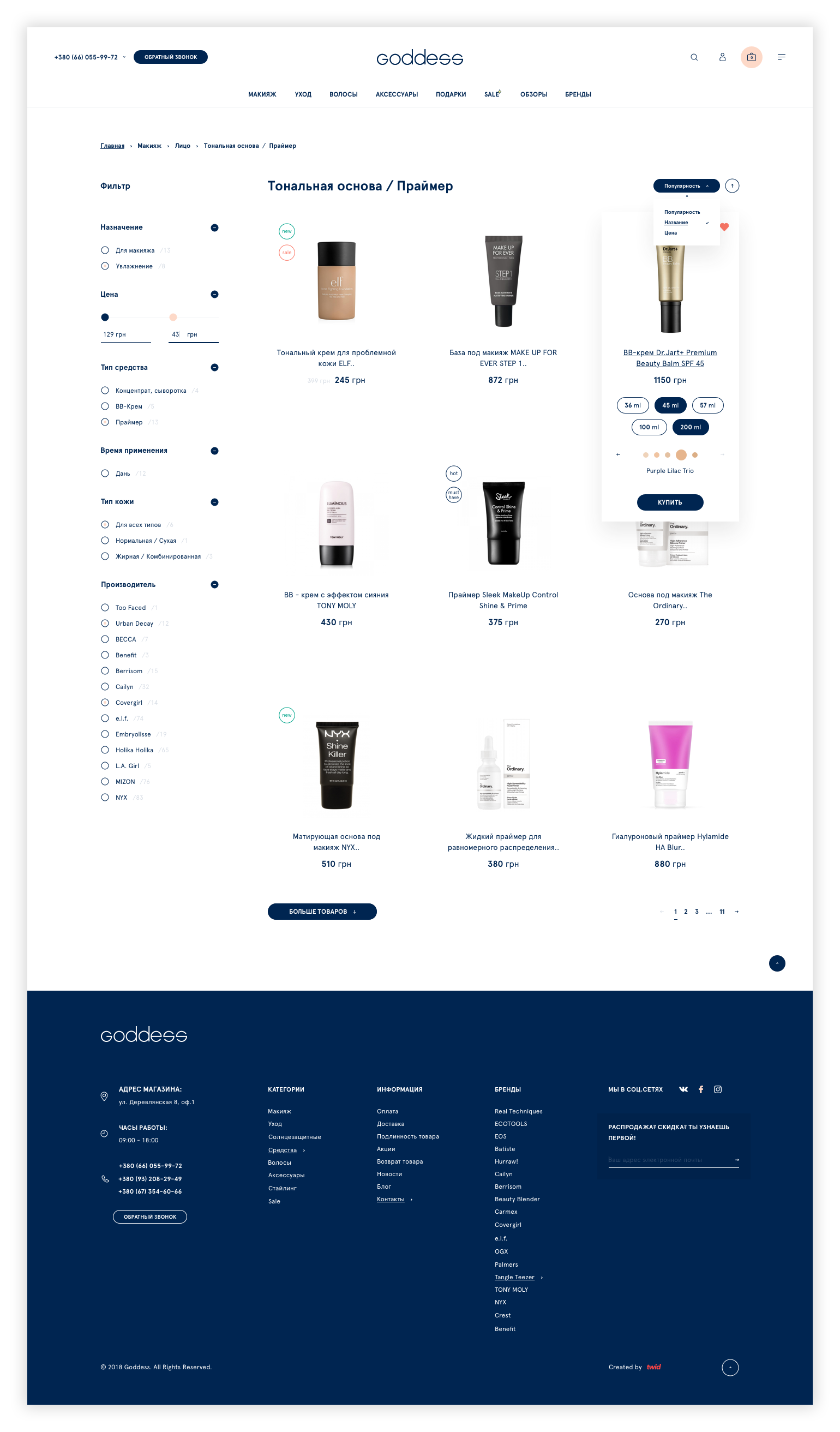
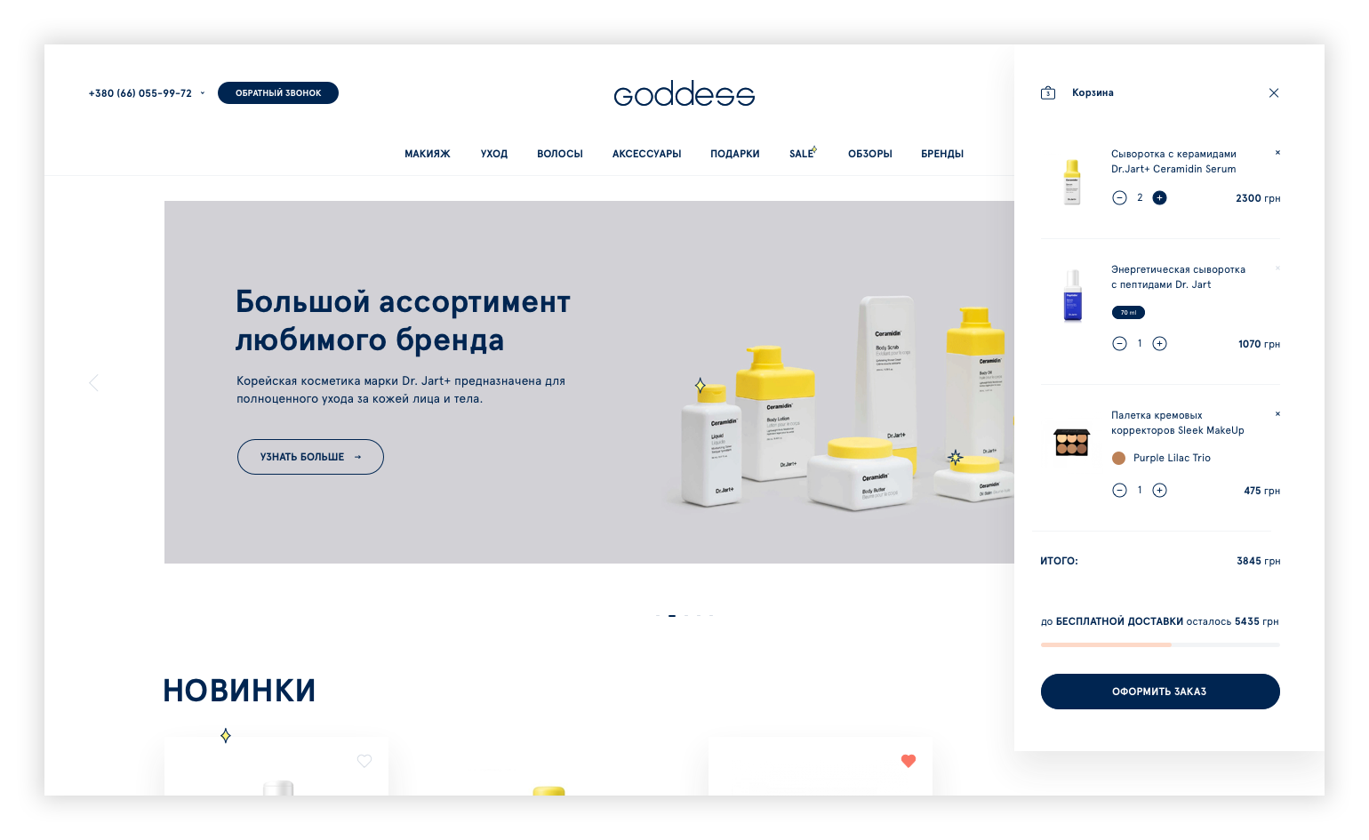
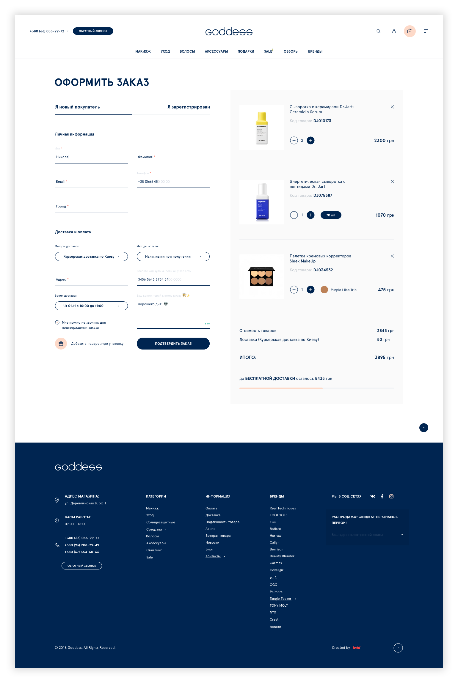
Так же особо тщательно были проработаны корзина и чекаут.
Но самый важный акцент был сделан на удобство работы с мобильной версией, поскольку в ритейле косметики мобильный трафик часто превышает 80%.