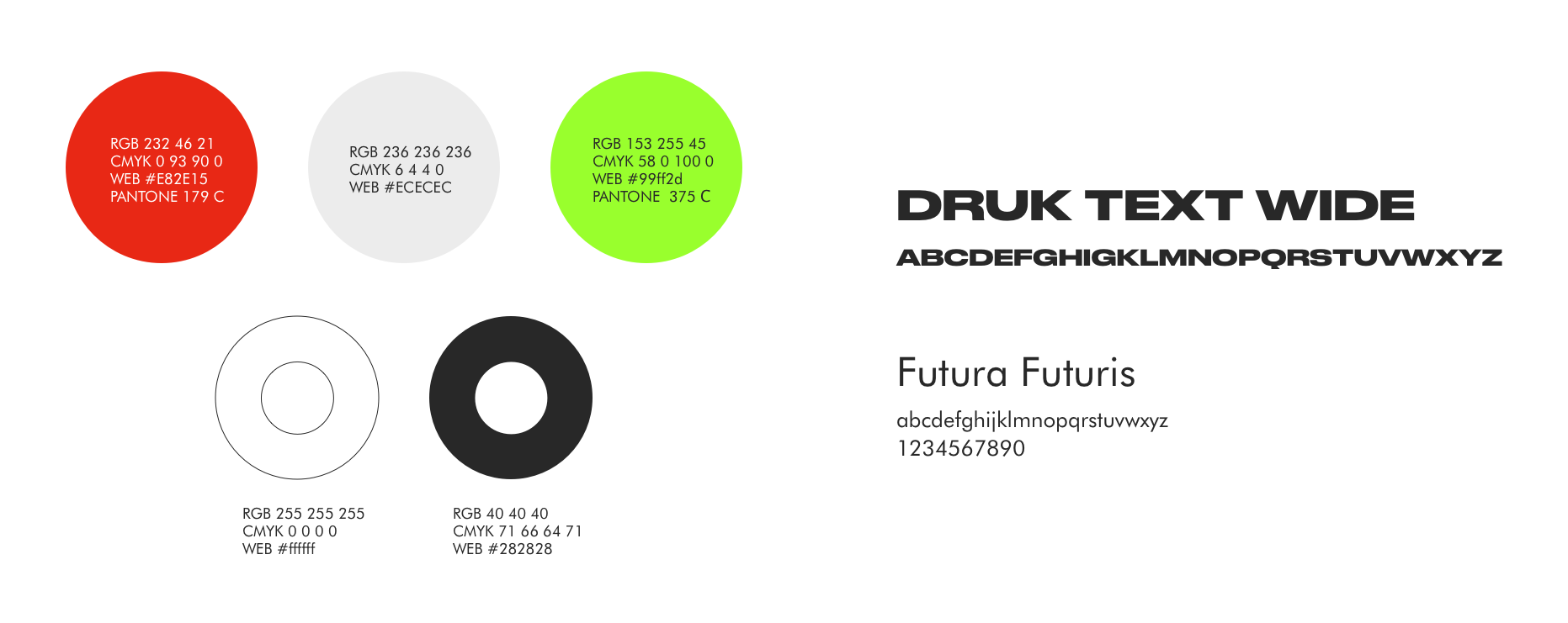
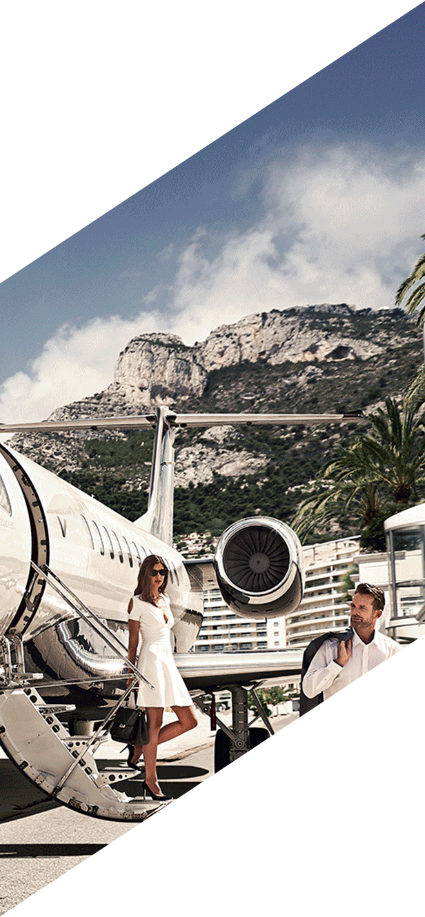
GR is a venture capital fund specializing in Series B and C funding rounds. In these rounds it is important that an investment-management fund stands out among the others. Our task was to create a brand image that would grasp attention, as well as convey the spirit of the company that is bold, energetic and persistent.
Initially, the company's name was GR Capital. Working on the project, we've decided to transform the name to GR, keeping the full name for business documentation. In this way the name was a better match for the brand's character and goals. We've turned the new name into a self-sufficient sign that combined a typographic and a graphic solution. The sign consists of geometric shapes that together form the GR acronym. The diagonal lines add dynamic to the logo and represent steps as a symbol of upward movement. Circles have their own meaning. The small one symbolizes the project that having found itself in the portal of the big circle propels itself swiftly up the stairs.
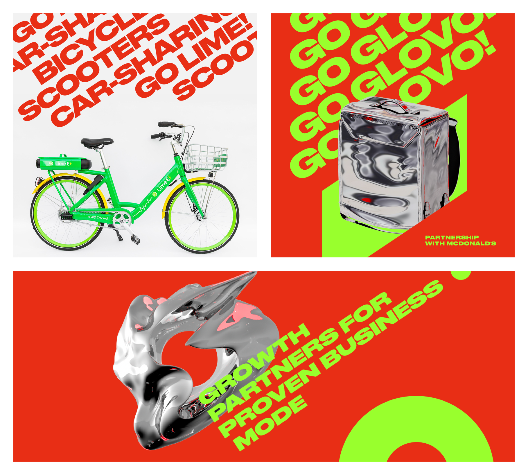
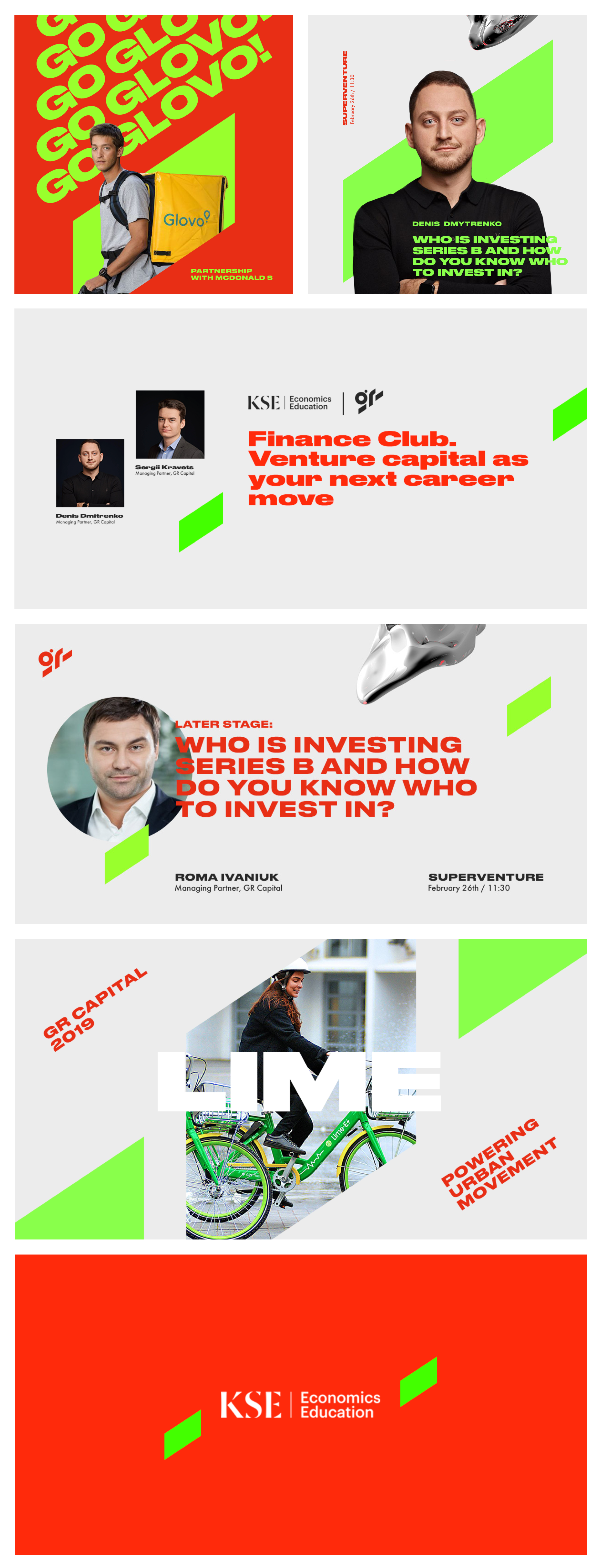
We've come up with a series of slogans, all of which are based on the concept of growth.
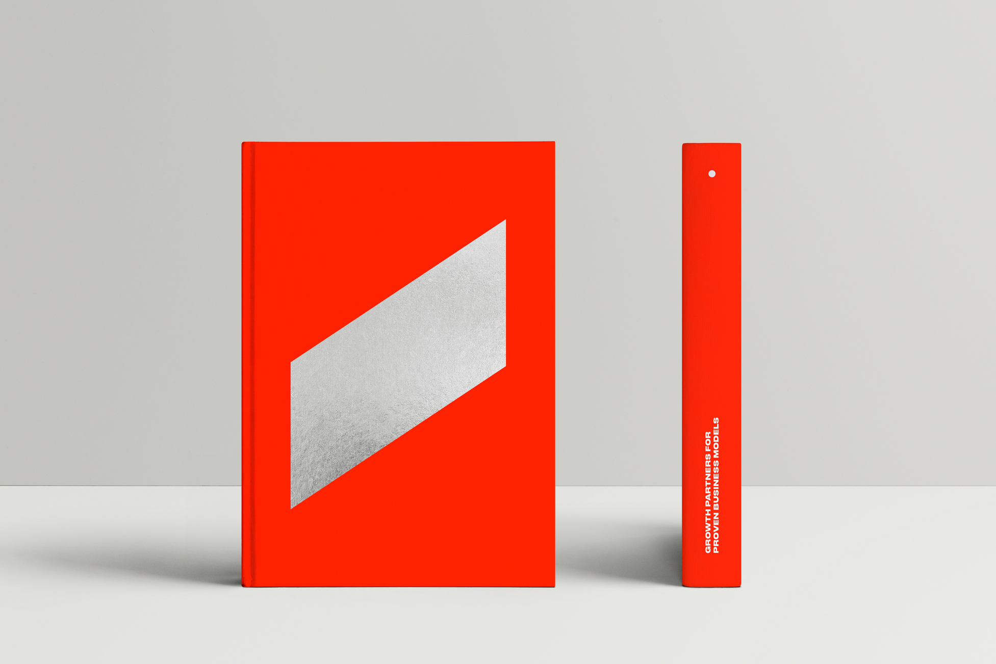
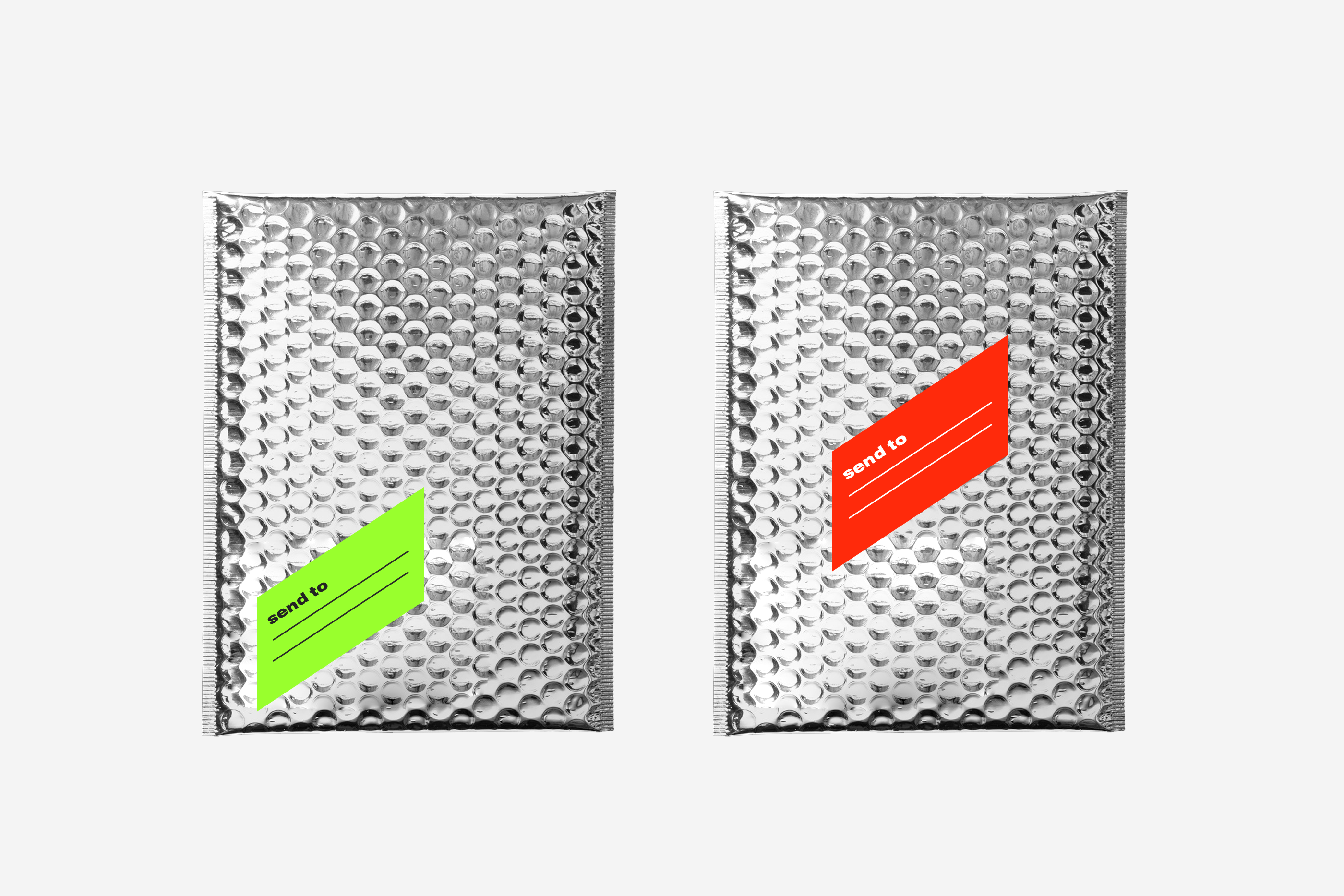
Stairs are one of the key elements of the brand identity. Their shape creates the progressive dynamic that we need and symbolizes growth. This element is technically easy to combine with different objects and forms.
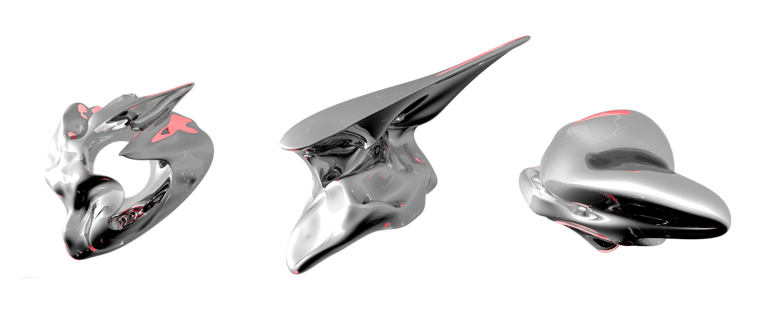
We are using metalized objects as additional graphic images. Objects like this are perceived as futuristic. They are often presented as abstractions, which symbolizes innovation – GR's field of work. In some cases, these abstract shapes turn into a specific form, demonstrating that an abstract idea could very well lead to specific results.
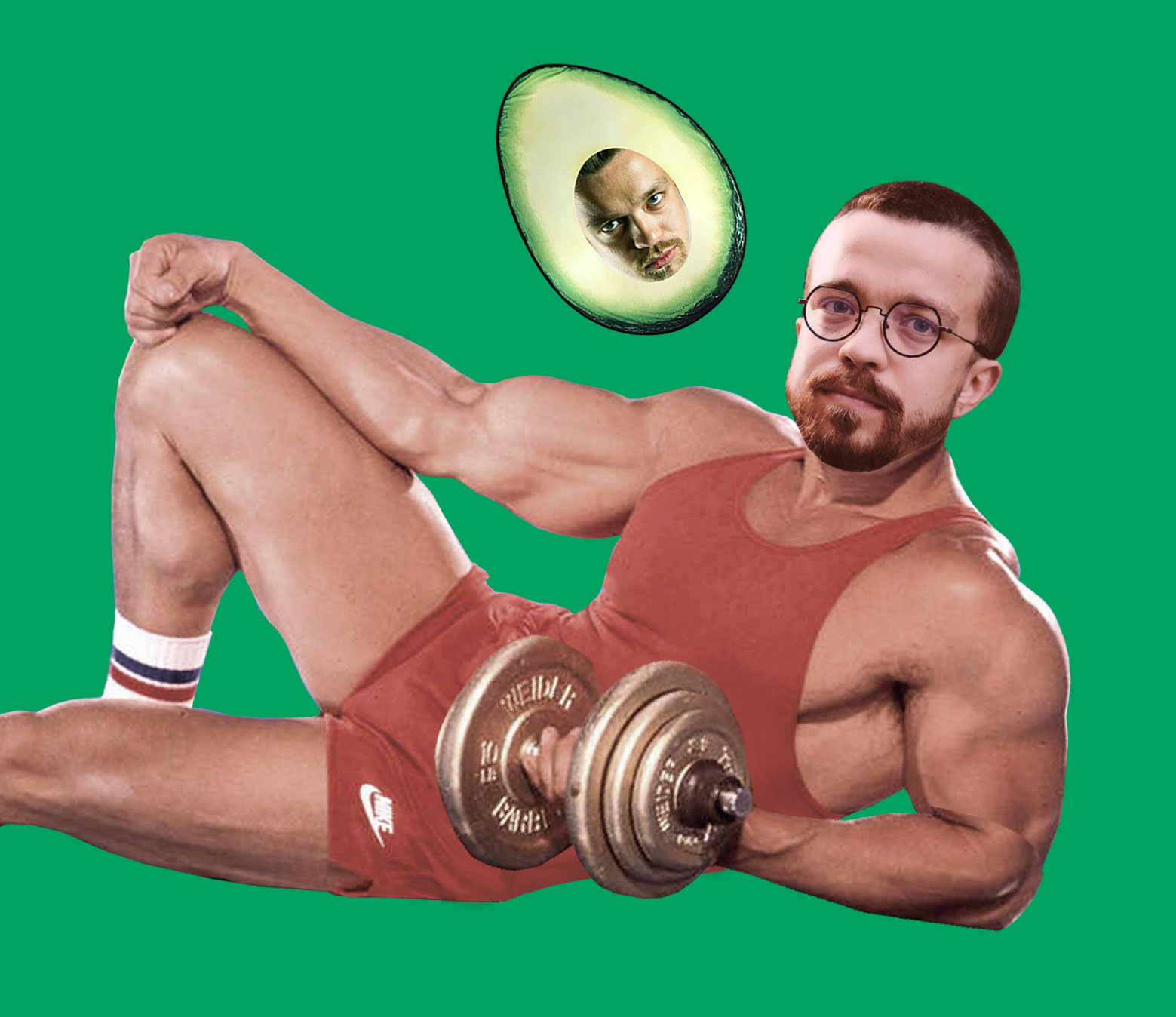
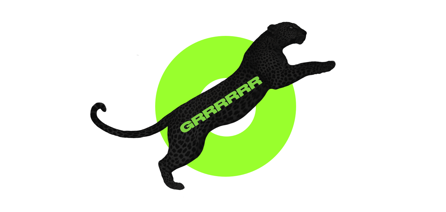
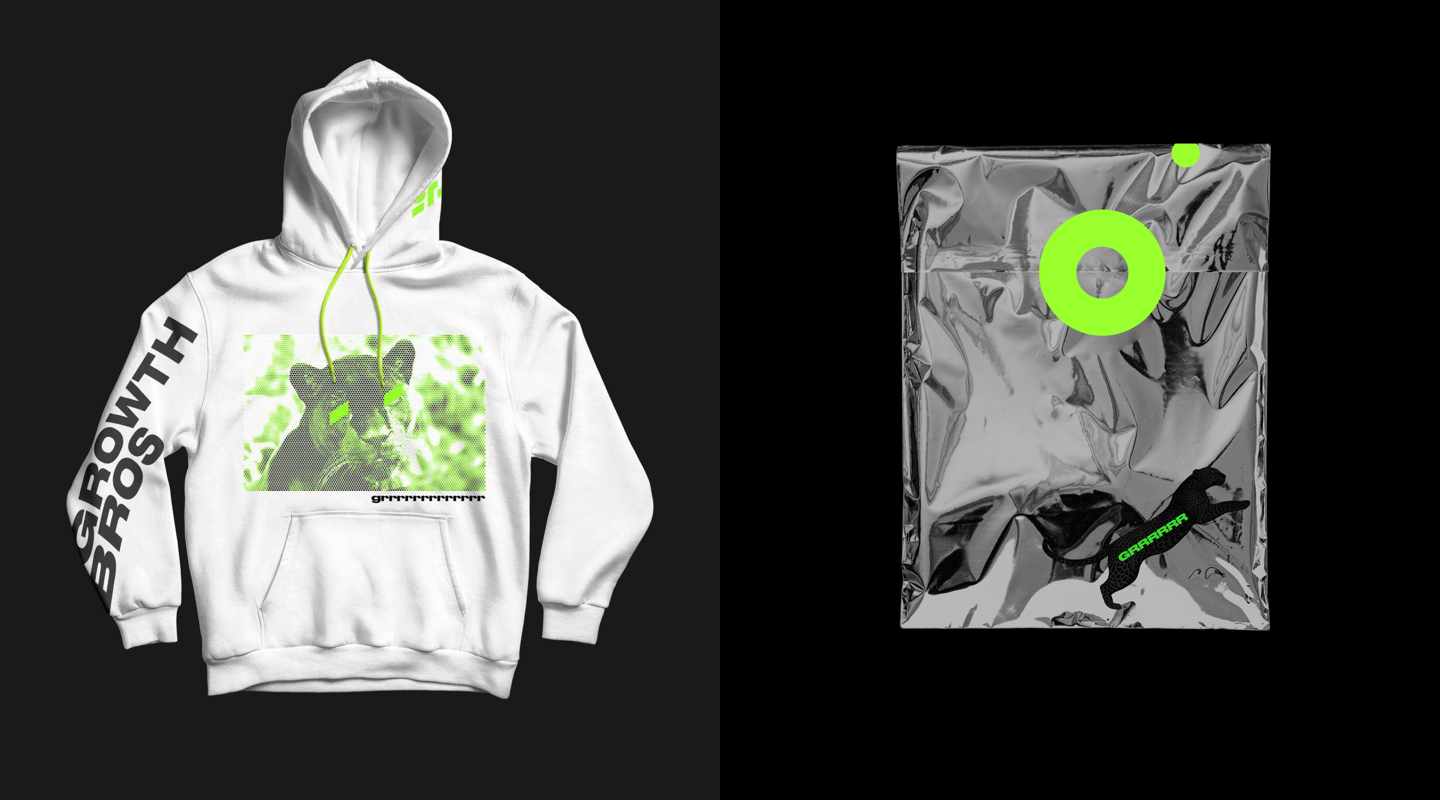
In our interviews with GR team, several people named panther as the potential totem animal, which was surprising, as this issue has never been discussed in the team. We believe that there are no coincidences, so the panther got its place in GR identity. Now it often grrrrrrrrrrowls.
In brand identity, we often use diagonal text, which further emphasizes the dynamic and makes diagonal orientation an additional element of the identity
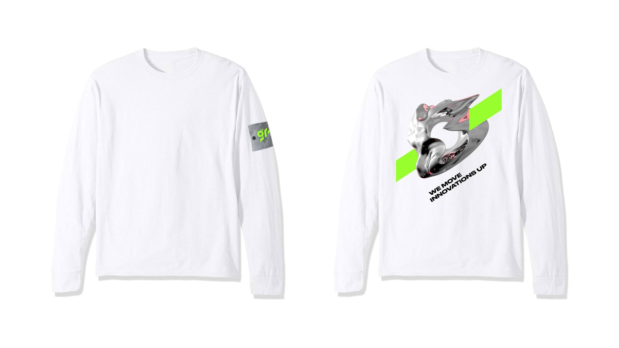
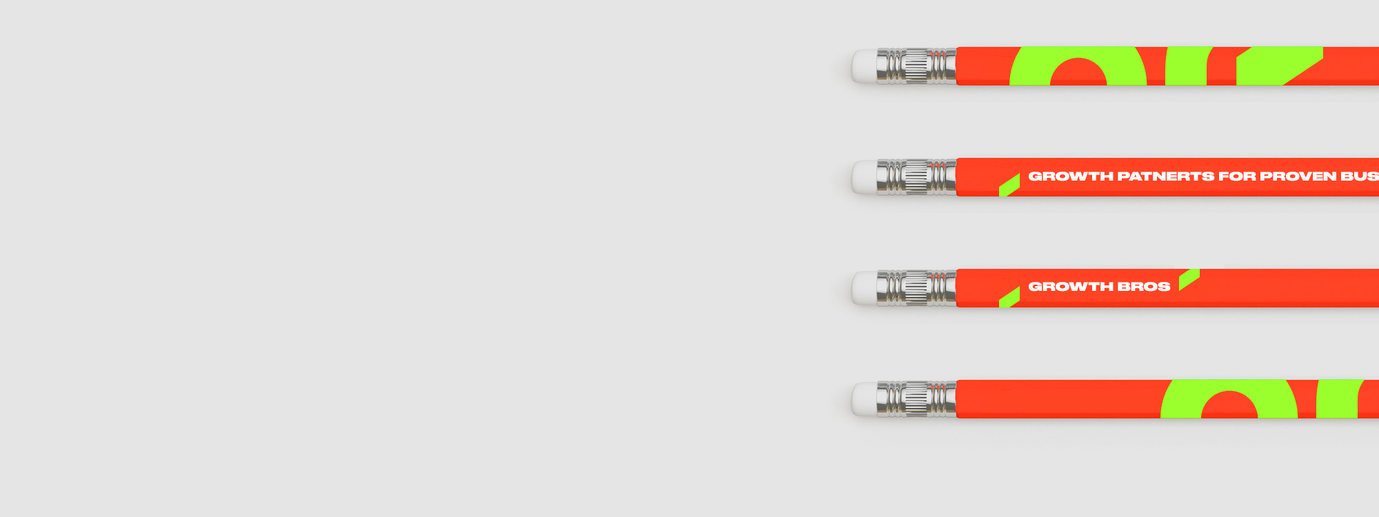
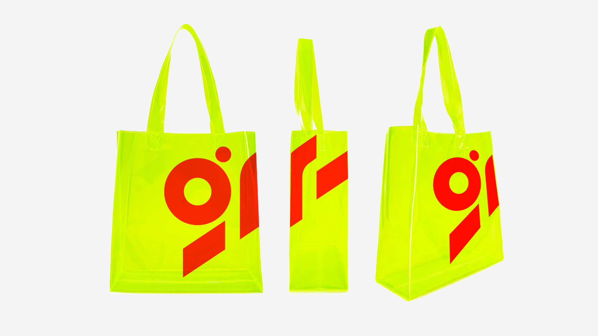
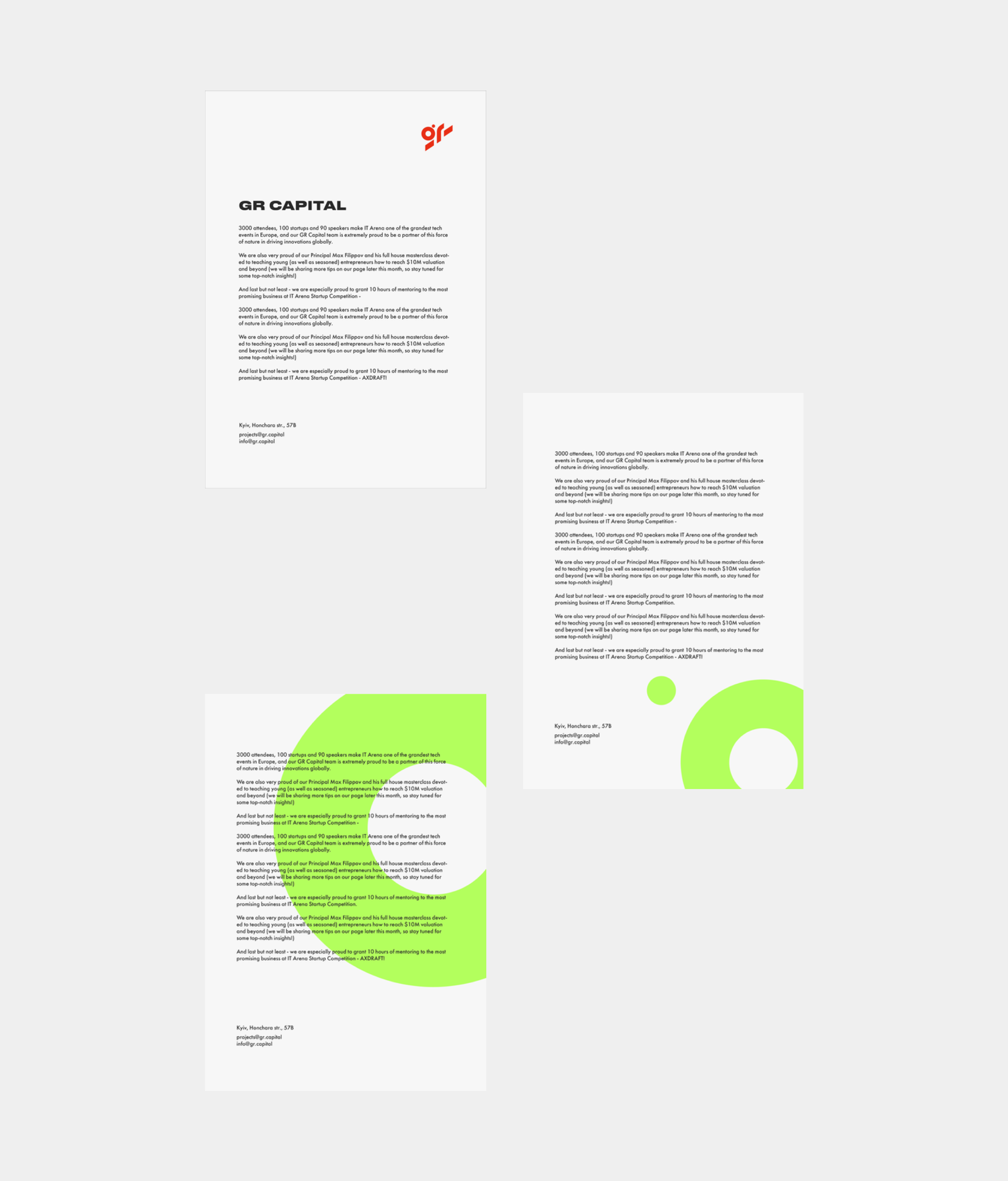
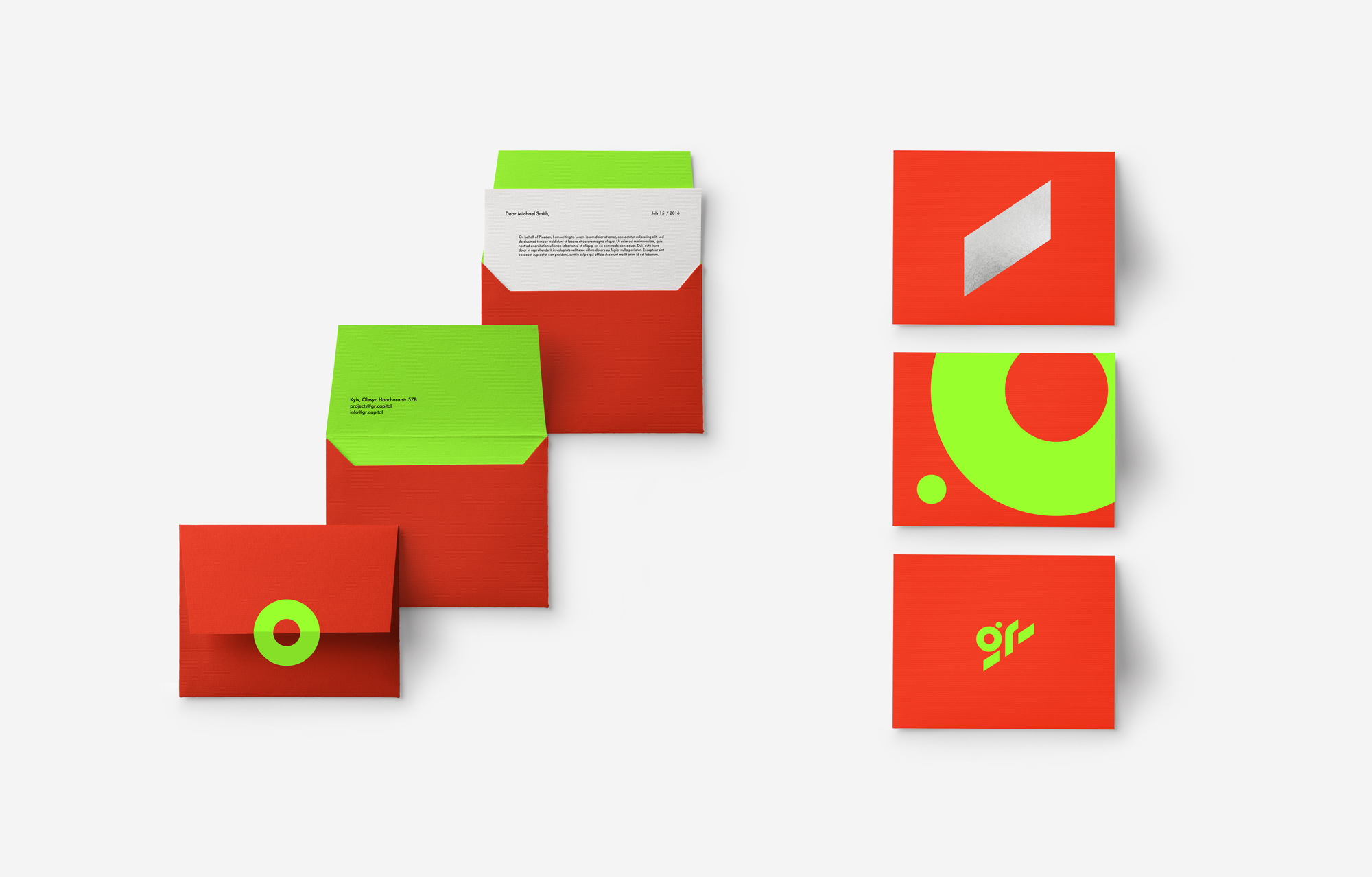
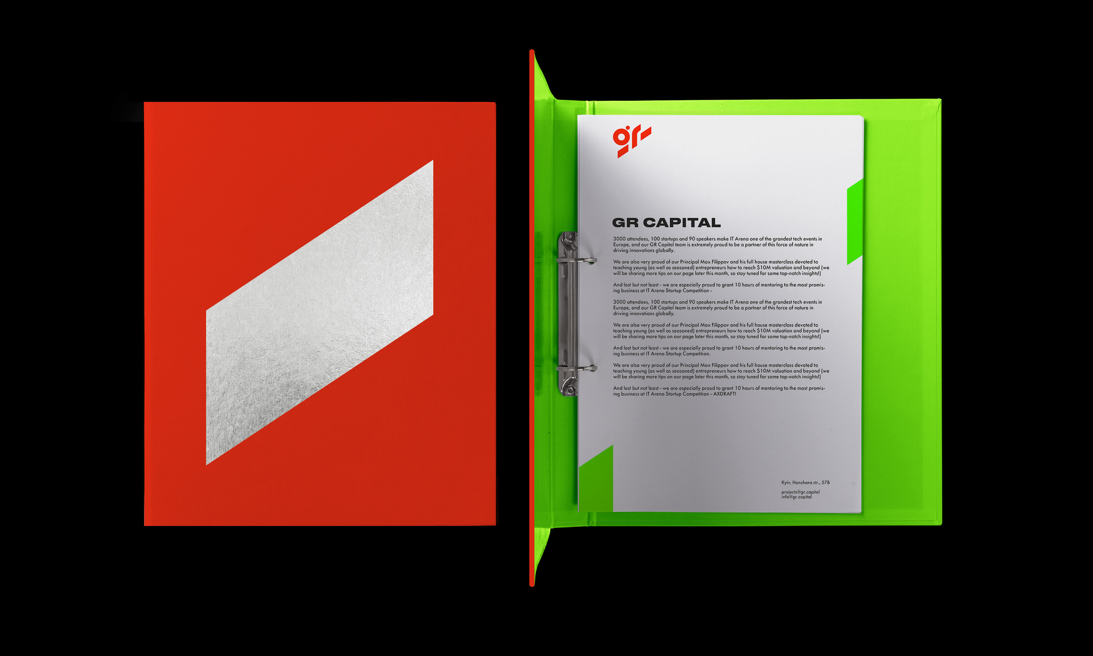
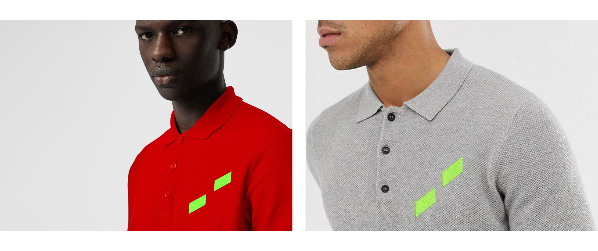
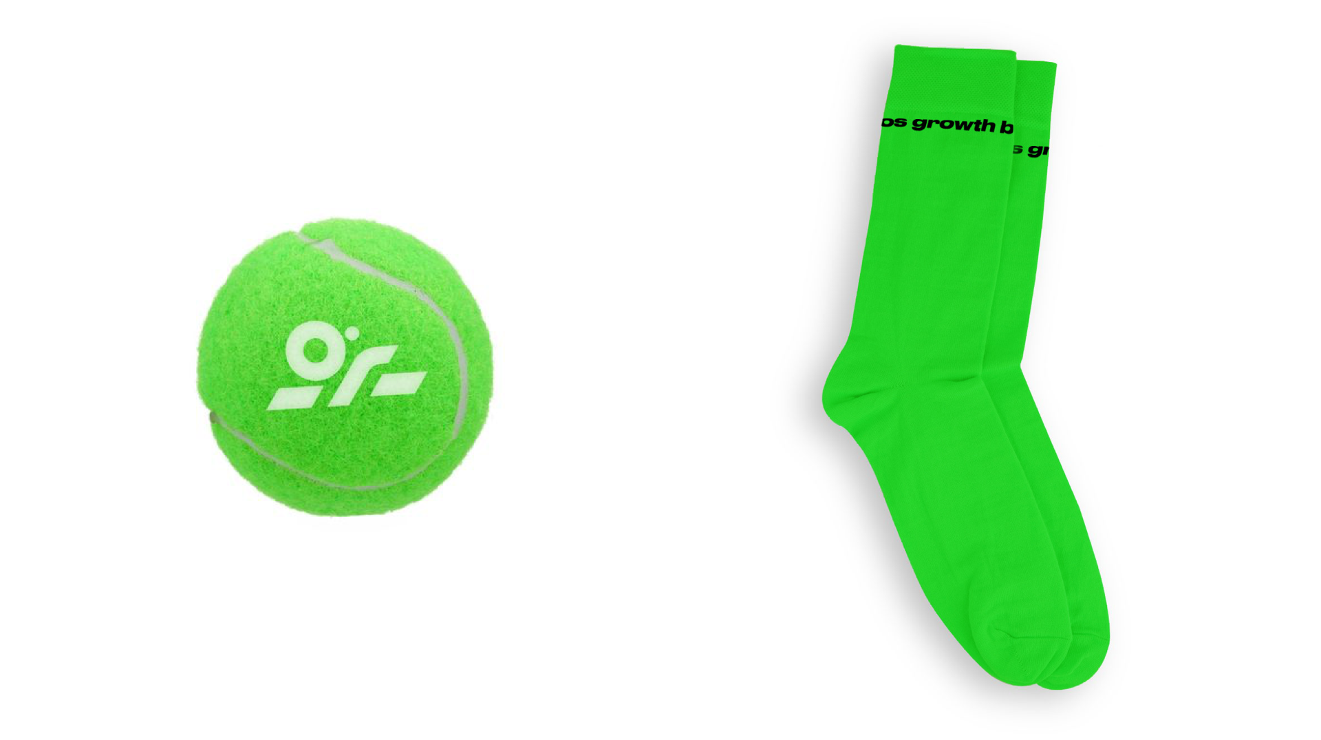
Working on the project, we've developed and supervised the production of a ton of different merch and print products. Here are some examples:
GR is active on social media, so we've created a separate detailed guide with examples of sample posts and different recommendations.
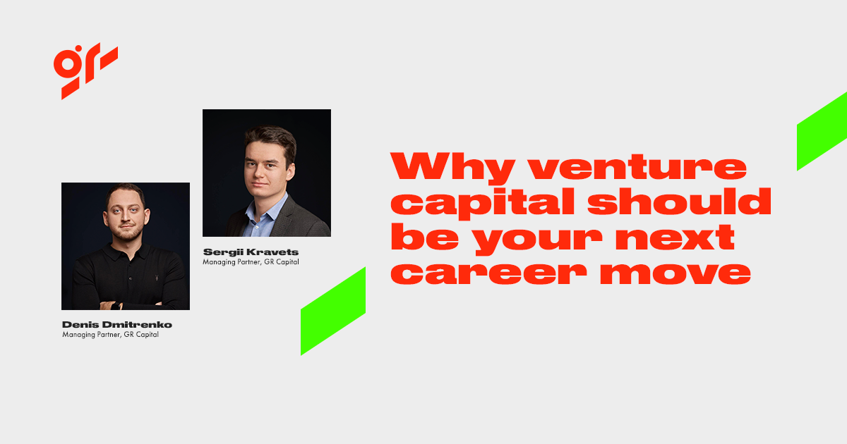
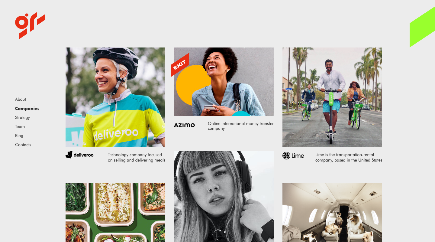
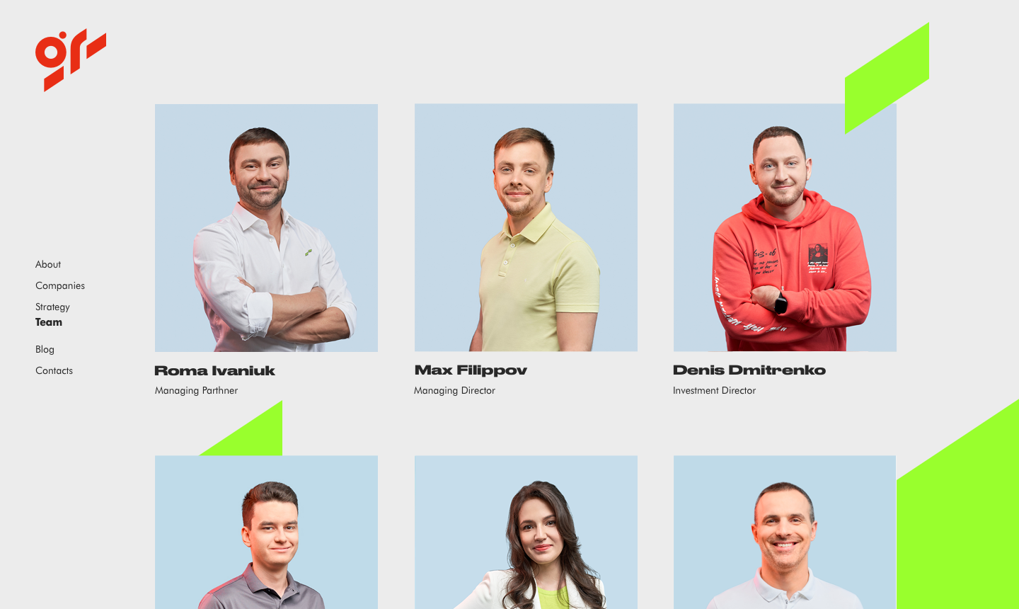
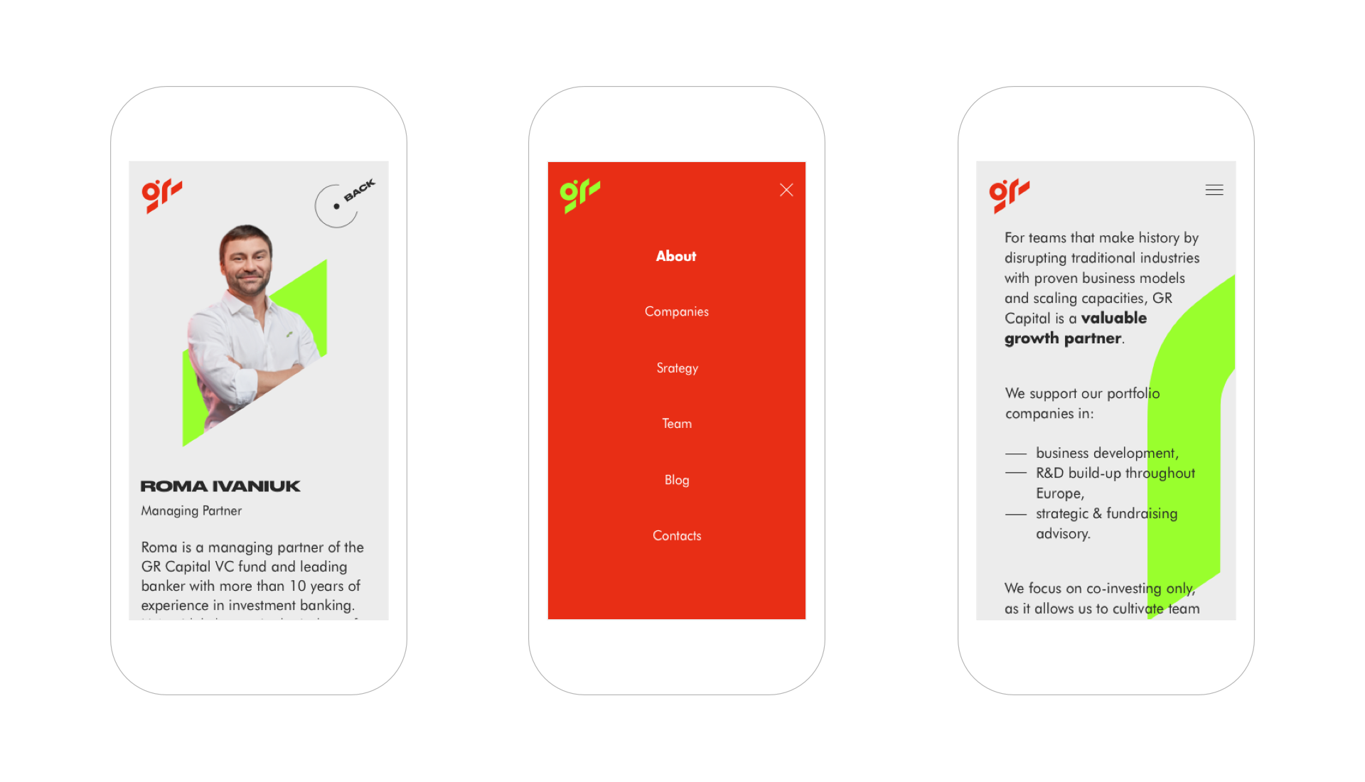
GR's website is its self-presentation. Target audience doesn't spend much time interacting with investment-management companies' websites, so it was important to provide all crucial information, as well as communicate GR's distinctive image in a brief and efficient form.