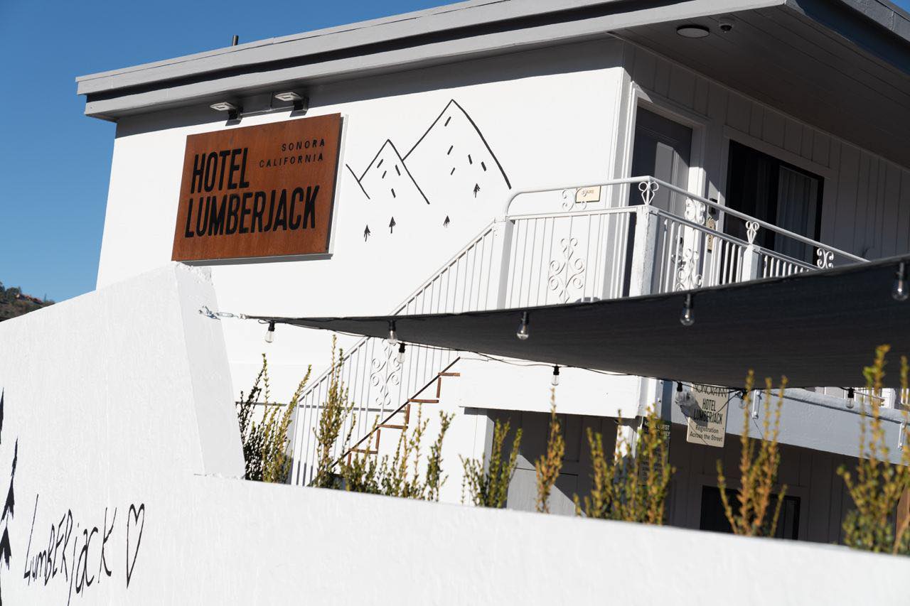
Hotel Lumberjack is located in Sonora, California. This is a former motel of the Roadway Inn chain popular in the States. Lumberjacks from the surrounding area used to come here, but now Western fans and wildlife lovers flock here. Why? There is a national park nearby. The need in a night shelter disappeared, but the demand for quality tourism appeared.
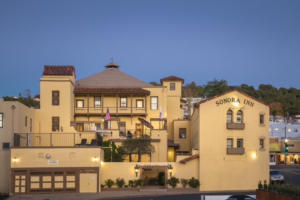
Our hero is the brother of the nearby Hotel Sonora. Together, they form the infrastructural link of the city, because they modernized what was useless. For example, the old parking lot next to the former motel.
People come to Sonora to breathe the clean forest air, but it is difficult to find modern apartments here. Hotel Lumberjack aims to fix that.
We had to not just update the hotel, but literally build the entire design system from scratch. We faced the task of organically integrating it into the context of the city. Therefore, we delved into city research, which really became a challenge – the entire team was in Ukraine.
Lumberjack recluse
We didn't have to read half the Library of Congress to come up with a concept. We researched the history of the former motel and took from it a vivid image of a lumberjack. Thus name Lumberjack was born.
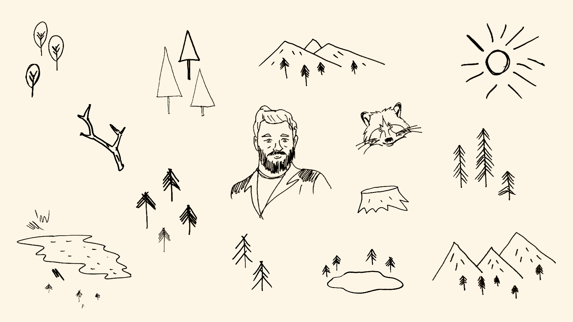
He never visits a hotel when someone is there, preferring a secluded life in the woods. Still, it tells us something about his visits. More precisely, it shows.
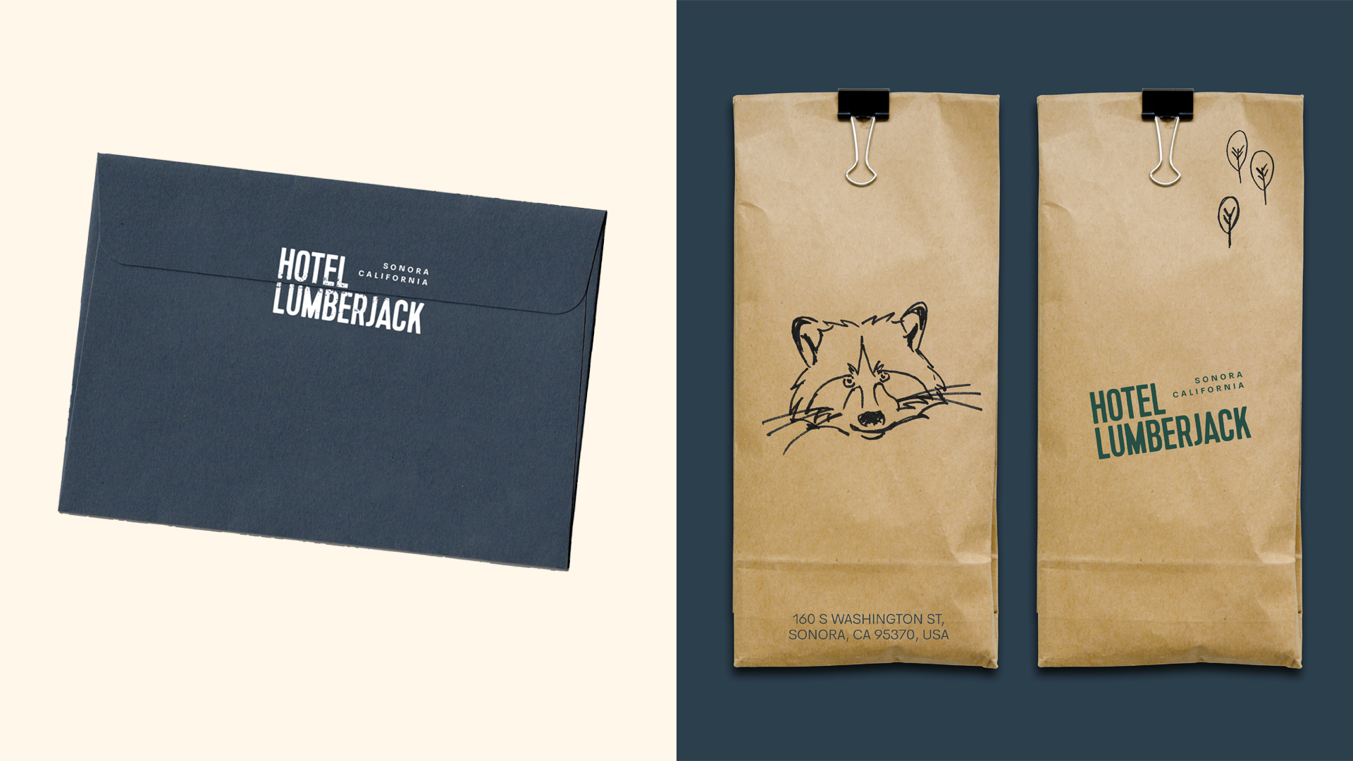
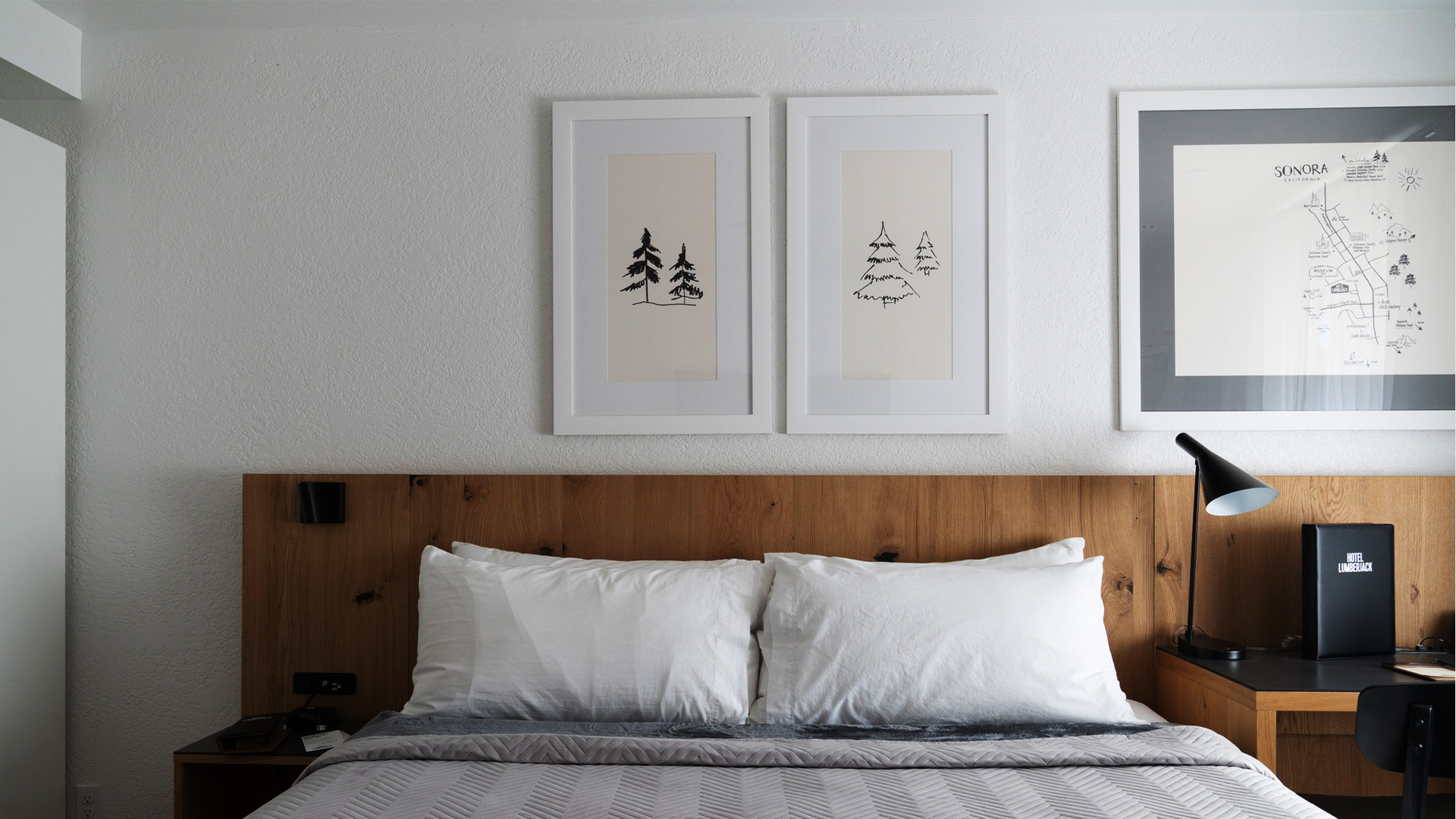
Pencil scribbles on paper
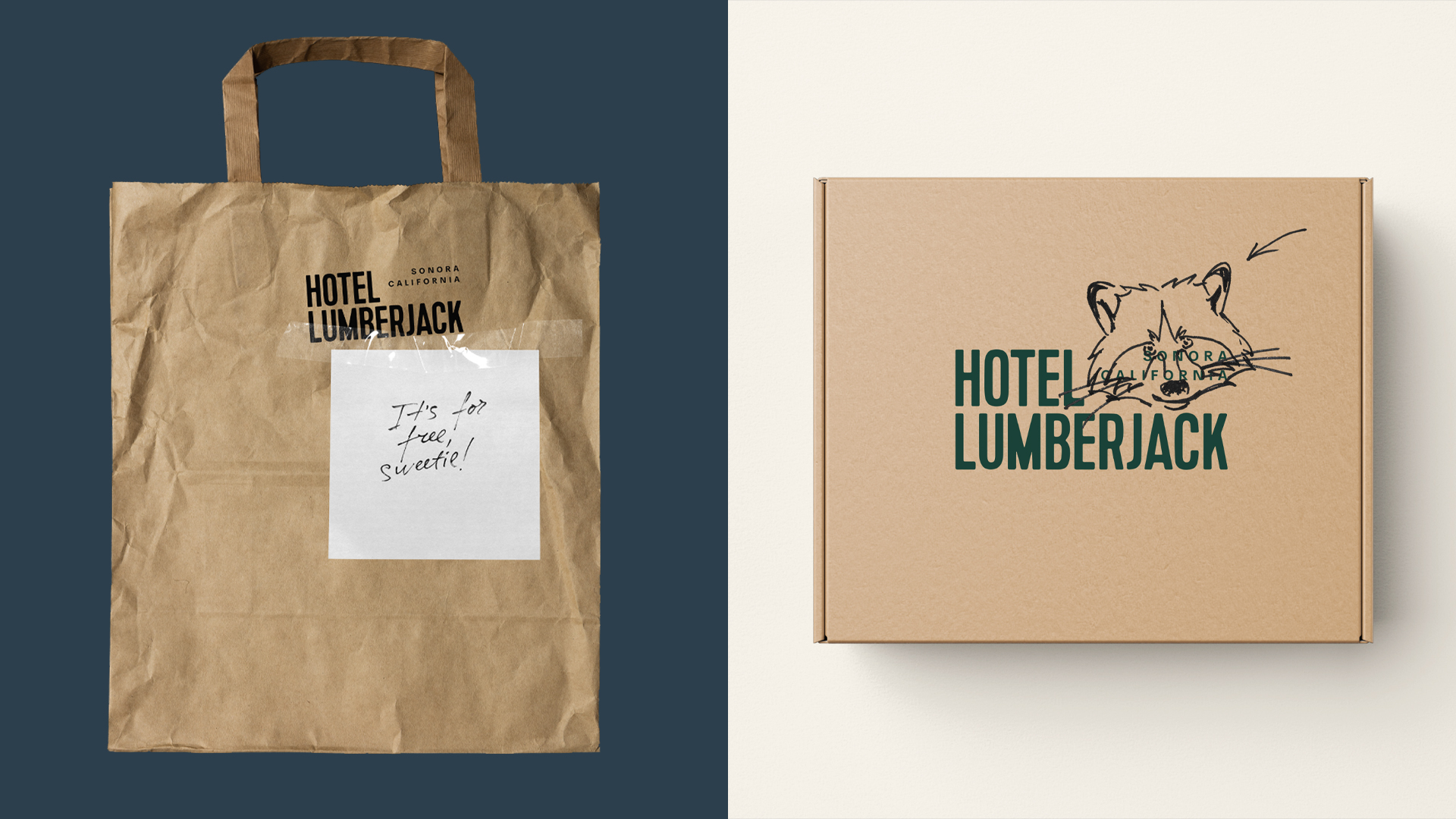
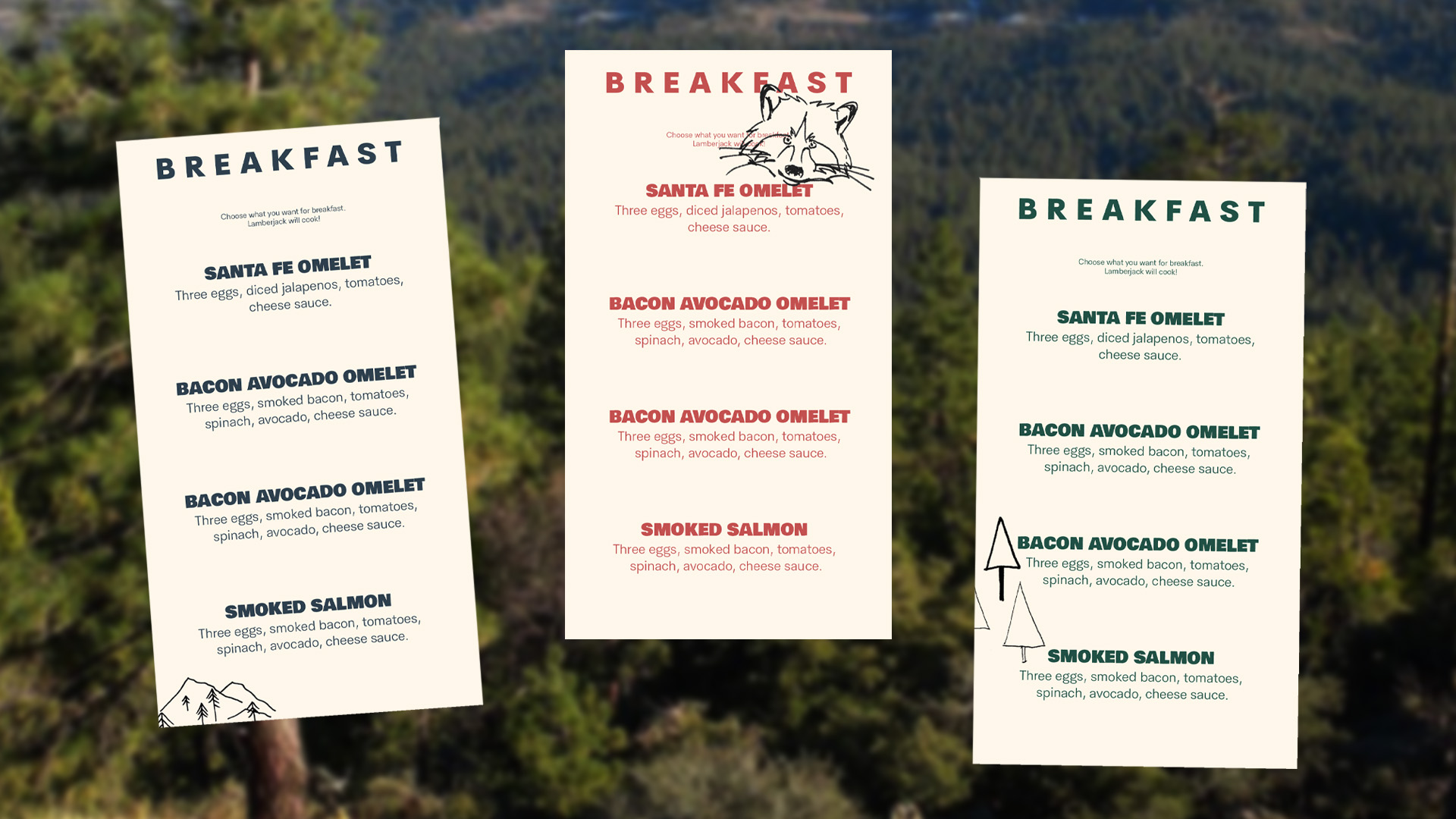
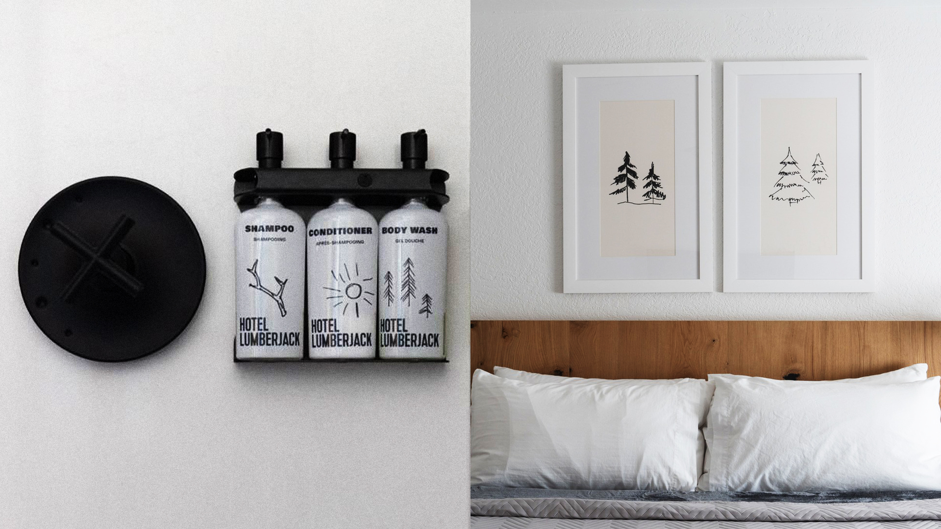
We've created amateur, sloppy illustrations by Lumberjack. He leaves these sketches from the life of a lumberjack on walls, napkins, soap dishes and other objects.
So the hotel turns into a real home of our character. You are no longer a tourist, you are a guest in the host's home.
The vintage of old America
We wanted to tell a story about modernity in the language of the forest America of the 20th century. It was even more important to show the city of Sonora. So we put it all together and created a harmonious design puzzle.
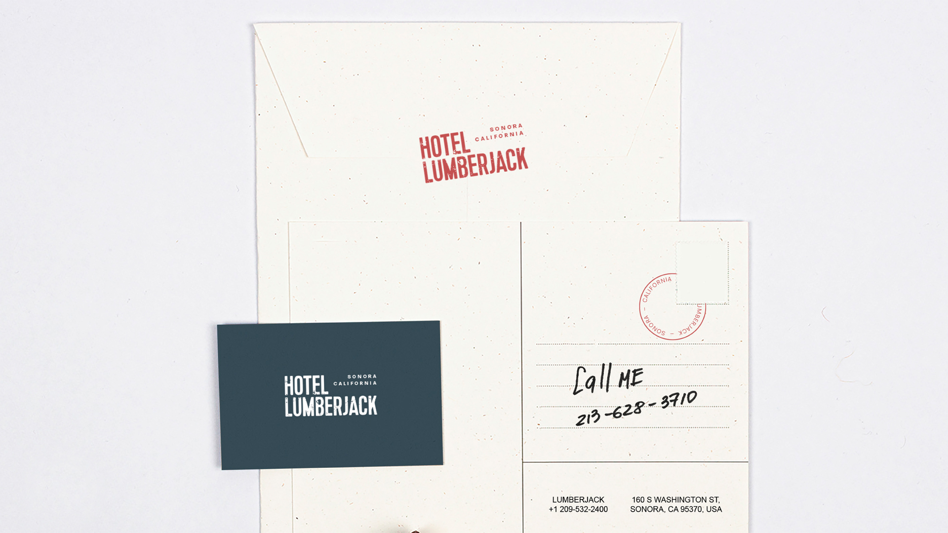
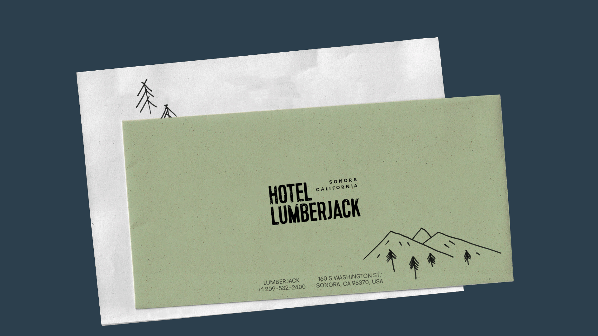
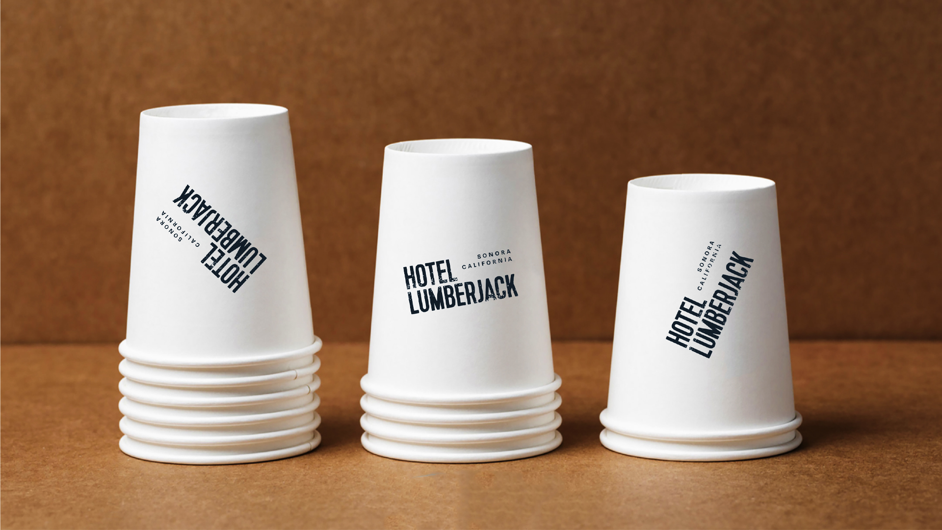
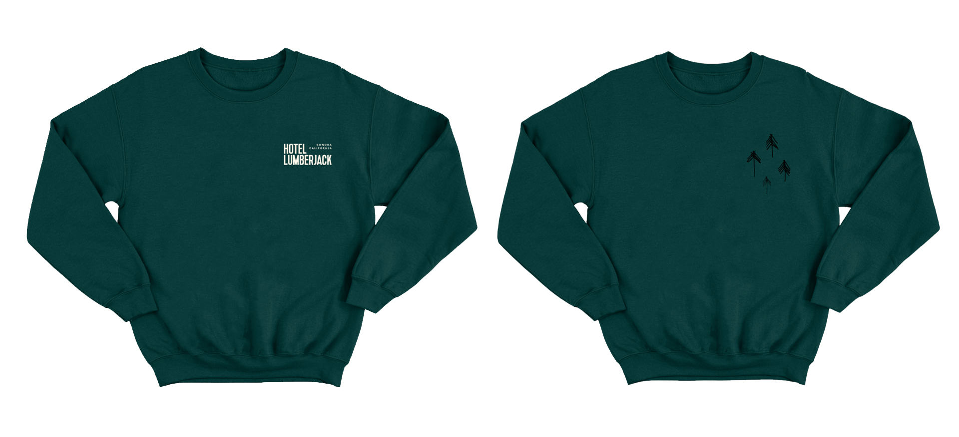
The font logo was taken as a basis, which is further revealed by Lumberjack's illustrations. His stylistics sends us back to old stamping. It is the stamps that appear on the paper utensils of the hotel: menus, forms, cups and other things.
We have specifically abandoned fancy typography: Lumberjack is welcoming and simple. These are the main fonts.
An 8,000 kilometers journey
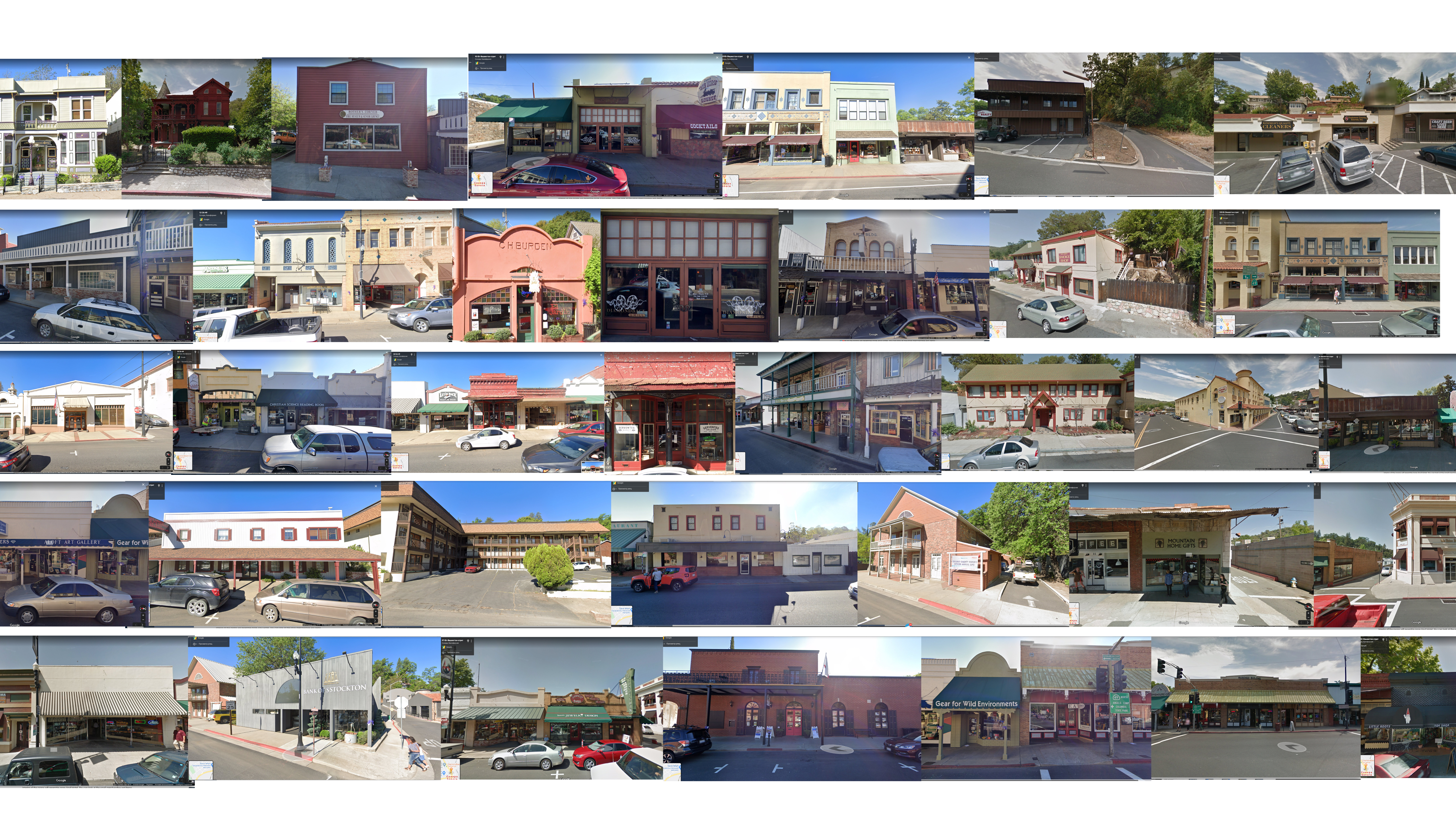
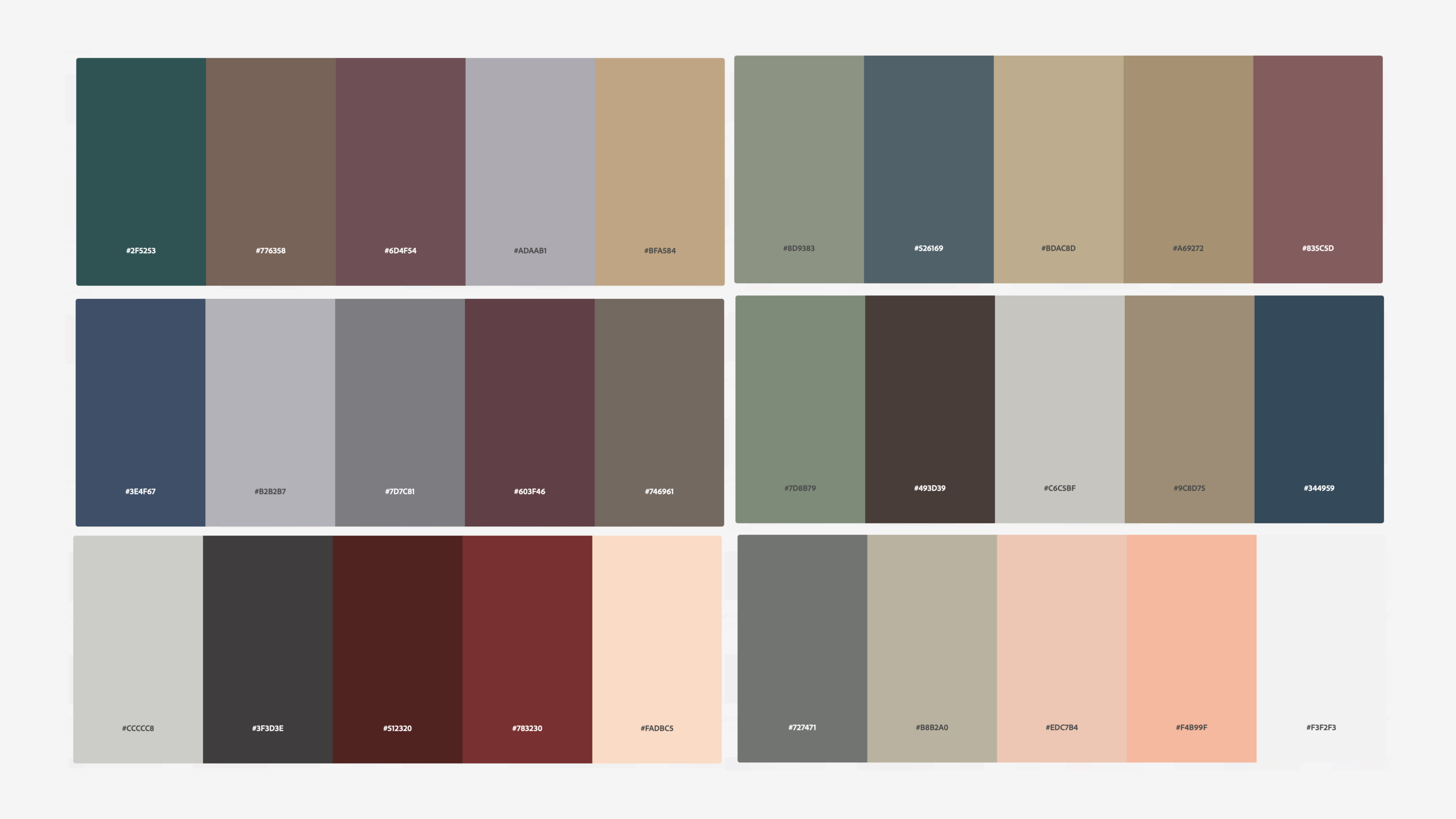
An interesting story with the palette. Using Google Maps, we took pictures of the facades of houses in Sonora and matched their colors. This is how green, blue, beige and red appeared -– our hero's favorite colors. We updated the hotel, but also remained in the colorful ecosystem of the city.
Friendly to travelers
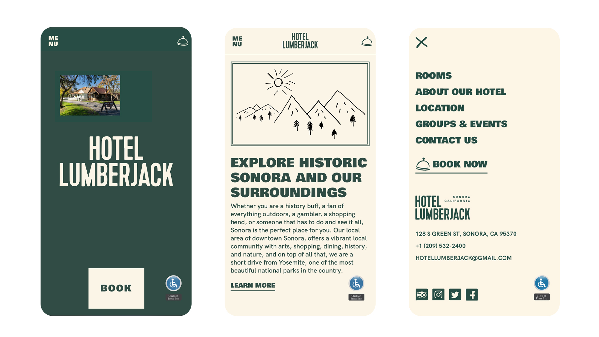
The last thing a weary hiker wants is complications. Therefore, the site is easy to understand. In addition, it immediately introduces the style.
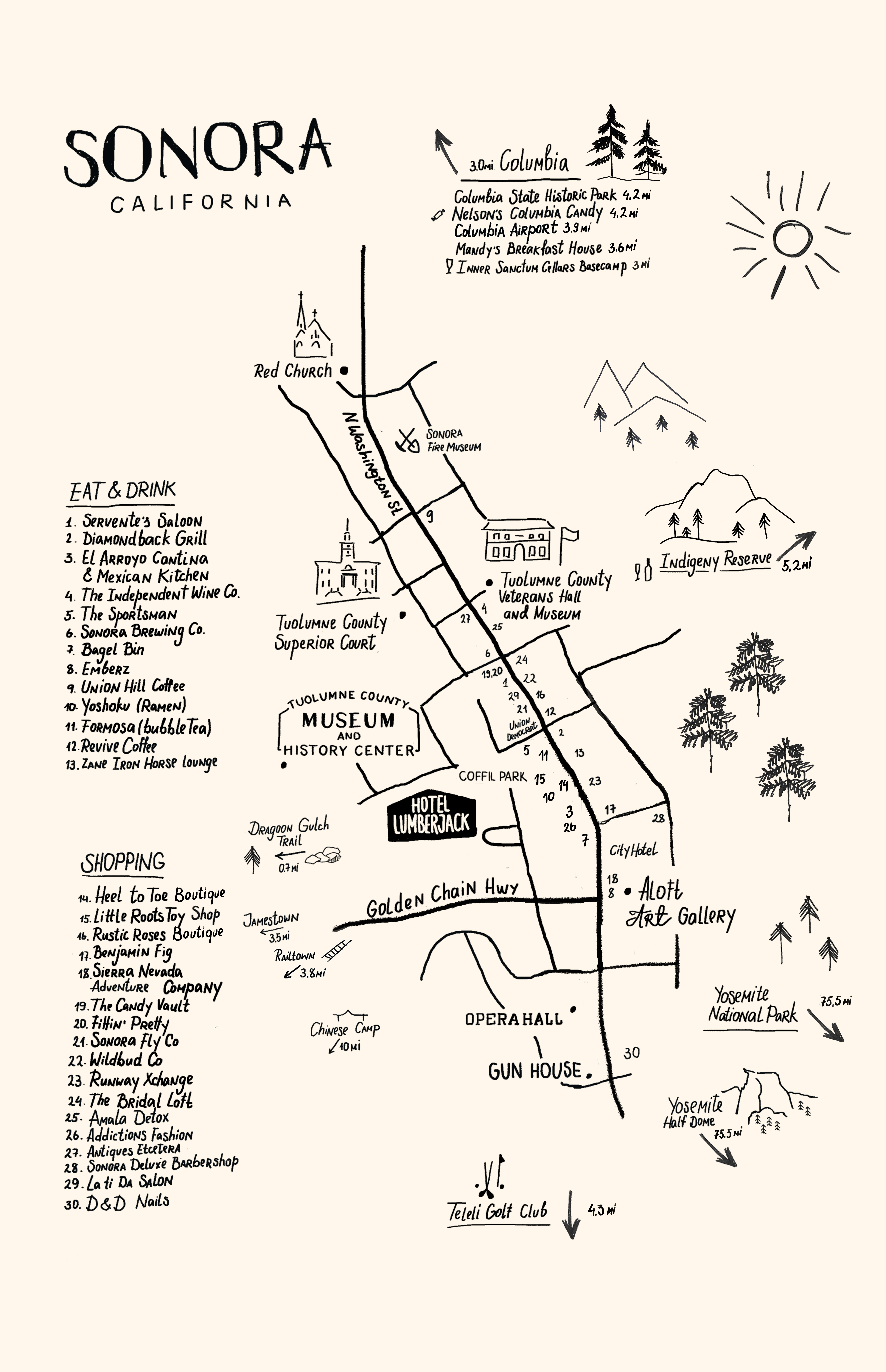
It is created in the main brand colors. We've added clear navigation, Lumberjack artwork, and left a few Easter eggs — like this handy map of Sonora.
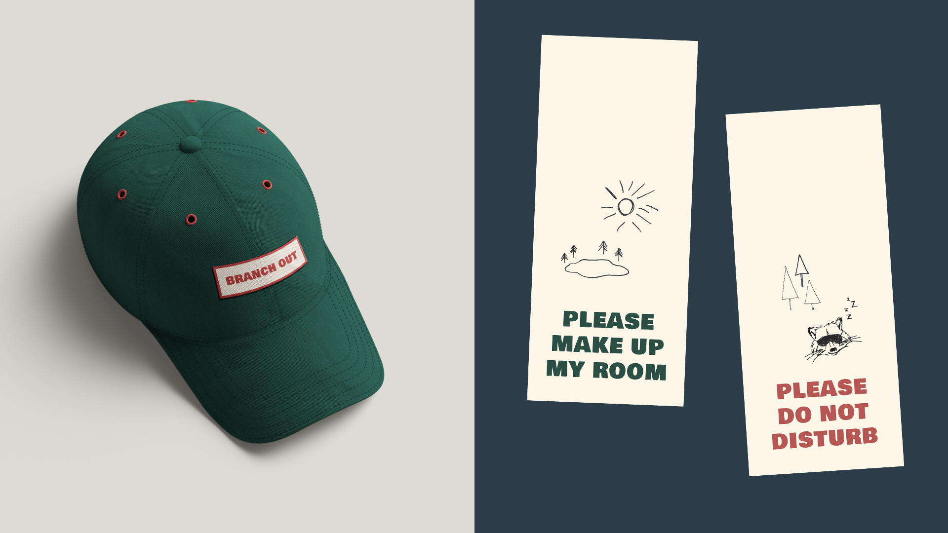
The decoration invented by Lumberjack
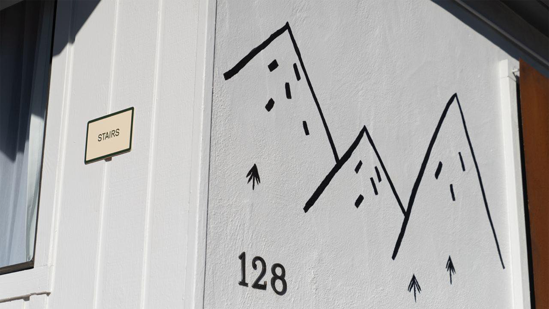
In addition to standard shampoos and stationery, we helped the client decorate the hotel. They thought about what the sign near the door to the room would look like, or explained why an illustration with a raccoon can be hidden near a garbage can.
Together with Balbek Bureau, we transferred our ideas from laptop screens to walls and ceilings.
"We were interested in delving into the life of a small town in California, albeit remotely. Exploring the local culture was the best experience.
The client immediately liked the concept, the legend behind it. I think the identity in general inspired him and breathed new life into the project.
We were interested in implementing all this — from cooperation with the architecture bureau of Slava Balbek to the preparation of various branded elements in the hotel, of which there were quite a few. We are still working with this client on another project.
And one more thing – the client was very supportive at the beginning of the war, he was one of the first who responded," — Alex Twista, Creative director.
Art Director — Yasya Bohdanova
Graphic Designers — Anatoliy Todorov, Lina-Maria Shlapak
Project Managers — Alina Grozdytska, Anna Partyn
Creative Director — Alex Twista
Web Designer — Syoma Mokrov
Frontend — Andriy Kuznetsov
Backend — Petro Shlemko