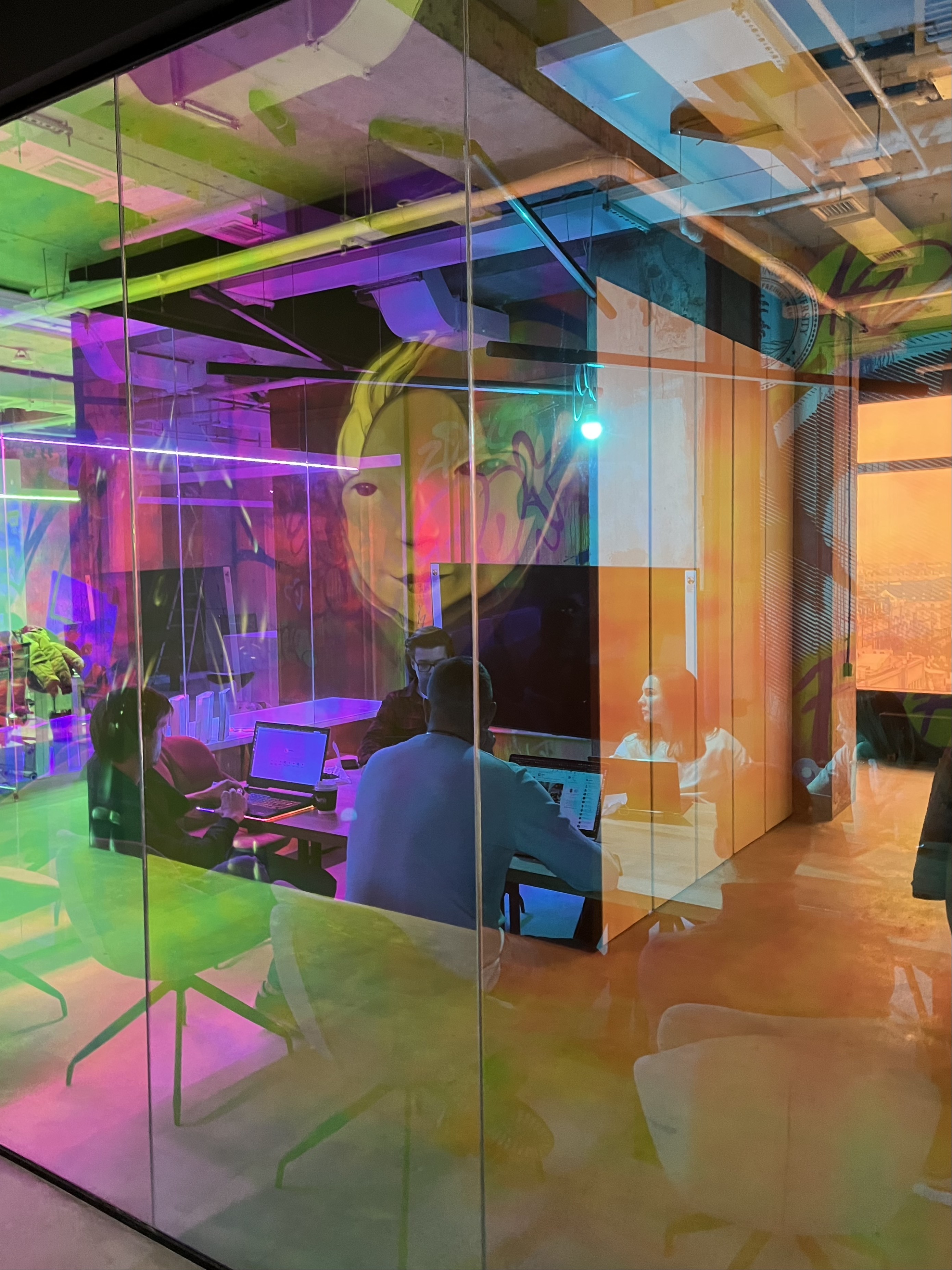
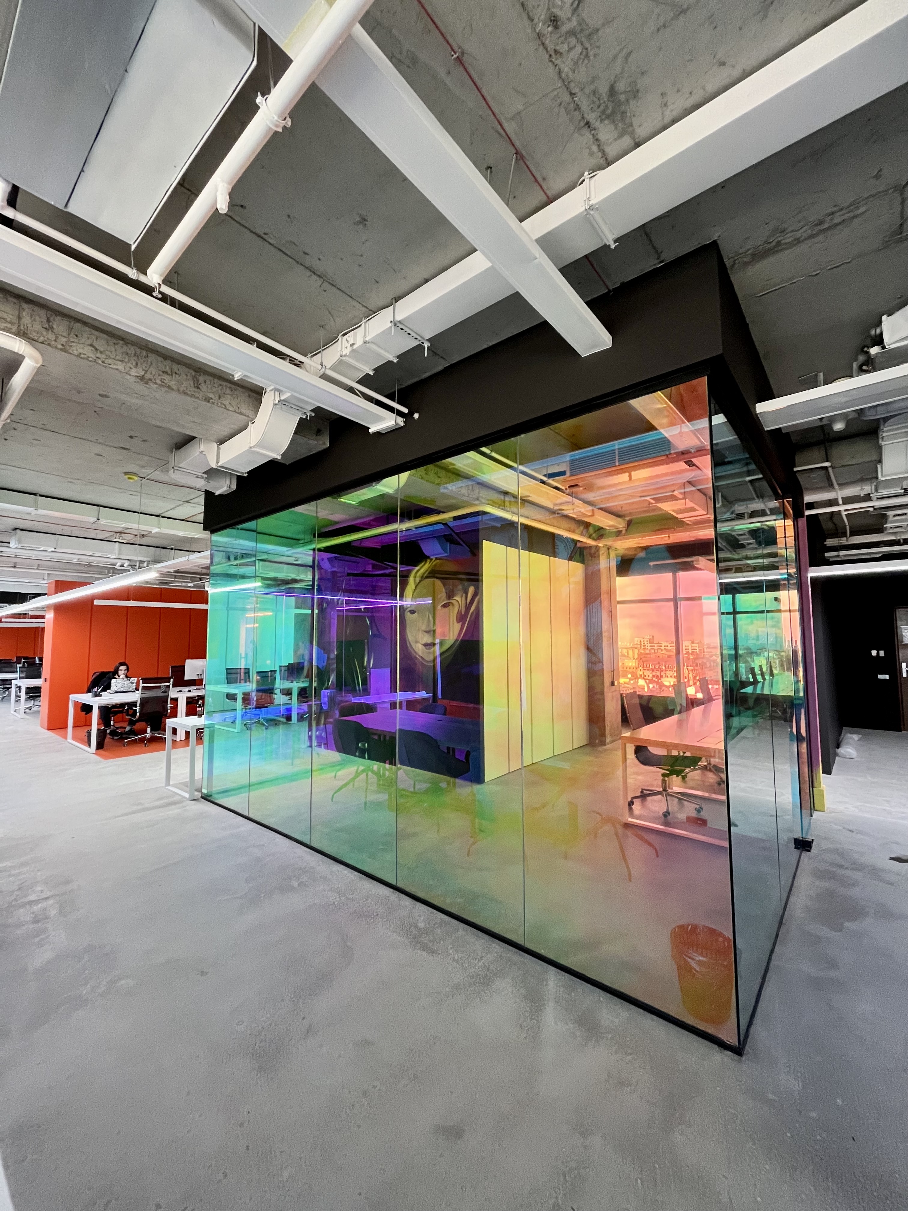
Pawa is an audacious young team that develops machine learning startups and products. Their story began with the big rollout of the Reface app.
The company asked us to help them find their visual identity. So we started with a strategy session with the Pawa team, where we formulated the positioning and outlined the basic principles on which the brand is based.
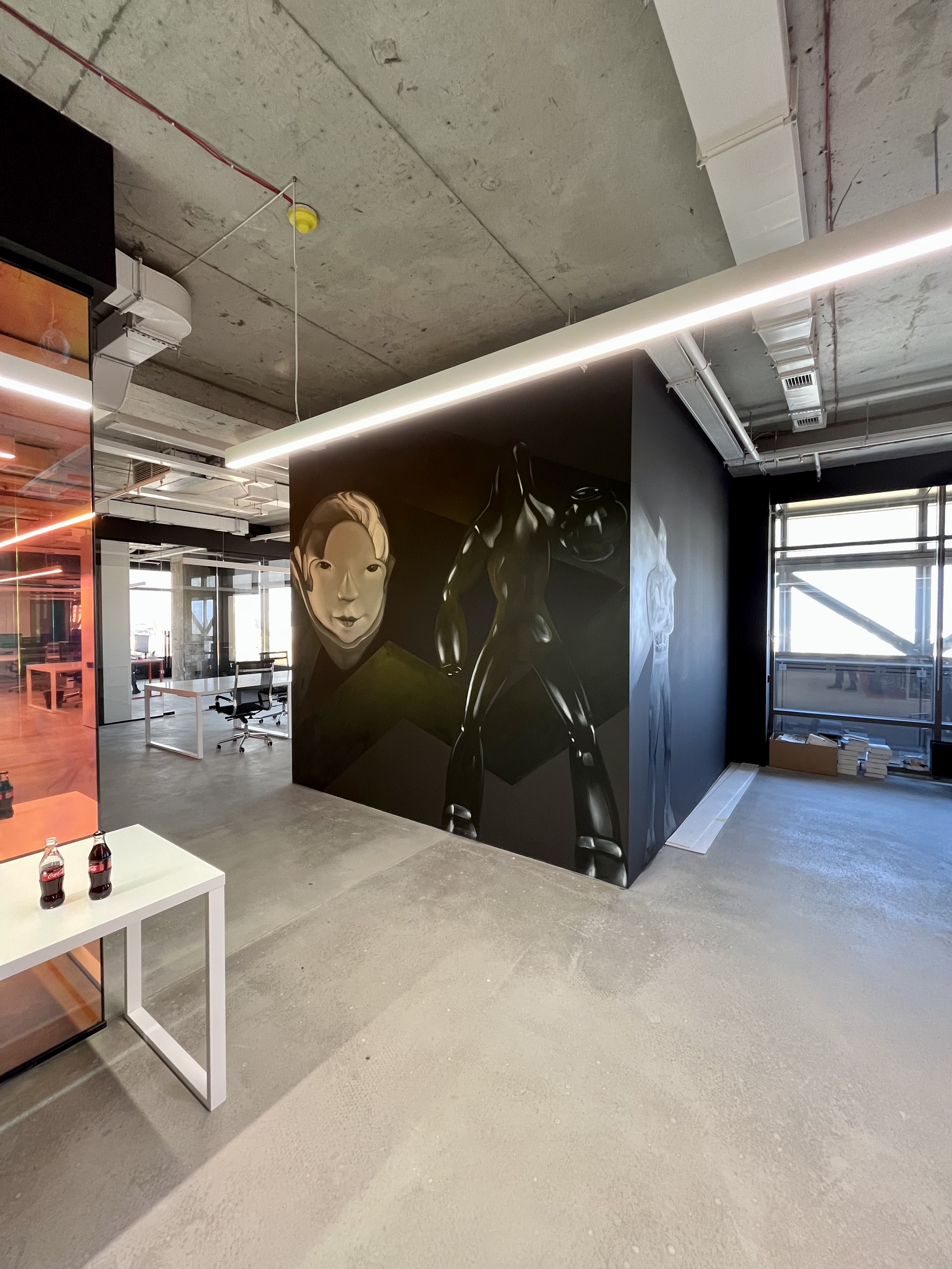
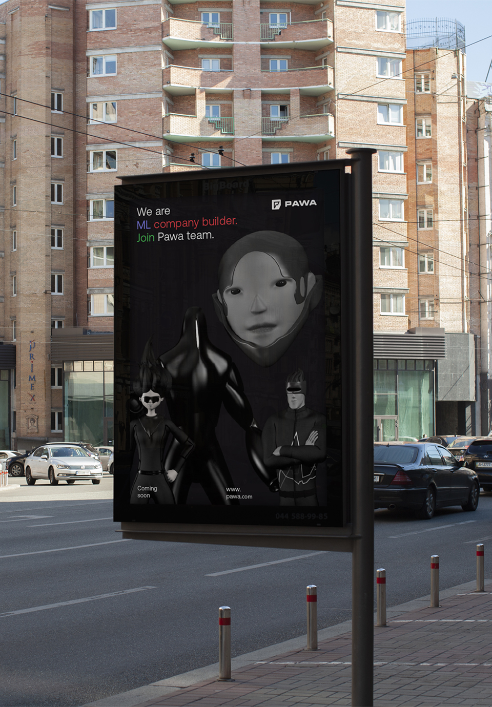
Pawa is all about team players. They provide their partners with the four driving forces that can turn an ML idea into a successful product. This is what we based their brand identity on: four heroes representing Growth, Machine Learning, Investment, and Product.
Together they are the Pawa team — a massive energy boost that helped an idea become a significant market player.
Have you seen any other venture capital business with a mascot identity? We surely have not!
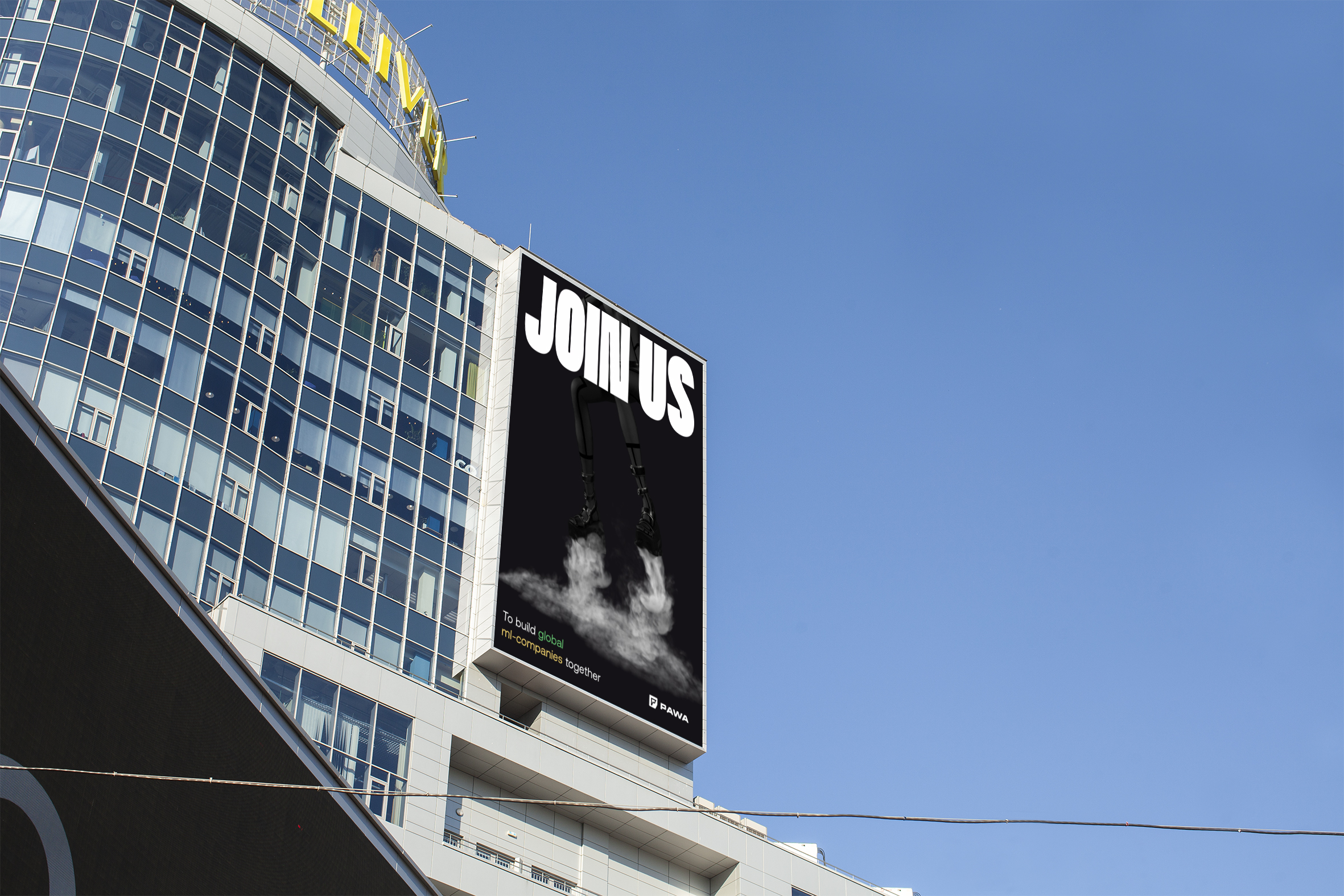
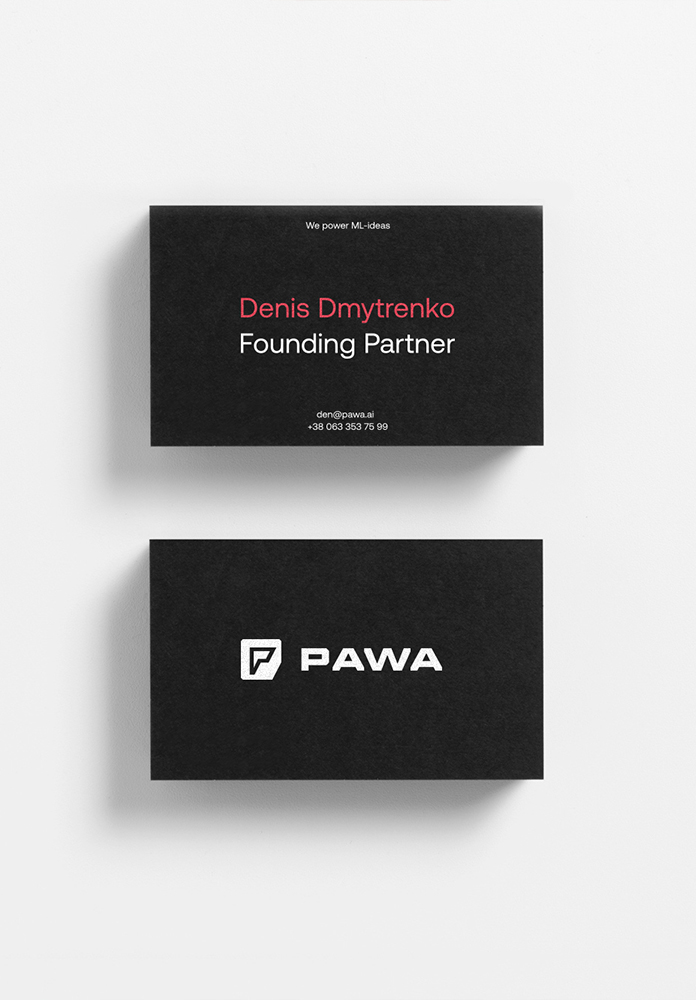
The logo is not just a label in our case. This is a symbol that superheroes can wear on their chests! Each shape reflects their essence — the driving energy. This is how its shape forms the first letter of the Pawa name.
All the accompanying elements of the identity enhance the image of our heroes, portraying them as strong, eye-catching, and superhuman. As a result, we have a system where the distinctive handling of fonts and colours can act as a self-sufficient manifestation of the identity, while the characters can also be used individually, depending on the context.
To gather all the elements into a single composition, we use a simple grid to divide the layout into equal parts.
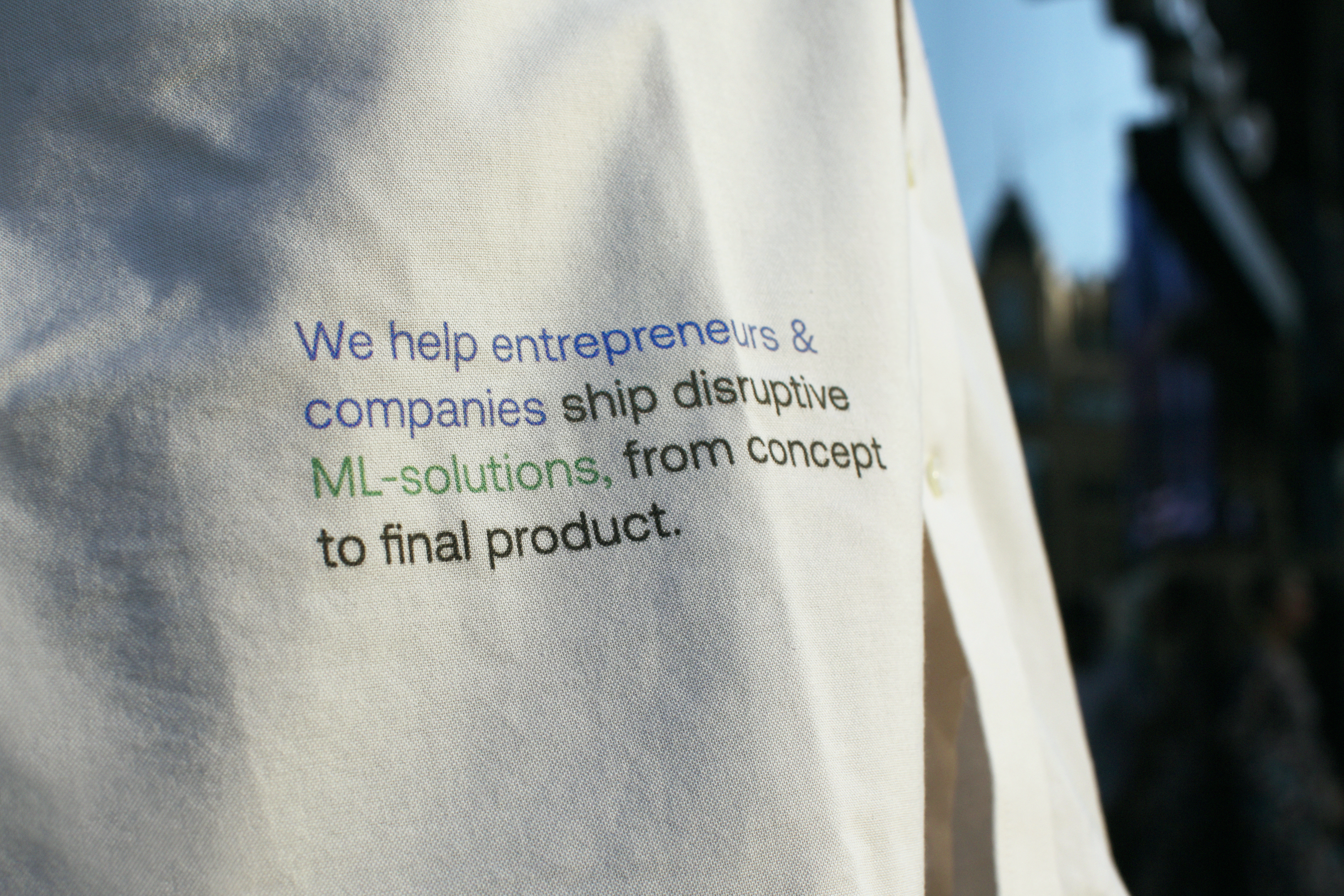
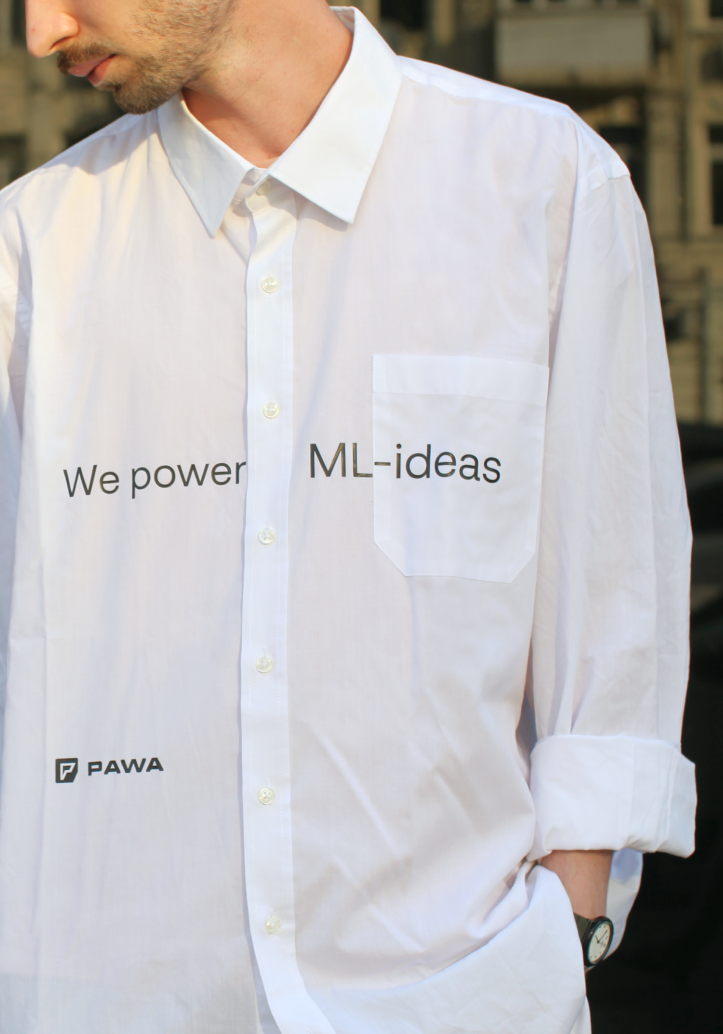
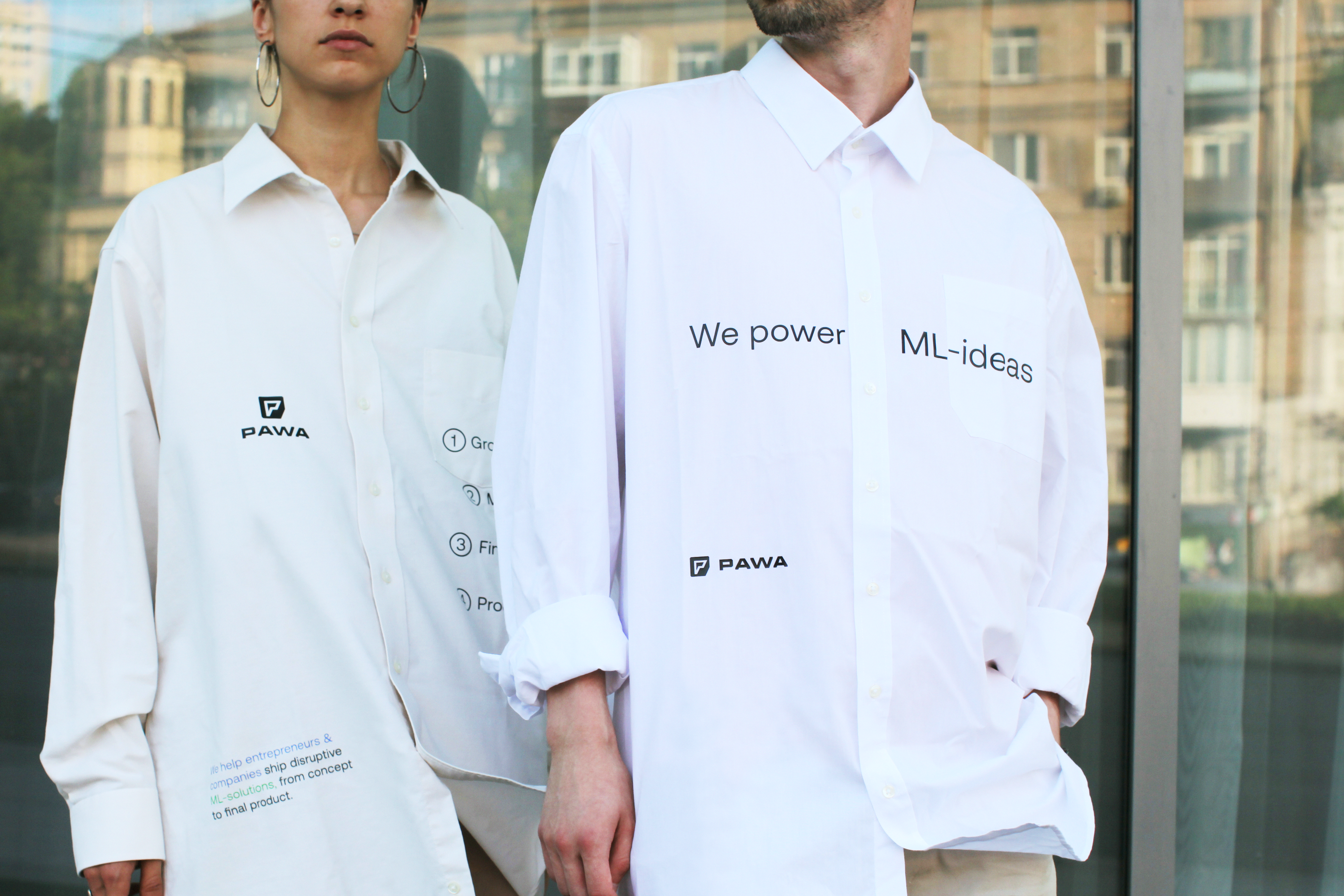
Our typography is based on a massive font inspired by titles from superhero posters, comics, and art. We paired it with a quiet, multifunctional grotesque.
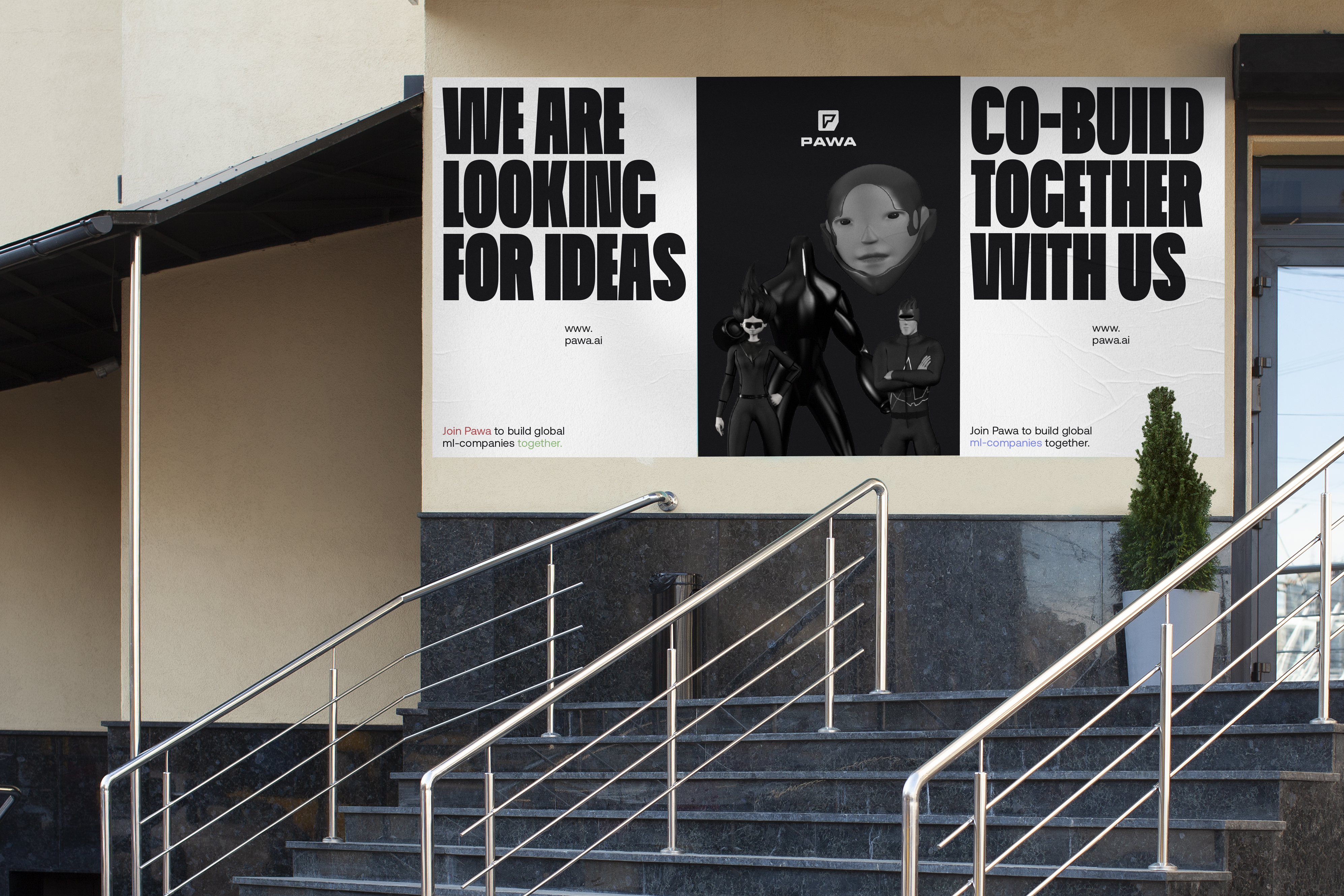
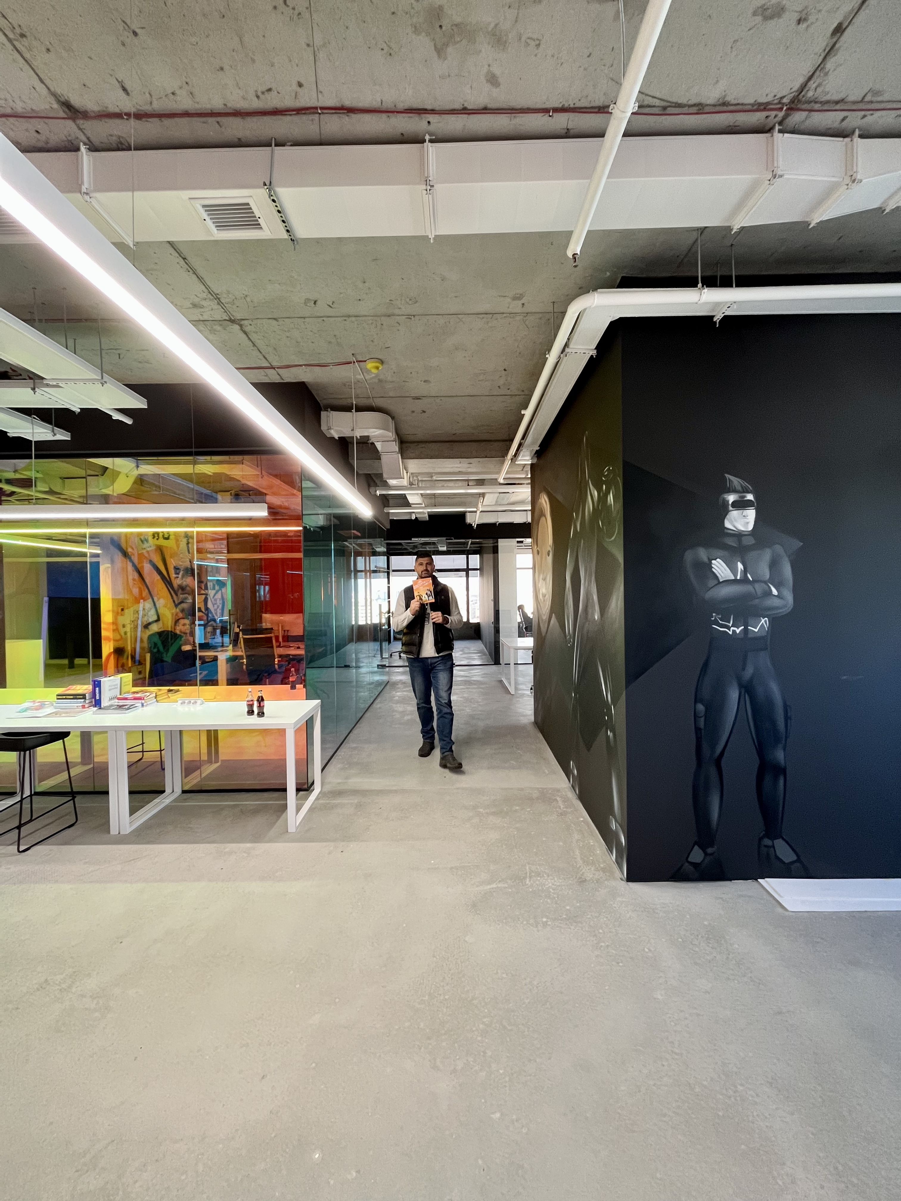
Have you noticed that our heroes are monochromatic? Our goal was not to make them cute. On the contrary, their appearance conveys a certain mystery and a bit of belligerence!
We chose graphite grey and white to complement the heroes’ dark design. We used four additional colours to highlight individual words or text blocks.