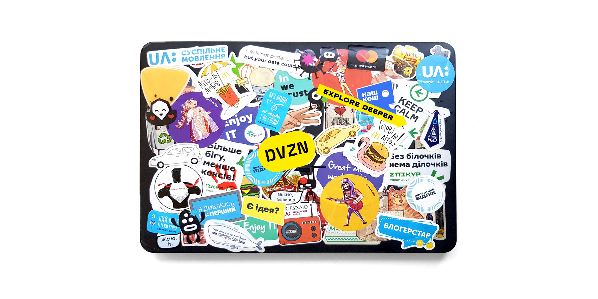
DVZN is an agency that offers business development services. As a separate unit, DVZN specialists can join any business to find its weaknesses and make improvements.
Their expertise and interest areas are in business development, crisis management, digitalization, configuration and optimization of operations, market strategy development and implementation.
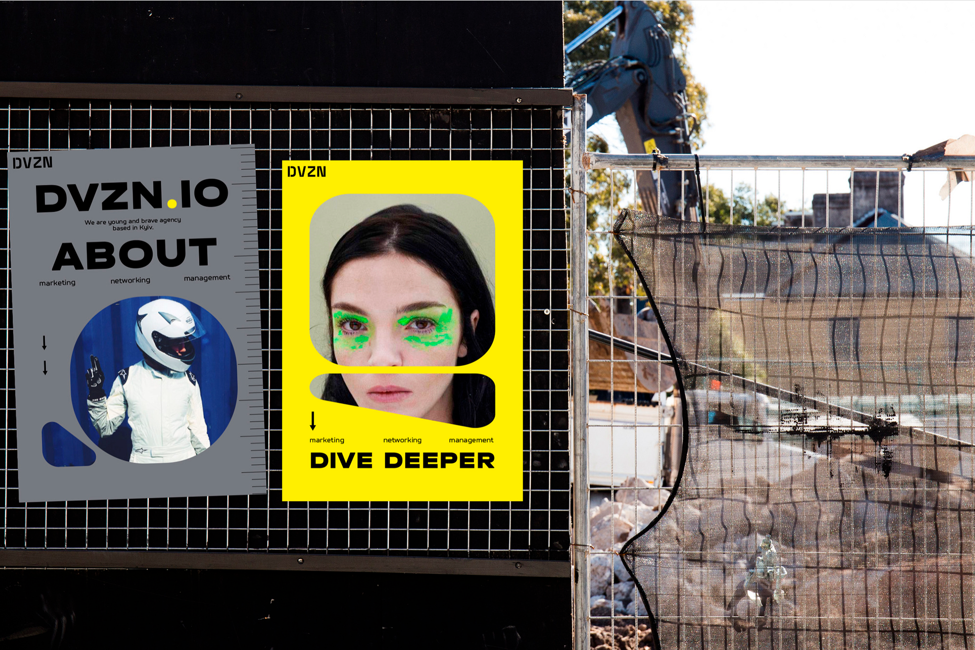
Our task was to create DVZN identity that would be the good kind of concise and simple to use. It was also key that agency identity represented the work, the people that do the work, and the philosophy of the people that do the work.
We've decided to compare DVZN's unique ability to immerse themselves deeply into any business to a submarine, the fearless researcher of the underwater world Jacques-Yves Cousteau, who was literally feeling his way through the deep dark ocean one step at a time. Thus, the concept was born.
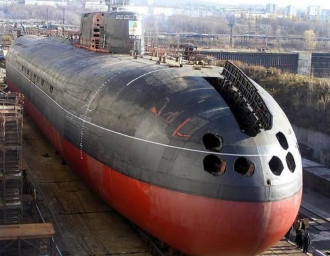
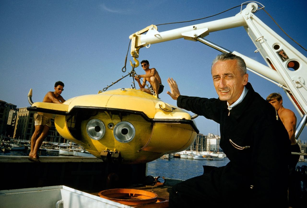

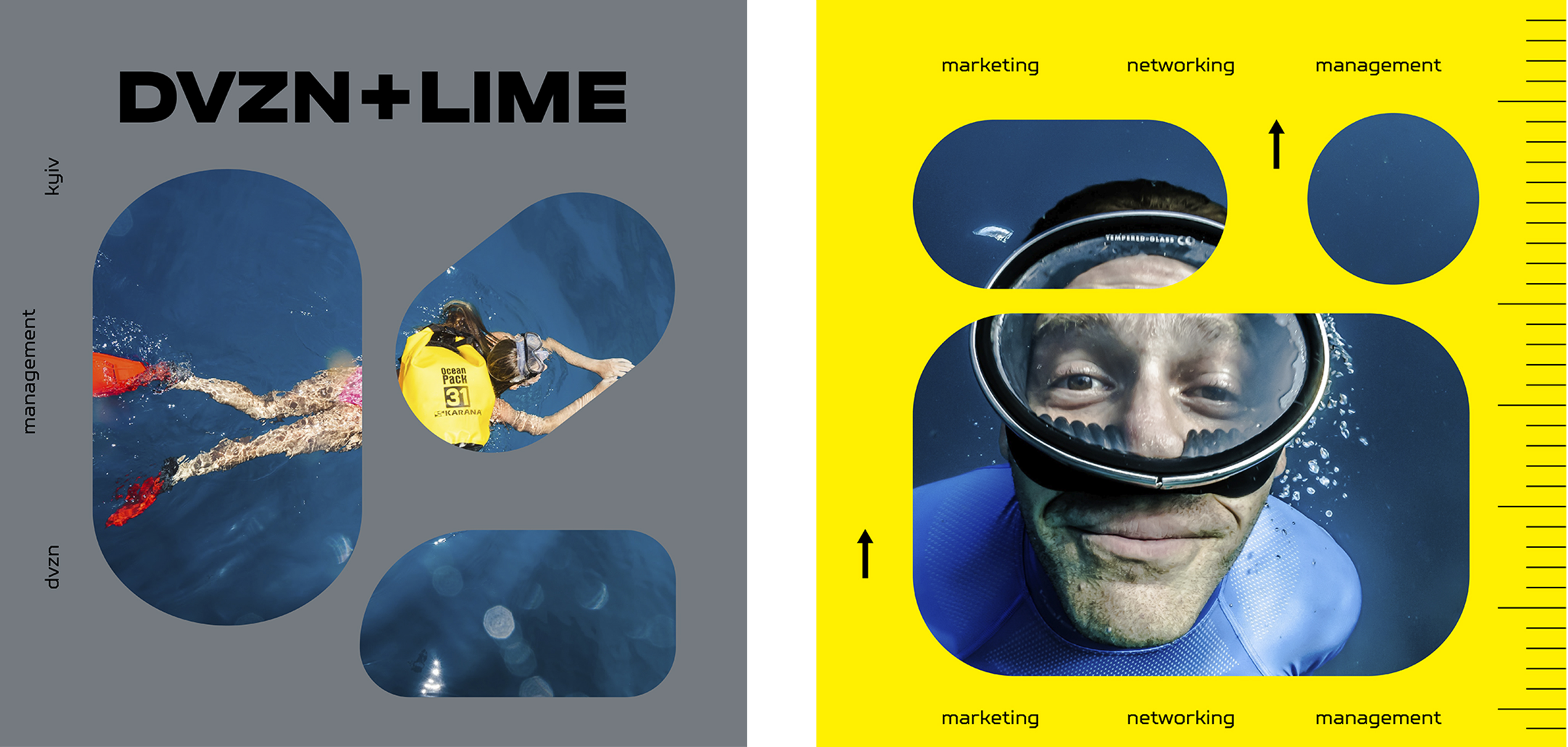
The aesthetics of submersible ships and underwater voyages inspired us to use the most striking images from this theme in DVZN identity.
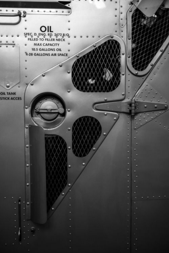
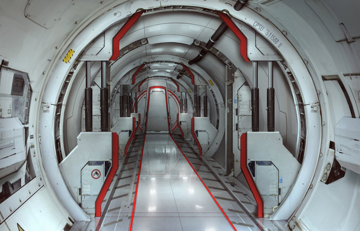
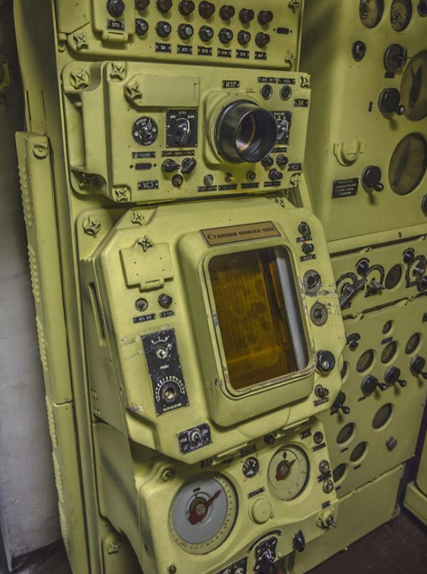
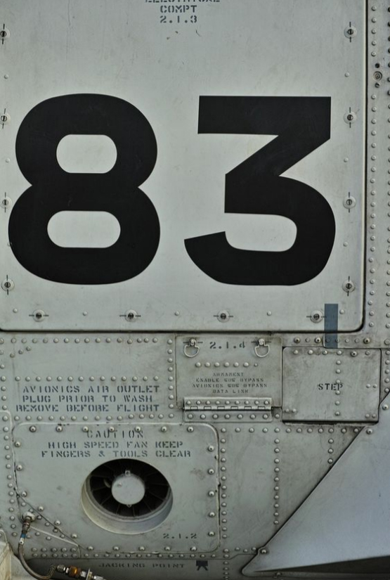
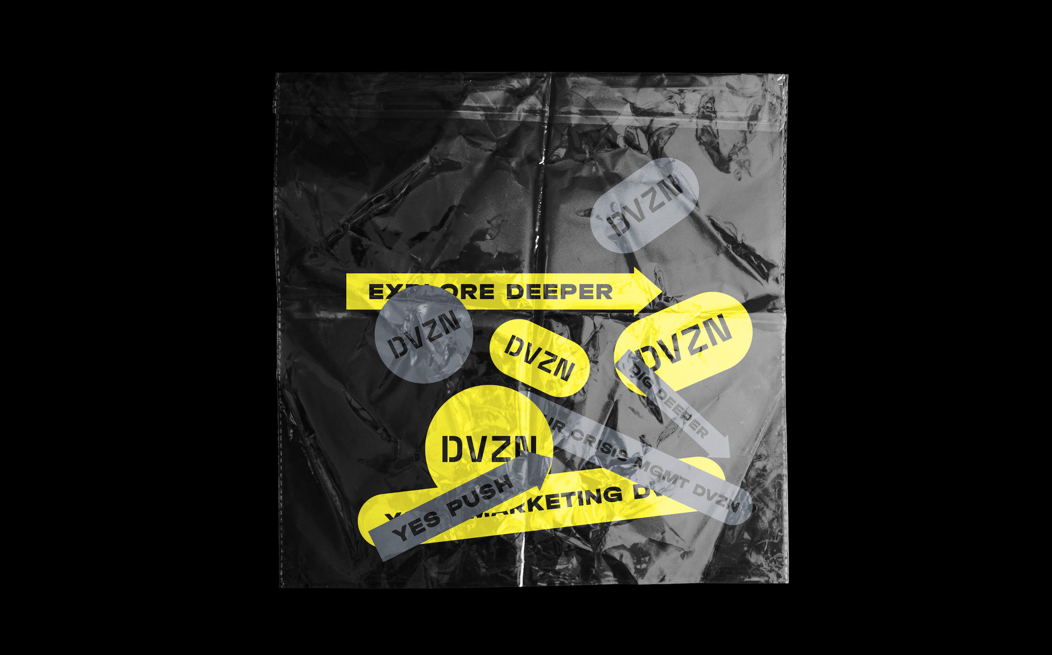
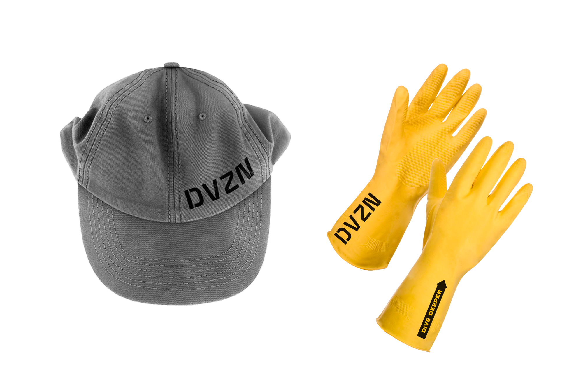
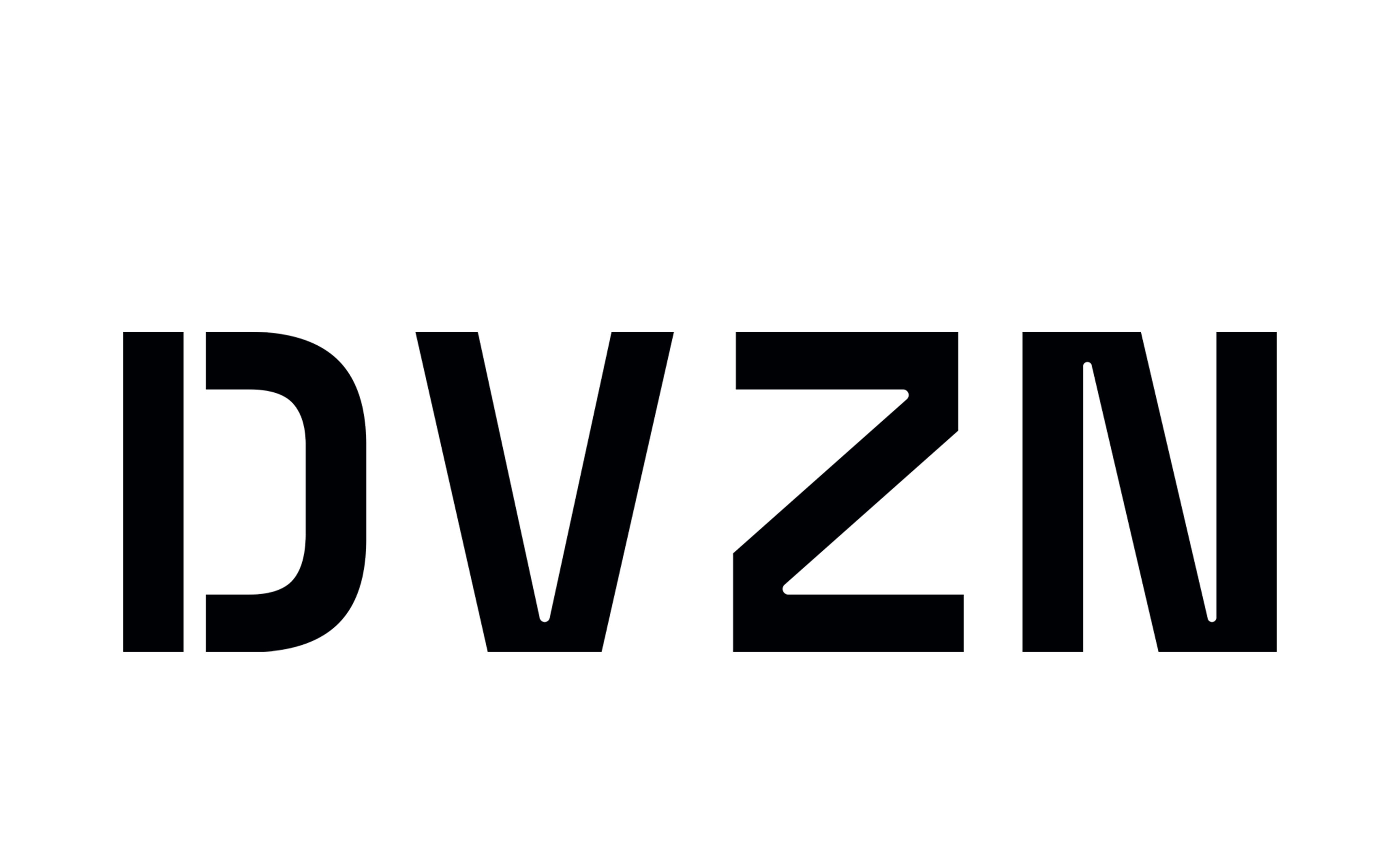
DVZN logo was also created under the influence of "underwater aesthetics". We've noticed that technical information about the ship is painted directly on its walls using a stencil. For DVZN logo we used the same principle adding styled spaces inside letters as if they were painted through a stencil.
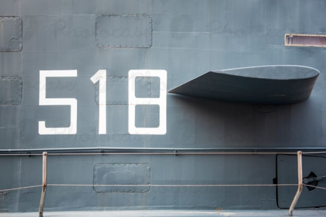
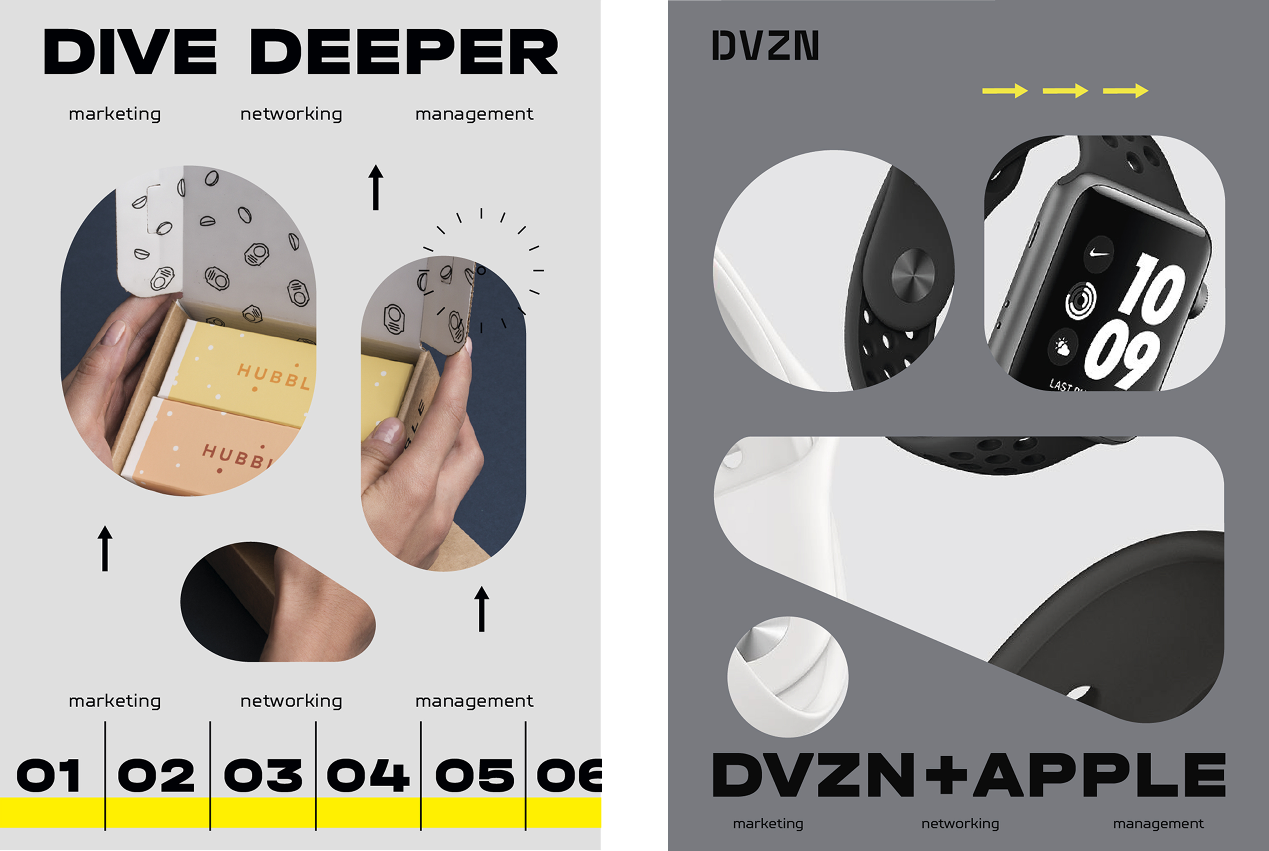
The feeling and build of typography were borrowed from submarine infographics. We've noticed that industrial typography has its own rules: center alignment, rough fonts, sans serif typefaces — all for the ease and convenience of painting. So for the heading we chose the Halvar Breitschrift font — a pragmatic grotesque with the raw charm of an engineer. It manifests itself in bulky proportions and constructed forms. For the body text, we used TT Squares. Despite being rather geometrical, it has great readability and is perfect for short inscriptions and long text blocks.

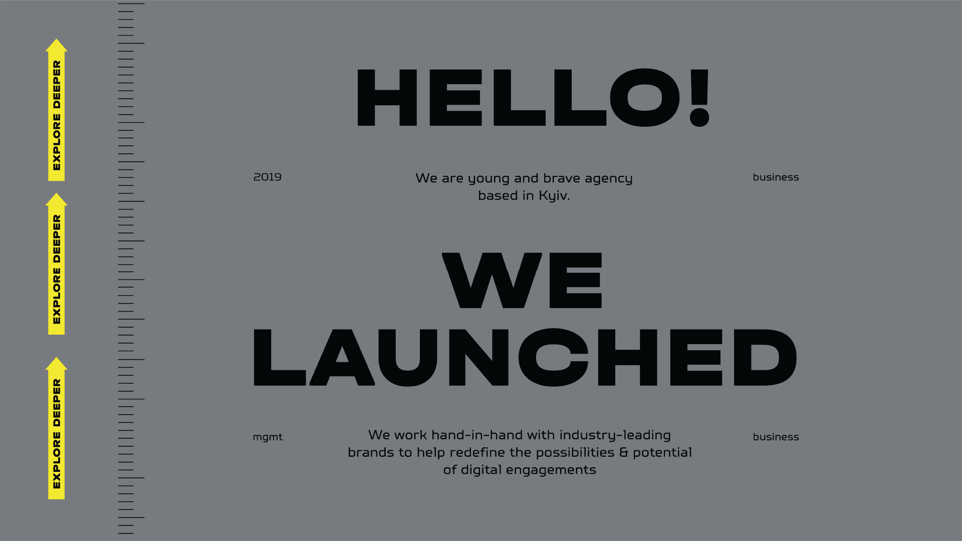
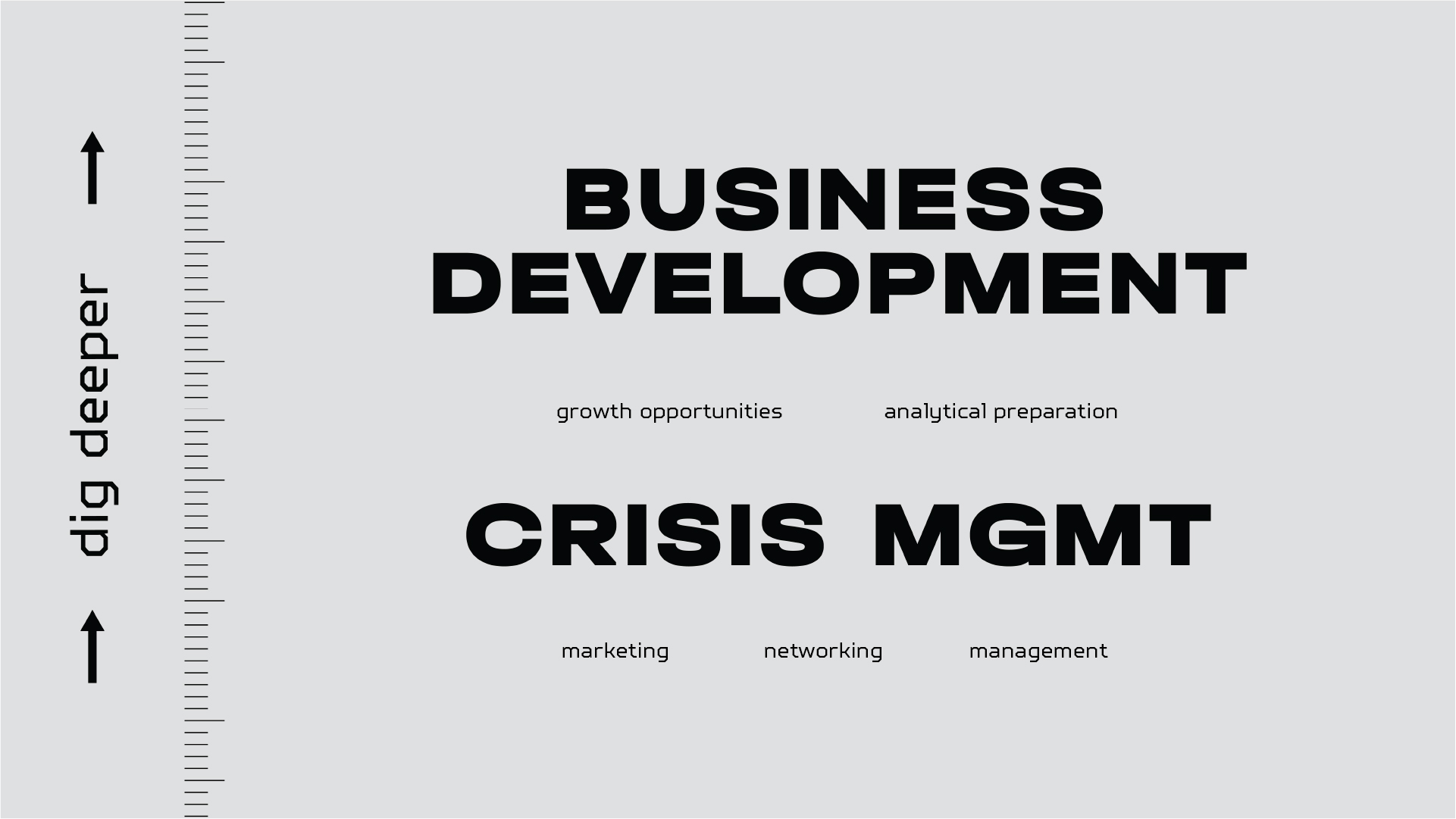
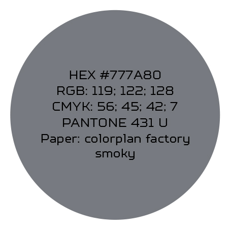
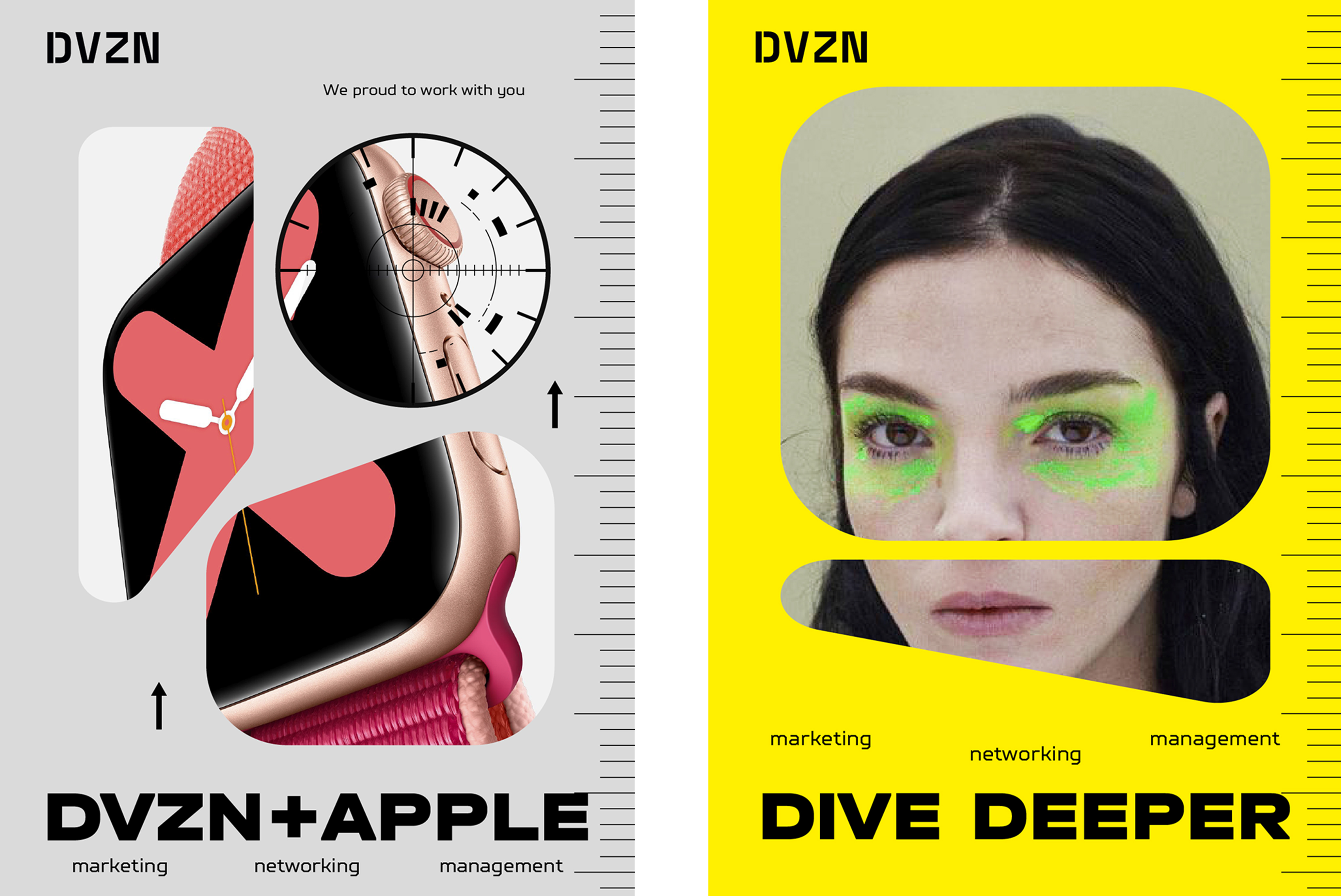
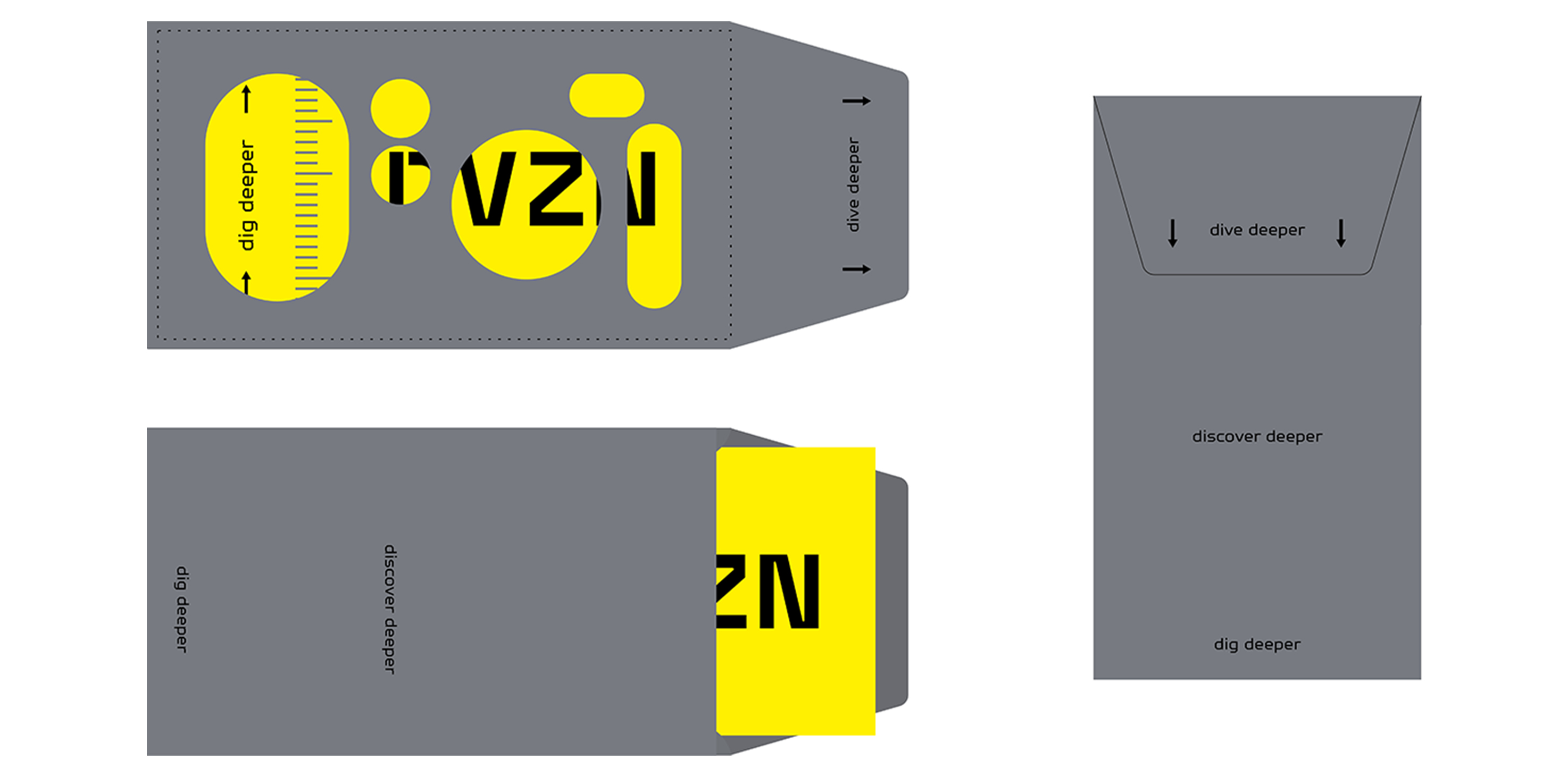
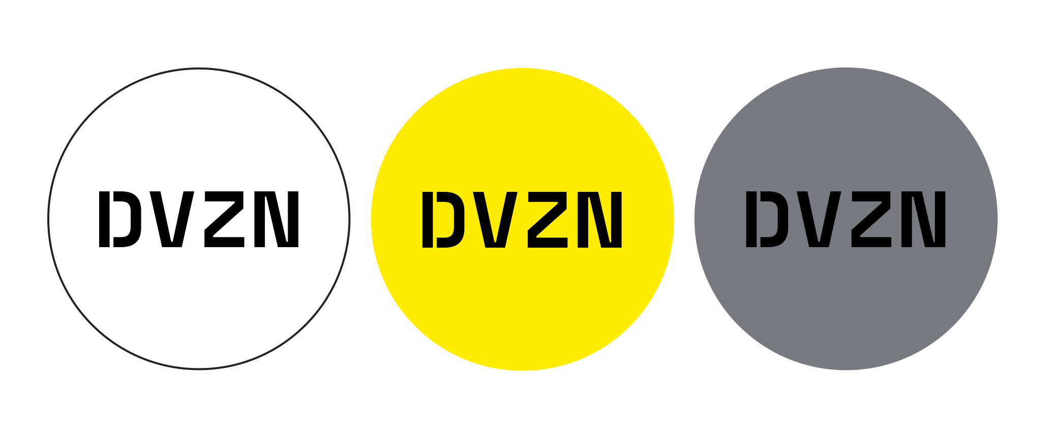
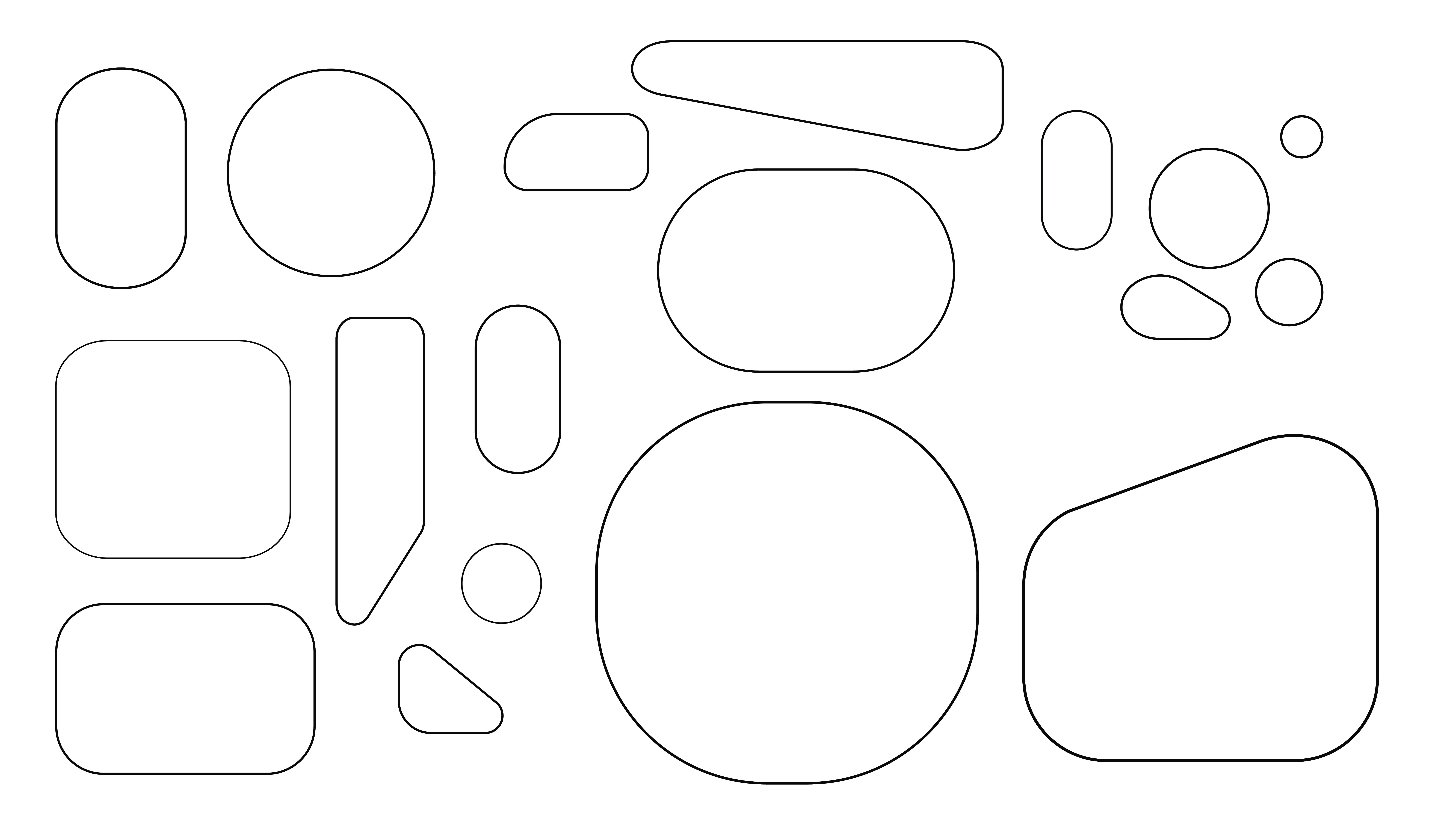
Hatches, viewports, doors, corridors — the entire submarine geometry is based on rounded corners. For DVZN visual communications we also used rounded shapes, while the bright yellow color was set aside for special highlights.
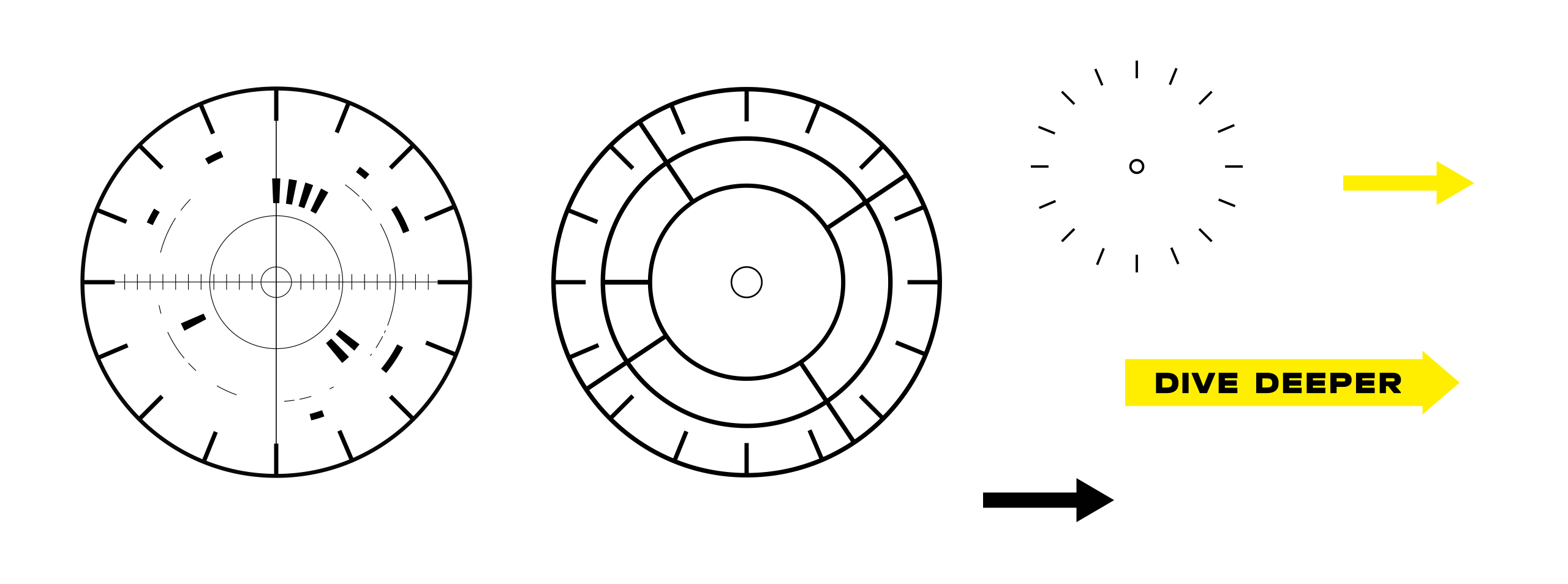
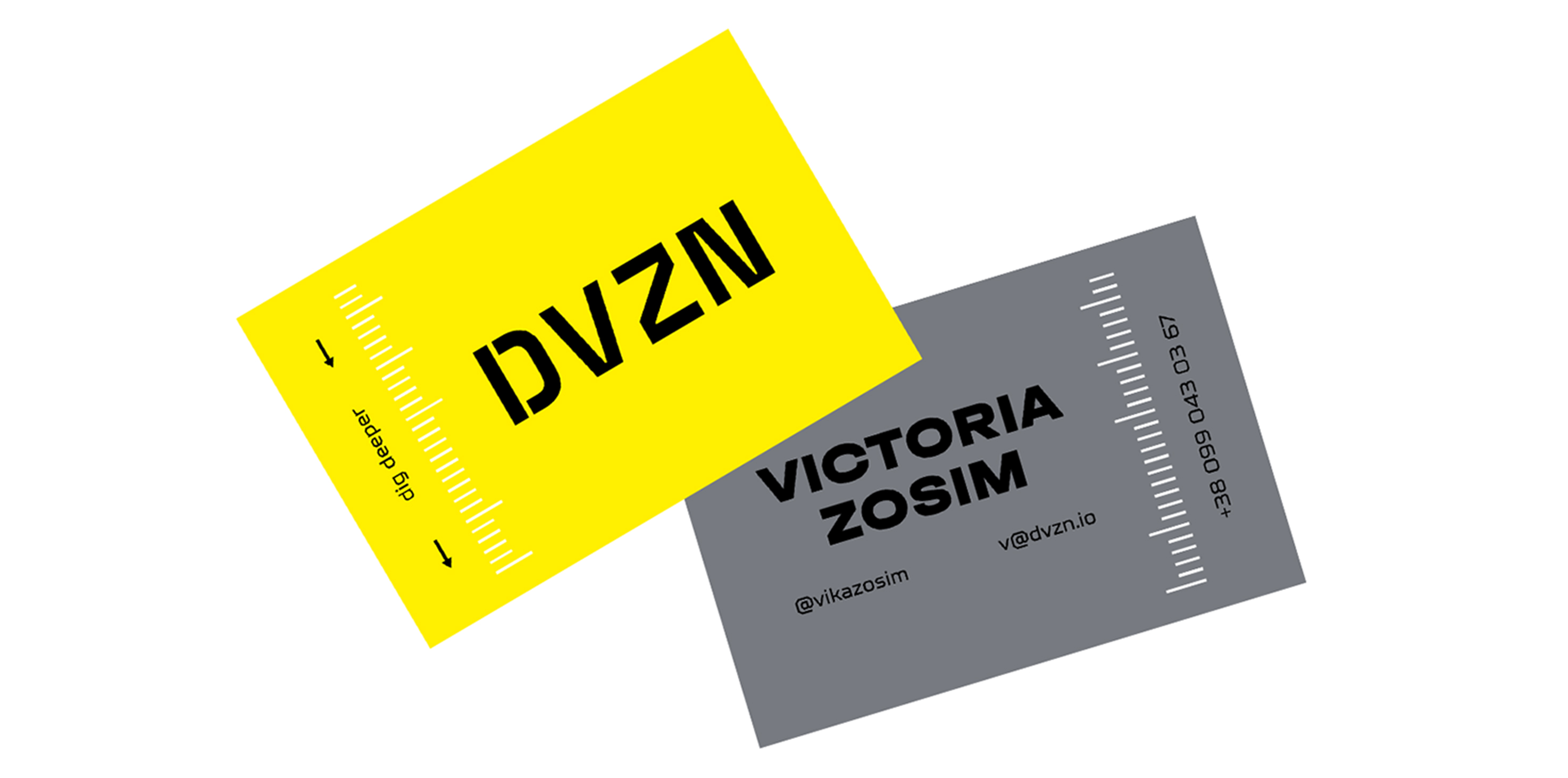
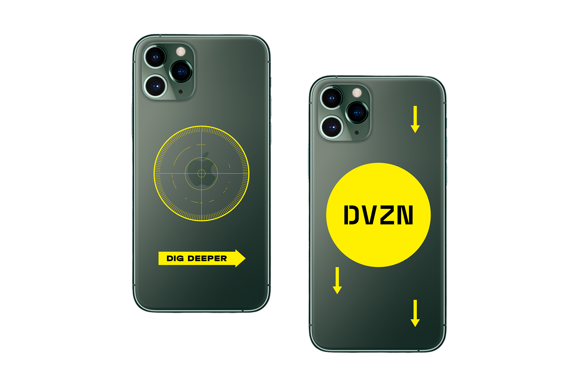
We've also added a bit of fun in the form of small design elements like arrows, gauges and measuring bars to enhance the overall style.

В качестве дополнительных элементов оформления и просто для красоты выбрали мелкие элементы типа стрелок, датчиков, измерительных линеек.
