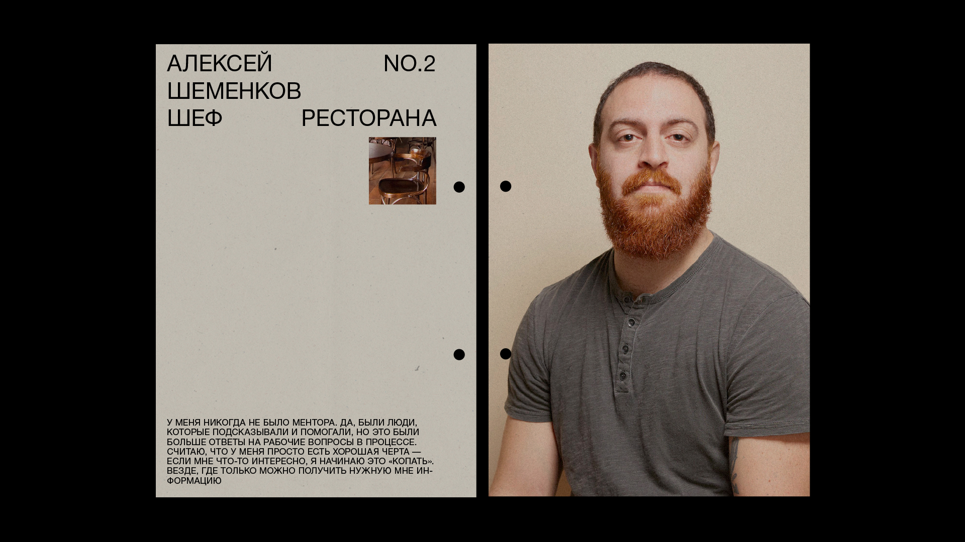
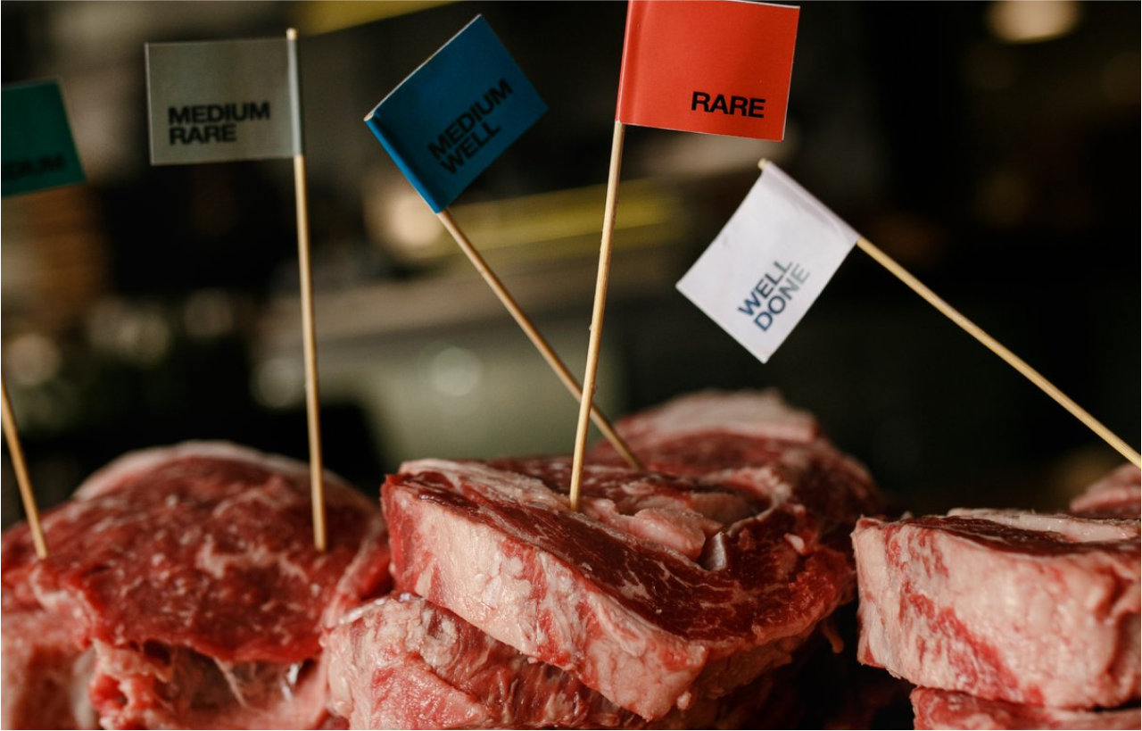
BEEF is a 10-year-old restaurant. We can confidently say that this is the main meat restaurant in Ukraine. Our task was to rebrand it in order to refresh and make the image of the restaurant more relevant. Make it more open to help attract a new audience, but stay close to the regular customers, of whom BEEF really has a lot. In addition, it was important to create tools for active digital communication.
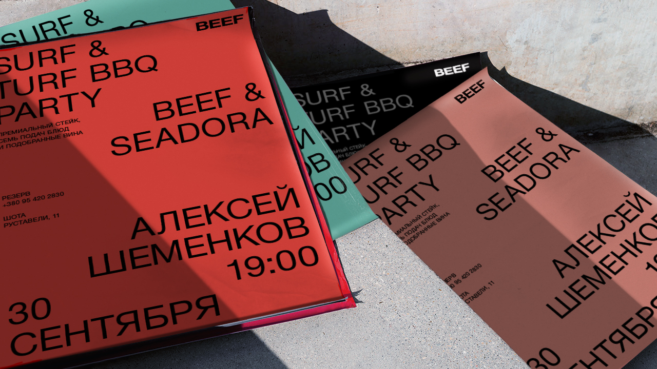
We started with the brand name, removing the descriptor "Meat and Wine", which was perceived by many as the main name. Our logo is confident and minimalist. There is nothing superfluous in it, no clarifications and decorations. It is about focusing on the essence and thus sets the tone for the whole identity.
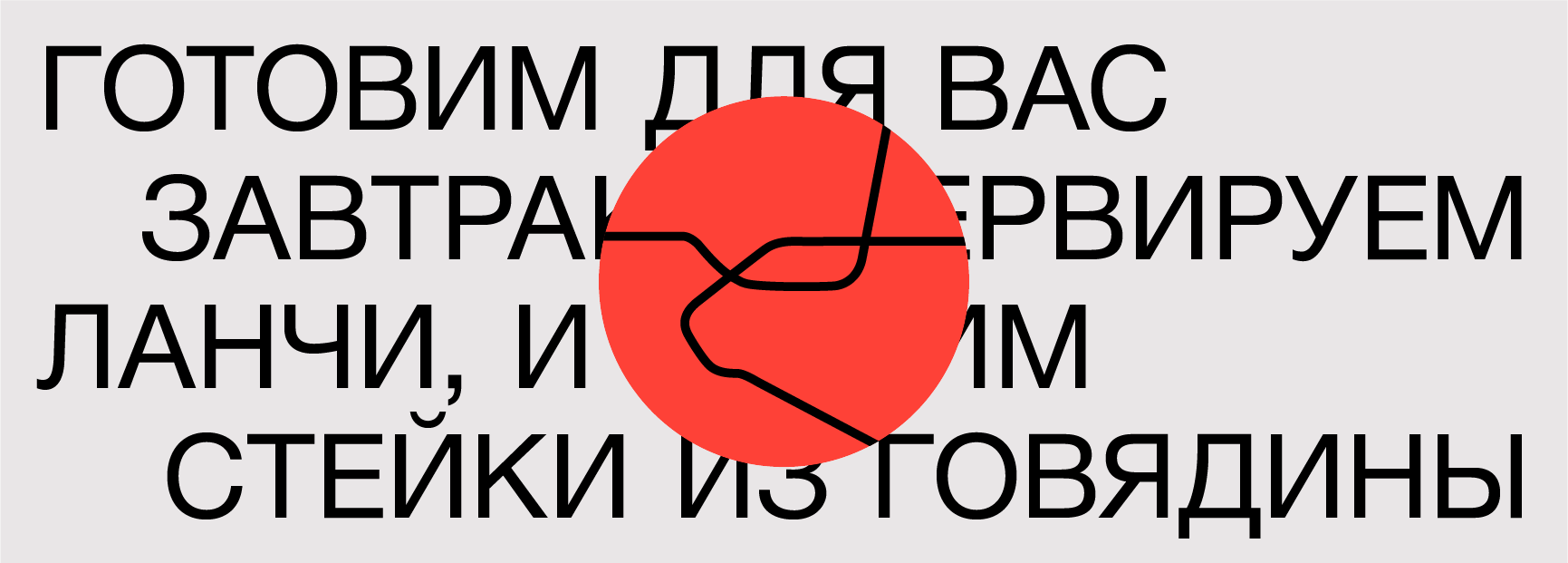
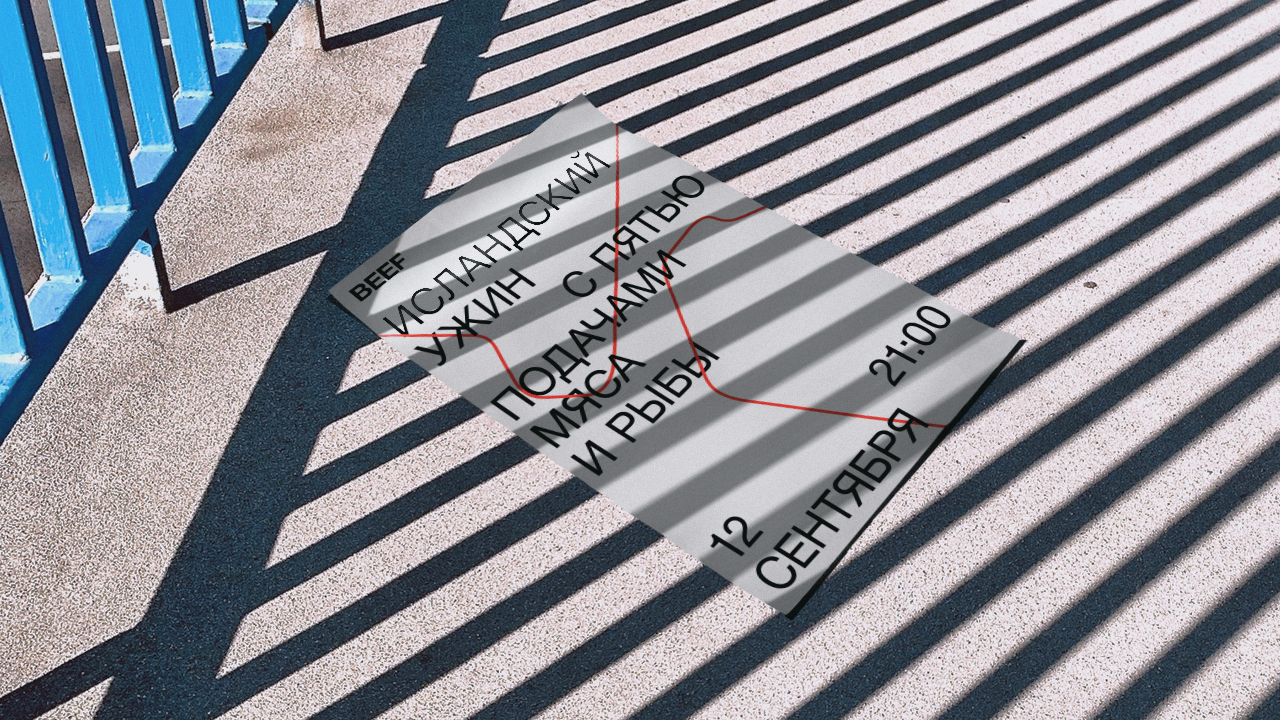
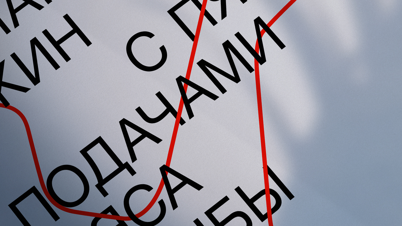
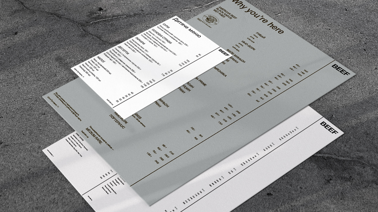
BEEF Identity is a combination of restrained typography based on Helvetica Neue font and line graphics. Typography is responsible for straightforwardness and minimalism, and lines – for the recognizable art component of the restaurant.
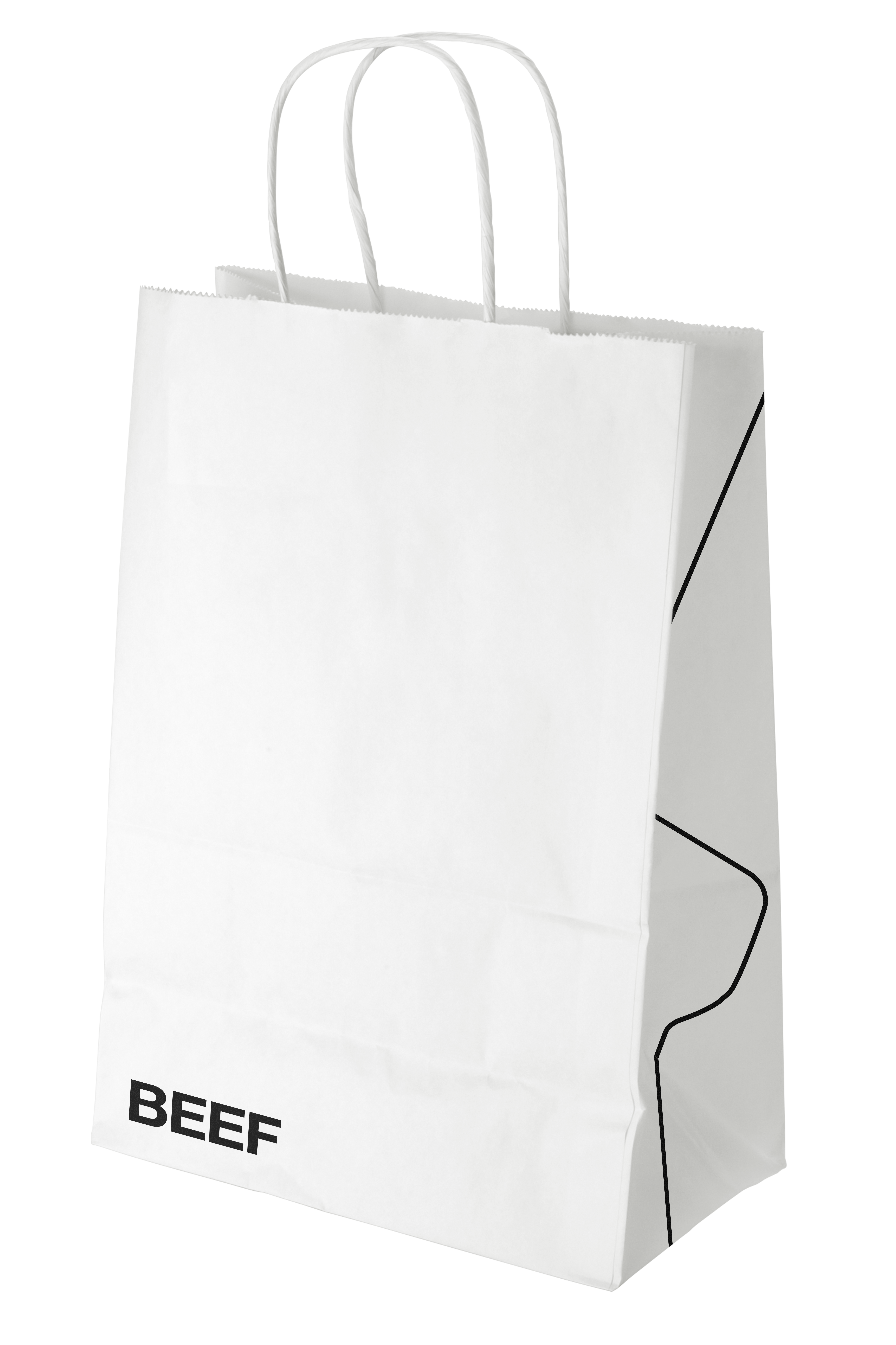
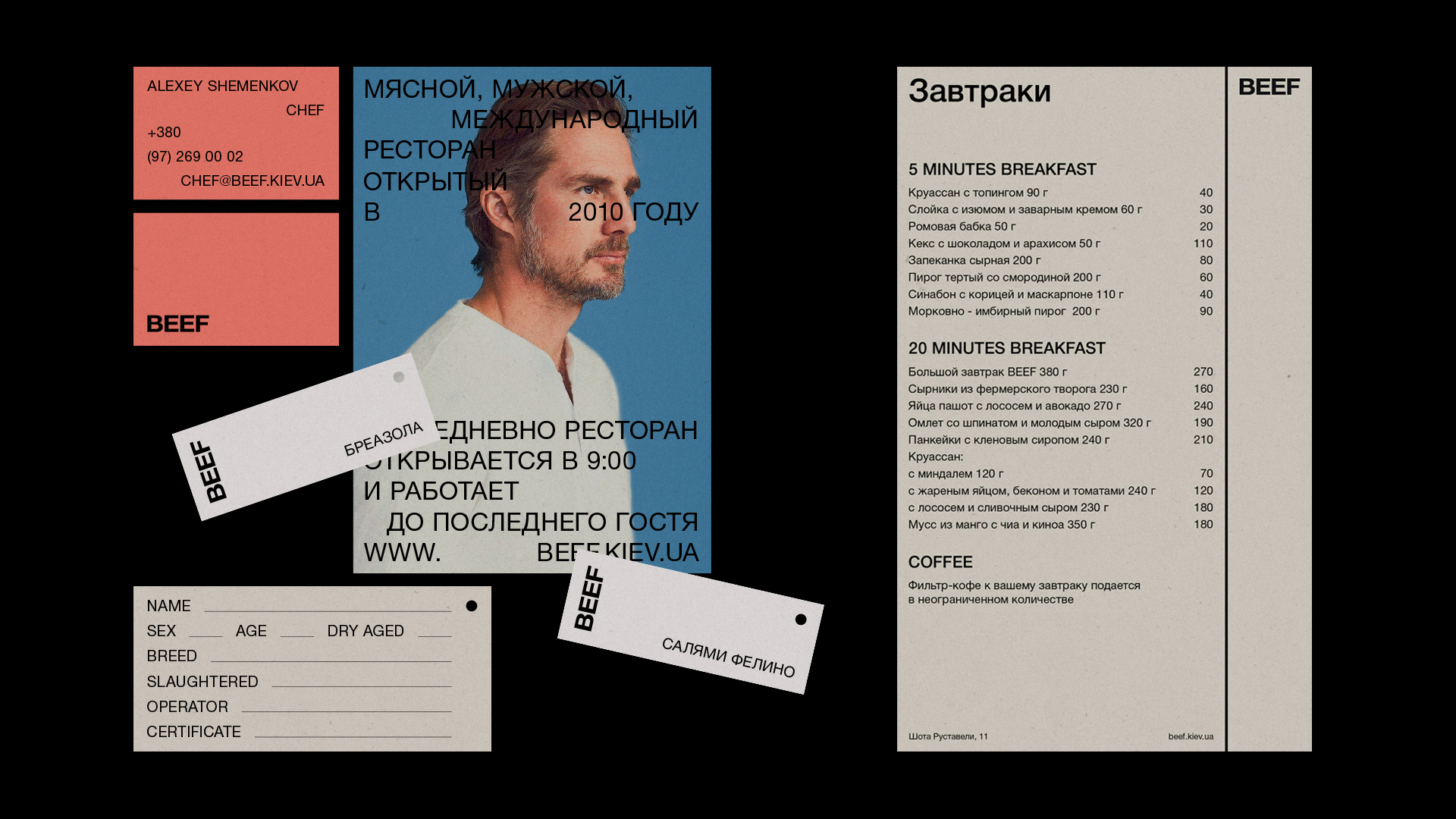
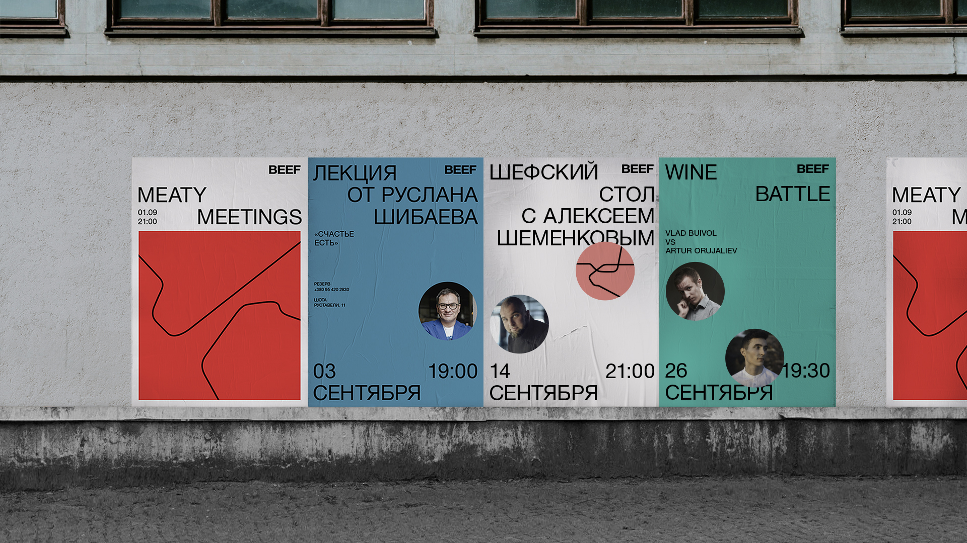
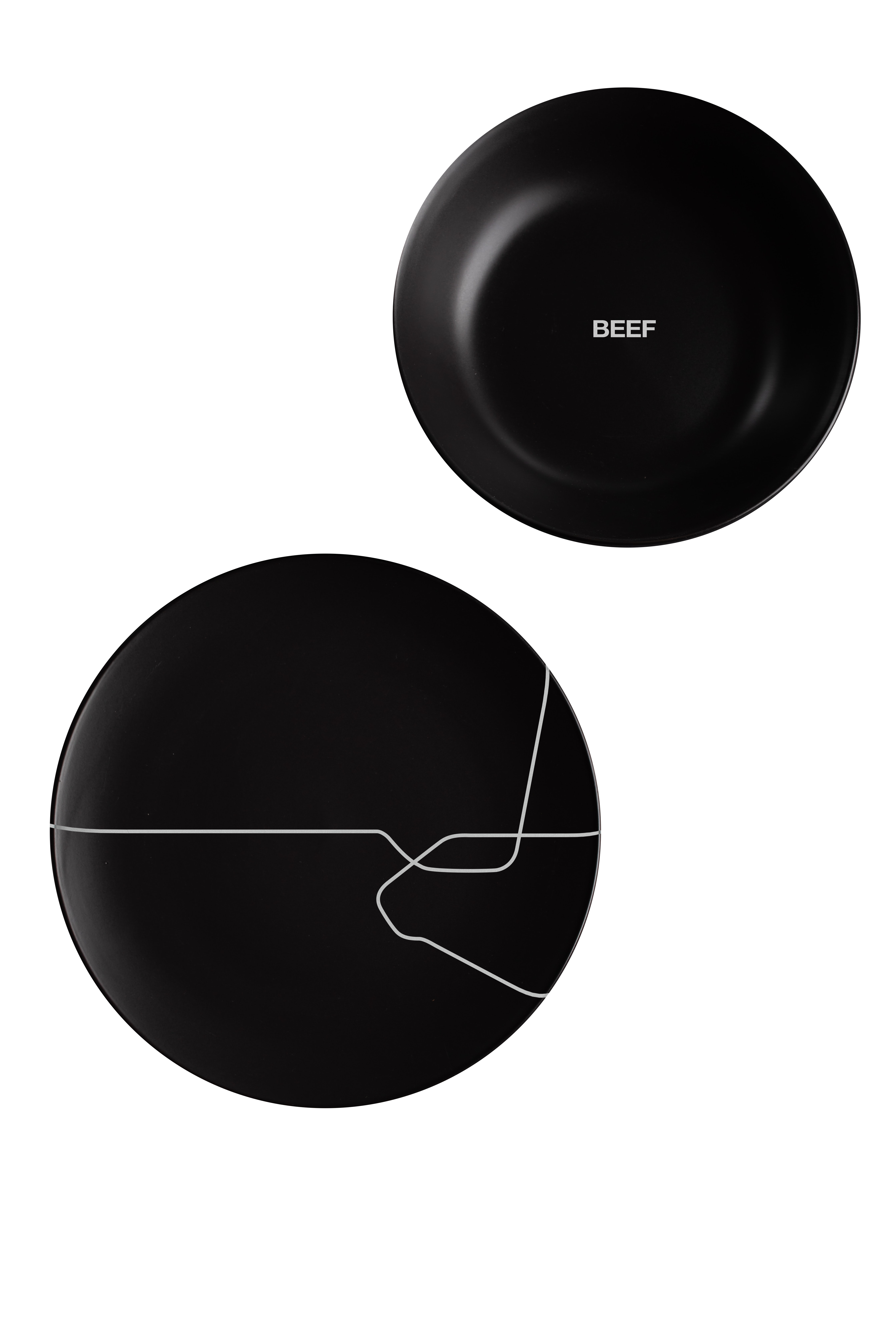
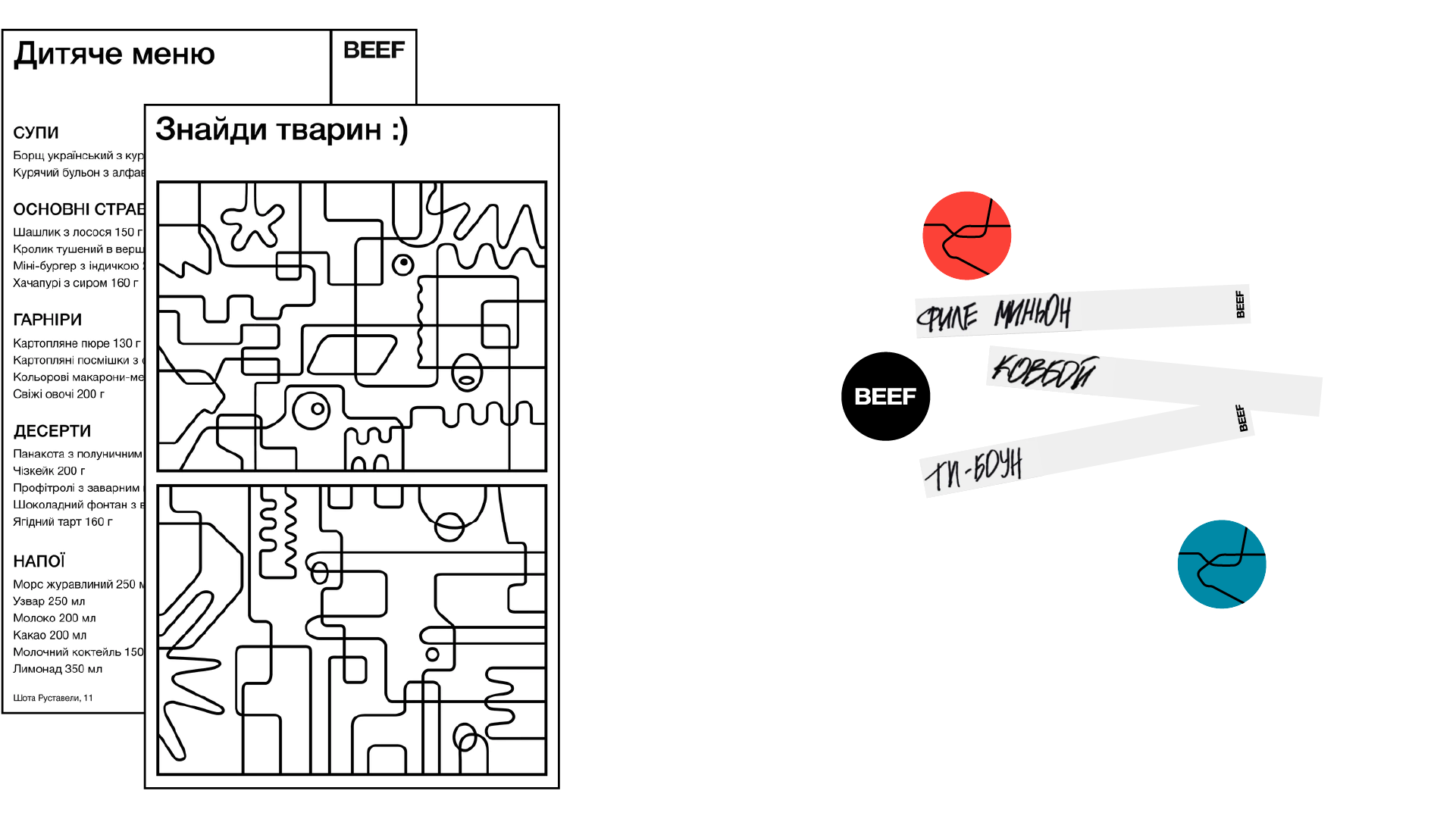
The new BEEF symbol is a bull's head formed of lines. Lines that originate from a trademark make up a graphic. They can work as illustrations as well as functionally as separators.
