RED BEE — це рекламна агенція з Лондона і наші твіни, з якими ми й запустили проєкт Twinning. Нашим першим спільним проєктом стала розробка дизайн-системи для їх агенції. RED BEE спеціалізуються на роботі з броадкастерами та загалом інтертеймент сферою.
The crux of this project lies in ensuring seamless adaptability across a myriad of formats, which is intrinsic to working with broadcasters. This necessity underscored the need for an exceptionally flexible RED BEE system. At its core, the style hinges on the concept of format adaptability, permeating every facet — including the revamped logo and the approach to typographical elements.
A dynamic interplay is evident in the new logo, where the RED “B” cleverly adapts to the smallest of formats, employing larger and smaller rectangles to illustrate this metamorphosis.
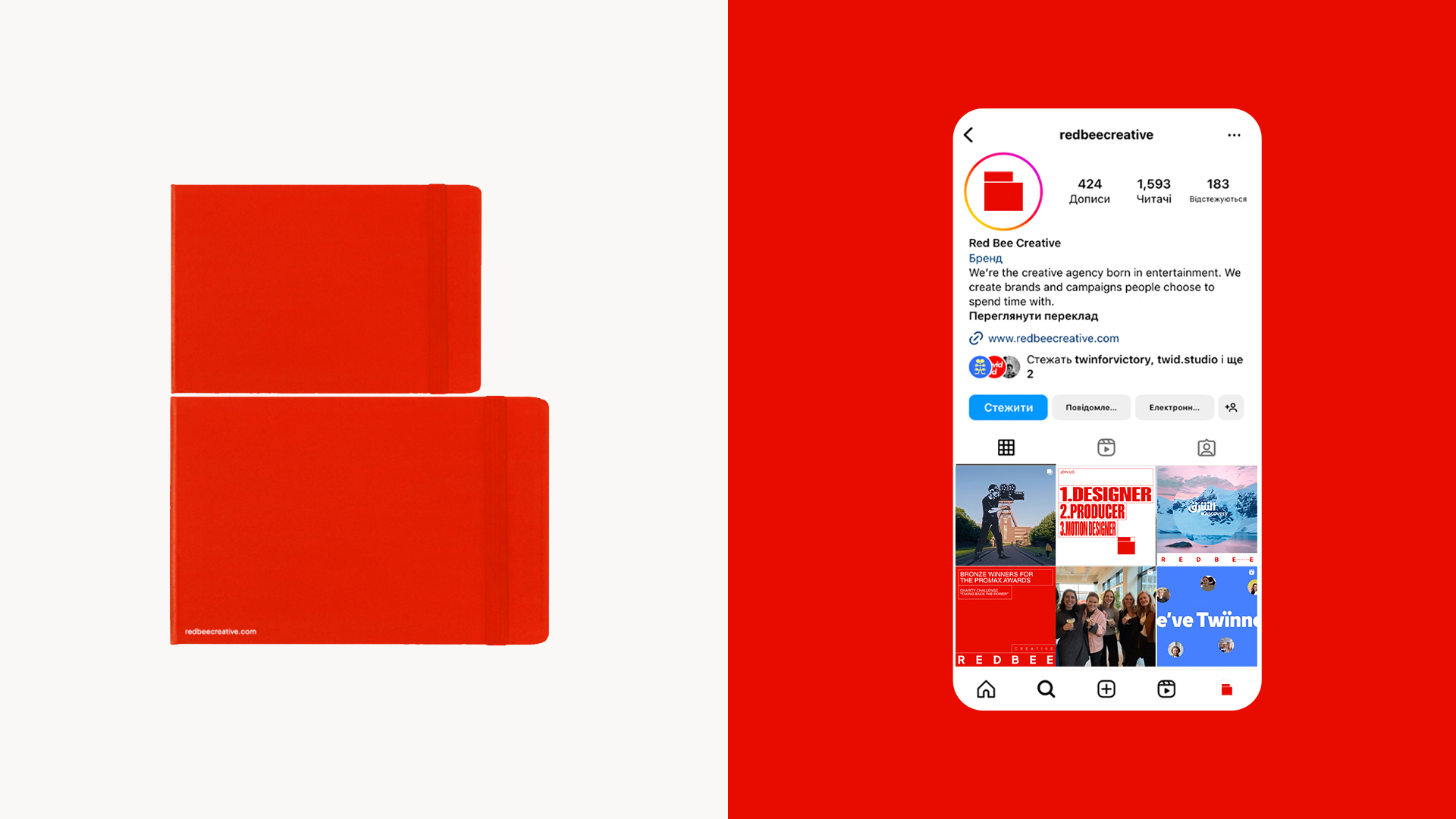
Summing up their new design system in a single sentence, RED BEE emphasized its central attribute: an intricate interweaving of screen formats, mirroring the dynamic and adaptable nature of contemporary content broadcasting.
Leveraging RED BEE's profound design acumen, we intentionally refrained from oversimplifying the system. Unlike scenarios with less design-focused clients, we nurtured a style that thrives on expansive growth, finding expression in its inherent dynamism. This ethos pushes the boundaries of conventional content, embracing key agencies and references commonly used in the daily creative processes.
Navigating the implementation phase demands finesse, as we straddle the line between selecting the apt style and considering the diverse needs of the agency's team members who interact with the system. However, this challenge serves as an opportunity for us, strengthening the bond through communication and collaboration with our design twin.
“Any creative agency asking another creative agency to rebrand them is tricky. Our identity is both who we are and what we do. From the start, Twid asked questions and led us to a new, insightful solution. As we began to implement the new brand, old habits and expectations were flushed out. Twid stayed cool and focussed on the vision, providing feedback and advice. Seeing the new identity ripple across our touchpoints, and colleagues enjoying using it, is brilliant. I am thrilled with the result – a solution that reinvigorates our look and pride in our creative agency. Our Twin just gave us a makeover that will stop any perspective client in their tracks!” — Jane Fielder, Head of Design at Red Bee Creative.
“The new RED BEE design system is definitely not simple. It has a lot of room for creativity and many opportunities to go too far when consistency could be lost. It might be tricky for someone, but not for RED BEE, with their impressive experience in communication design. Anyway, questions in the use process could be an extra reason to collaborate and occasionally communicate with our twins if they need any help with implementation.” — Alex Twista, founder and creative director of a Twid Studio.
“It was interesting to keep in mind that RED BEE is an agency with 15 years of history and heritage. So, we hesitated between keeping this old-fashioned note or completely giving RED BEE a new lease of life.
As a result, the identity, which initially had a correct but restraining square in the center, was transformed into a system with flexible different formats (we left the square for the attentive ones, of course). The idea reflects the diversity of screens where content exists today, including RED BEE's content they create for their projects. It's great that we focus on their work this way, as it's essential for the agency.
This adaptability to the format, the core of the identity, also continues in the work with typography, layout, and composition.” — Mariia Bystrova, Design Director at Twid Studio.
Creative director, art director - Alex Twista
Project manager - Ana Partyn
Design director - Masha Bystrova
Graphic designer - Lina-Maria Shlapak
![薇閣薇恩 – [Wēi gé wēi ēn]](https://twid.studio/wp-content/uploads/Untitled-1.png)