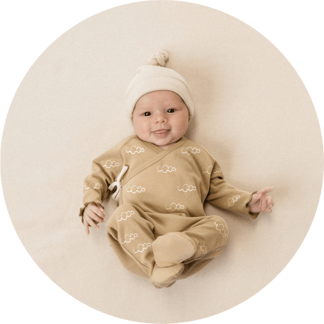
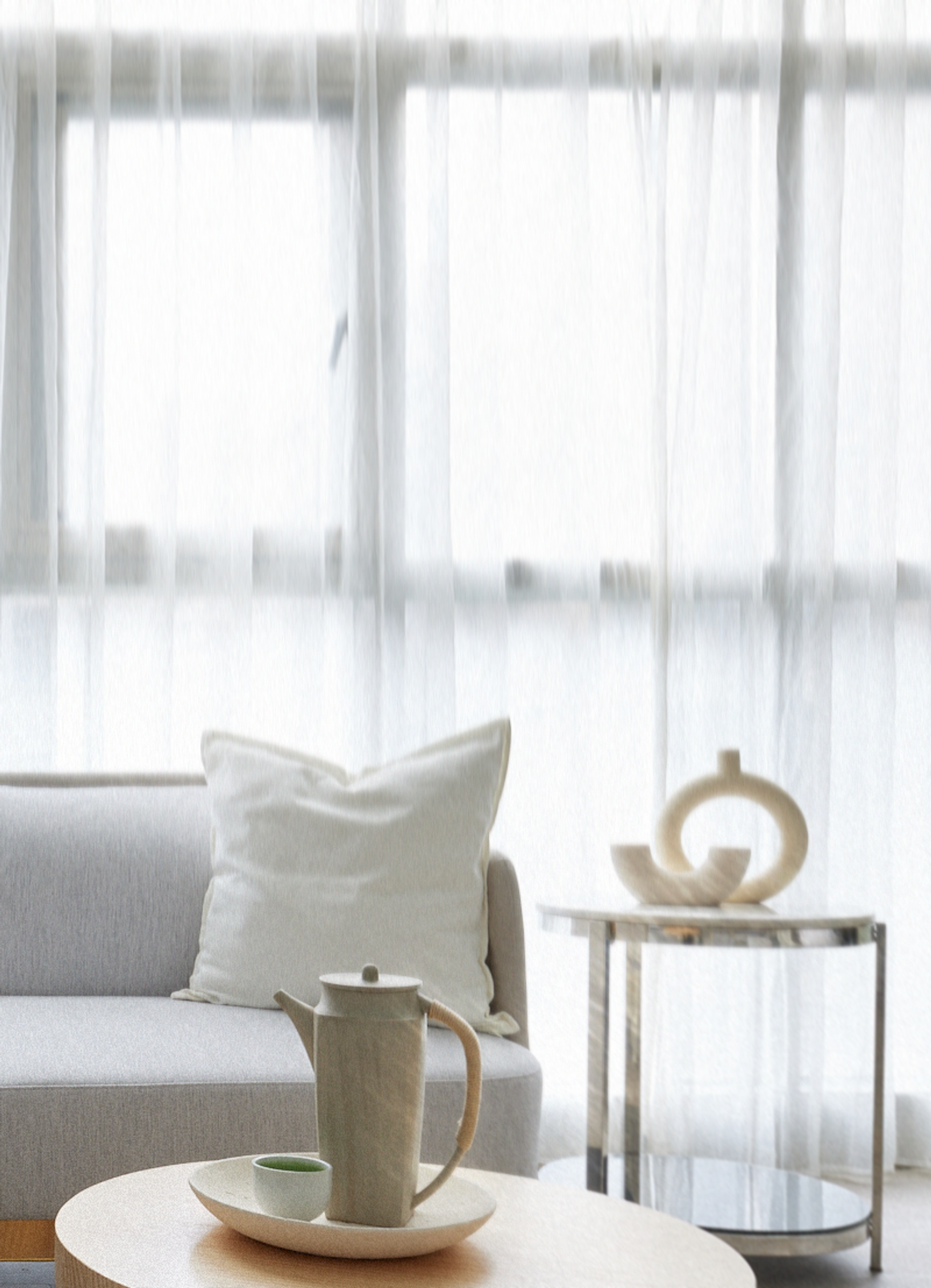
Wiggo Wayne is a hotel for postpartum rehabilitation and care for mothers. It is located in Taiwan, so everything about the project was new to us: culture, language, hieroglyphs, a sense of aesthetics. And carrying out such care was completely new to us. In this hotel, the new mothers recover, take courses, eat delicious food, receive medical care and enjoy a spa. And, as it turned out, most of Wiggo Wayne's competitors went either in the direction of pink or conservatism. The path of wabi-sabi turned out to be a closer fit for the client. It suited us too.
The project was a real challenge for us. We developed an identity that included digital, an approach to space design, and uniforms, and clothing for mothers with newborns. And, let’s not forget the sound.
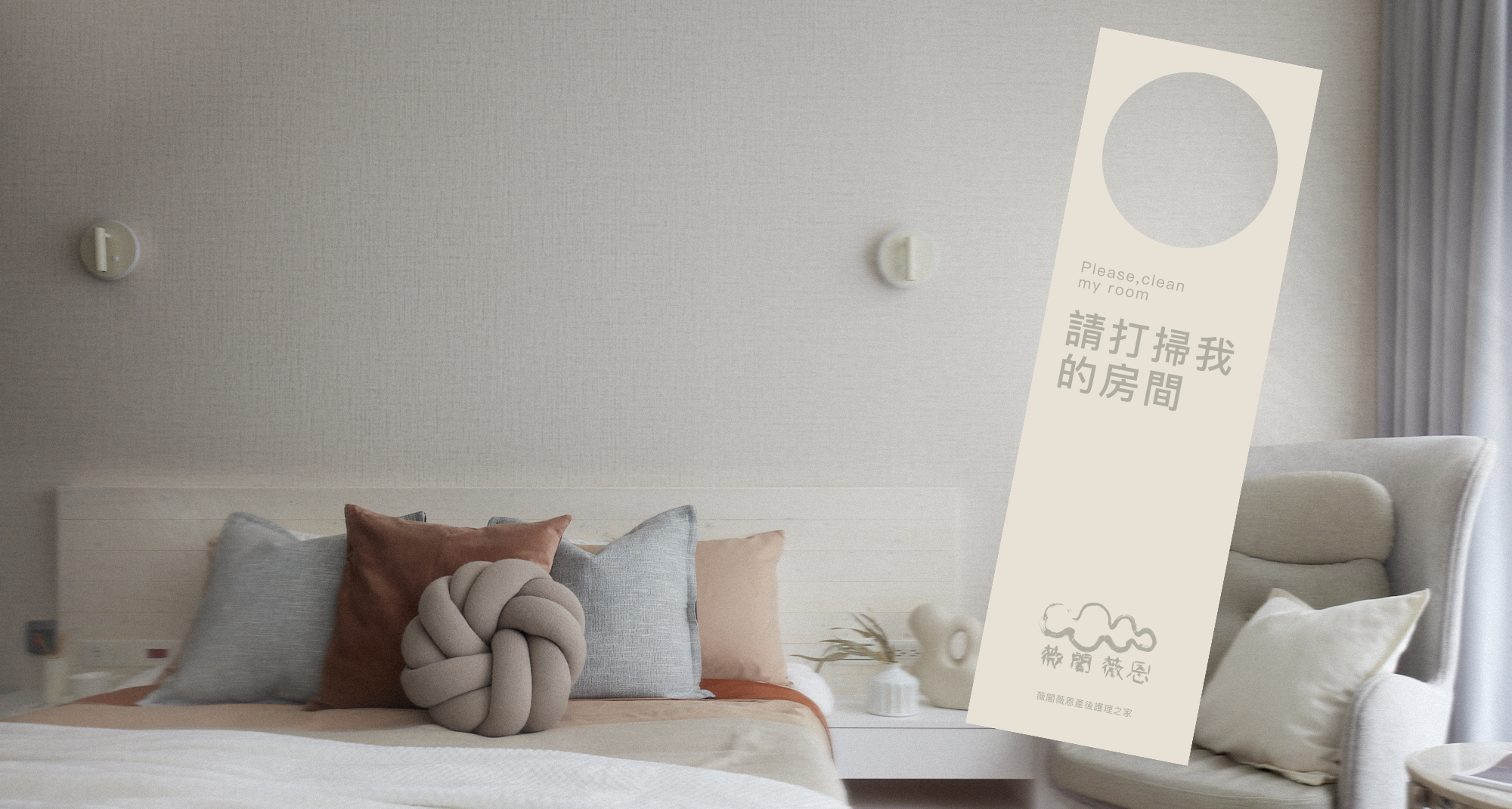
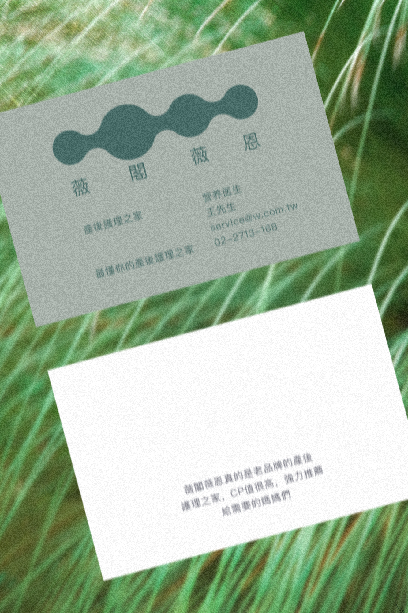
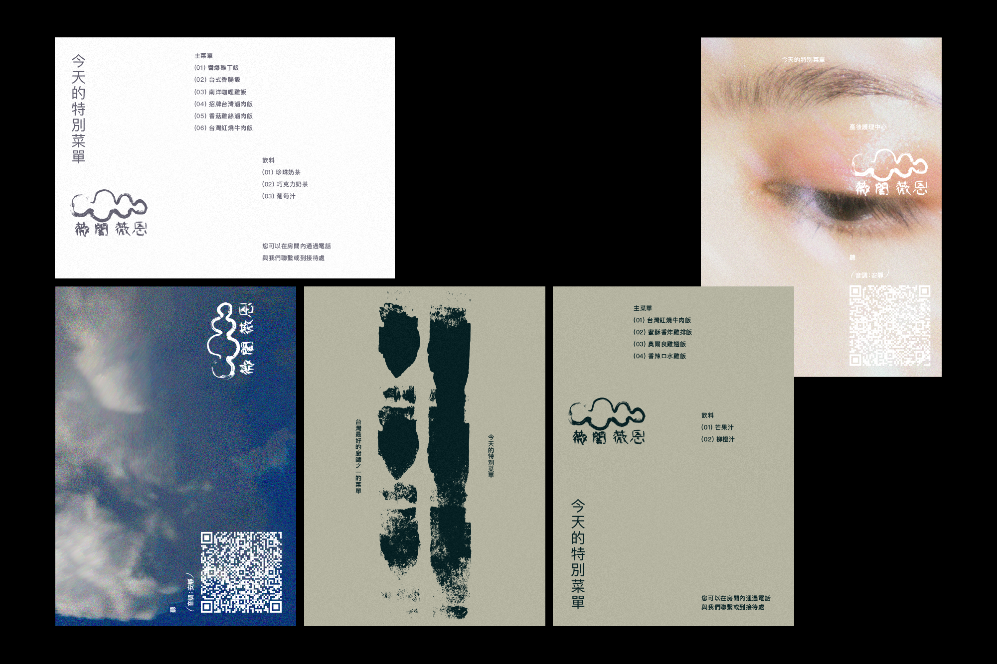
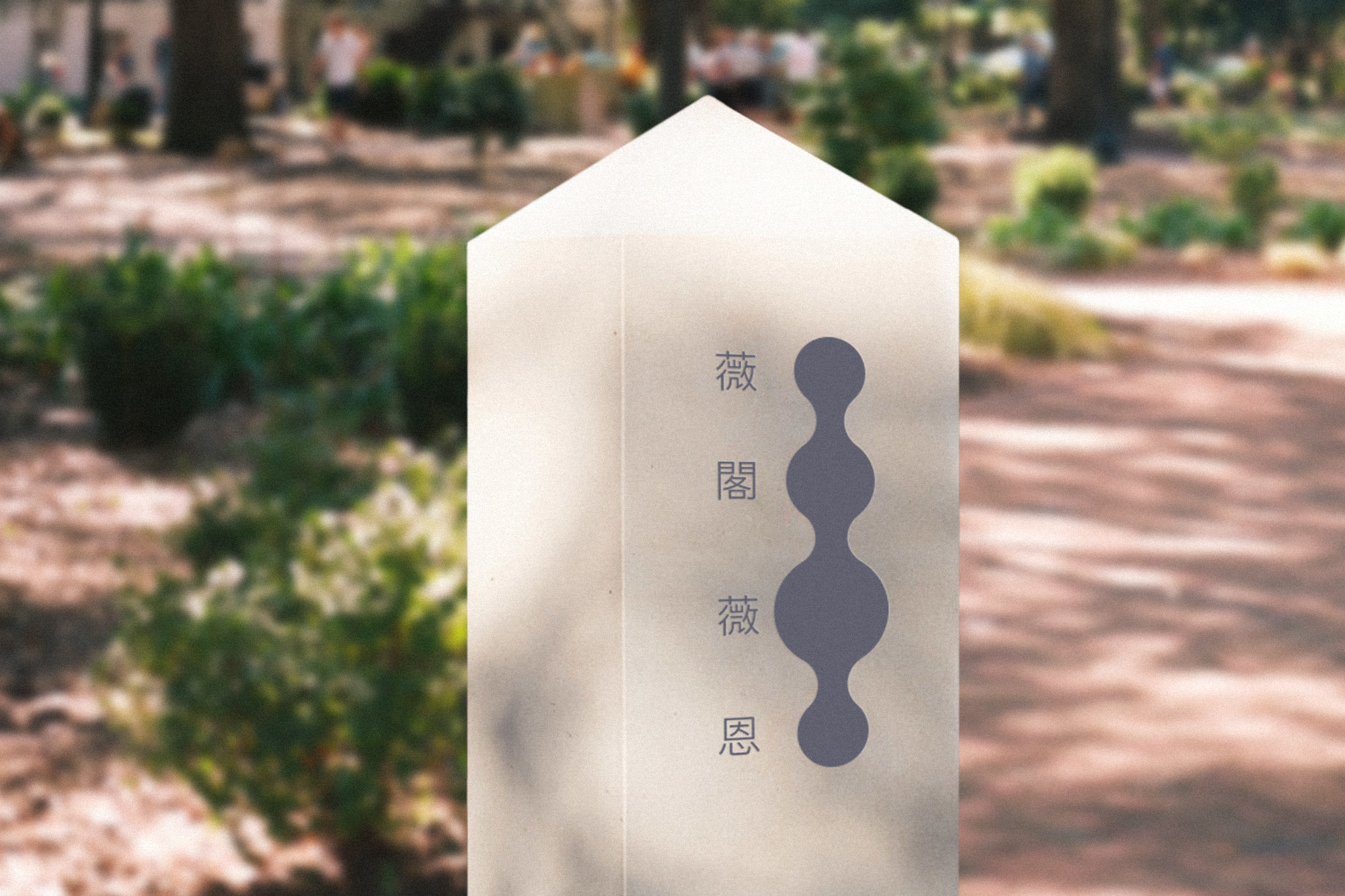
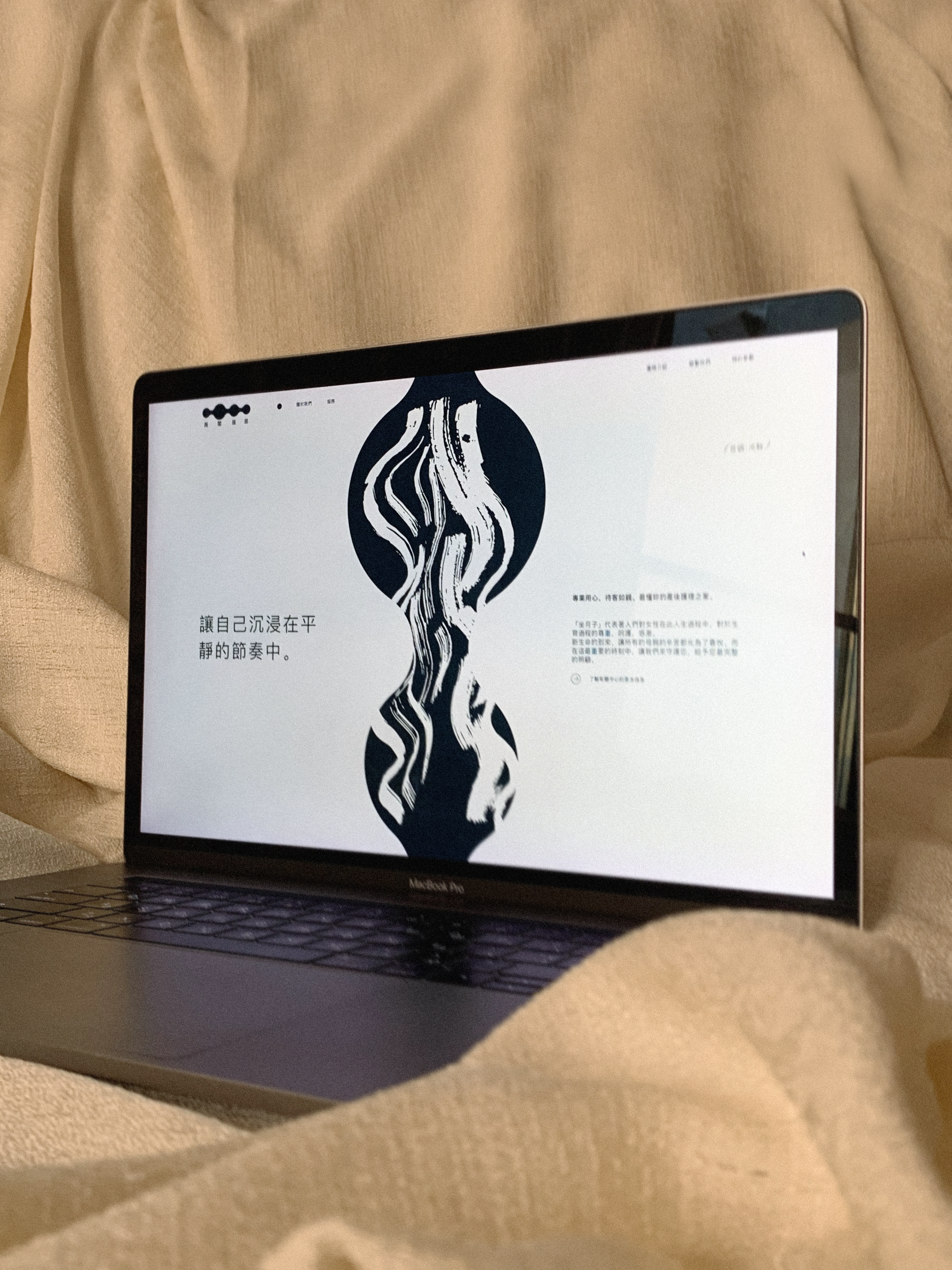
At the Wiggo Wayne Center, mothers have a place and time for rehabilitation after the birth of a child. Here they find the conditions to come into harmony with their body and child. And the first change that awaits them in the center is a slowdown in emotional rhythm. This is reflected in the logo: its circles form a smooth rhythmic wave.
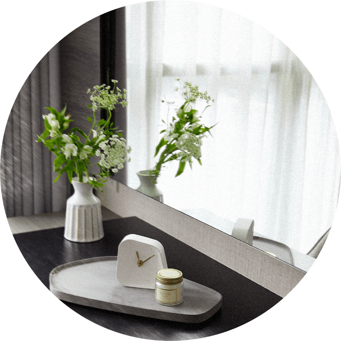
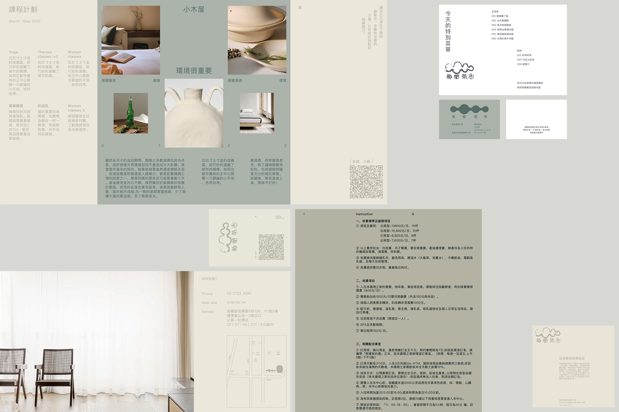
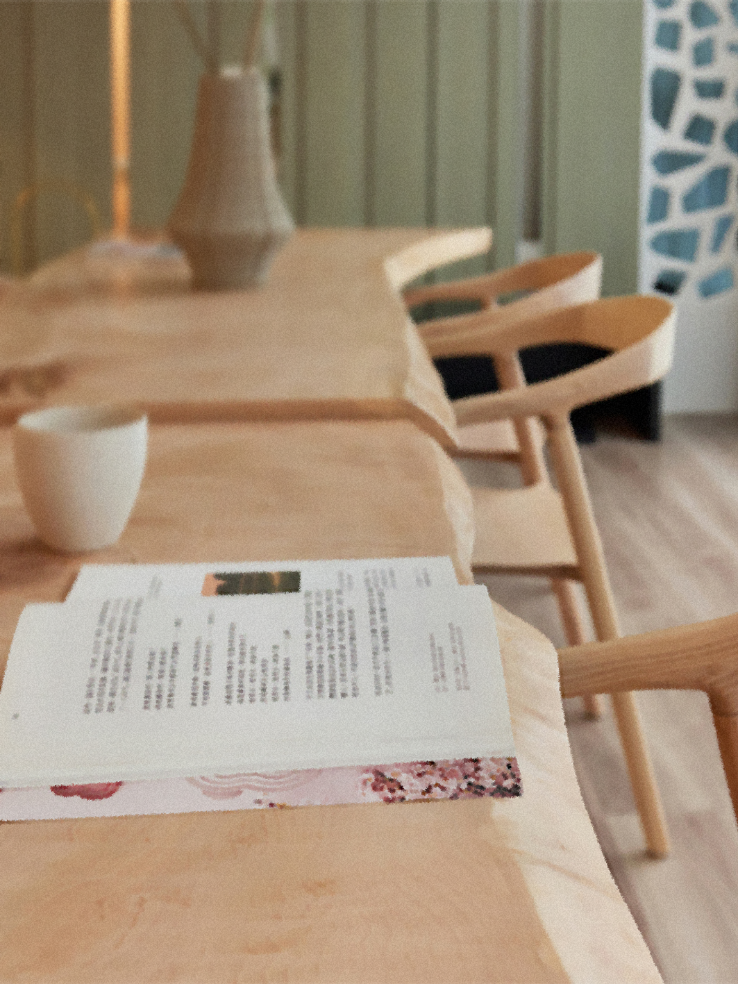
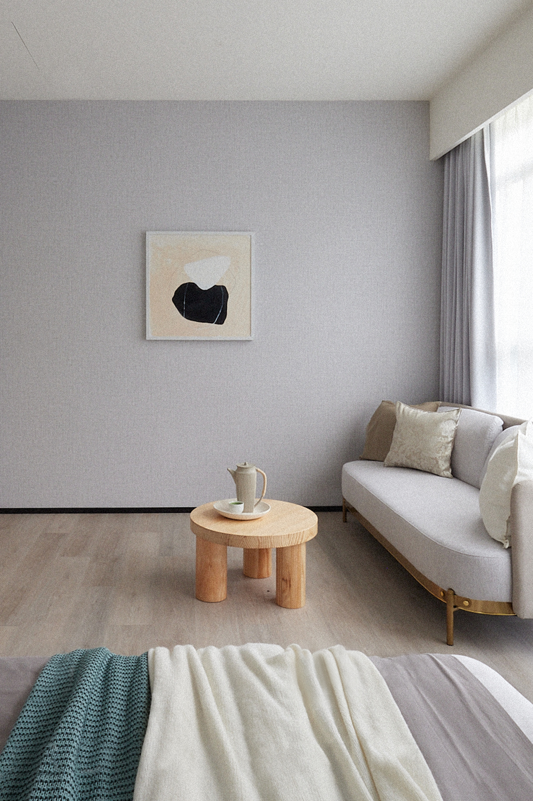
To implement this concept, we followed the style of wabi-sabi: natural materials, concise forms and modesty. The center has its own large collection of paintings, so we understood that aesthetics was an extremely important aspect for them.
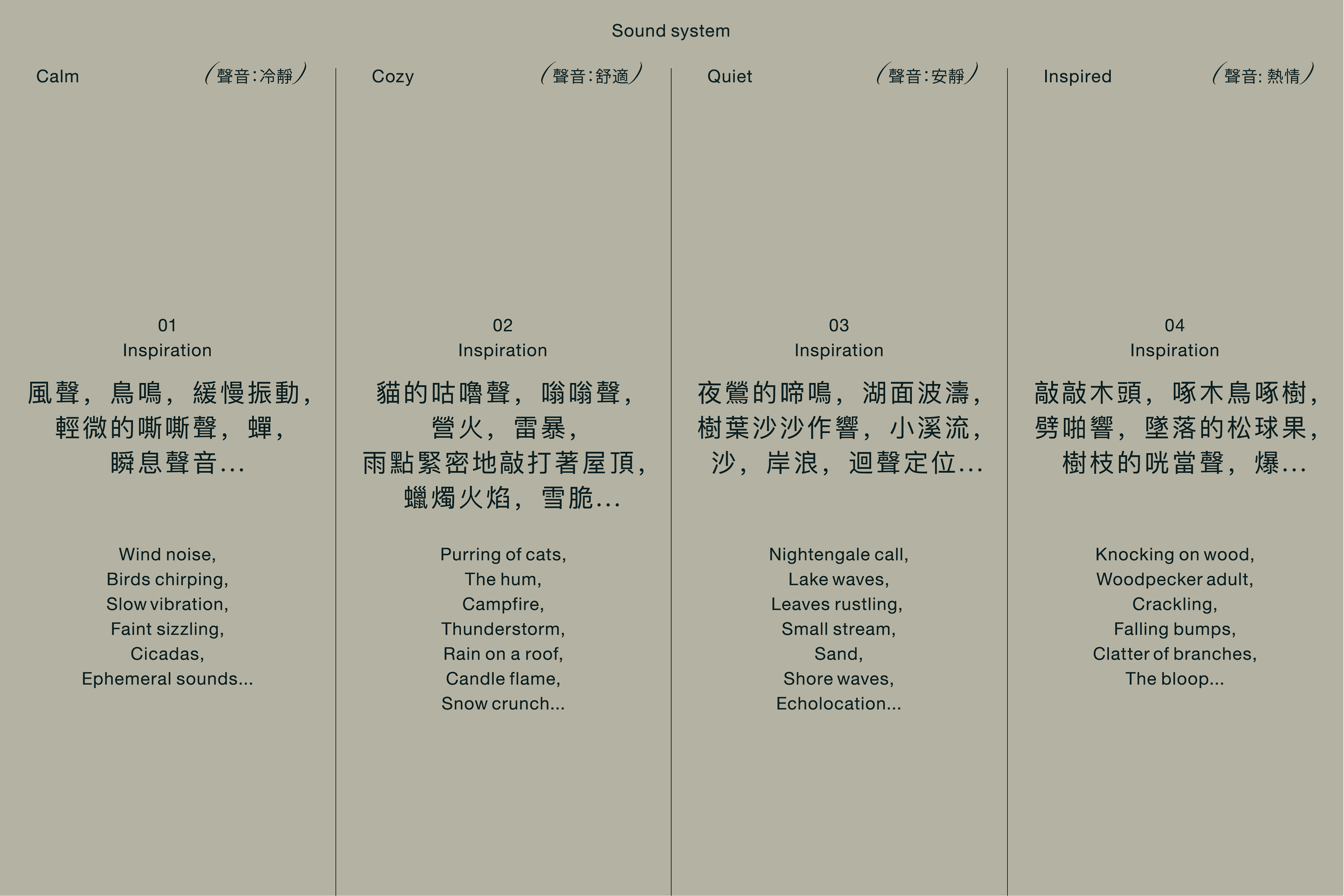
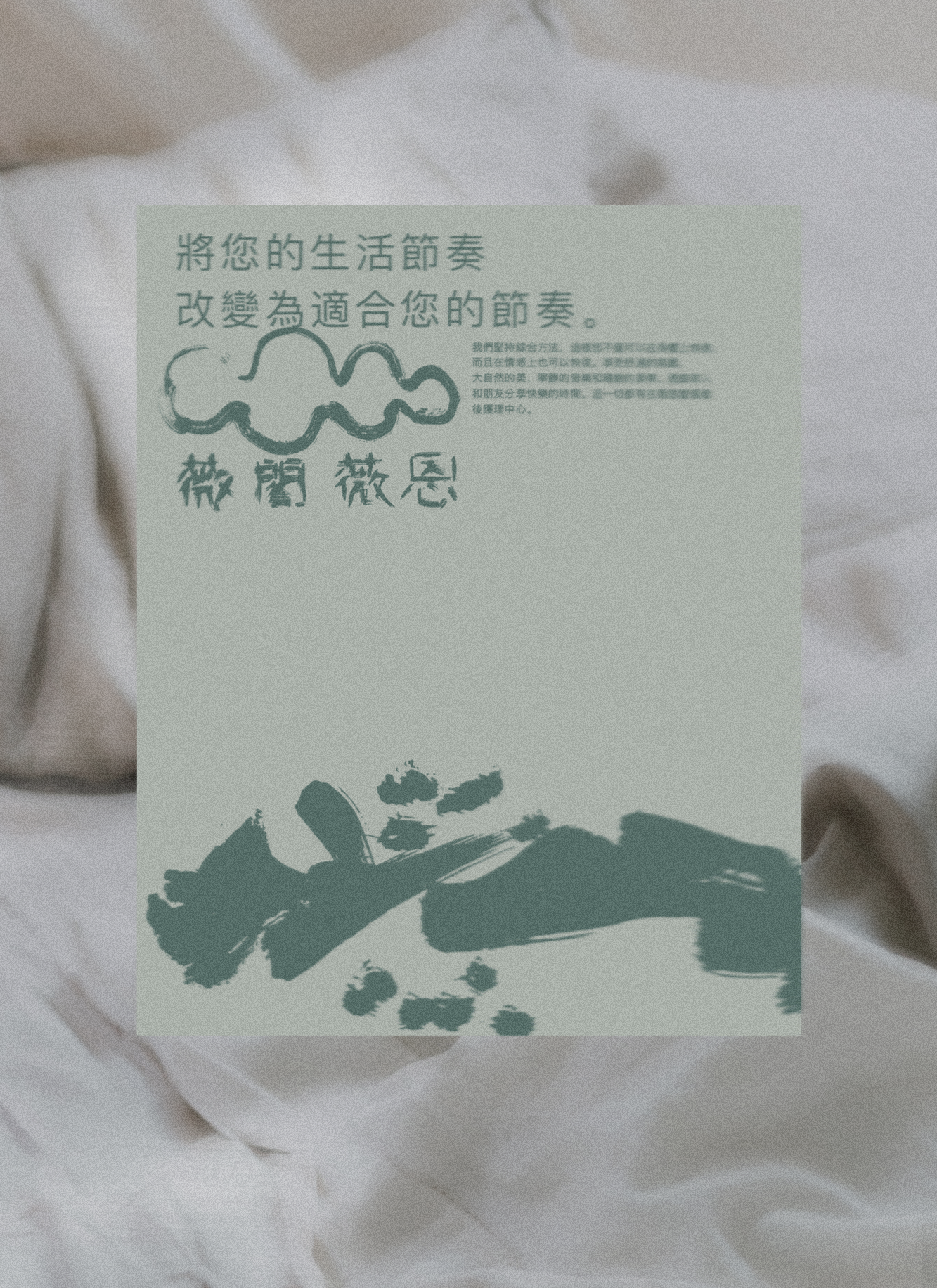
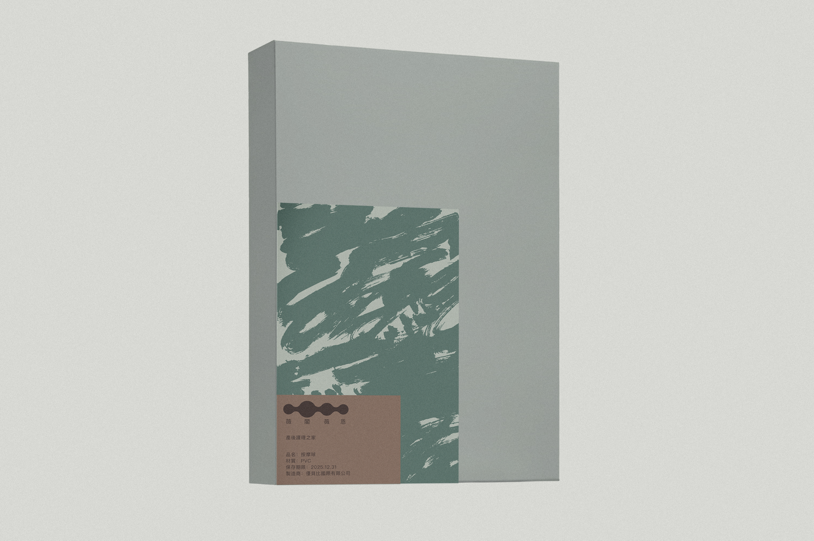
Music can plunge you deep into a certain state. Therefore, the nature of the concept of slow rhythm is not only visual. We have created 4 examples of ambient tracks designed to immerse the listener in a state of tranquility, quiet, comfort and inspiration. And transferred these feelings from the music with a brush on paper thick gouache. This became the central visual image of identity.
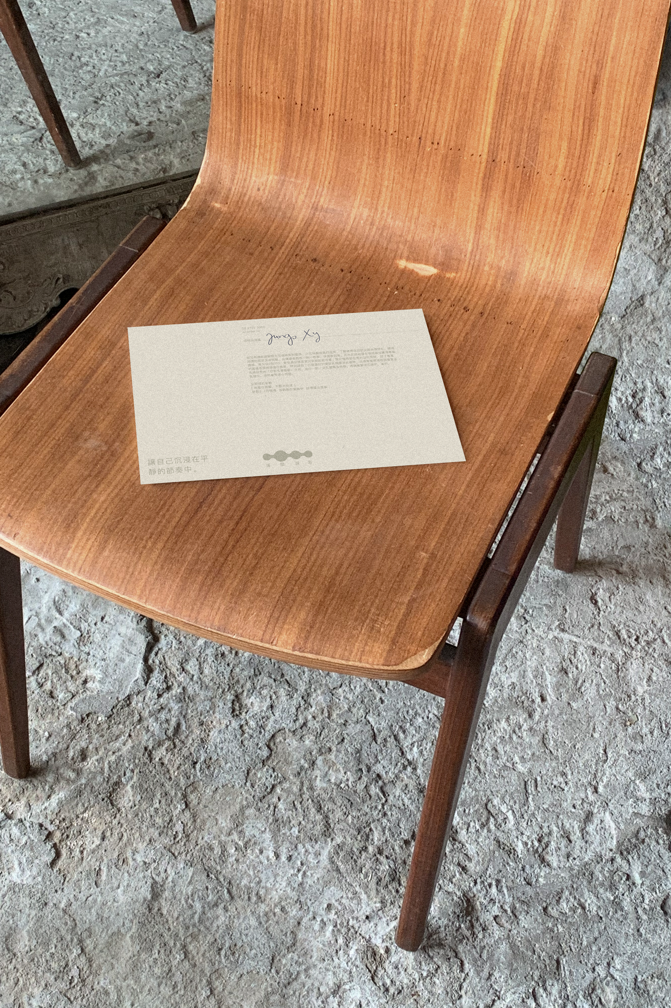
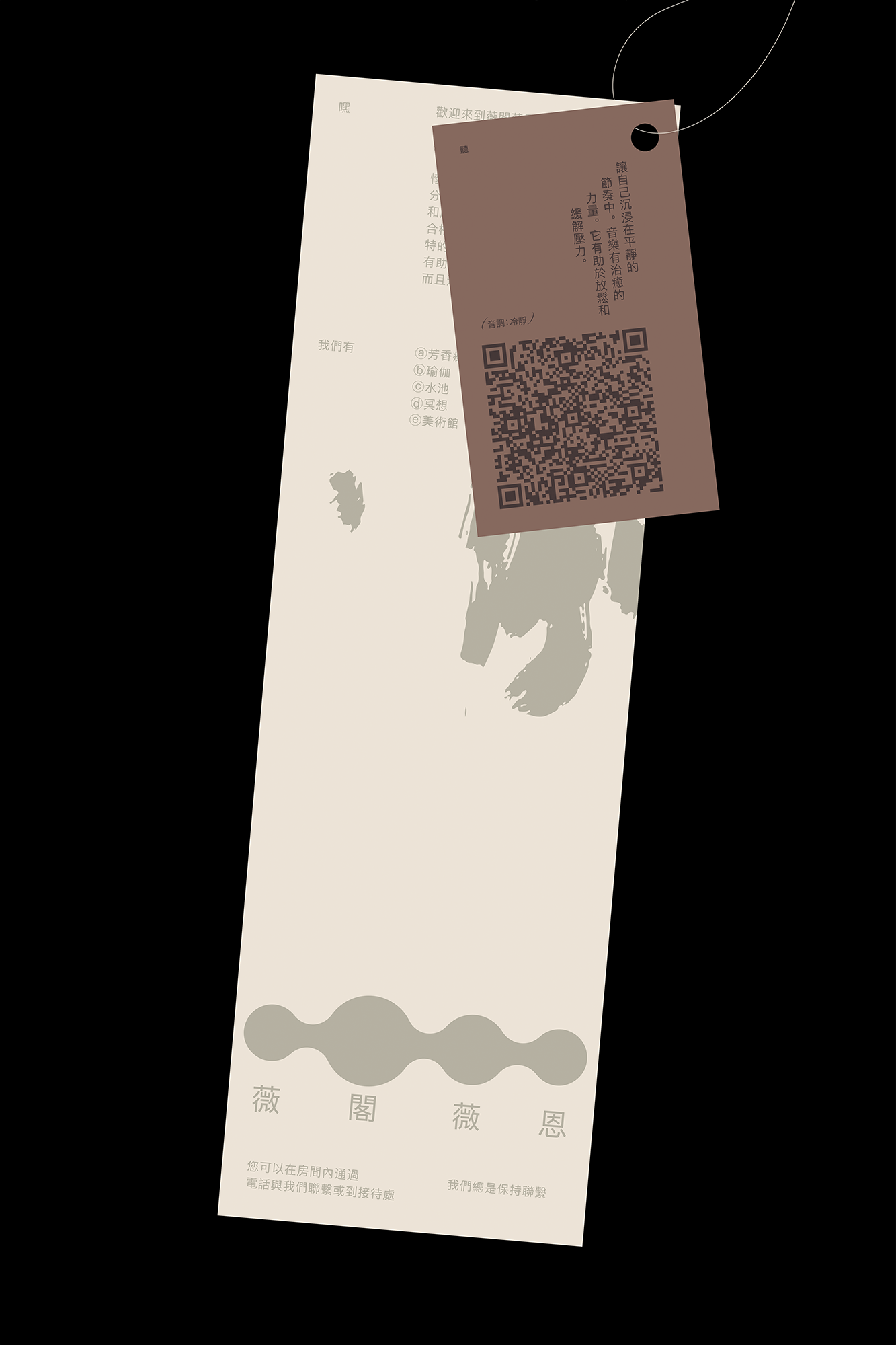
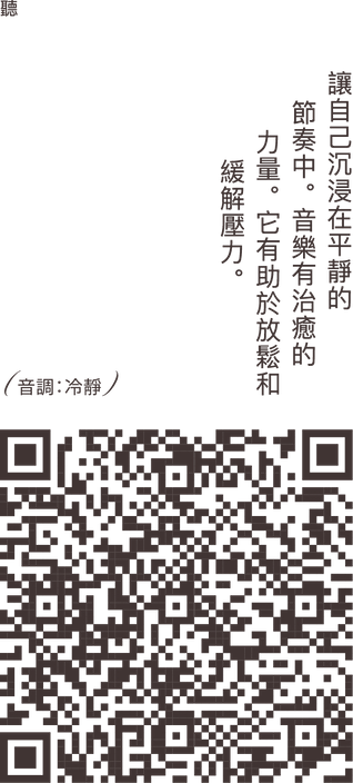
By the way, drawing music in itself is a meditative practice. So that moms can immerse themselves in this relaxing atmosphere wherever they want, we have placed QR-codes for music with the appropriate mood tags on all printed materials.
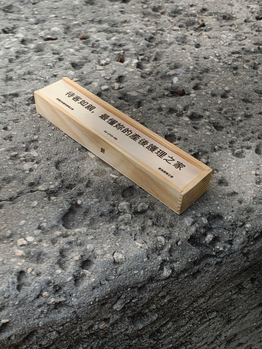
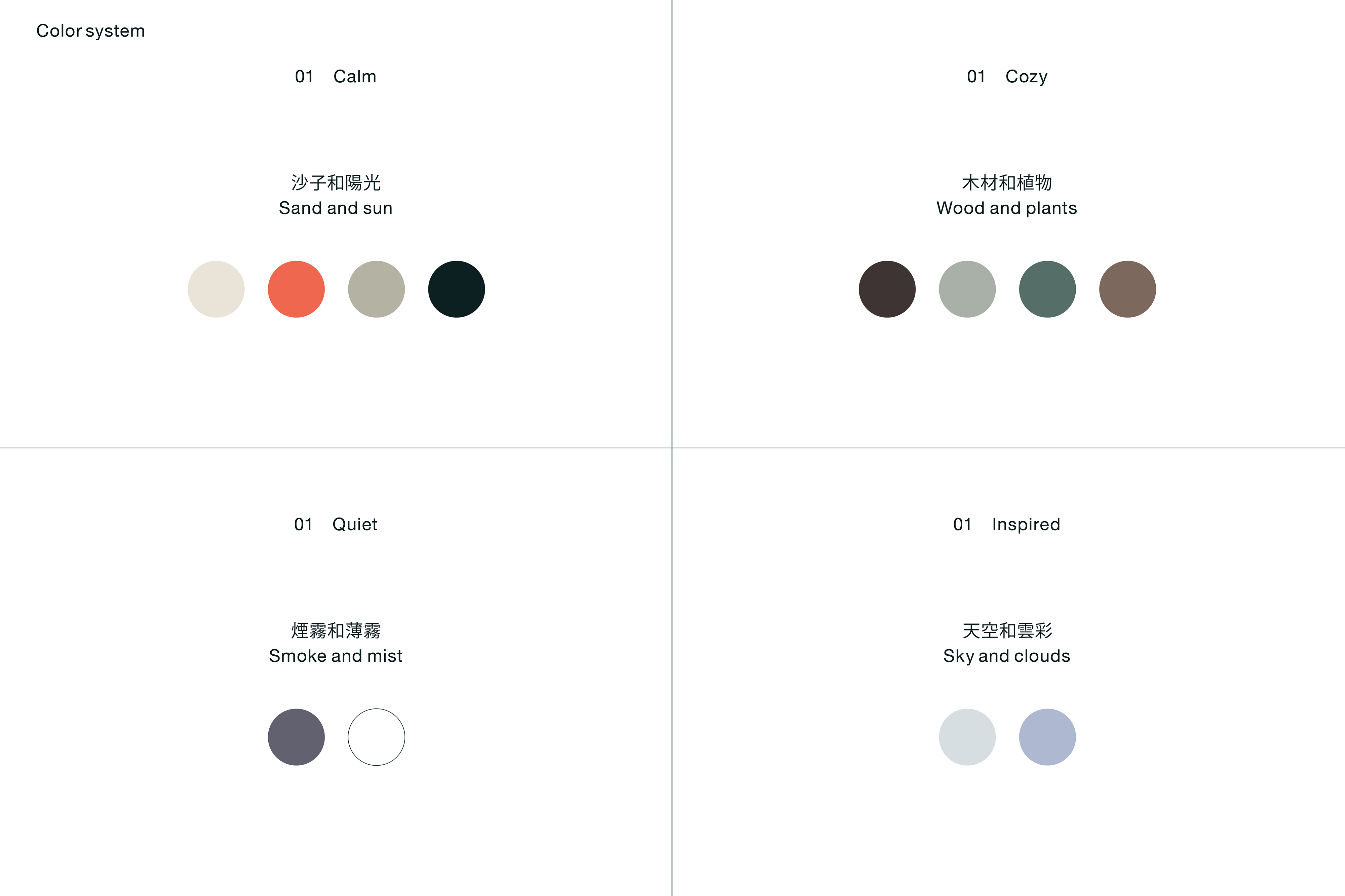
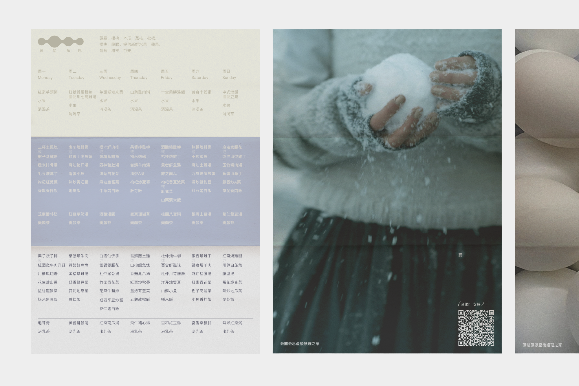
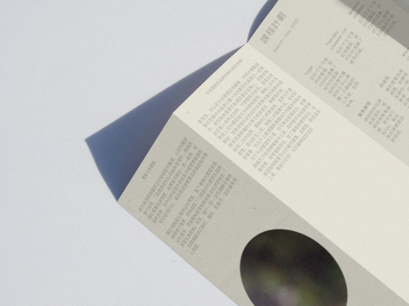
We collected natural colors and tied them to emotions. This is a hint for the customer to make it easier to remember how to use them. After all, these colors work only in groups. We are talking about calm emotions, so be careful – nothing should attract too much attention. We followed the same approach with printing: for the most part, no titles are needed. This creates a sense of balance, silence and slowness.
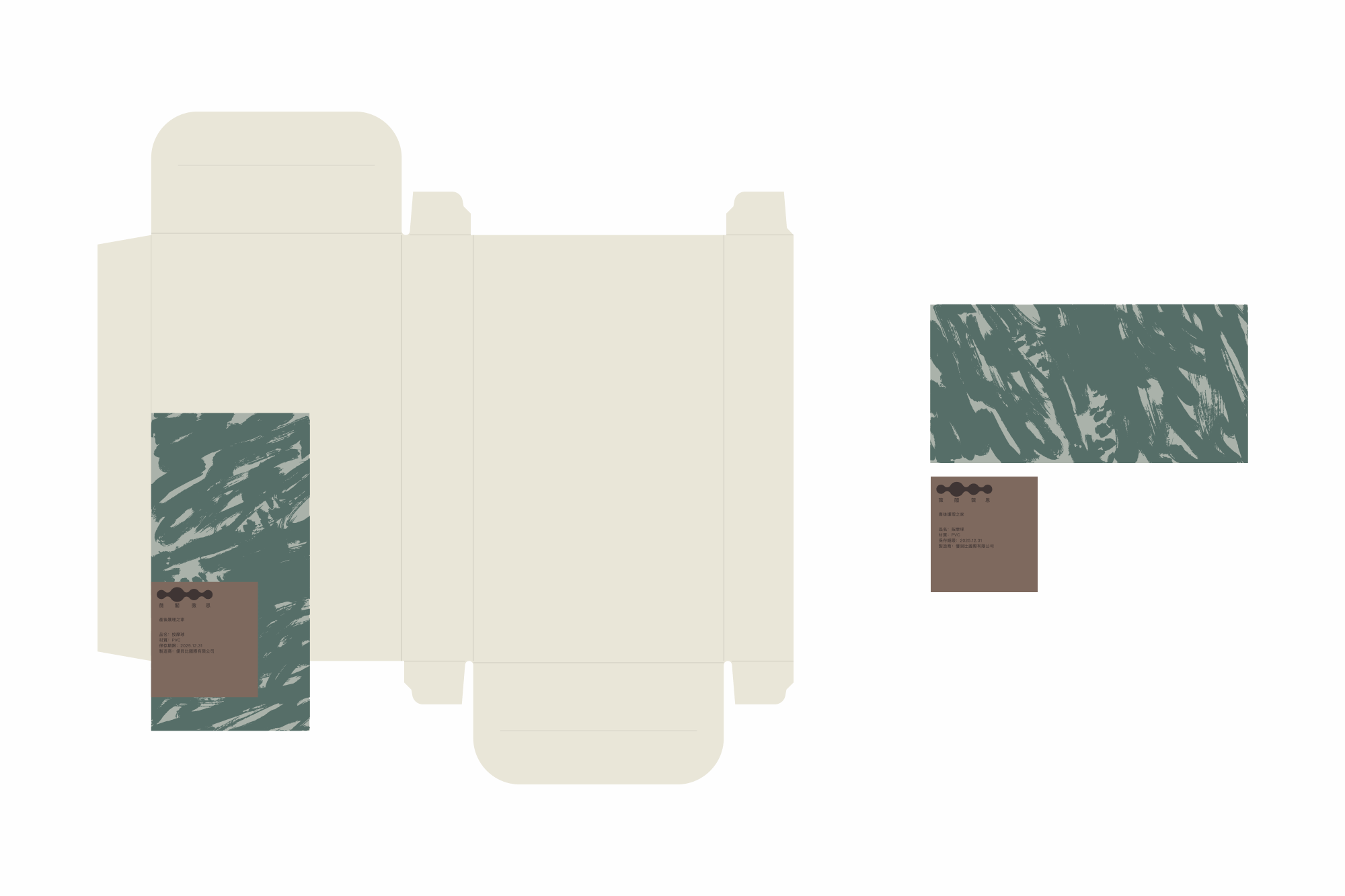
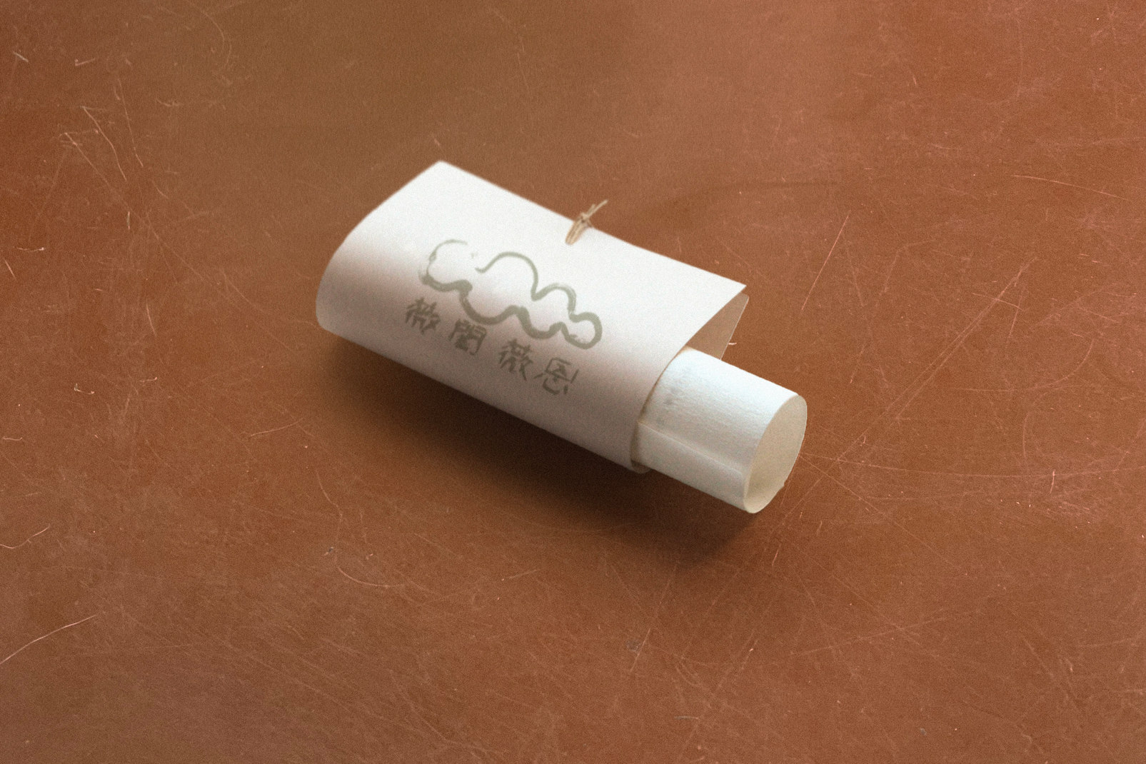
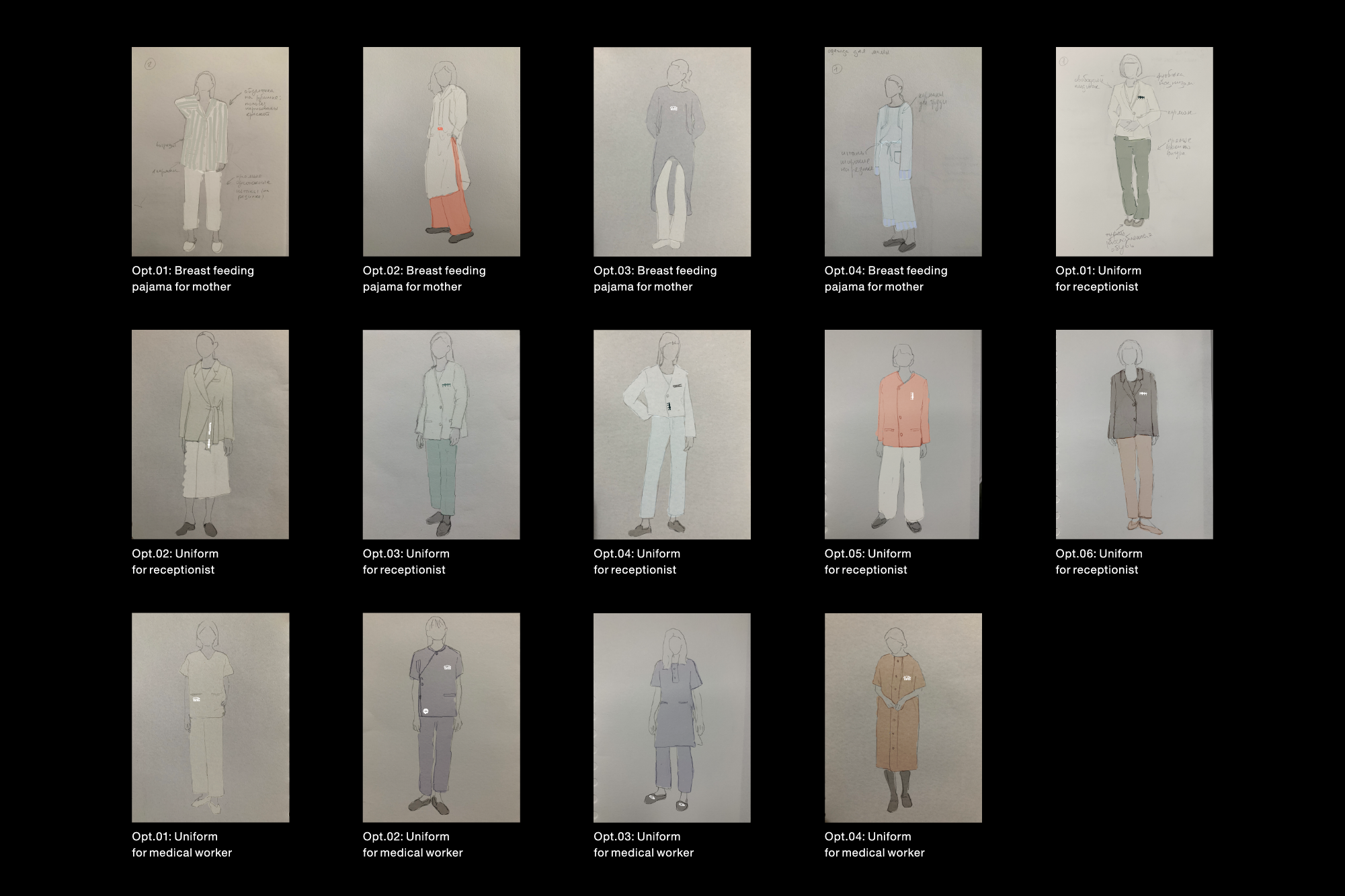
All forms around the mother with the child should convey a relaxed mood and a slow rhythm. That's why we developed a series of sketches of clothes for staff and customers – simple things in a free cut.
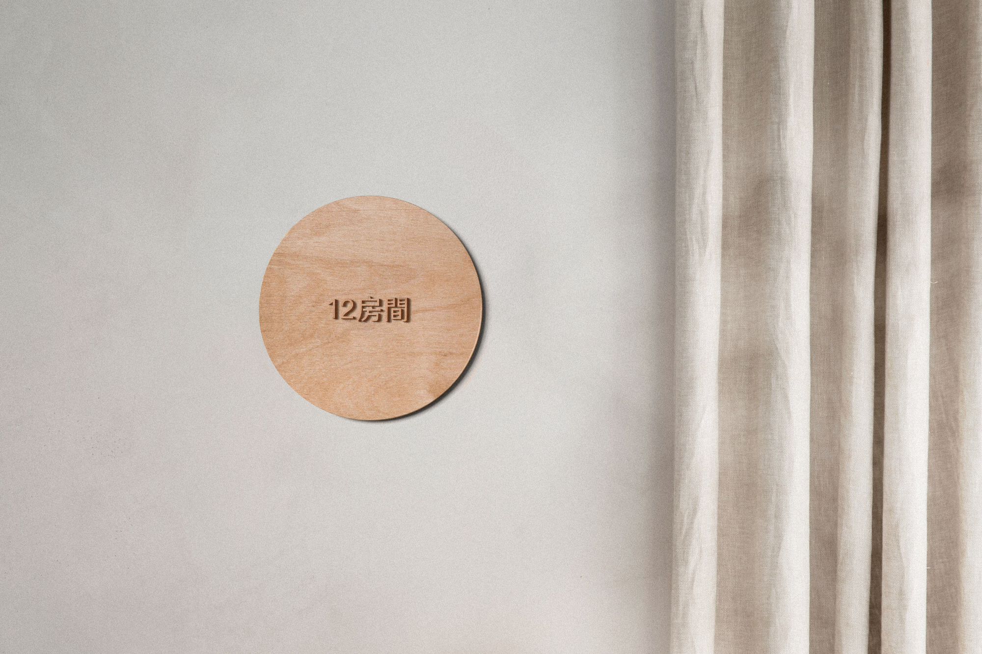
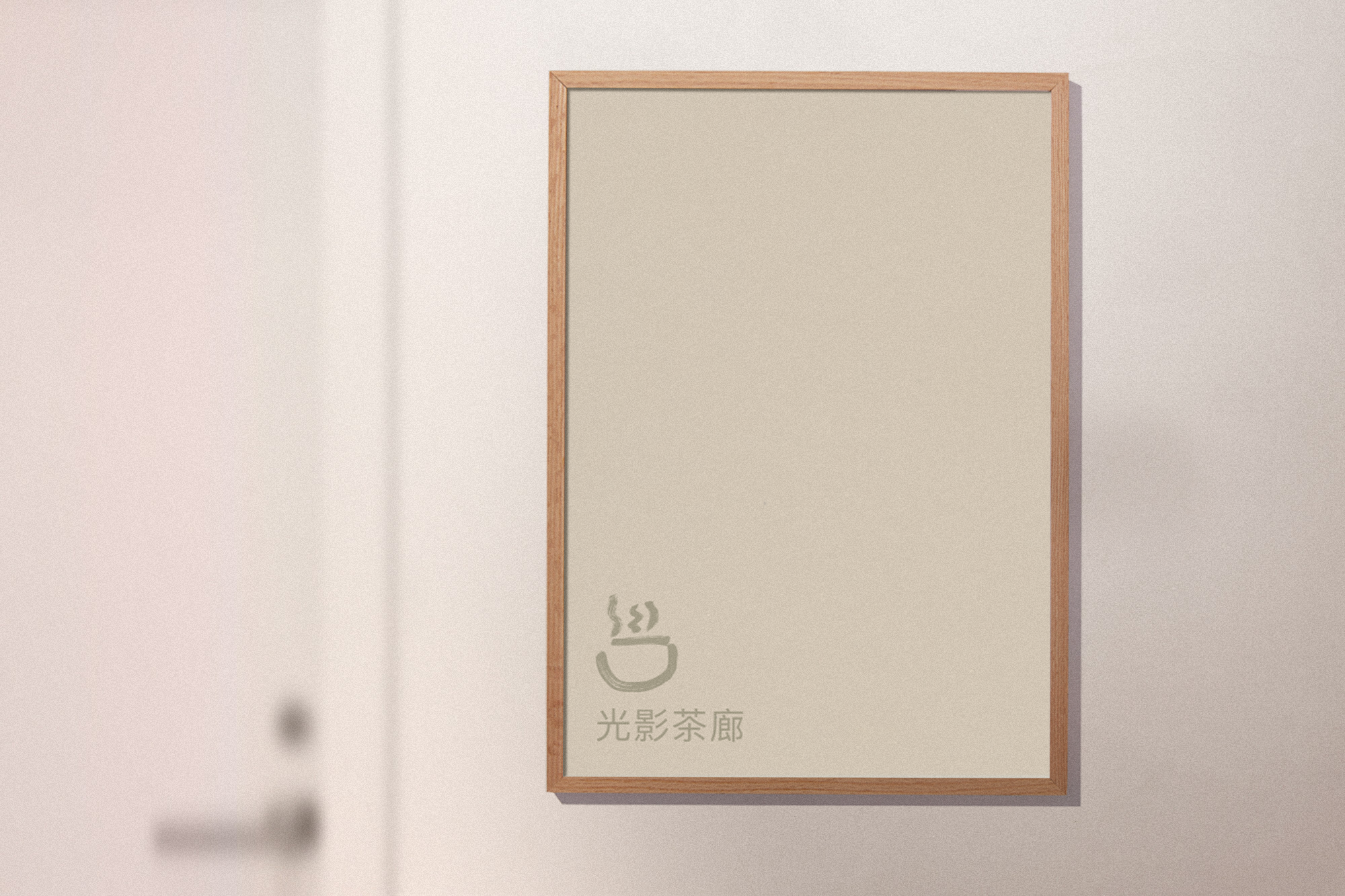
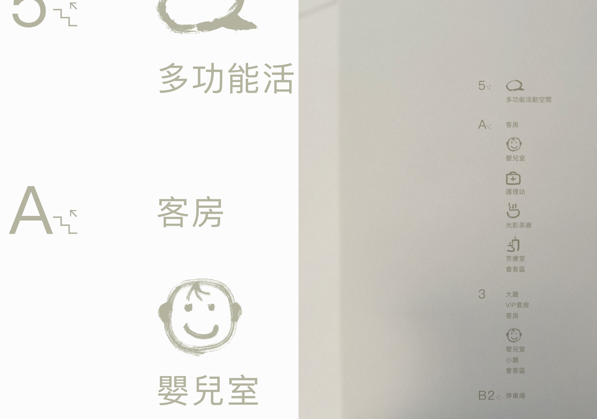
Characteristically, we placed the navigation elements in the frames. So we organically integrated the functional elements among the collection of paintings housed in Wiggo Wayne.
Made of oiled and grainy film, they look slow and naturalistic. So that they convey the feeling that you are prolonging the moment. There is no overload. The same is true for our social networks, where the main principle is – the design should be 2 times less for photos and videos.
“This identity developed precisely as an aesthetic, not a strict system. So it creates a strong emotional background around the brand. The style turned out dreamy, relaxing and natural. What kind of state do you want to put mothers from the center in?
I want to note the strongest things, in my opinion. First, it's craft. These days, people underestimate the impact of handicrafts in the context of branding, but it has weight and makes the brand much more alive.
Secondly, sound identity. At first we were faced with this and it was interesting to create a clear working system. So, for this purpose, we became attached to the ones that were suitable for certain samples,” said Masha Bystrova, Art Director of the project.
Creative Director — Alex Twista
Designer — Masha Bystrova
Sound Designer — Kolya Tolstyh
Project Manager — Anna-Mariia Makarevych