UNIT.City turned to us to develop a new design system that would allow working with the ecosystem's many projects, which have emerged over the last few years, as well as match the brand's new positioning and the big plans that UNIT has for the next few years.
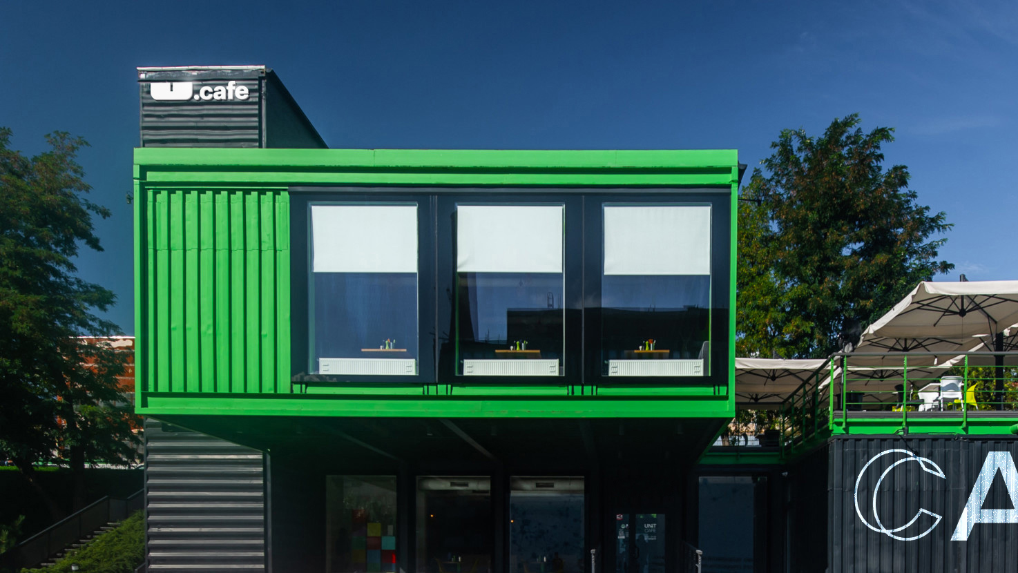
From the first day, it was clear that we didn't want to change the truly powerful logo, so well-matched with the brand image. Yet there were a number of logo-related issues we needed to solve. We highlighted the letter U, making it an alternative logo on its own, as well as making all ecosystem's project names start with "UNIT.". We also came up with the localization format for UNIT in different cities, using the outlines of corresponding territories.
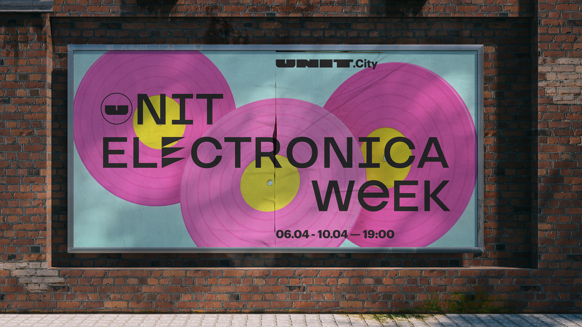
The developed identity represents the rebellious high-tech spirit of the brand. Logo, font, rich color and image palette play well together, creating a vibrant and unconfined visual language for UNIT. To streamline working with different materials and ensure consistency of style, we've developed a basic grid for combining different visual elements.
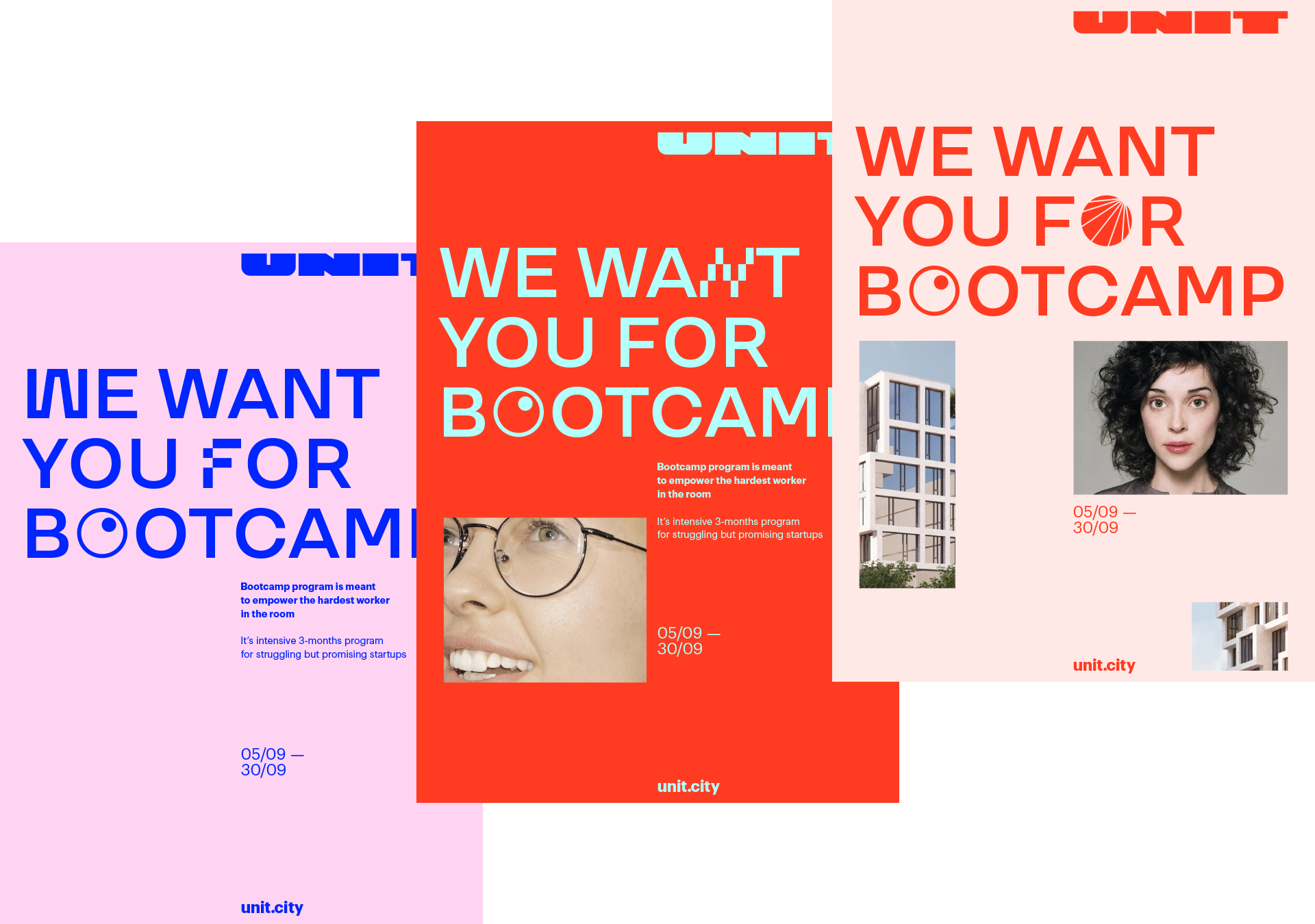

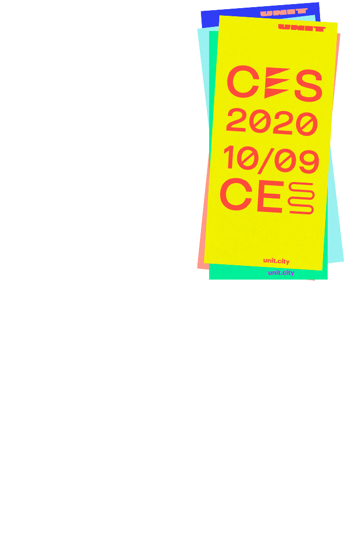
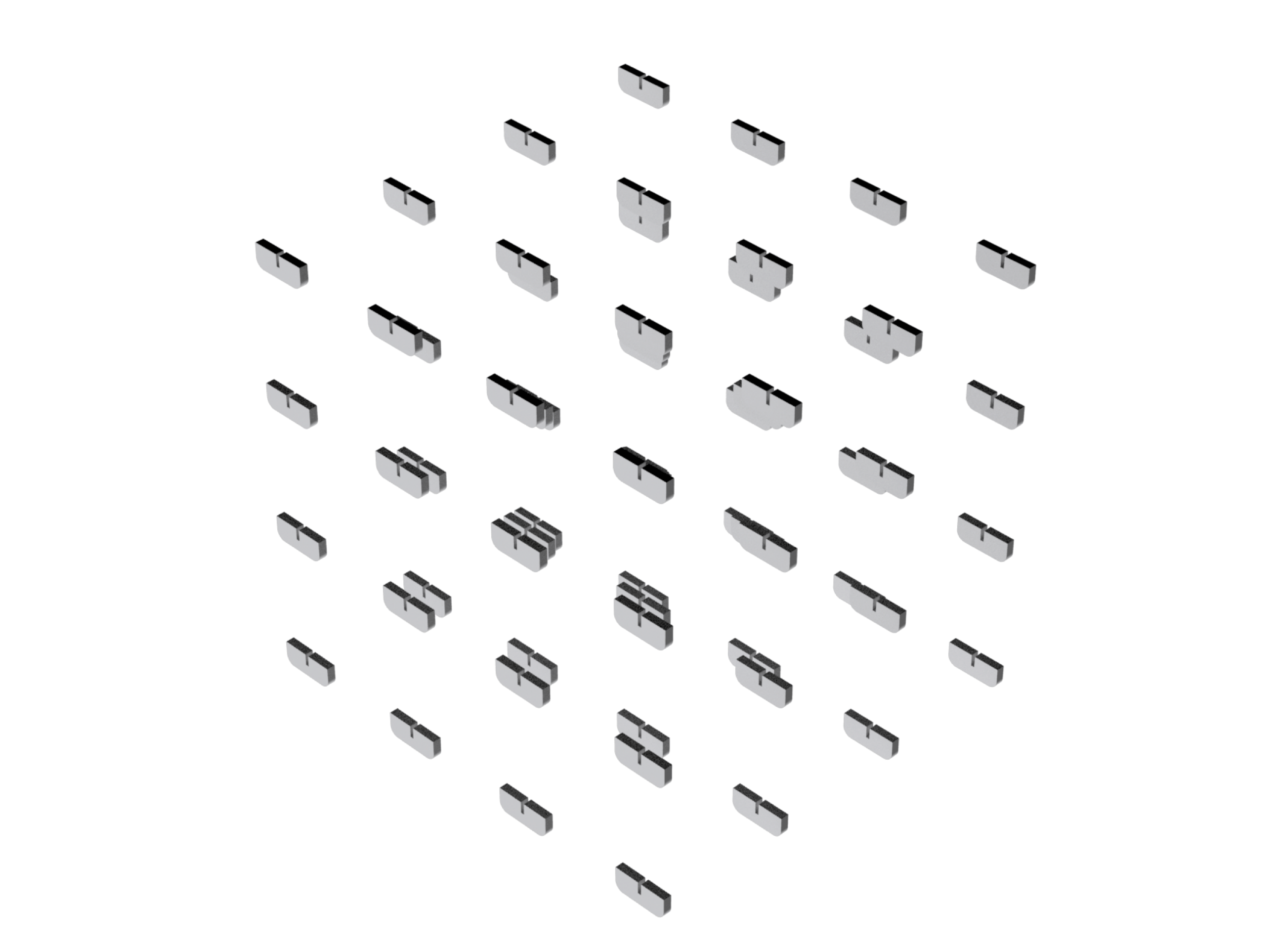
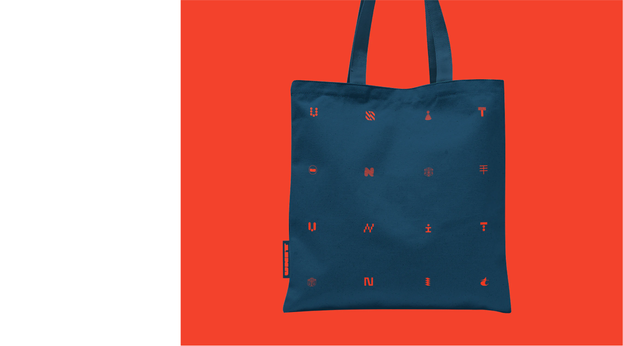
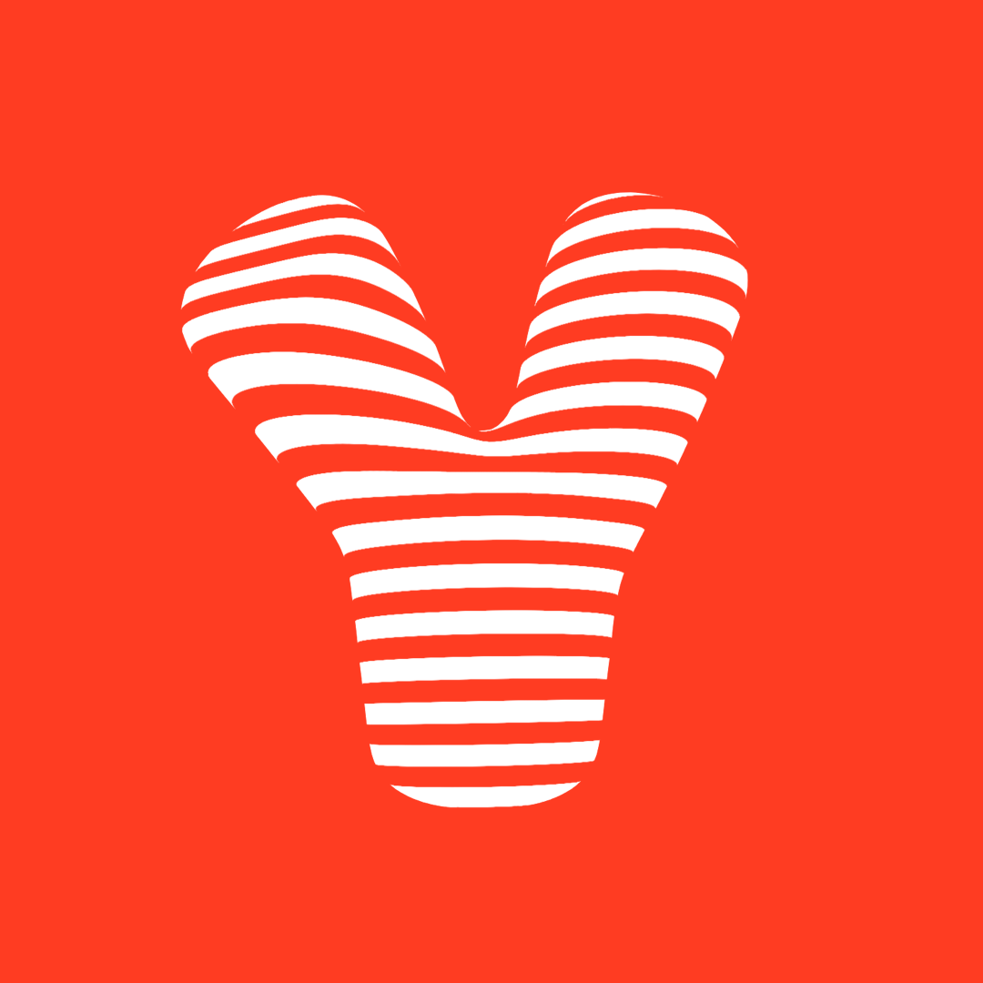
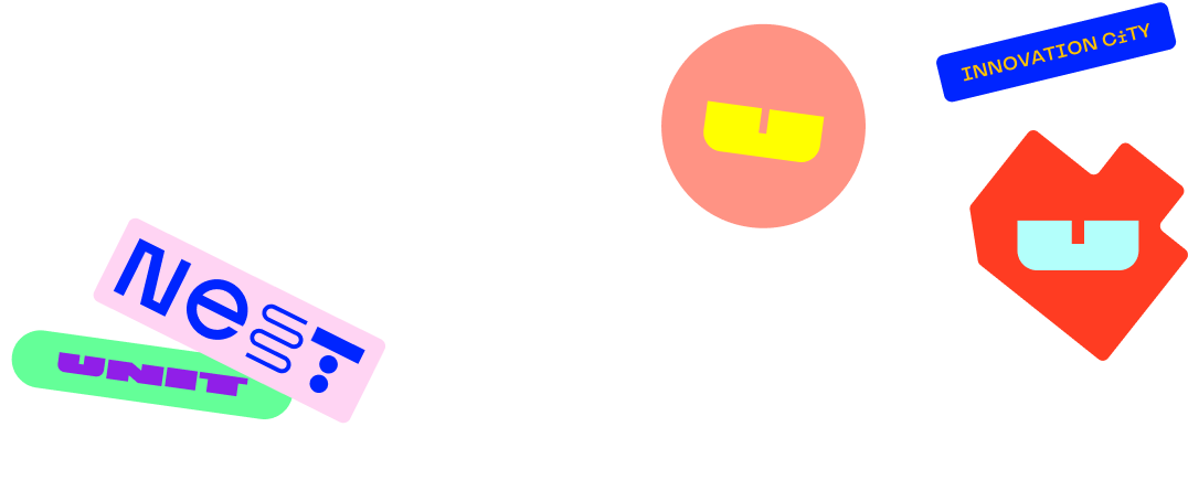
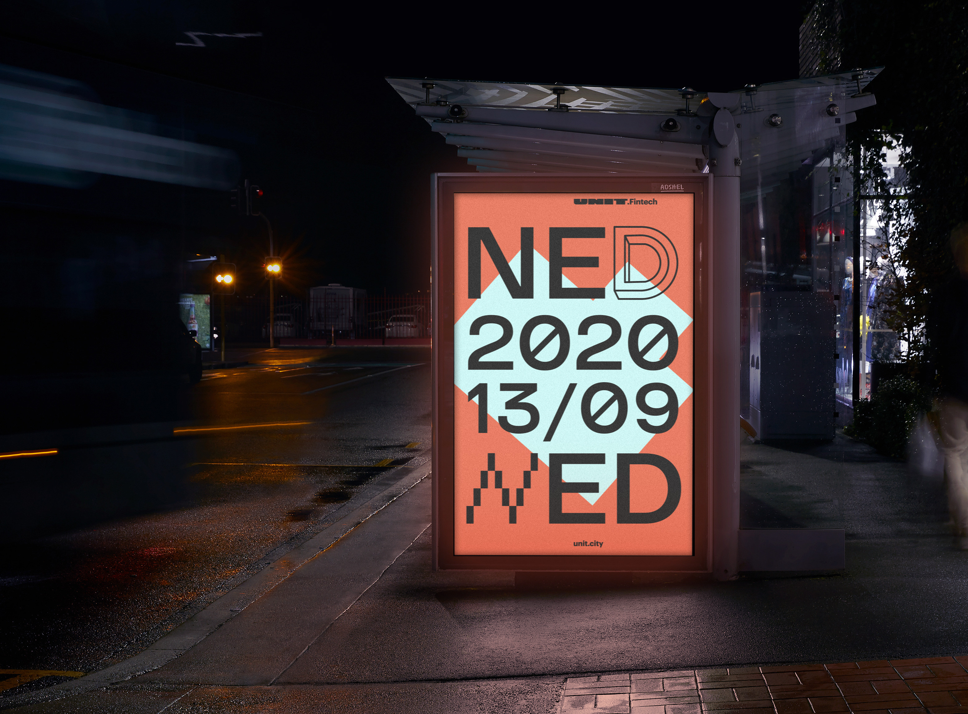
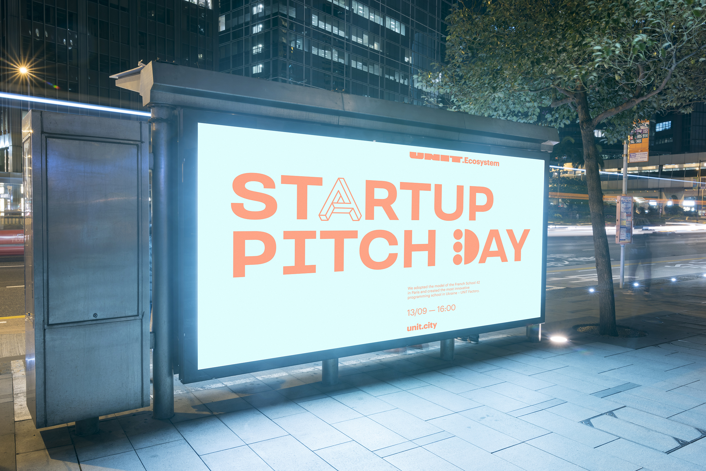
We've introduced a new font based on TT Travels' grotesqueness and a wide array of graphic symbols (about 5 per each letter). The font became one of the most distinctive identity elements. It allows you to focus the viewer's attention on the message, and graphic letters can be used to create independent narratives and animation.
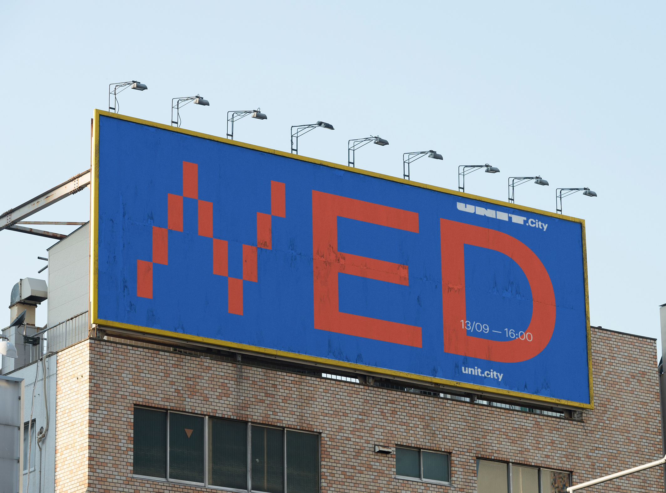
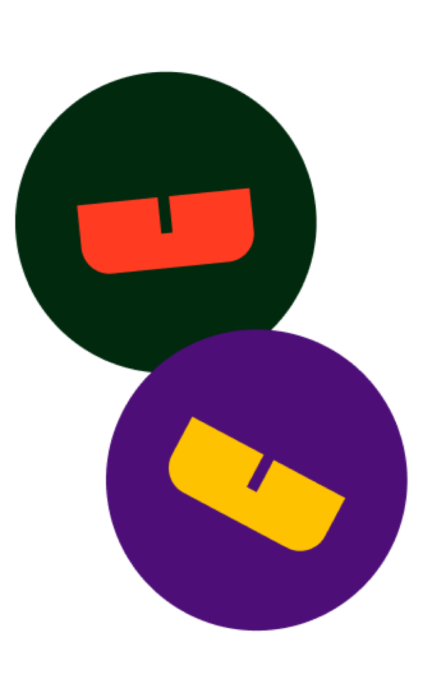
Another identity key element is the rich color palette, in particular –– a selection of two-color combinations.
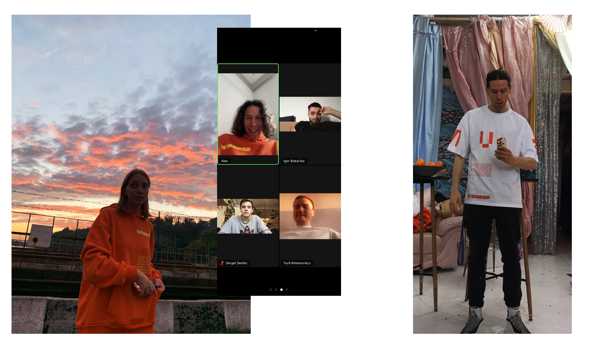
To be honest, merch is the most pleasant stage of the "revival" of the design system and identity. For UNIT we released orange skinny and double-sided T-shirts that can be worn inside out like by real rebels. Also we've printed notebooks and other cool stuff. We like to meet people dressed in our merch in the city (it is bright, it can be seen from afar), and see it on colleagues at zoom meetups
У 2021 році проект здобув Red Dot Award у категорії Brands&Communication Design.