An orthodontist from Germany has patented a new device for expanding the skeleton of the upper jaw. So he was looking for a team to develop an identity, website and video explainer to sell the invention to other orthodontists. And he chose us after he had seen our work for ADAM.
"From the client there was an insight that orthodontists were tired of the usual medical descriptions and after a long working day would better perceive a spectacular visual demonstration of the product" – Project manager Anna Partyn.
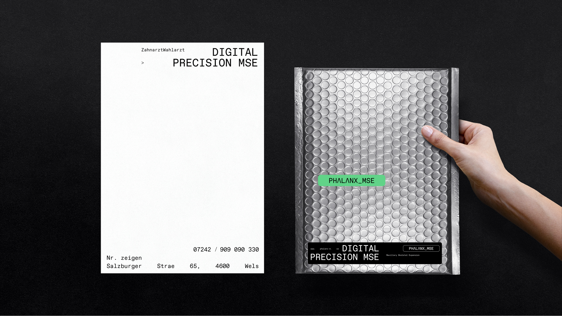
''We had to develop an identity in the spirit of innovation, which would be clear to our TA, at the same time separate from the classical medical aesthetics. Therefore, in visual solutions, we followed the function and were inspired by the interfaces of tomographs, X-rays and so on. That was how the black-and-white scale, accent color and mono-wide font appeared" – Art director Yasya Bohdanova.
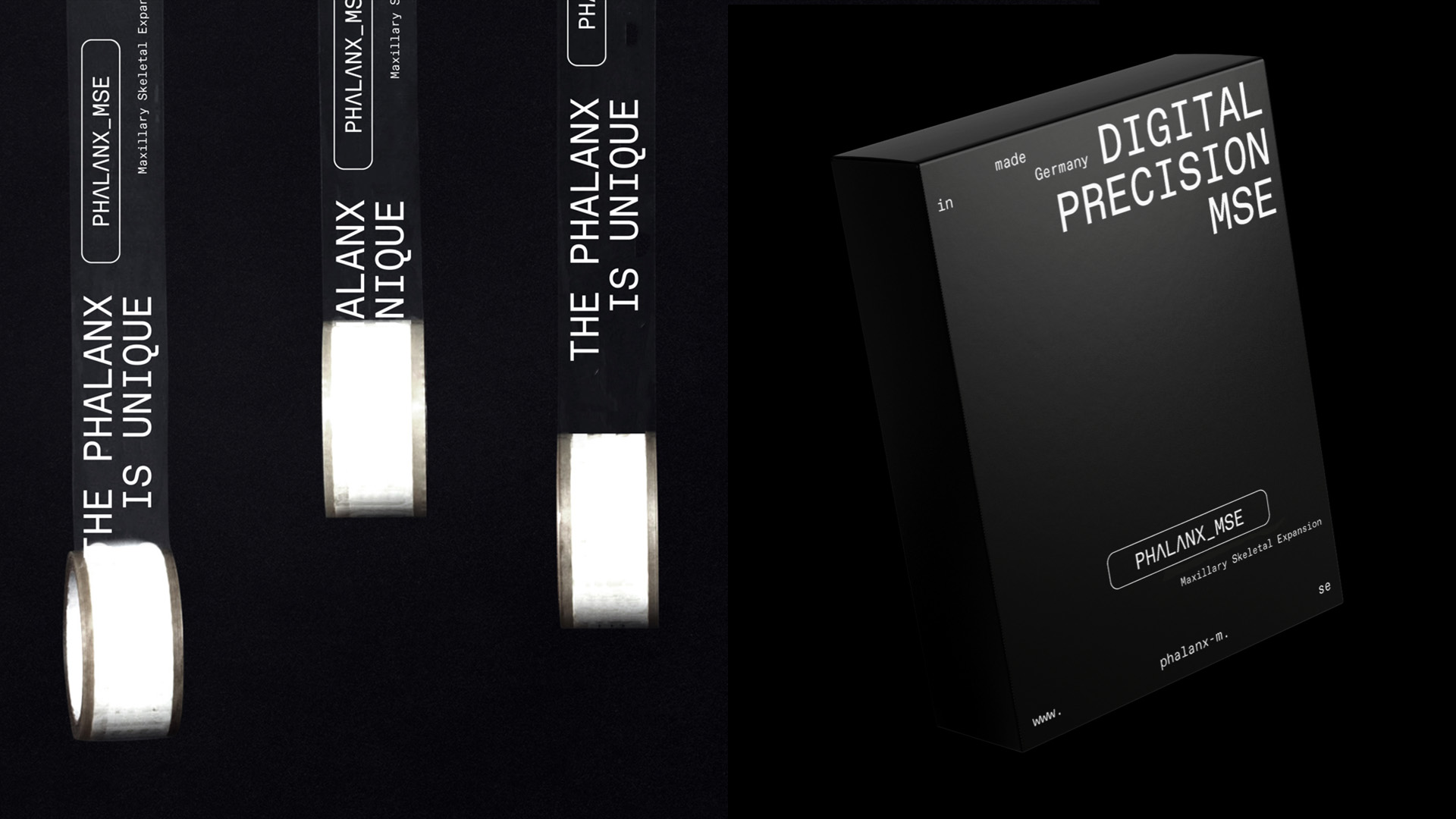
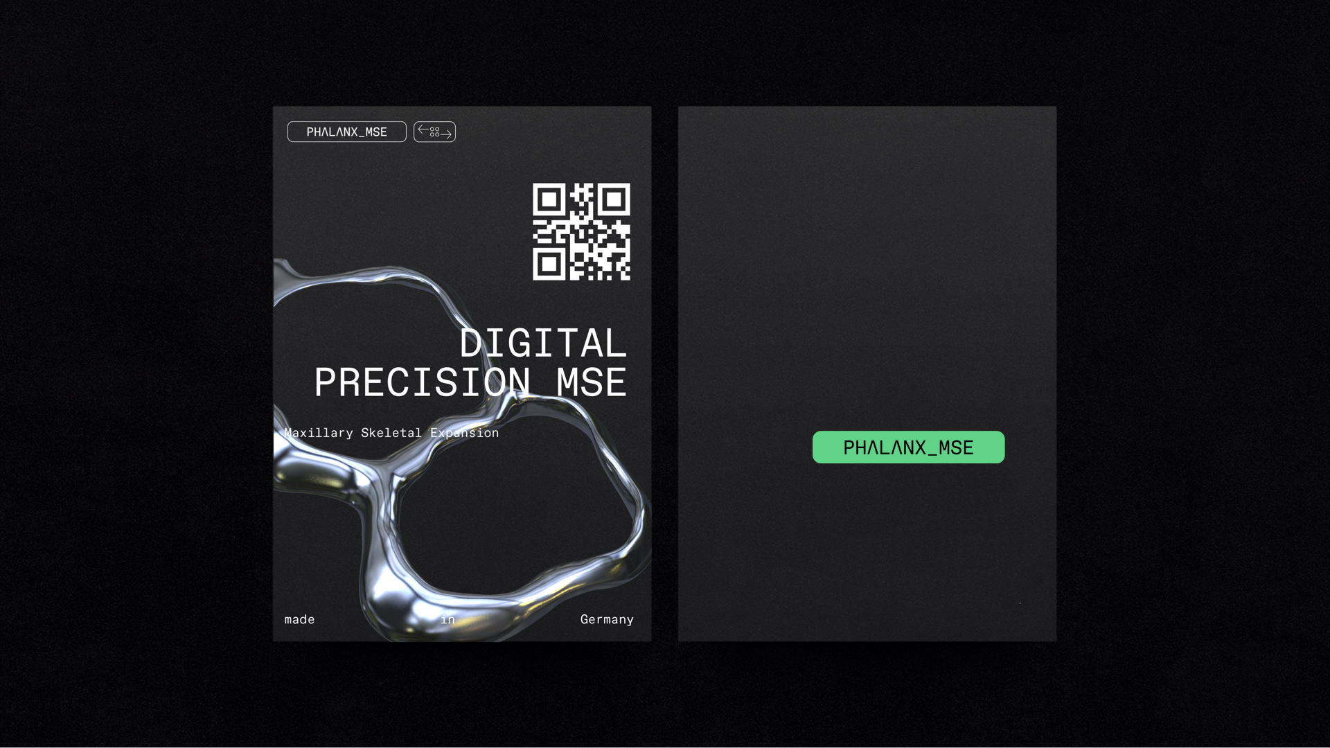
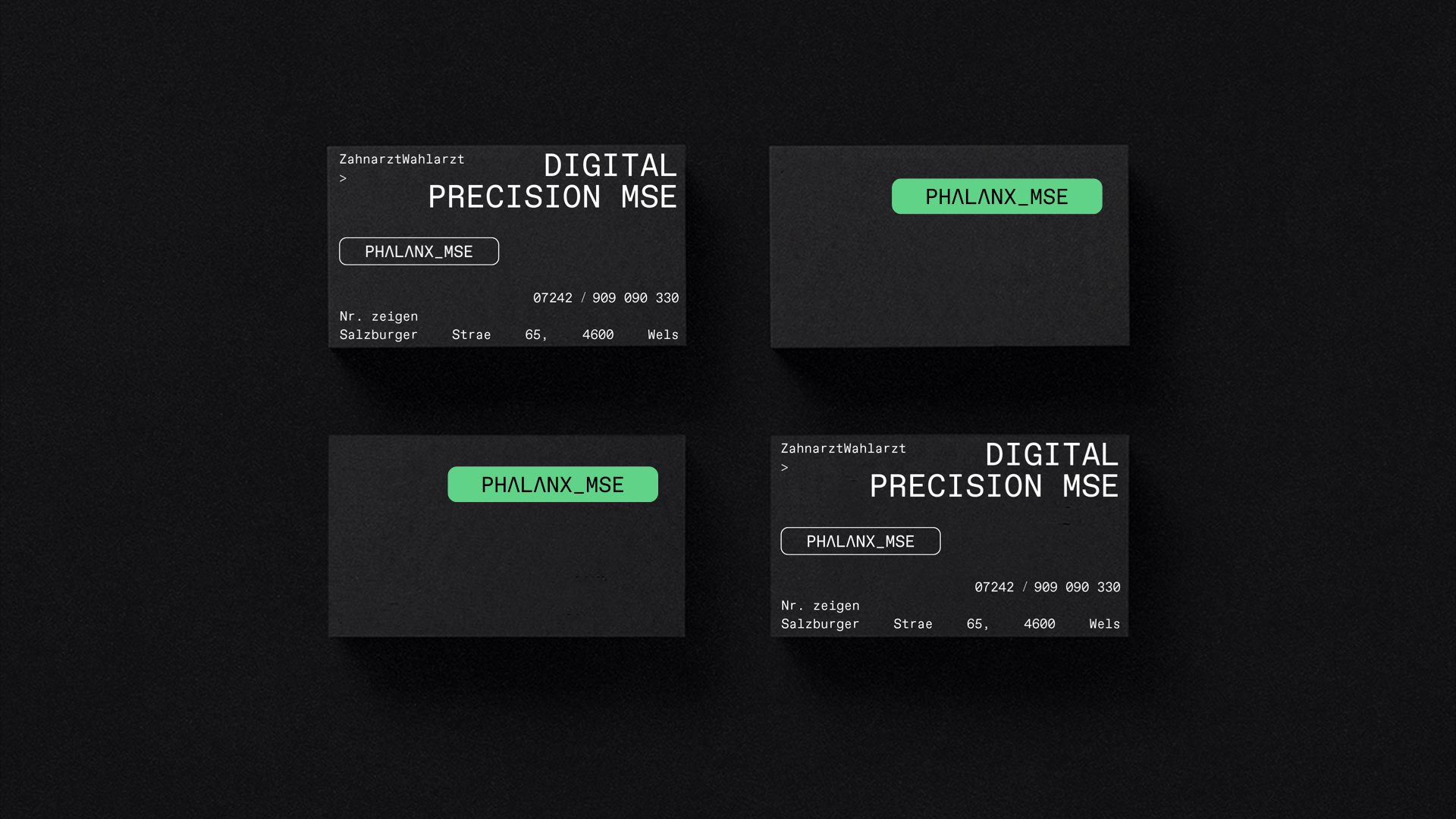
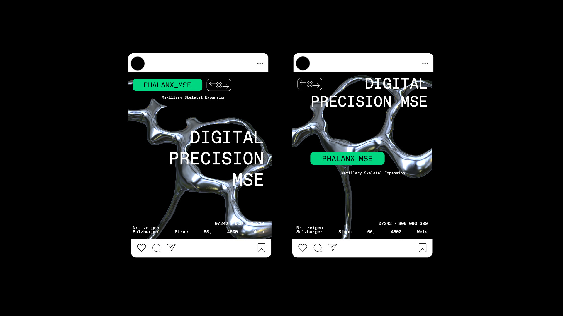
‘'The logo works as an accent, thanks to the use of green. And the sign next to it symbolizes the control system, an important detail of our device. At the same time, the product itself has become an integral part of the design system. These specific chrome details have been actively used in both print and digital media'' – Graphic designer Igor Babariko.
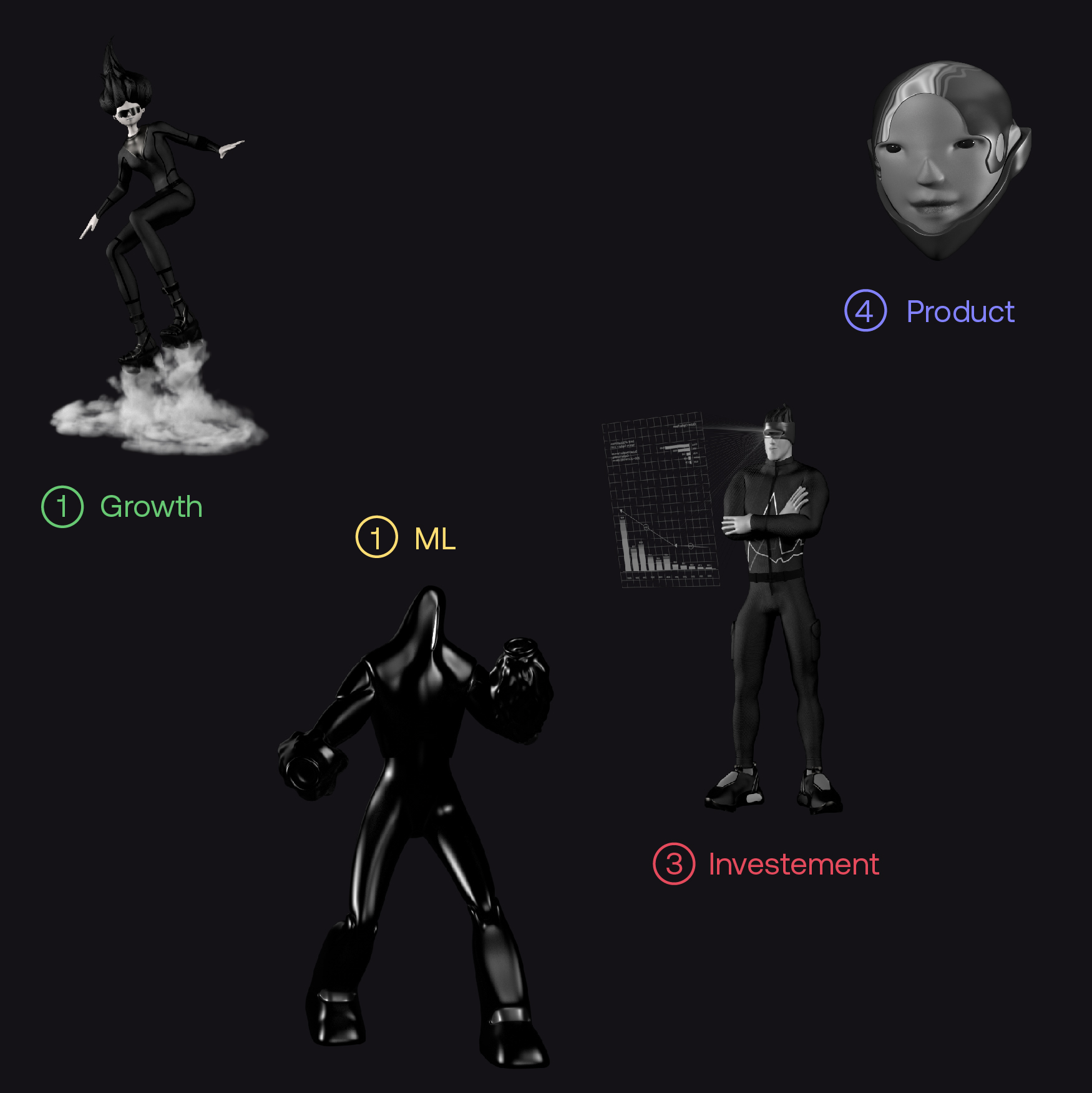
''We divided the user interaction algorithm into interdependent steps: uploading a 3D model of the patient's jaw to the site; customization of the Phalanx device for individual needs; order and payment. Each step was gamified to some extent.
And the general visualization of the invention performs not only an aesthetic, but also a practical function. It became a video instruction'' – UX designer Yevhen Volodko.
''To create a 3D model, we made a sample in Germany. After all, everything was important: the shape of each tooth, the nature of the movement, the details of the mechanism and the method of its installation. This stage hadn't been given at first and there had been a lot of funny and not failures. My favorite – when we did the first visualizations of how the Phalanx suited a jaw, and it turned out that it was the jaw of a monkey (not human)" – Project manager Anna Partyn.
“We made a model of the jaw and realistically deformed it to reflect the problem that the Phalanx solved. There were many details and the process of installing the device, because it had to be a documentary, to reflect how everything would happen in the orthodontist's office. It was especially interesting with the animation – for example, to show how the dentition was aligned. Anya helped me with this. She had deciphered the orthodontic terminology from the client, such as sutura palatina mediana, and so step by step we built an animation'' – 3D designer Alex Ross.
‘'I joined the project at the beginning, when I had to make a model of the Phalanx. Sample had come from Germany. I took pictures of it and started modeling. It turned out that first I had made a model without a product in front of my eyes, so then I had to make it again because the real scale of the Phalanx had turned out to be completely different than we had imagined from the client's photos'' – 3D designer Vova Morrow.
''In a nutshell, it was necessary to develop a soundtrack for a product from the future. When I looked at the references, I realized that this had to be something like a Space Odyssey. The most interesting thing had been to work on the effect of 3D printing, because the sound had to describe the shape of the device'' – Sound designer Kolya Tolstykh.
"The initial concept underwent several changes by the client, but it seemed to me that the team managed to achieve what we wanted" – Art director Yasya Bogdanova.
"I would like to emphasize the cool work of 3D designers, Vova and Ross – a super beautiful and detailed model of the Phalanx. Thanks to the details, all the bumps, notches, smooth lines, the material was very interesting to work with light in the scene. And a cool style came out – a mixture of science and medicine, futurism and jewelry precision" – Motion designer Yura Khomovsky.
"The initial brief to create the image of the Terminator around the orthodontic device was very attractive. Working with a client from Berlin sounded nice. Only during the process, it had become clear how difficult this task was. Narrowly specialized topics and such a specific target audience proved to be a serious challenge. There were a lot of unusual details in the project, such as the fact that we even contacted a broker to clear the Phalanx sample through customs and only got it on the second try. Although we reacted swiftly with the creation of visual style, the creation of a product video and online store became an unprecedentedly difficult process for us. I believed that in the end the foundation for the product was strong and the meeting with the market is ahead. Let's see what our Terminator will be capable of'' – Creative director Alex Twista.
Creative Director – Alex Twista
Project Manager – Anna Partyn
Art Director – Yasya Bohdanova
Graphic Designer – Igor Babariko
3D Designers – Vova Morrow and Alex Ross
Motion Designer – Yura Khomovsky
UX Designer – Eugene Volodko
Sound Designer – Kolya Tolstoy
Frontend Developer – Ilya Monastyryov
Backend Developer – Petro Shlemko
