Room8 is an experienced team of creative minds specialised in the art of computer, console, and mobile games: from 3D characters and locations of different scales to game UX/UI, animations, and VFX. You may have seen the Studio’s works in many games, including DOCTOR WHO, FORTNITE, AGE OF EMPIRES IV, CROSSFIREX, and APEX MOBILE, to name a few.
Room8’s target audience could be divided into two groups for convenience. One includes the existing and potential workers, while the other is the b2b clients cooperating with the Studio. It was important to us that the new identity resonated with both groups.
A logo is one of the primary elements of a brand identity, especially in the case of Room8. It must convey both the Studio’s passion for technology and its creativity.
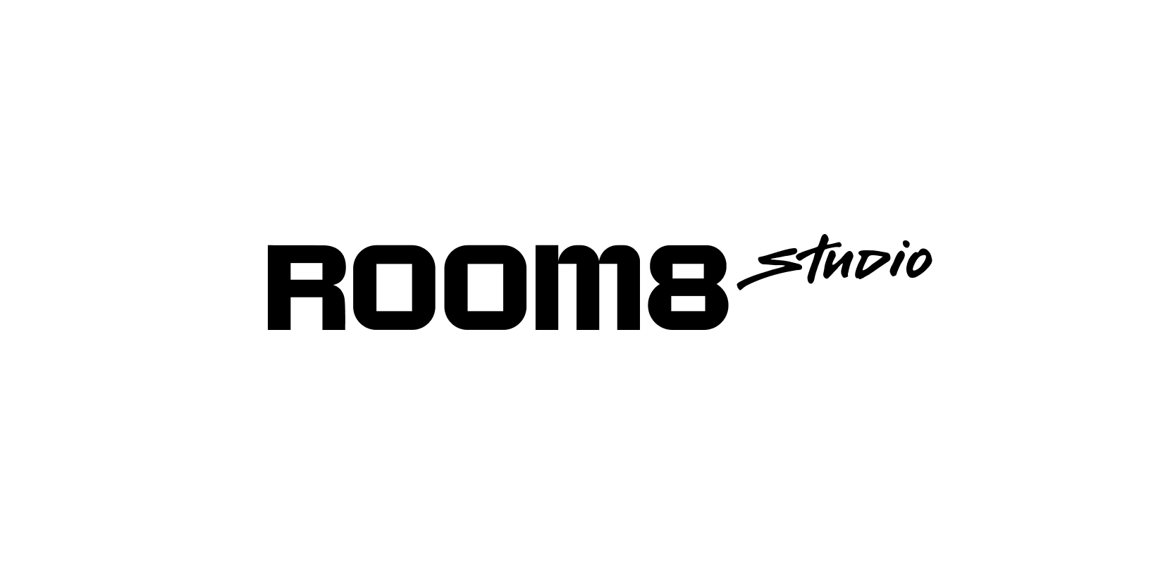
That is why we developed a font logo that consists of two stylistically different parts.
The first one represents gaming and sci-fi. The second one is streamlined and calligraphic. We asked dozens of Room8 specialists to write the word ‘Studio’ by hand in their preferred style. We received various exciting options and chose the one that best suited the logo.
Afterwards, the design completed by a professional artist and calligrapher became the ultimate version of the logo.
Since the Studio is part of Room8 Group, we also ensured the logo fits well with its general style.
Our art directors selected a colour palette for the Studio, but we were able to arrive at one primary colour following the development and creative discussion process.
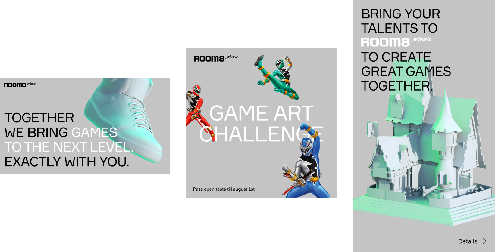
From now on, the Studio will use FORMULAR font for its texts, which chimes with the logo and forms a double combo with INTER, a font used for short descriptions.
The black and white letters are well visible on the corporate grey background.
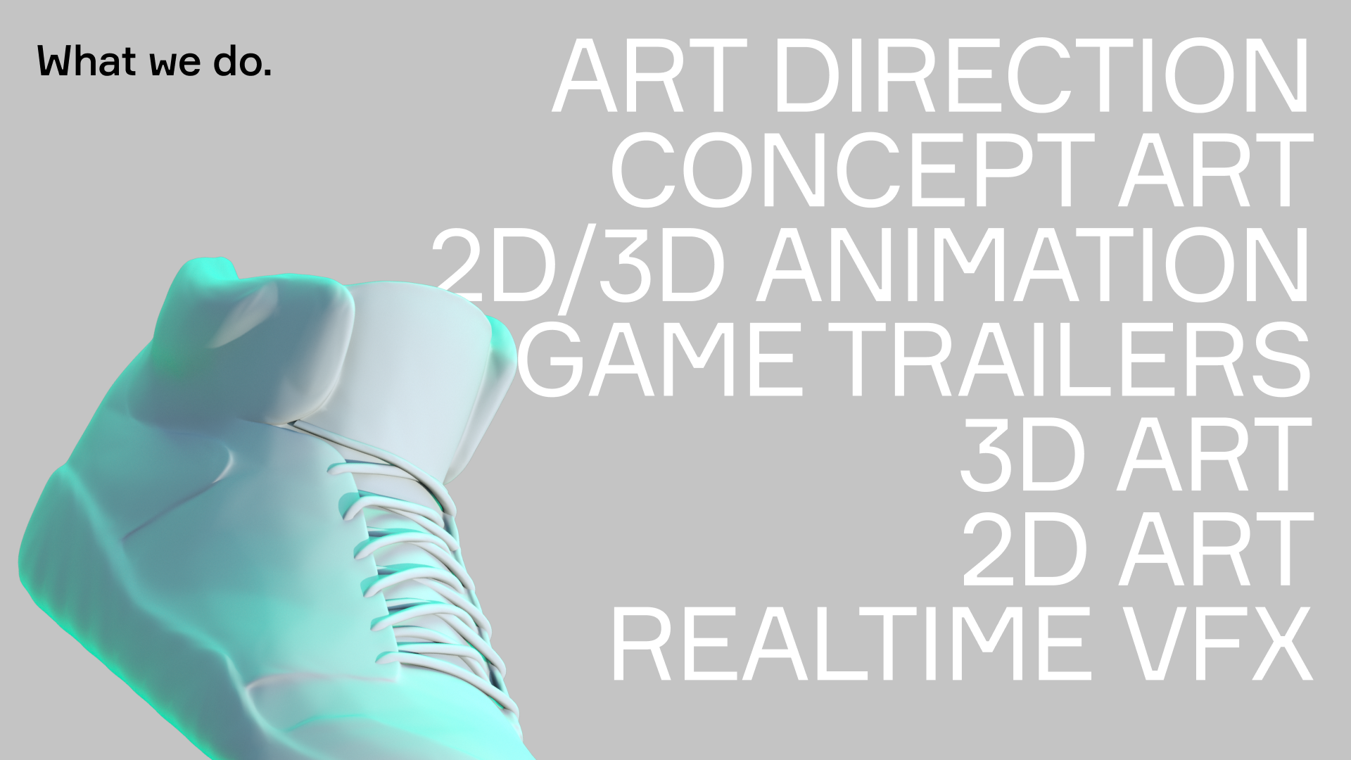
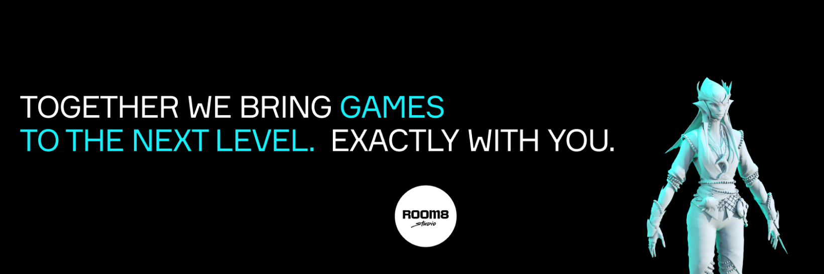
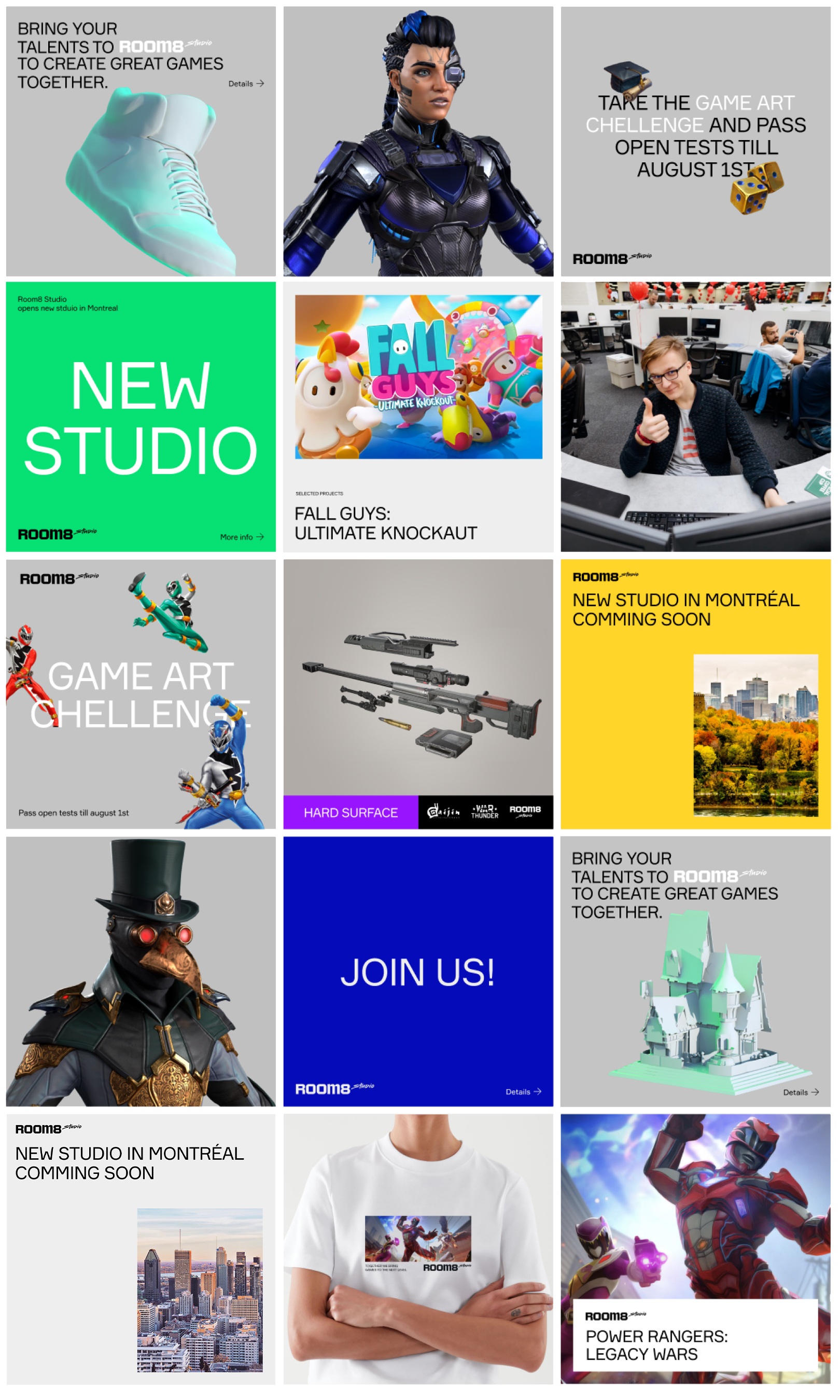
For Instagram, we proposed the materials arranging algorithms based on the Studio’s art objects. That allowed us to showcase Room8’s developments and encourage others to join the team.
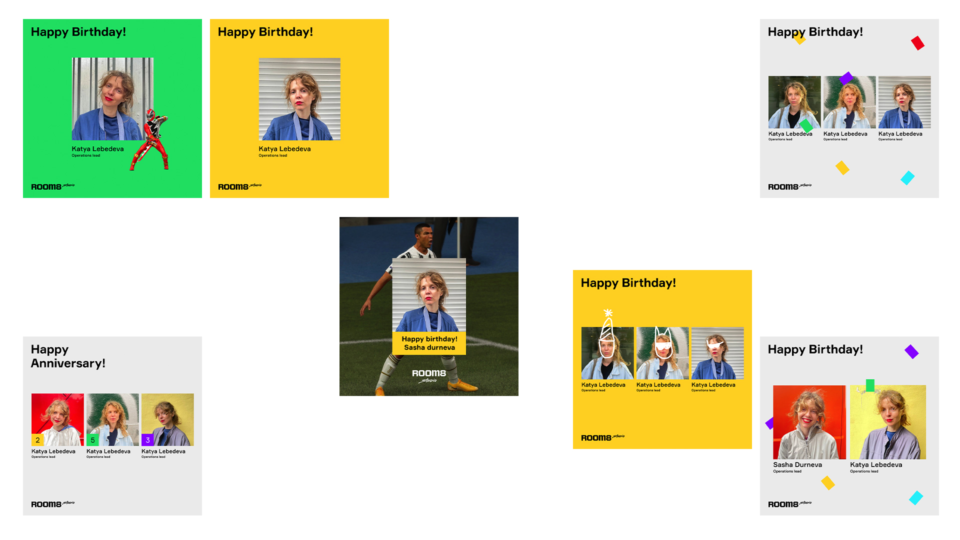
Room8 brings more than 400 specialists together. We have prepared a candid photo guide to show the beauty of each of them. The guide contains descriptions of poses, dress code, backgrounds, and simple tips on colour combination and framing. That helped the Studio team take selfies with their smartphones, which simplified HR work while maintaining the company’s general aesthetic.
We then expanded this approach by adding funny pictures or favourite game shots to photos as birthday greetings.

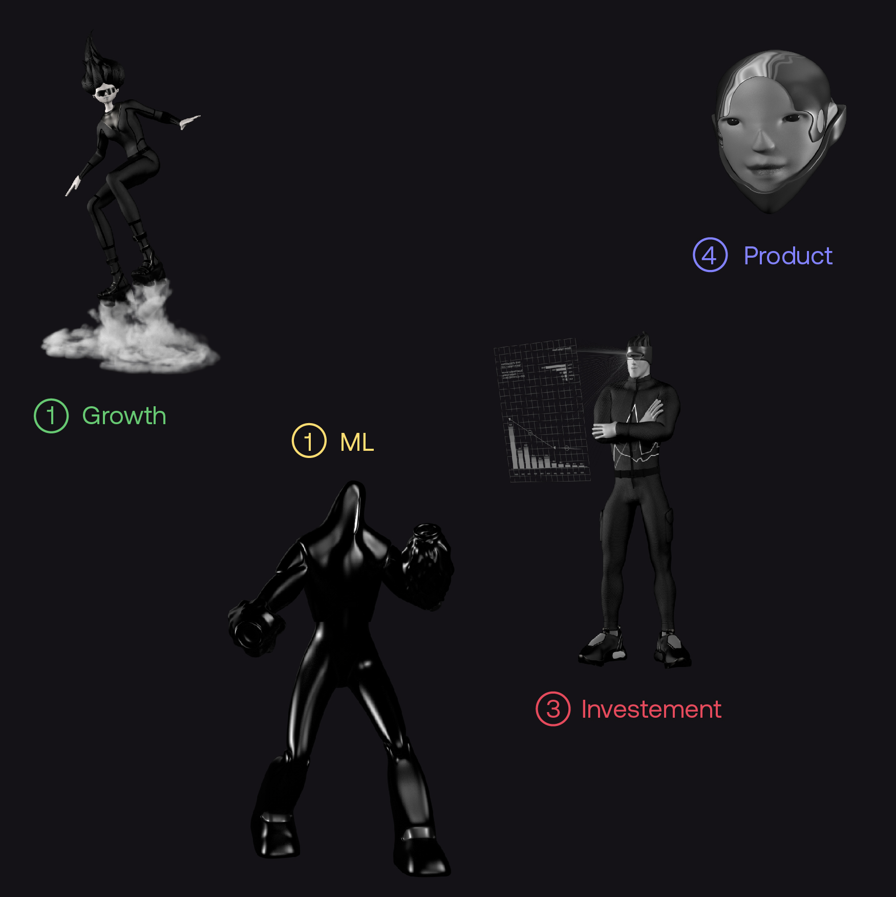
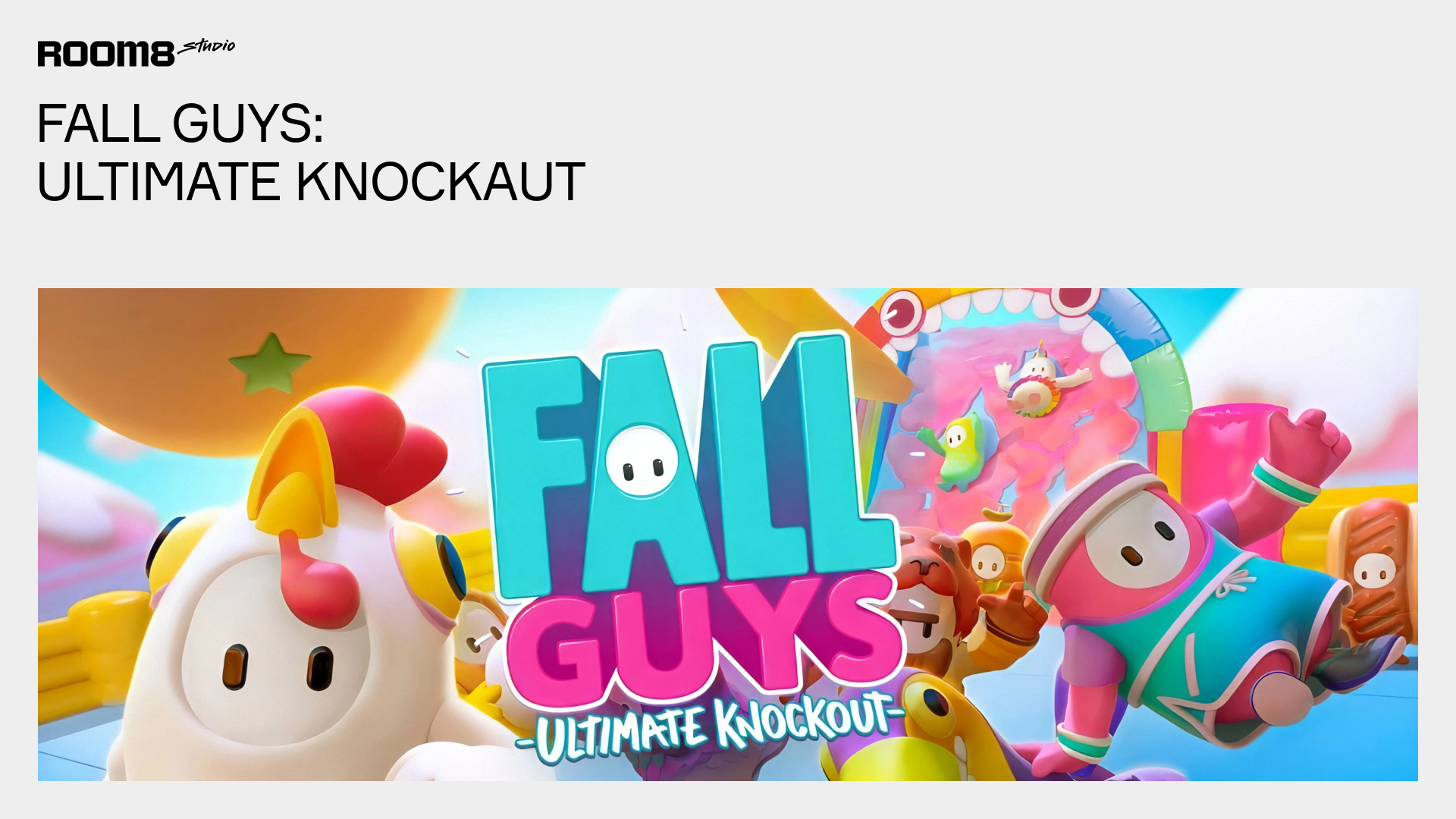
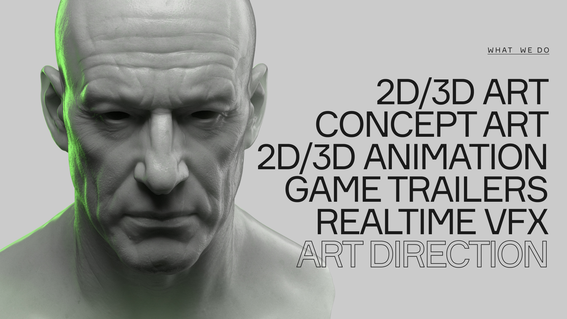
For Room8’s visual style, including internal presentations, we used the Studio-developed 3D models of characters and supplemented them with signature textures, materials, and light. The style and 3D models began to transform later when Room8 developed its website. With many design-related people working at the Studio, our approach has been elaborated and expanded gradually with animations, new effects, and icons.
Alex Twista, Creative Director, says:
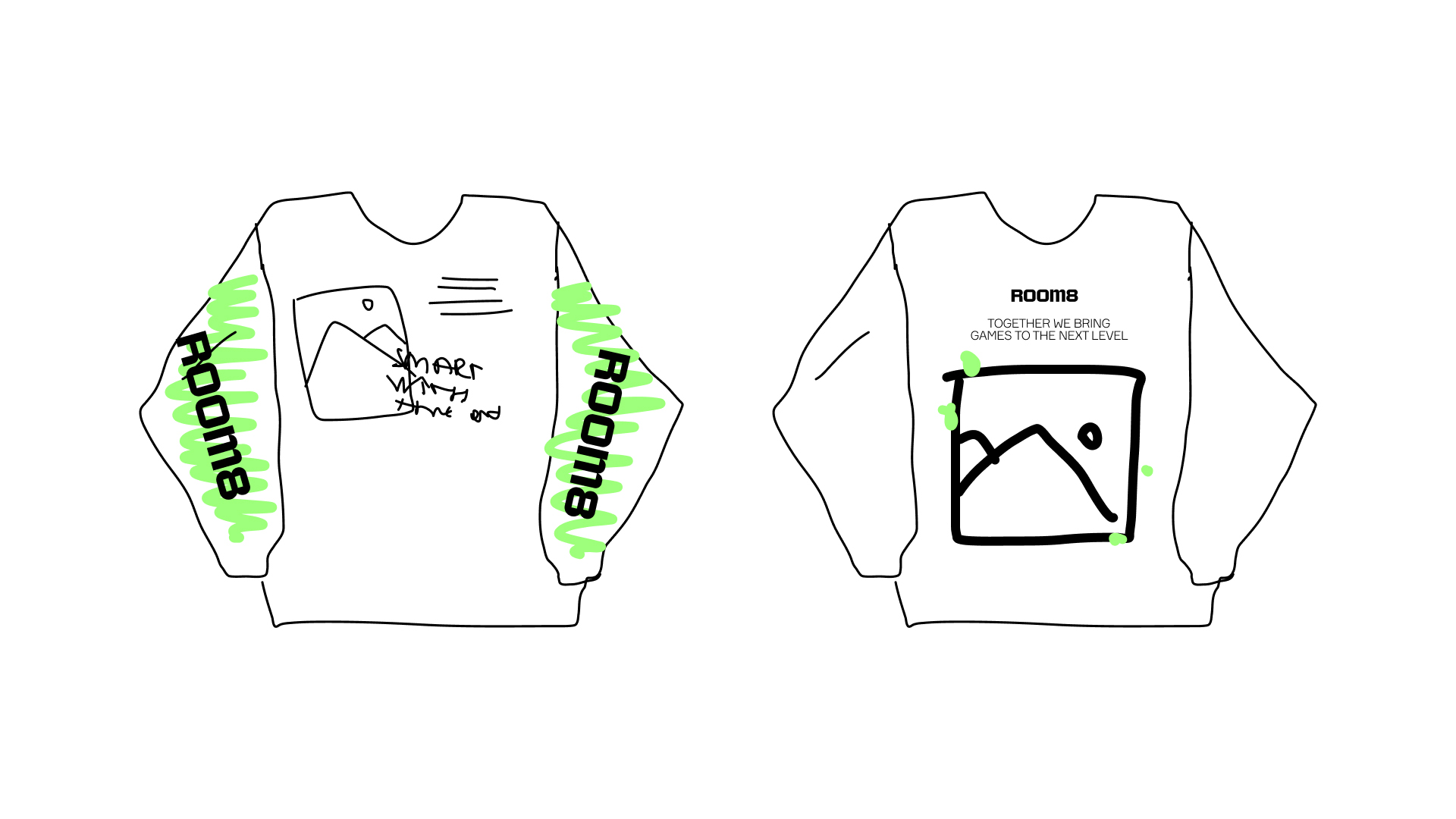
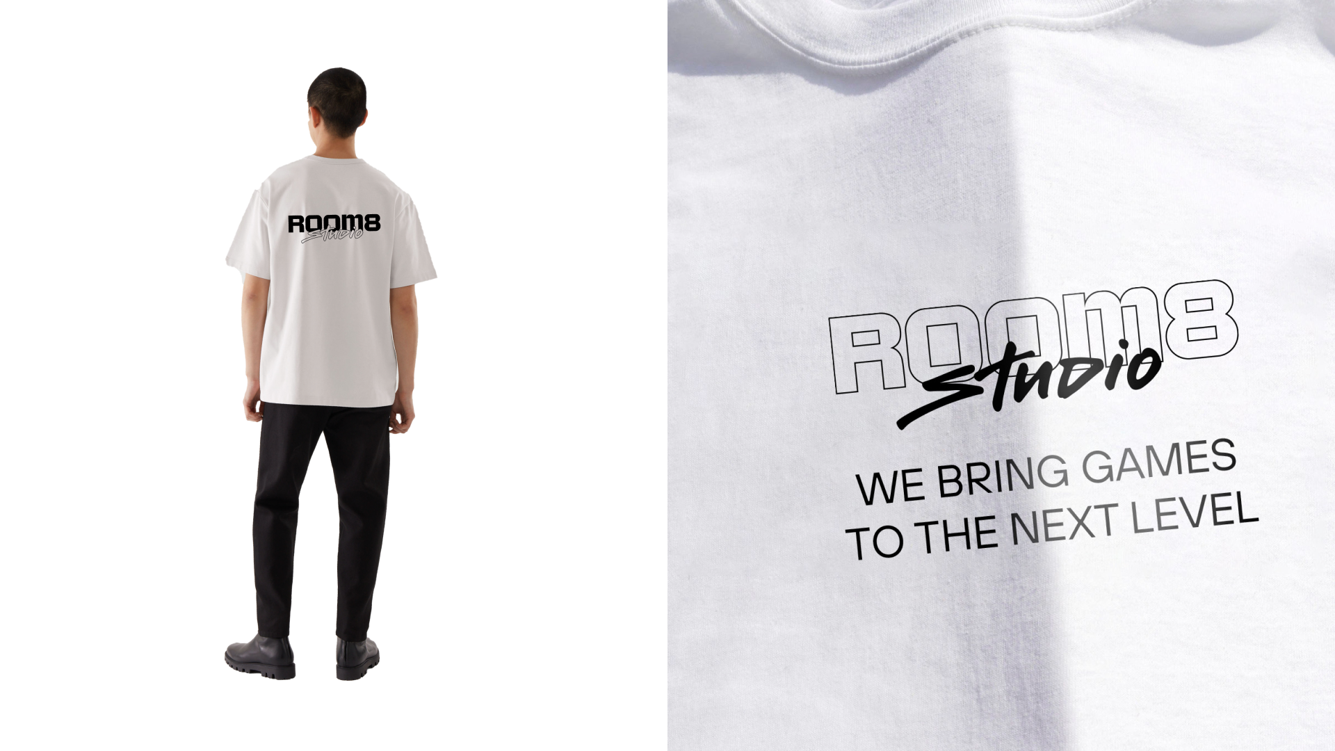
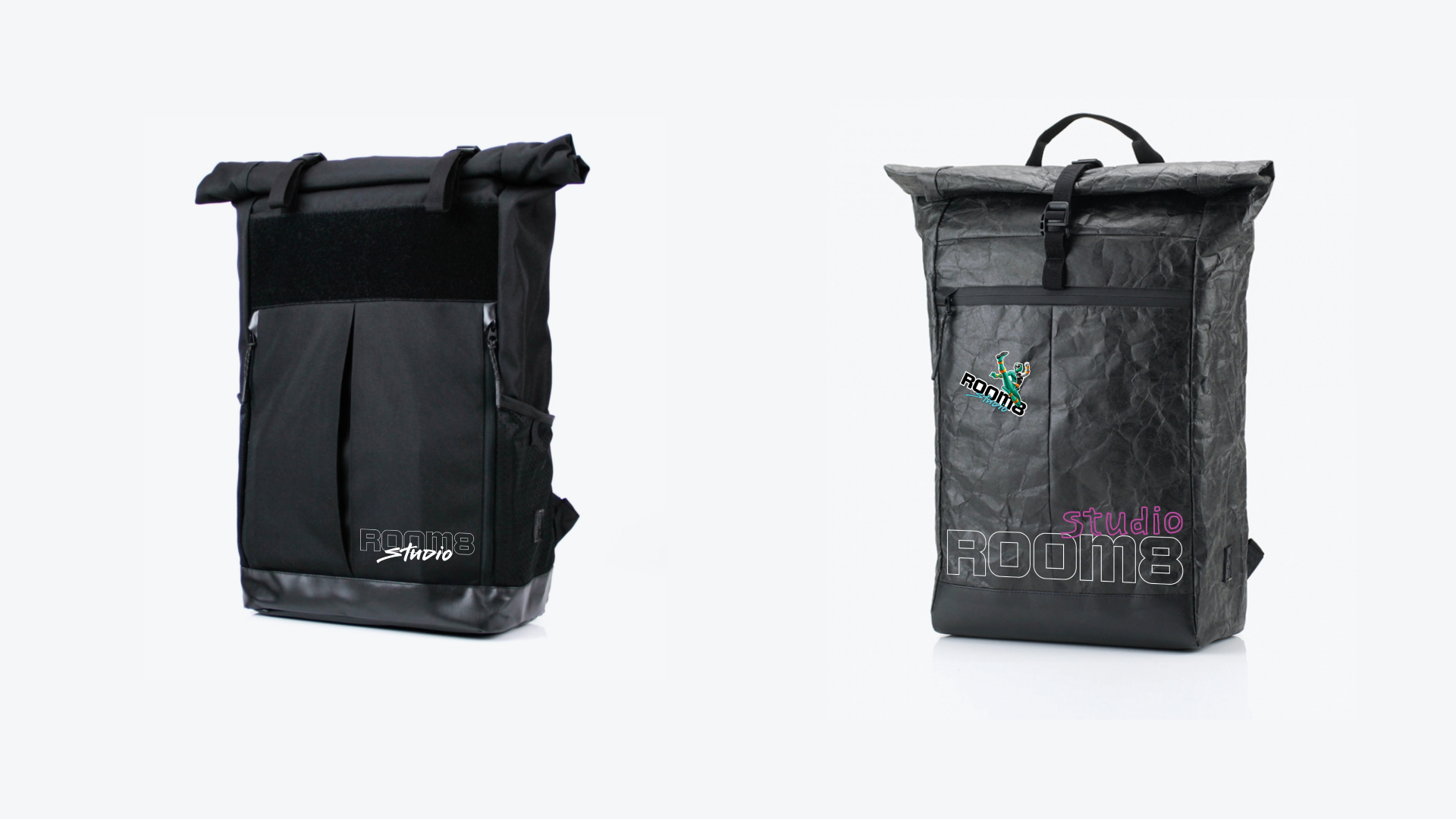
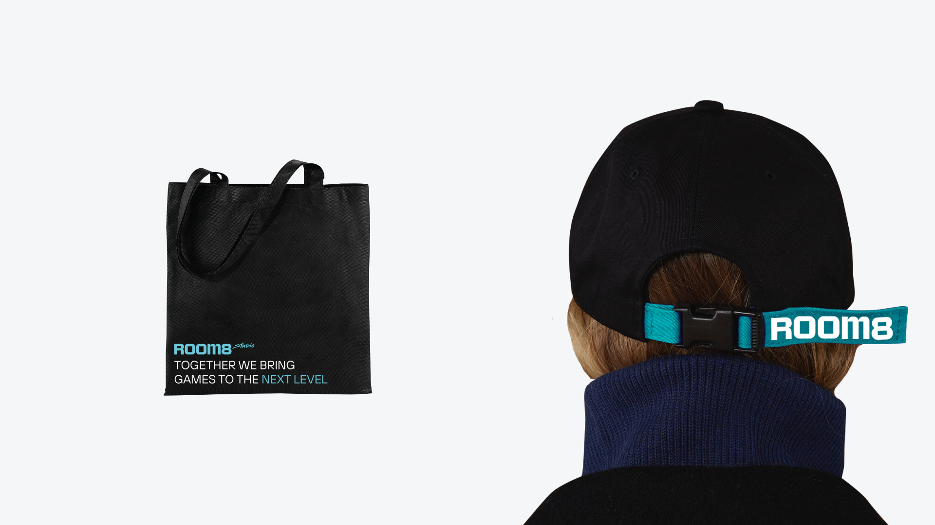
‘I’m sure that style works when it takes on a life of its own. We developed the design to transform it into various media—from web pages to corporate merchandise. Some of the elements literally came to life. For example, animation and new icons were added to the website, and visual effects were enhanced using 3D art. It’s interesting to see your work incorporating new details yet retaining its core principles’.
Alex Twista, Creative Director
Tolik Todorov, Graphic Designer
Daryna Panisheva, Project Manager
Alex Ross, 3D Designer
Zhenia Berdnikov, Calligraphist
Maikl Babenko, Brand manager at Room 8.
Nikolai Slivianchuk, Render artist at Room 8.
SNIG, Website development.
