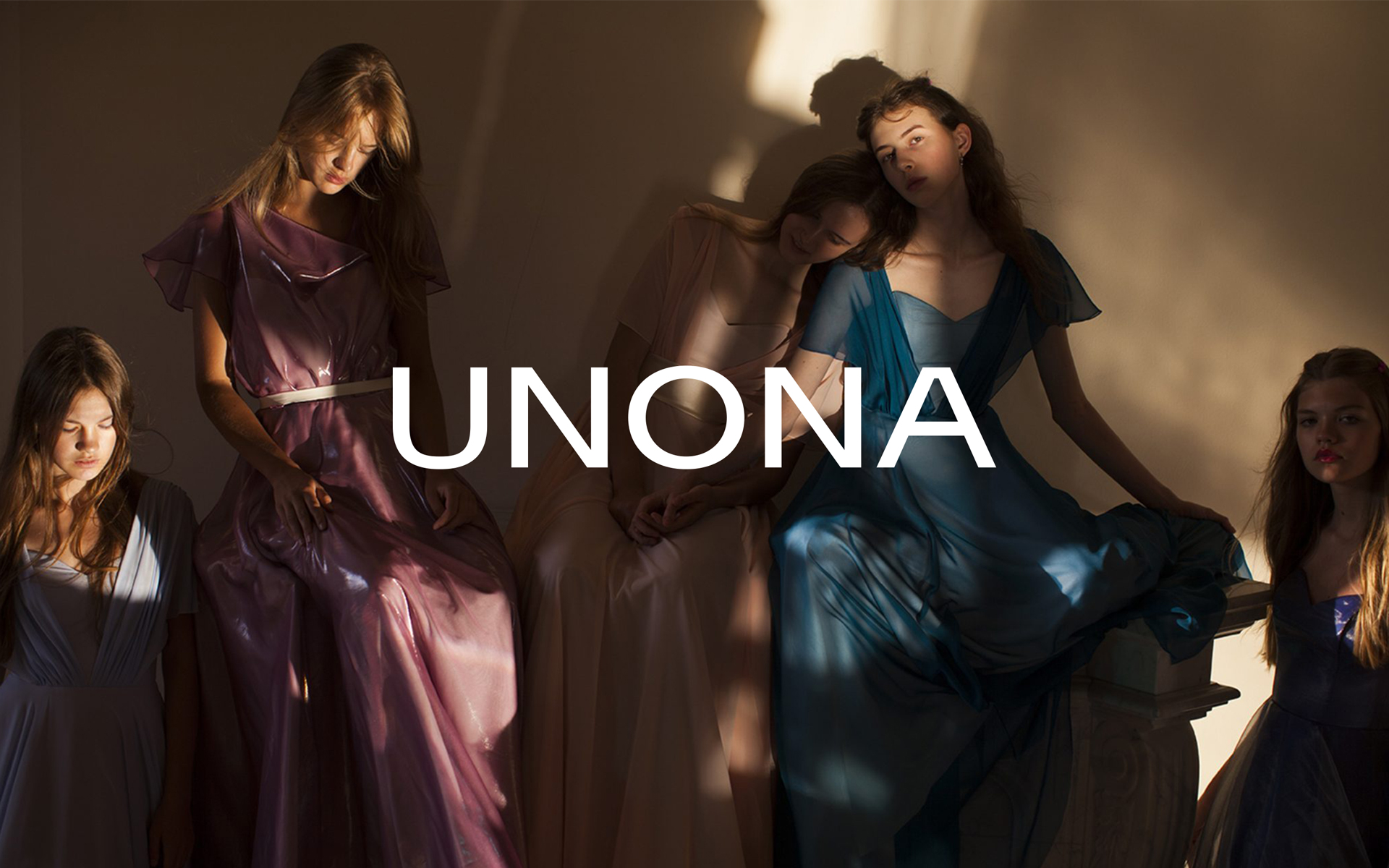
UNONA's story is over 25 years long. The brand keeps developing and has recently radically changed its appearance and direction. UNONA aims to change wedding services market, bring together art and fashion, create a mindful attitude to clothes. We have tried to help them achieve these goals.
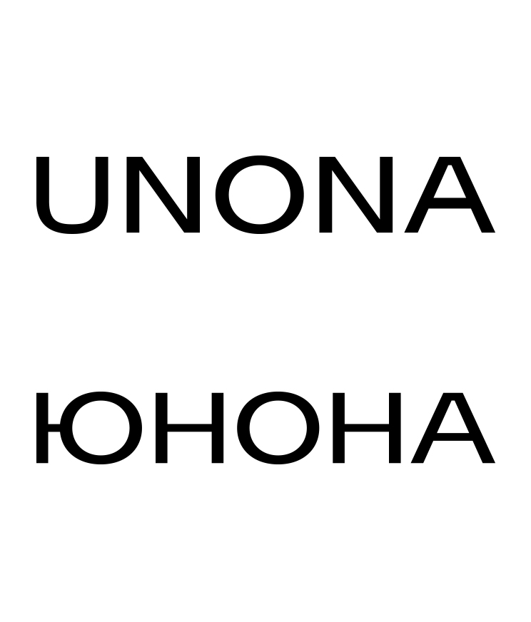
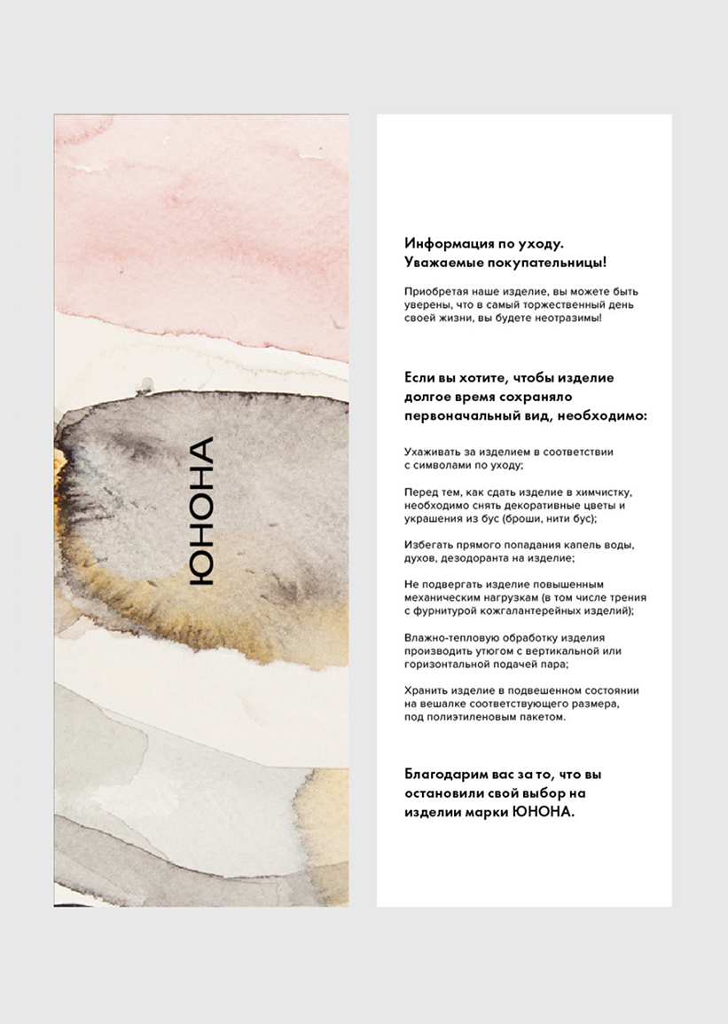
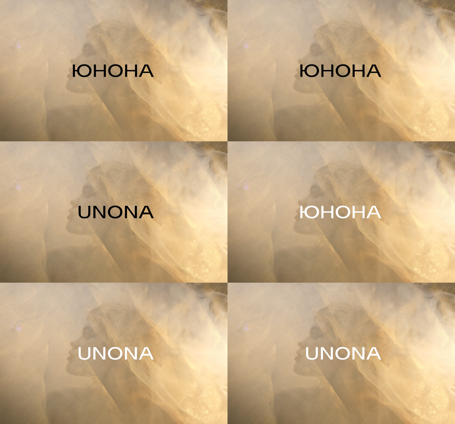
Previously, there was no system to using the logo, it had different fonts and styles at the same time. The new version was constructed using a typographic solution and can be used with both Latin and Cyrillic alphabet.
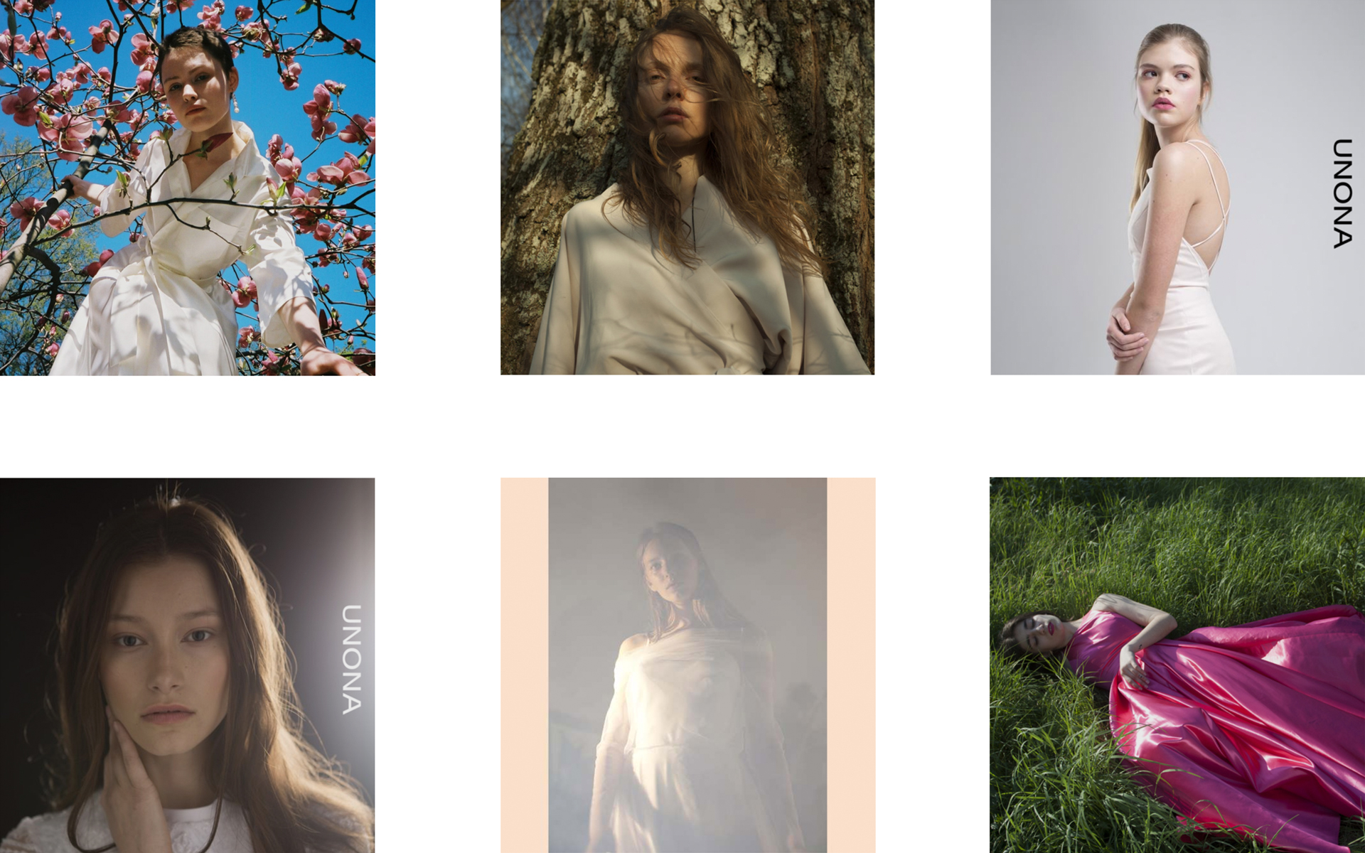
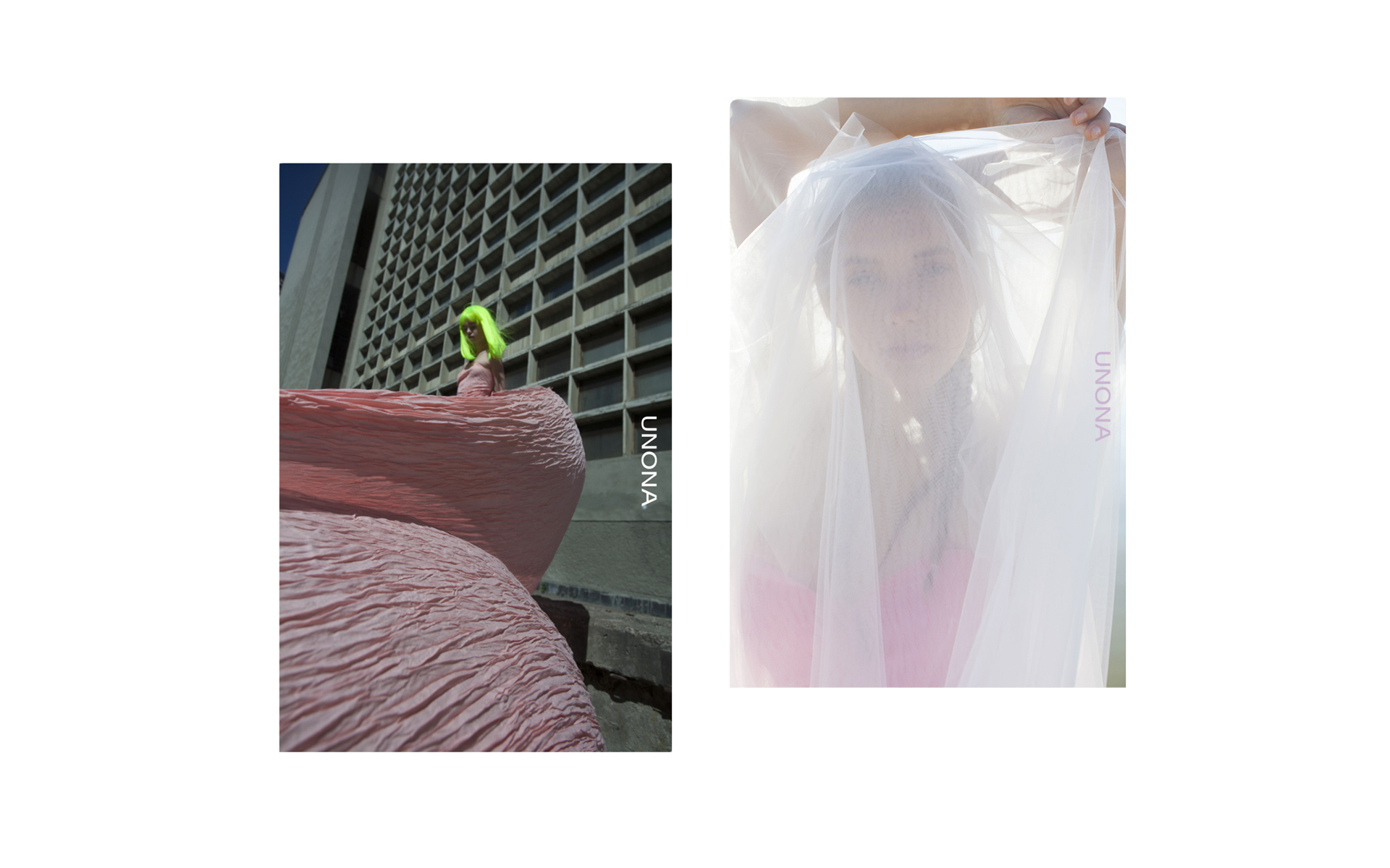
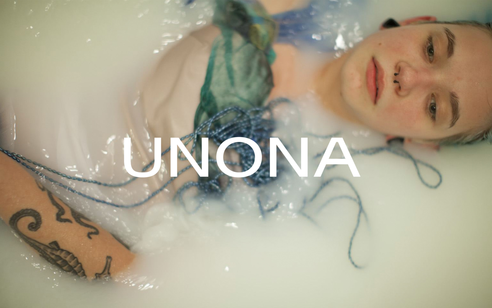
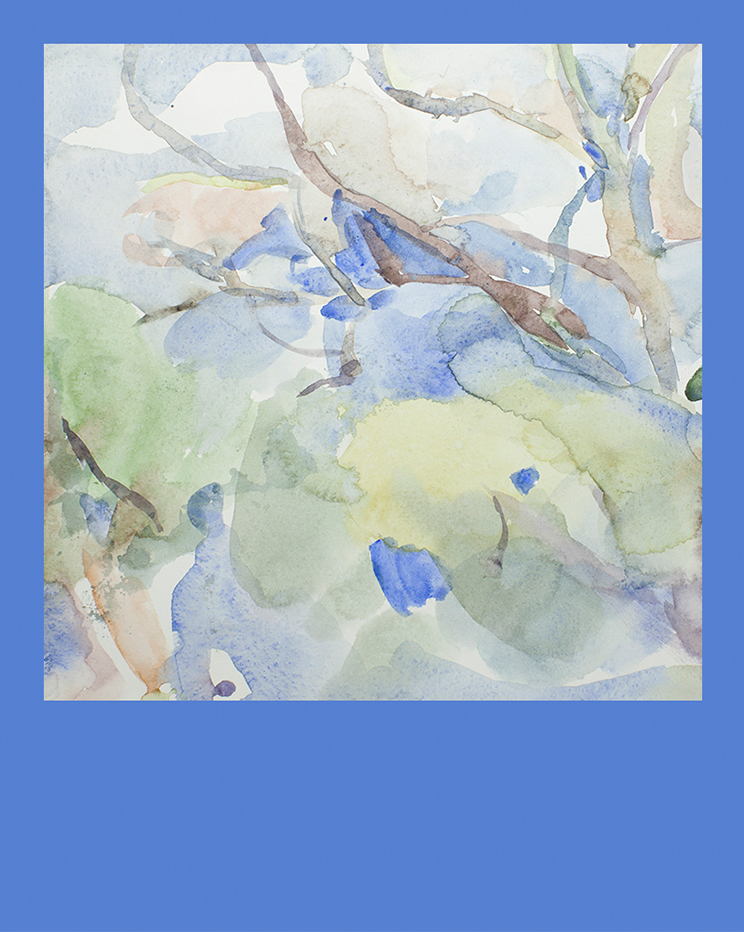
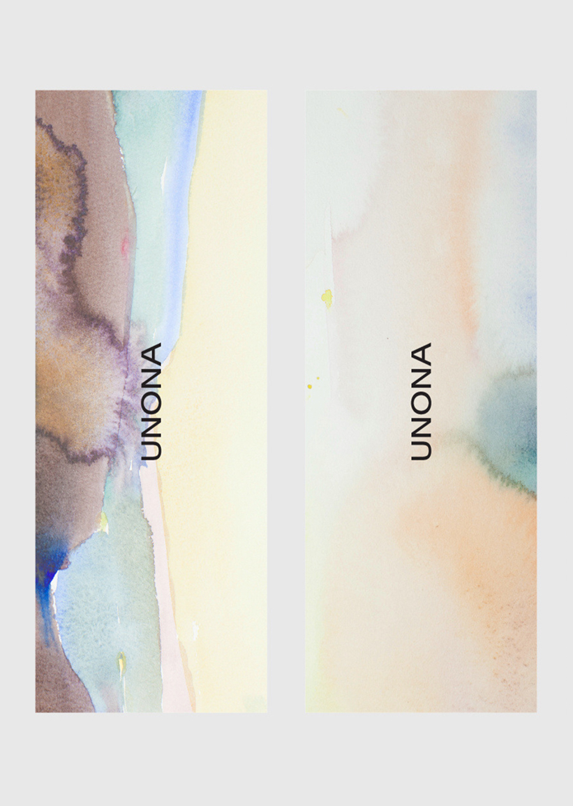
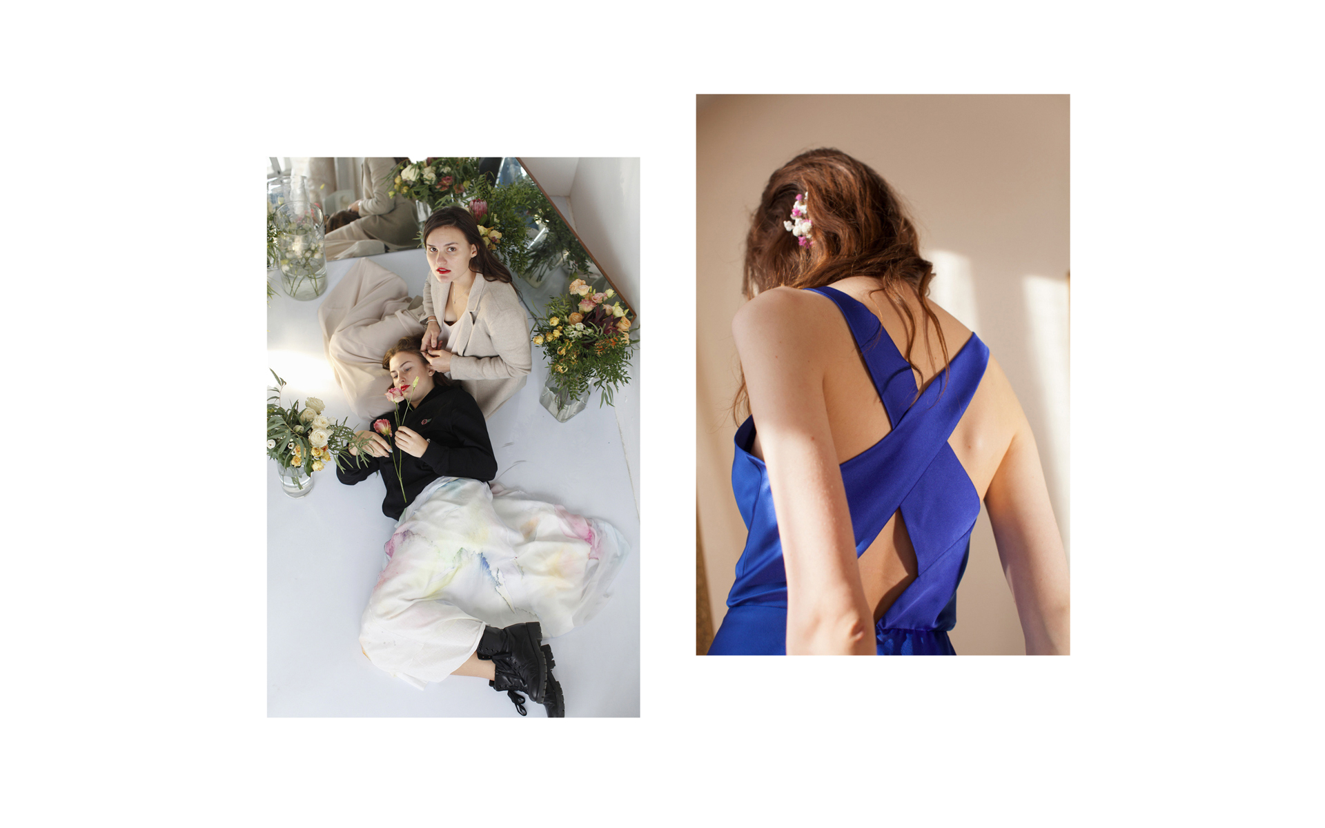
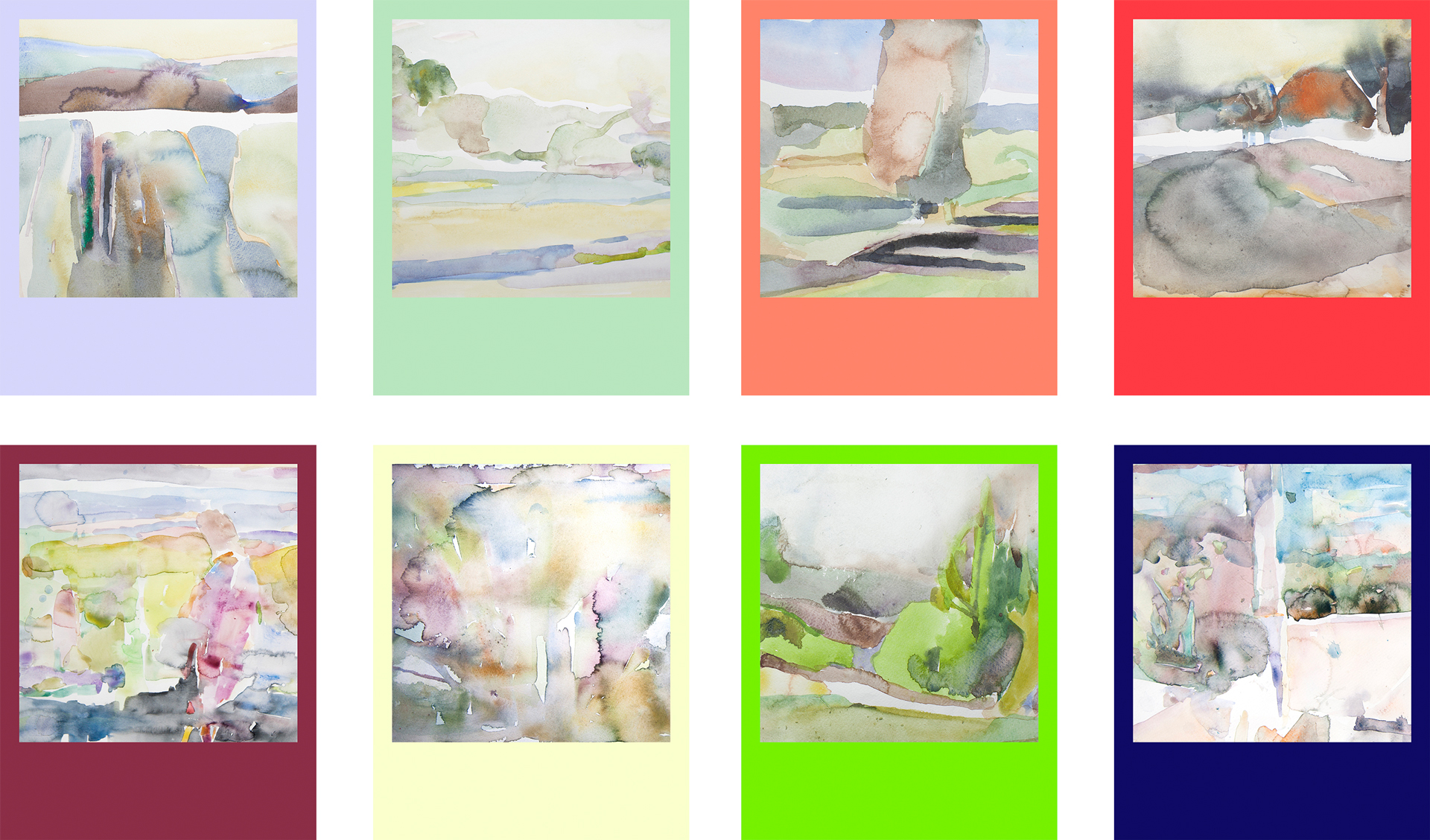
We've decided not to limit brand identity to certain colors. UNONA designers are always working with color and their color palettes can change from collection to collection. We proposed to base the palette on paintings, photographs and other art works regularly created by the UNONA team.
We paid special attention to creating a set of rules for working with typography, as this was the process that caused most difficulties. For corporate fonts, we are using Proxima Nova and Futura.
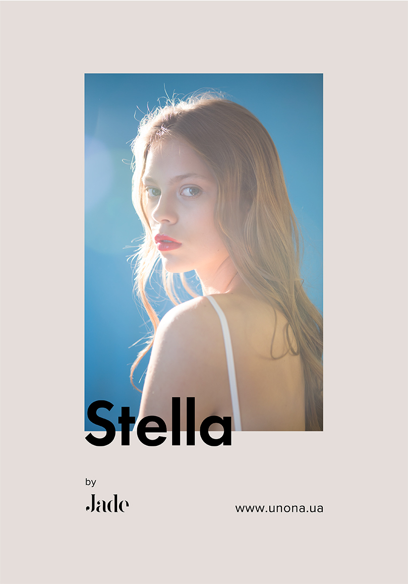
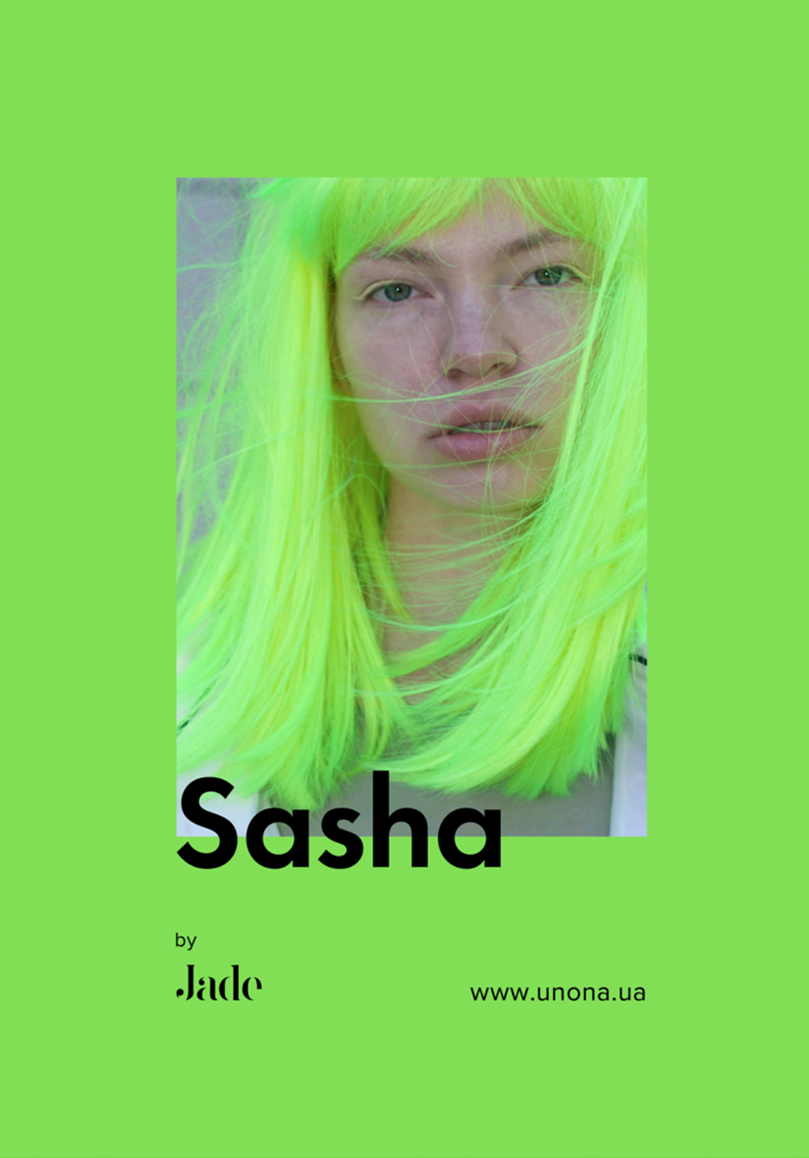
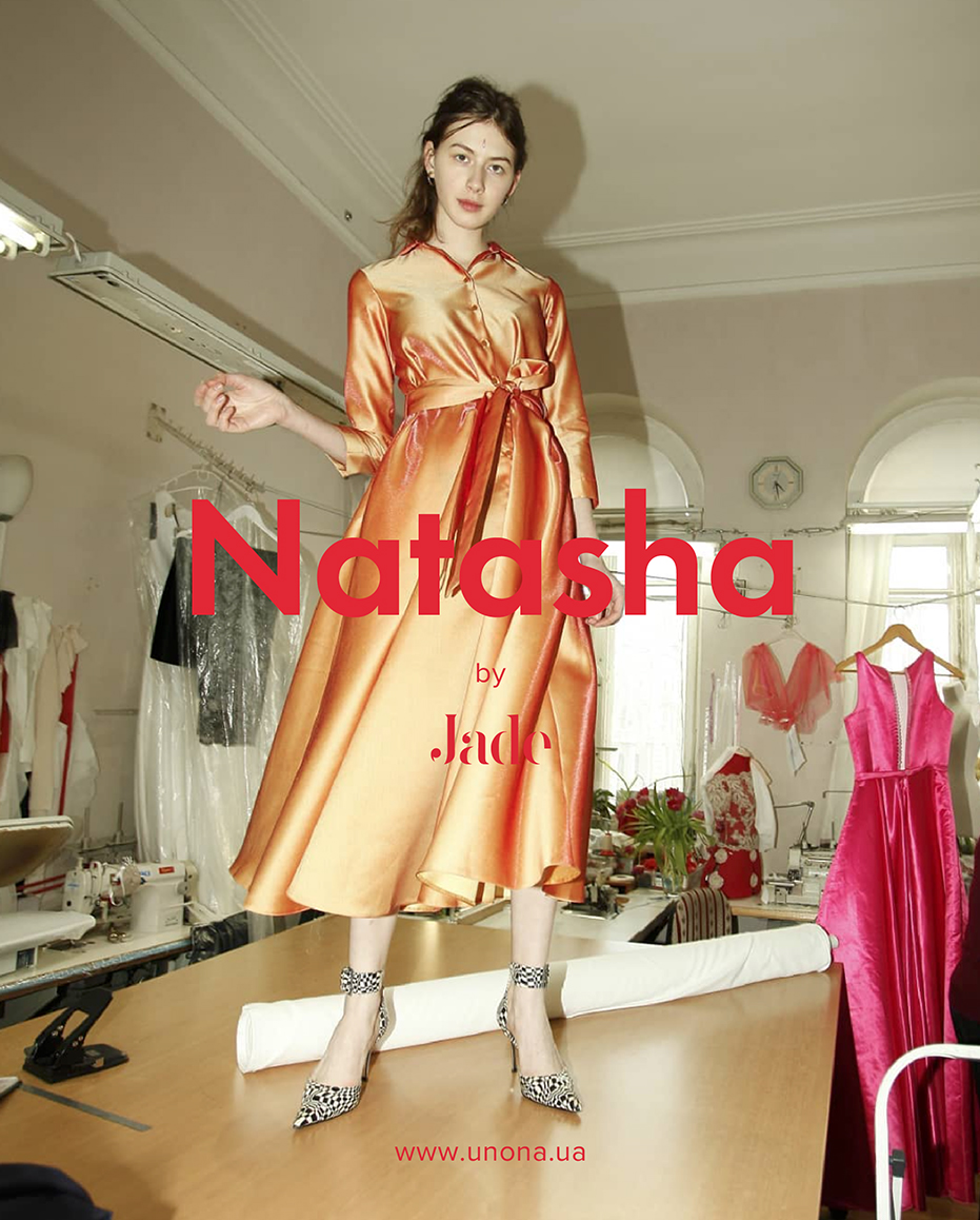
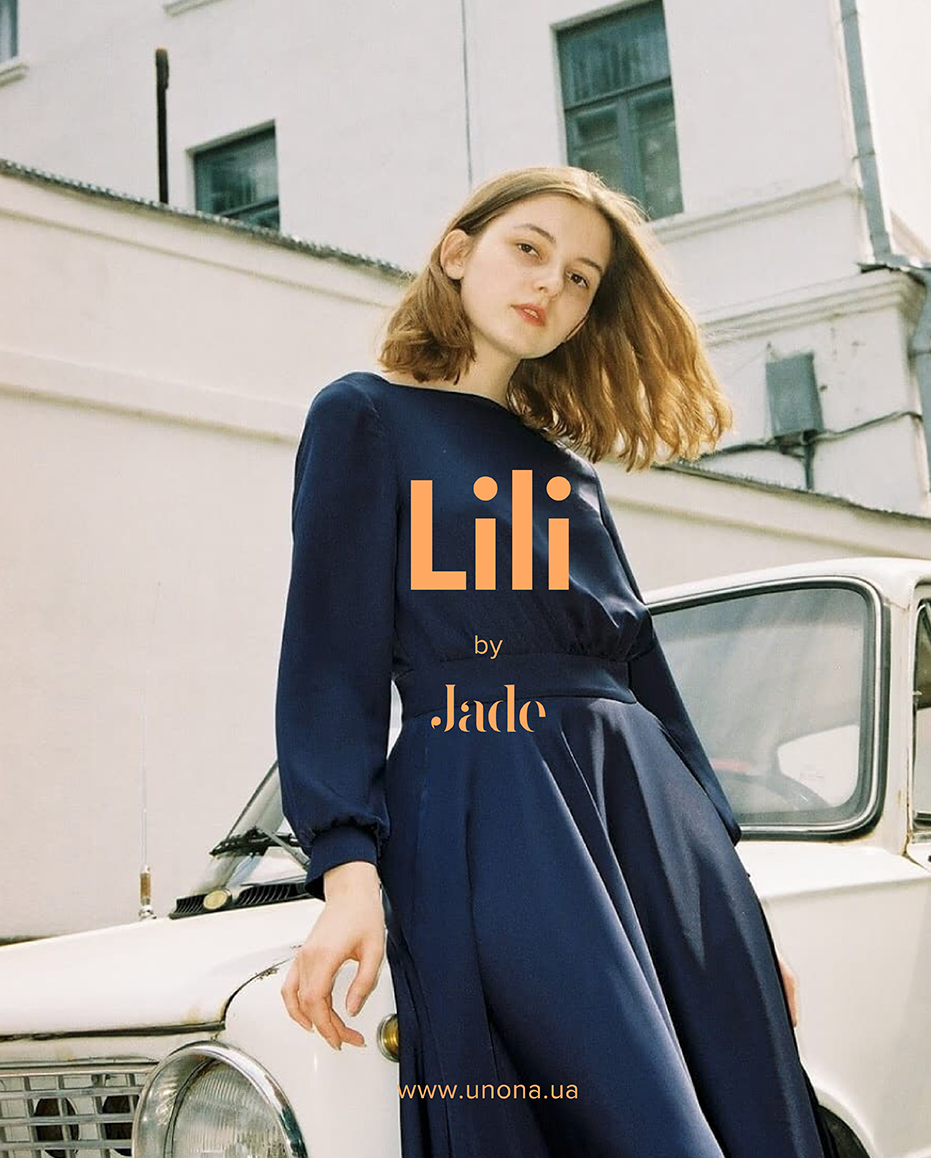
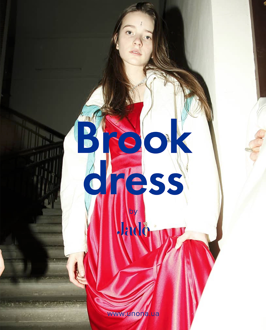
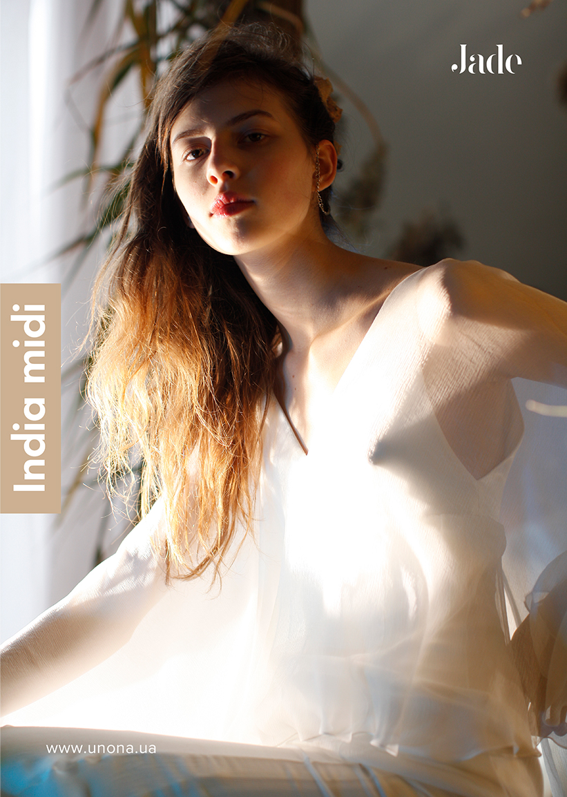
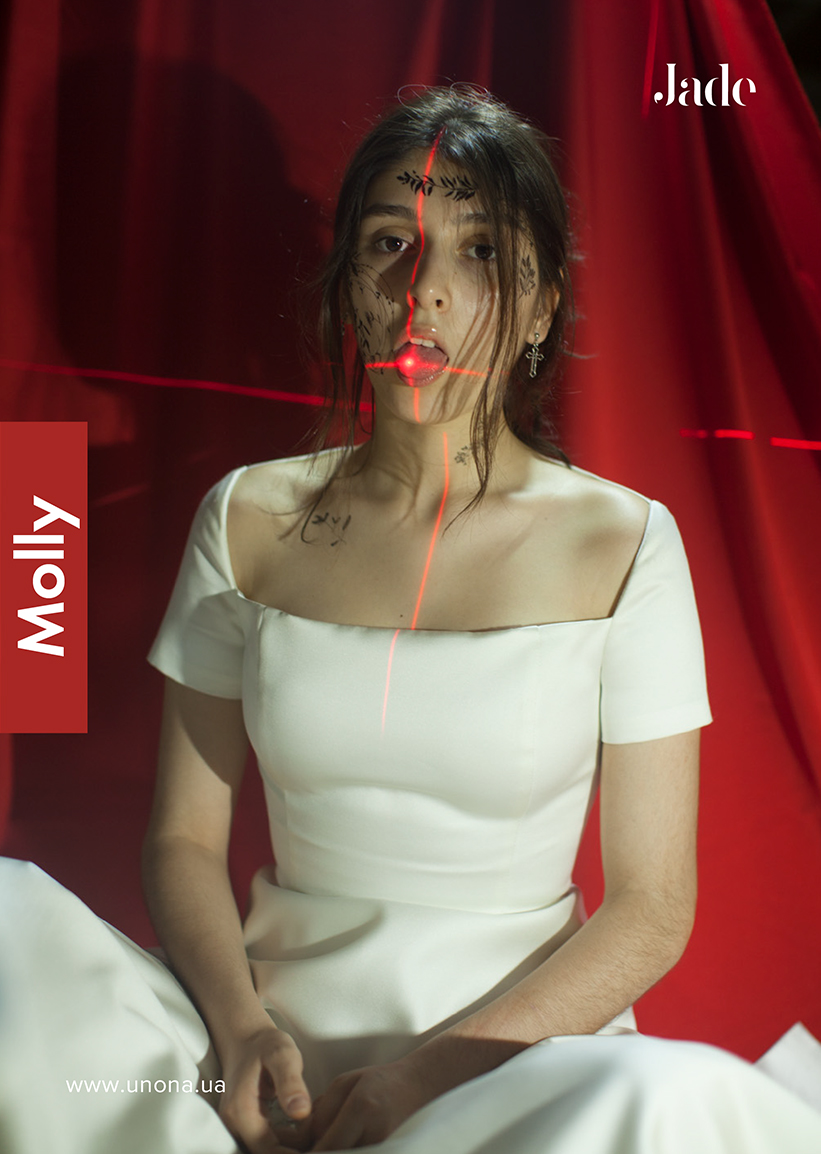
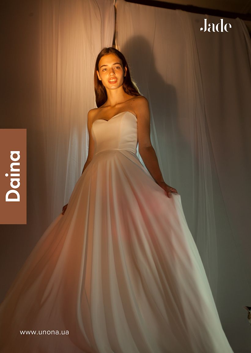
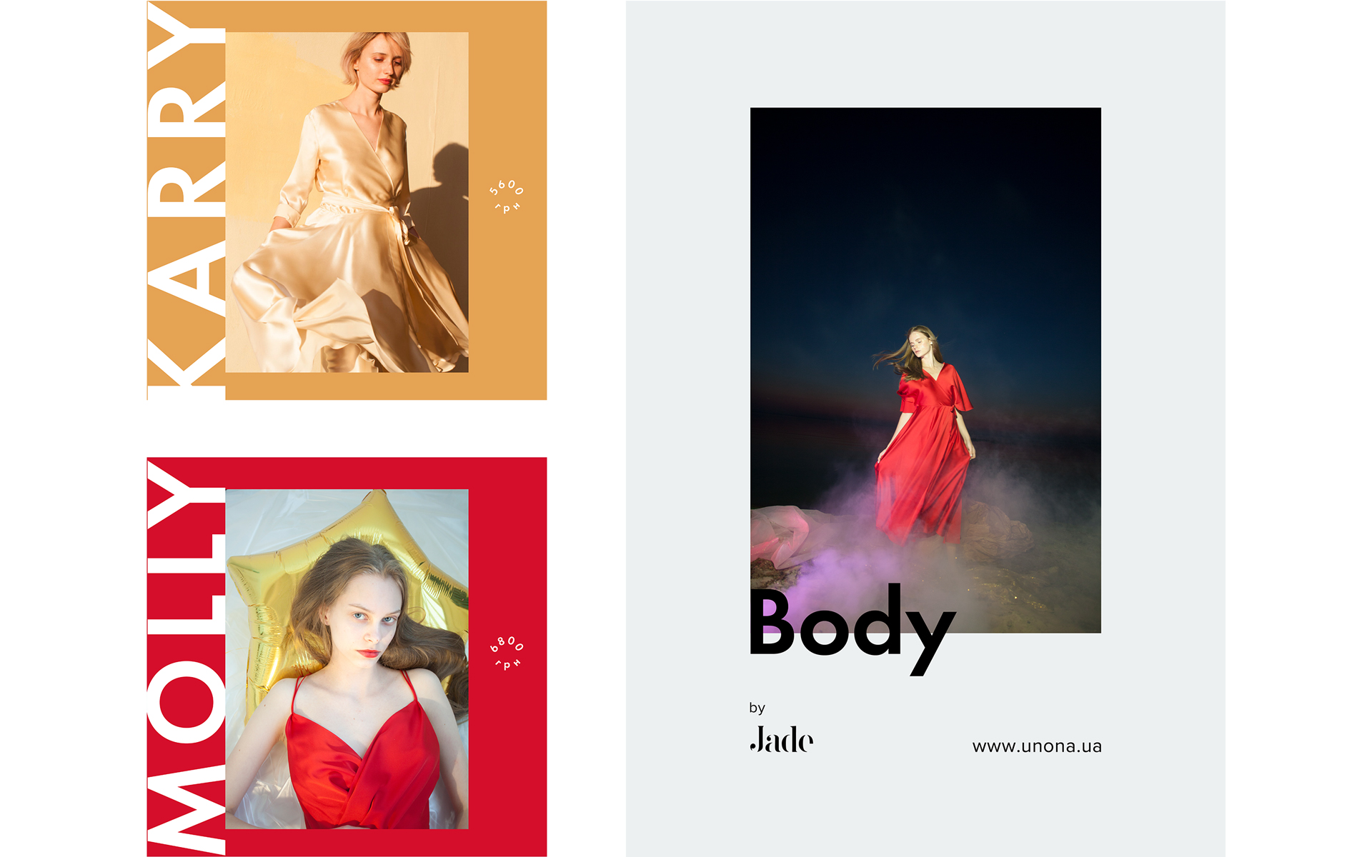
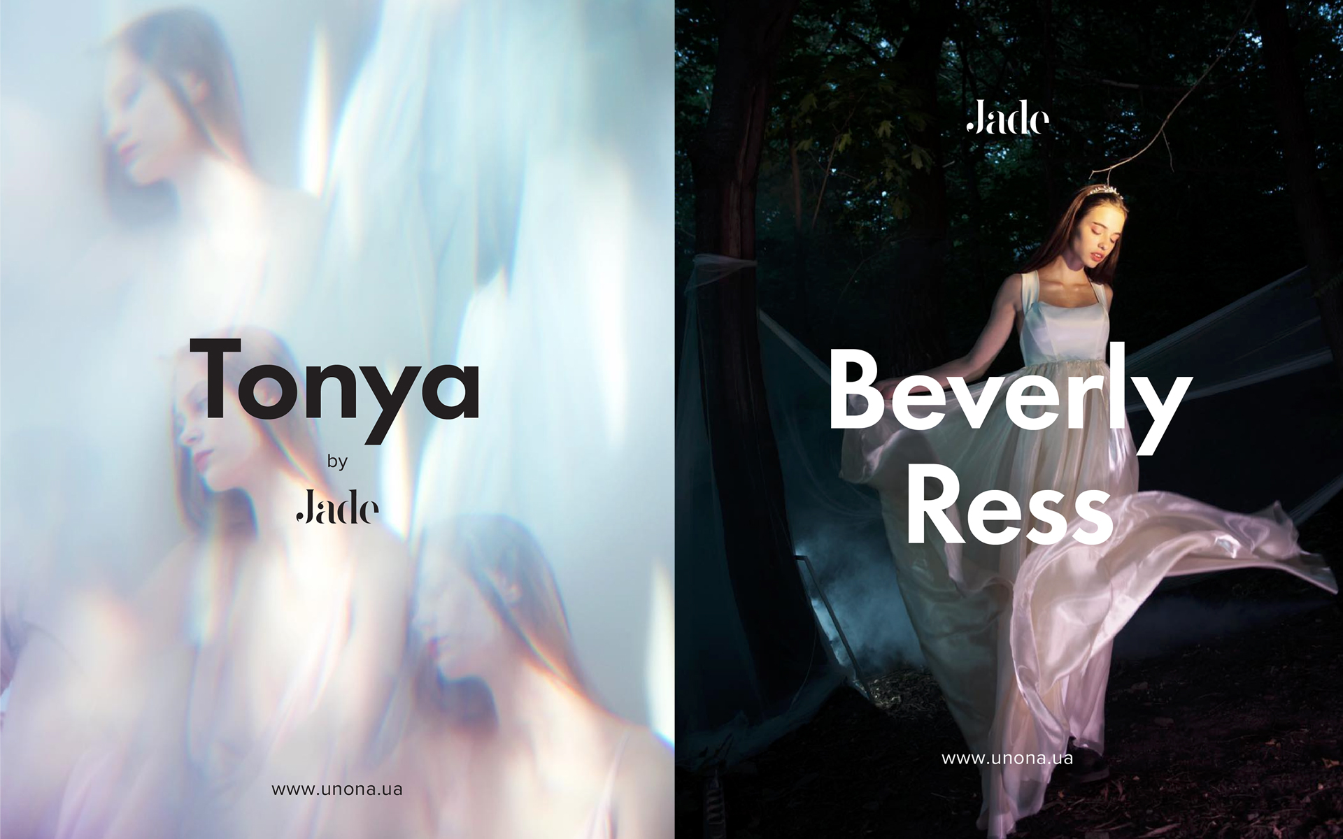
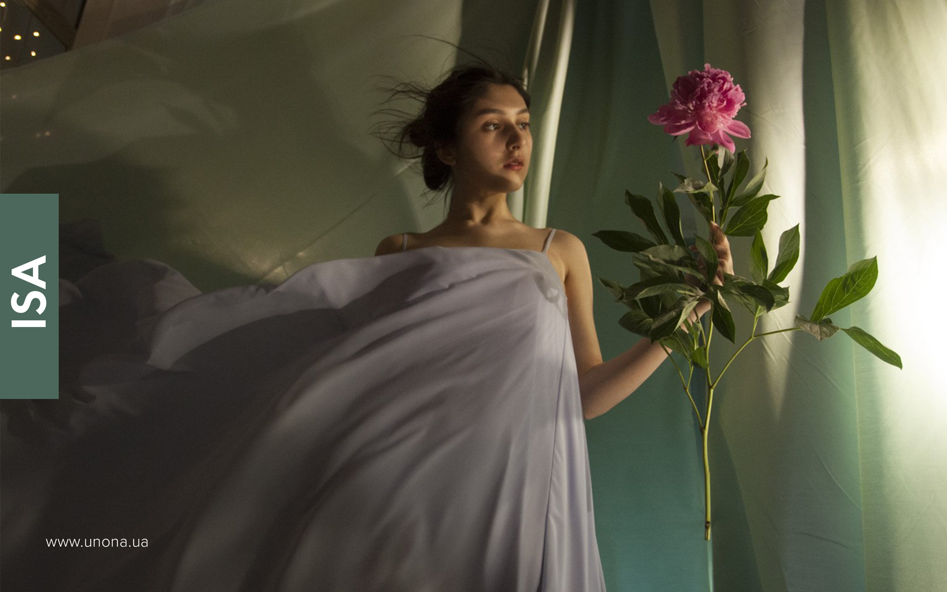
В большинстве случаев текст приходится использовать в связке с фотографиями, поэтому мы разработали целый ряд систем, которые позволяют комбинировать фотографии с различными форматами текста.
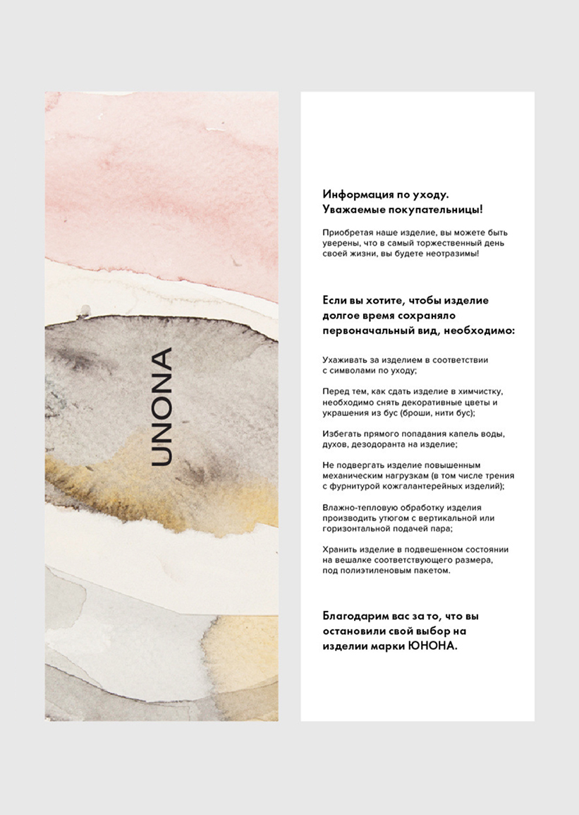
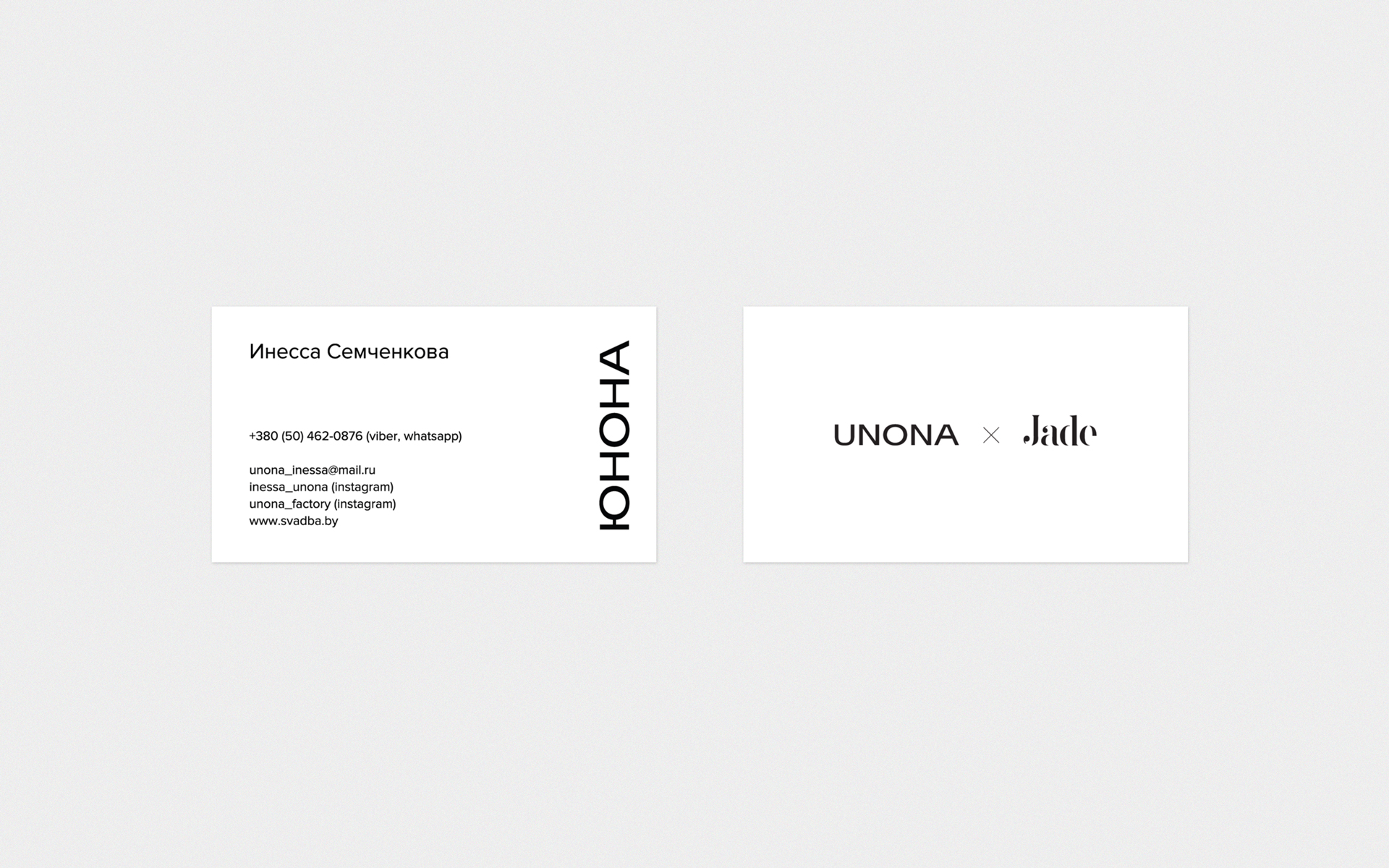
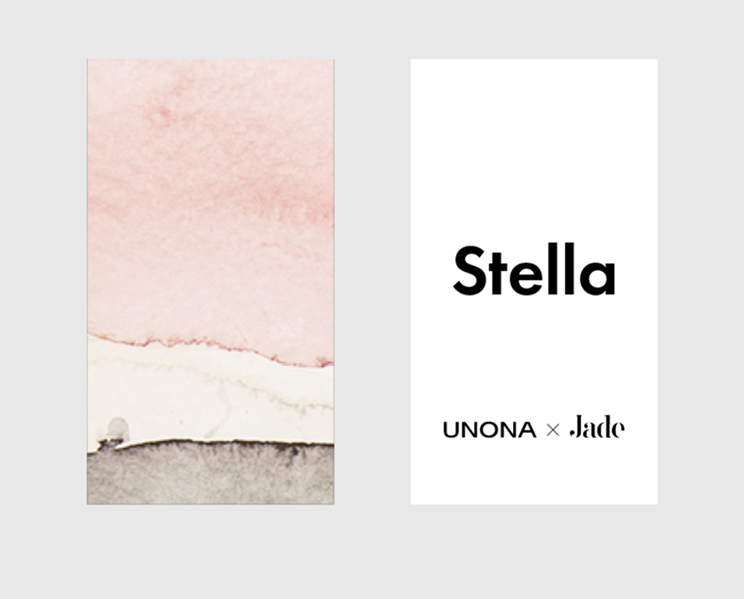
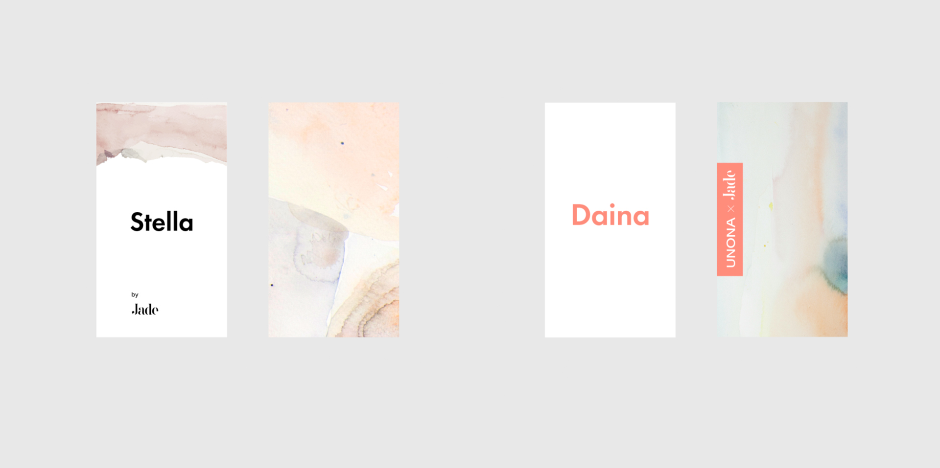
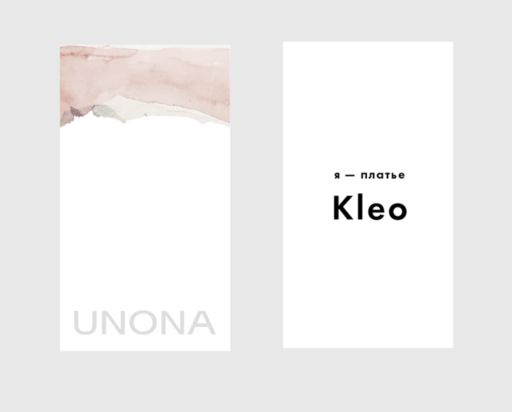
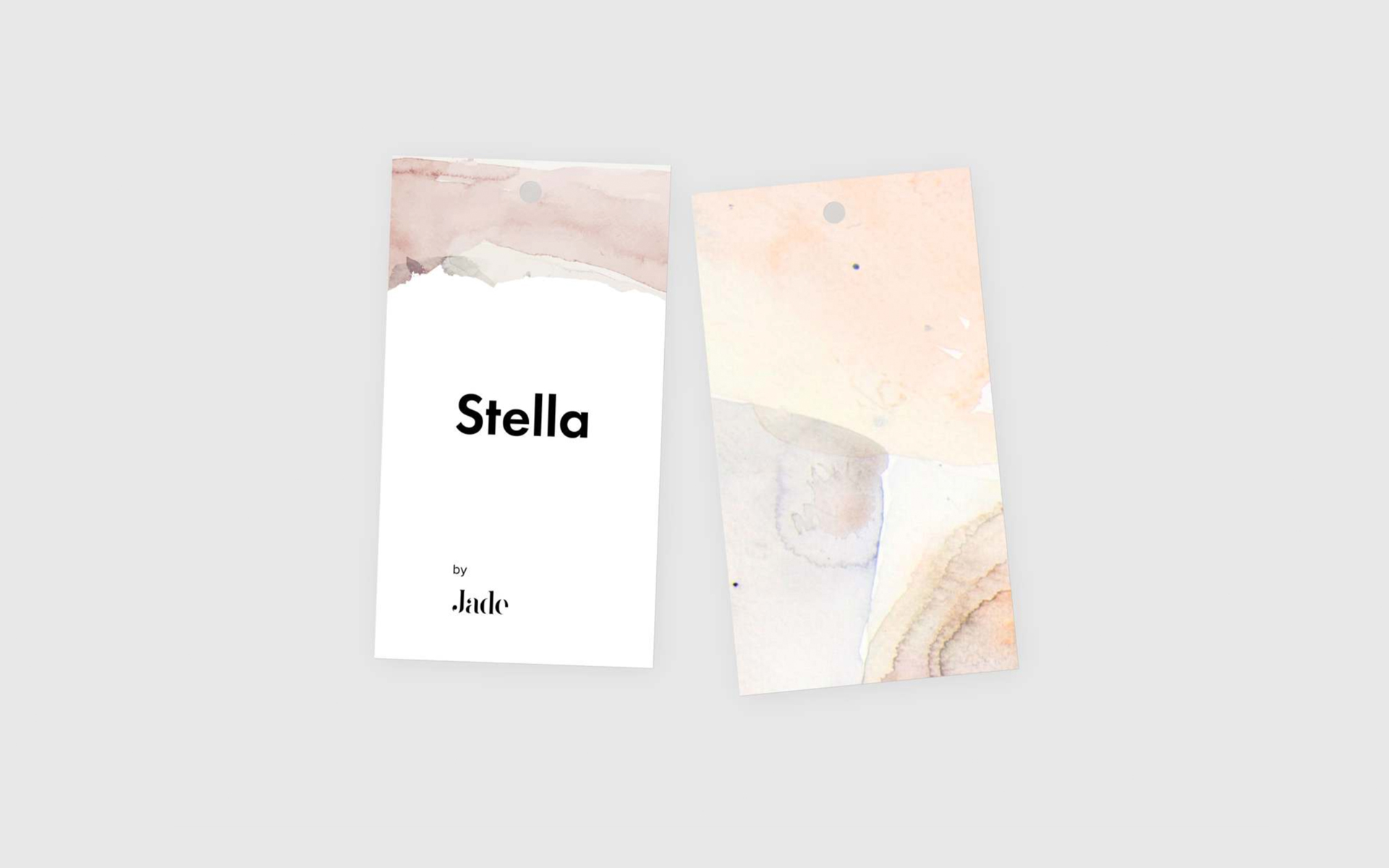
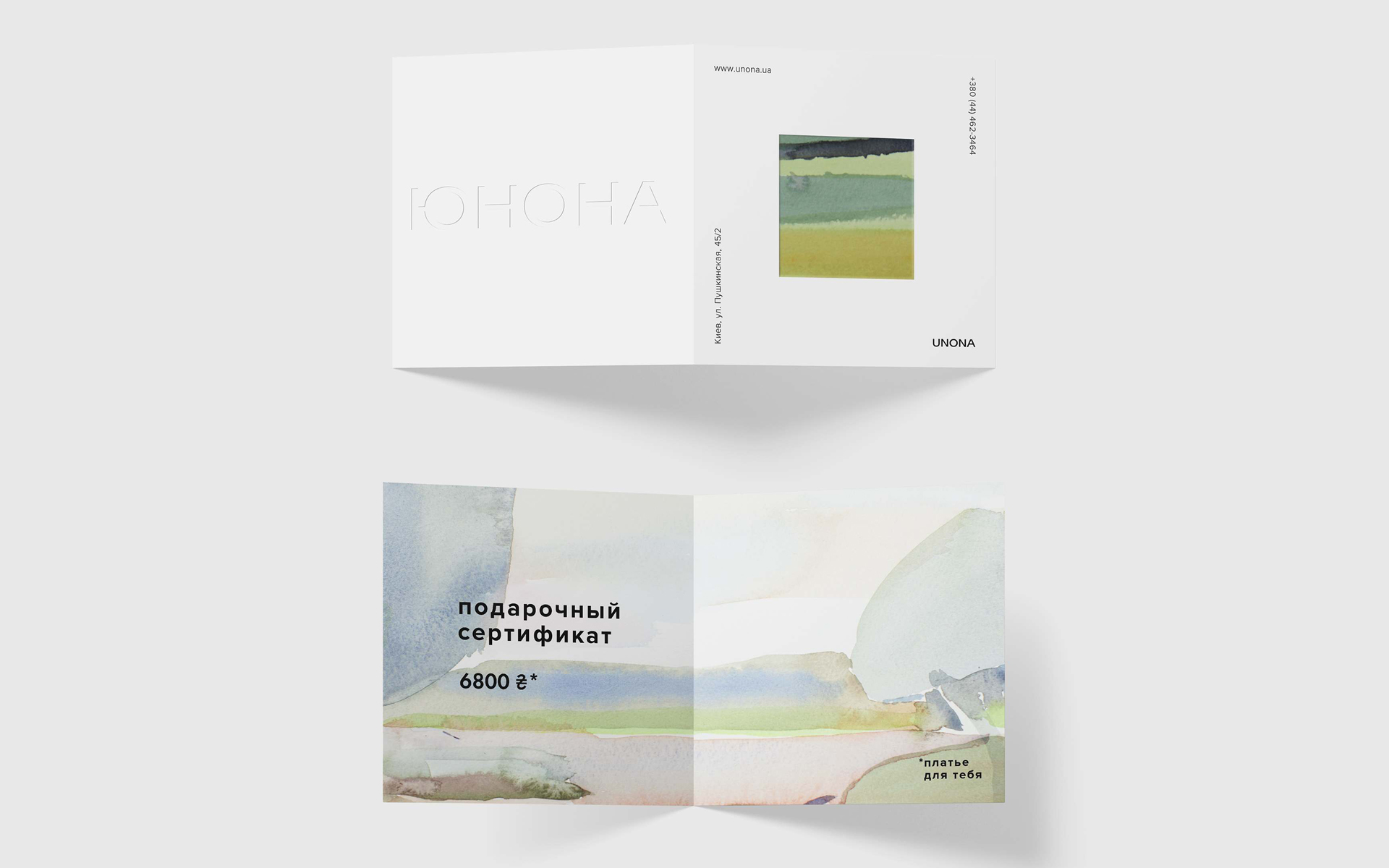
For print products, we thought it would be natural to use materials that are part of sewing production processes (cardboard, fabric), as well as watercolor paper, avoiding plastic. We use close-ups of illustrations and photos as prints.
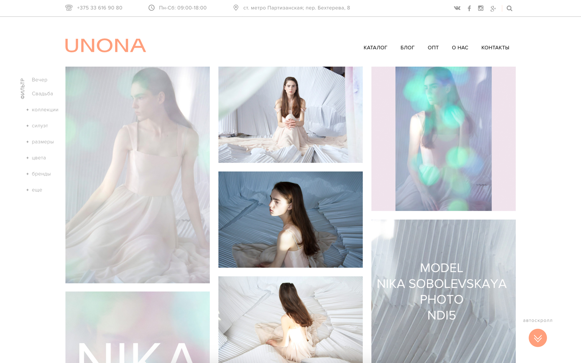
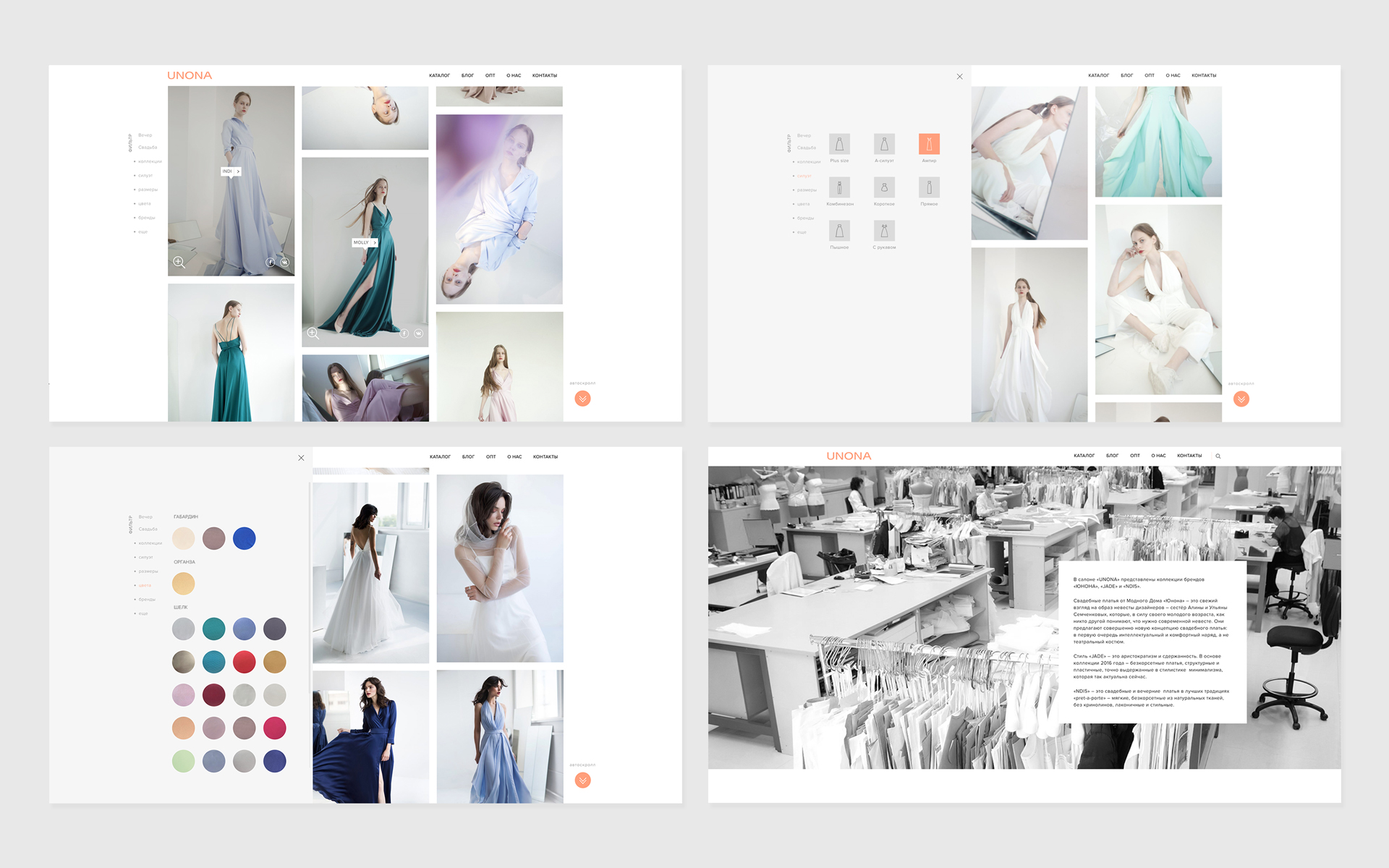
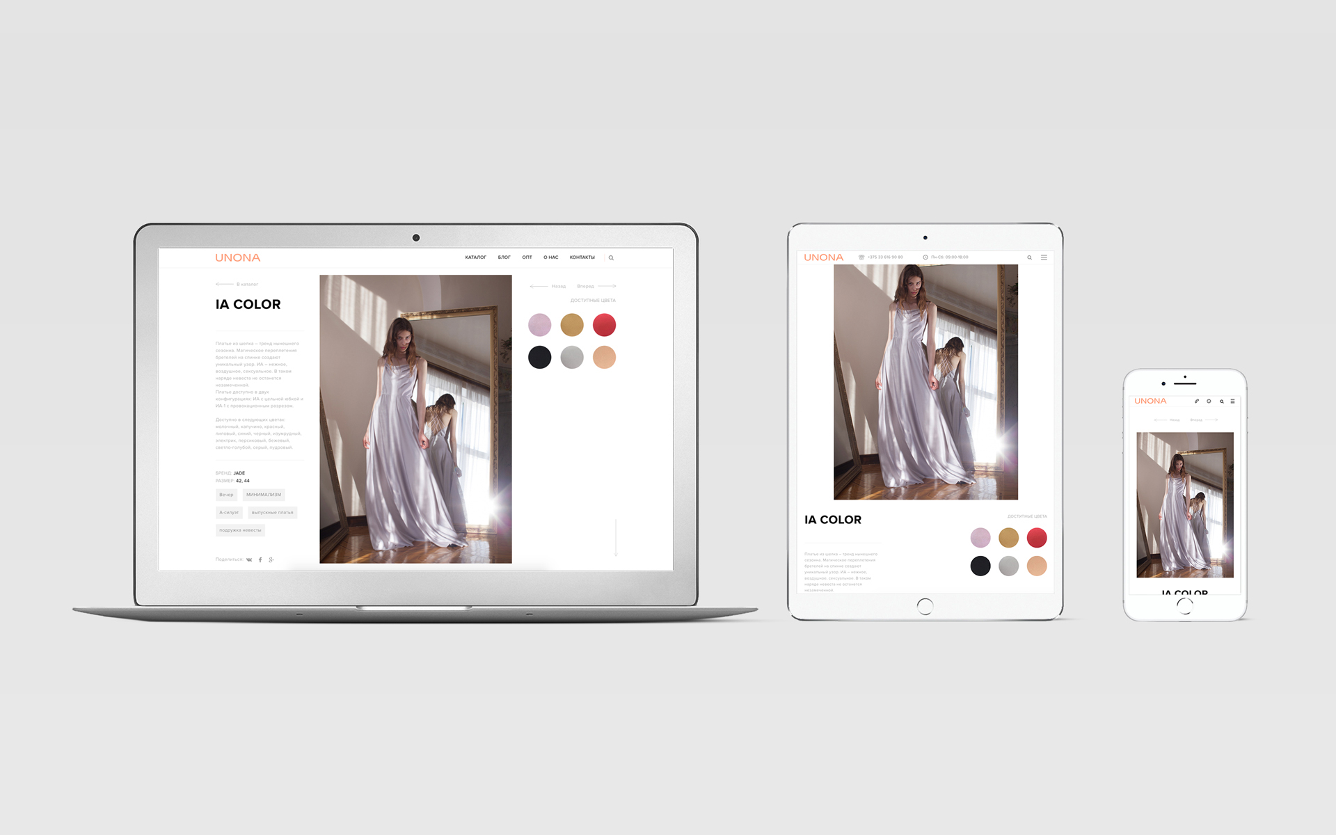
We've developed a website that is different from most websites in this market.
