Asiatchina is food court cuisine. Do you want to eat some noodles or would you like to treat your taste buds? You must visit. The team offers bestsellers in Chinese, Vietnamese and Thai cuisine. They cook so it is not only delicious but also satisfying.
2020, ouch
The Covid lockdowns started just as we were developing our positioning strategy. By the way, they were called WOK FACTORY at that time. Lifestyle has changed, so the industry has become more extreme. We quickly realized: everything will be digital with more deliveries.
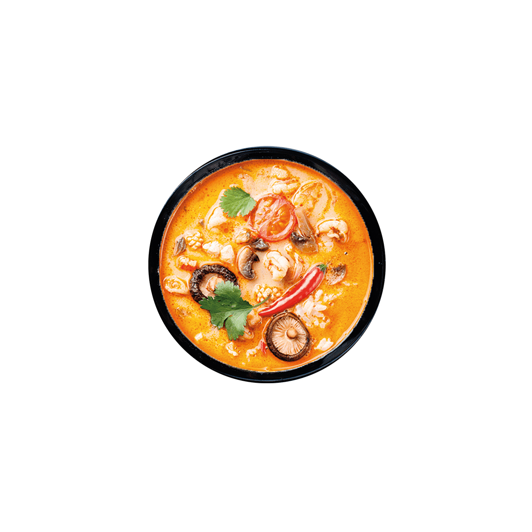
Our goal was the mental availability of Asian food. Something like a casual kitchen. At the same time, we had to be expressive, both in terms of food court and digital. This was the positioning strategy, naming and identity.
We learned that our target audience needed something clear in name and price/quality/weight. It was supposed to be something familiar.
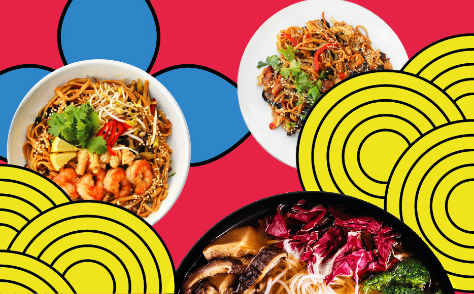
Brand naming has become a continuation of the brand's positioning – understandable Asian food. Asia that everyone likes. One word that describes a menu of popular Asian dishes.
The name is in the logo.
And basically a reception with forms that quickly make it clear that you can eat here. Stylized captions in two languages as a descriptor.

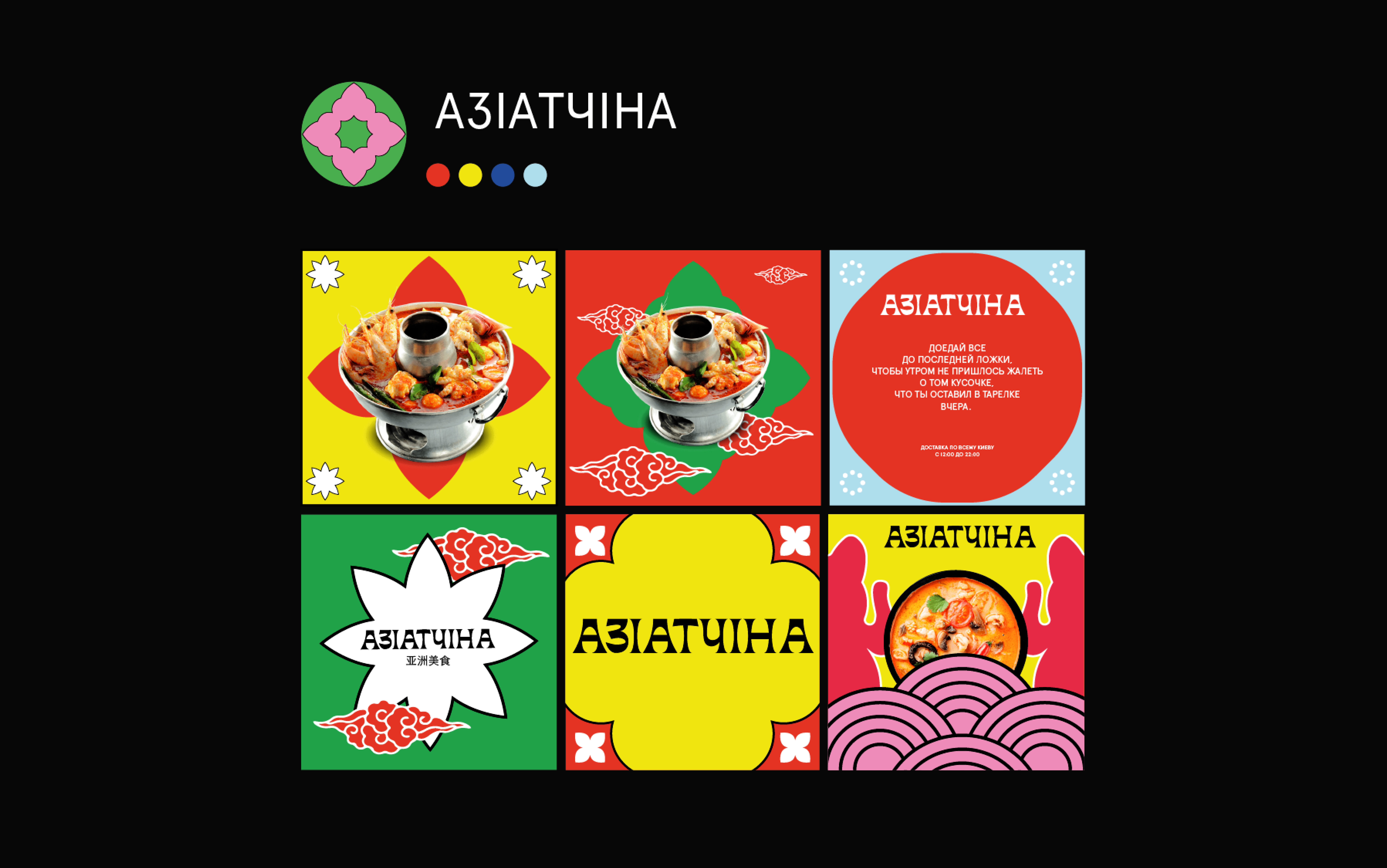
When you see such an identity, you immediately distinguish Asia from the noise of other brands, such as on the food court. You can make a choice right away without studying the details. The same applies to pictures in delivery applications. Based on the name and concept of the institution, we mixed visual images and characteristic colors familiar to a wide audience. And made it a constructor.

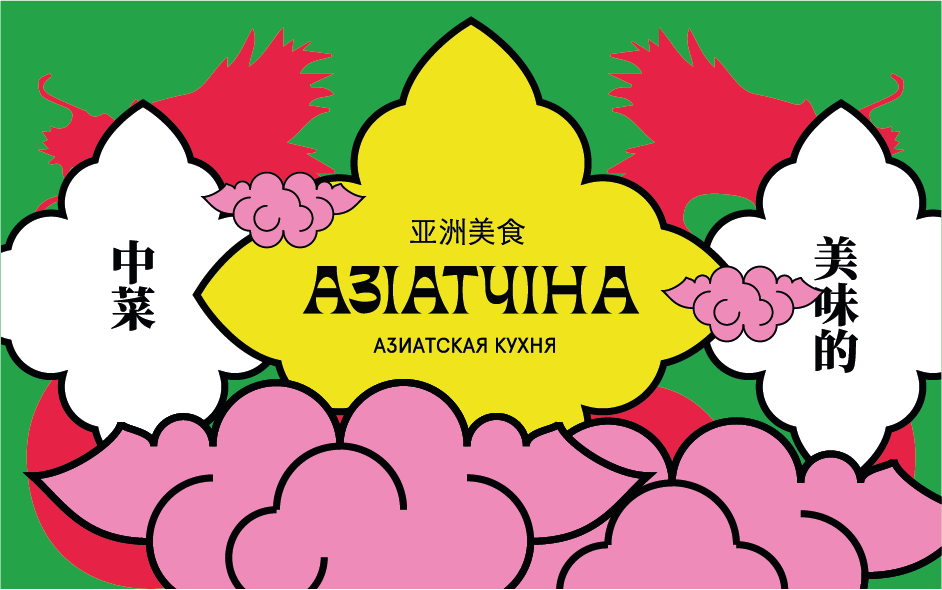

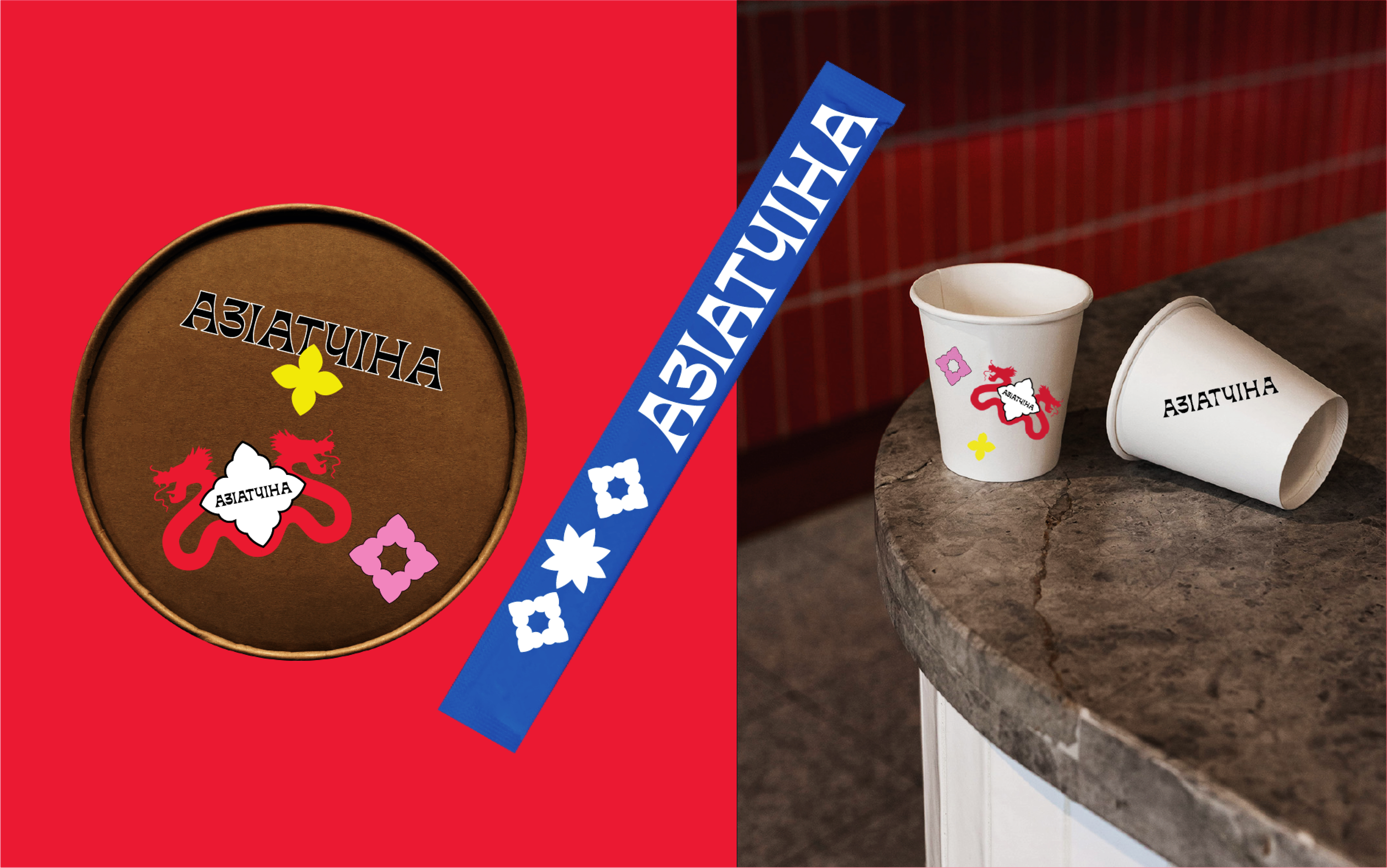
Elements of our constructor are divided into meaningful, decorative and complementary. Due to the logo and dies, they can be combined in many combinations. The composition is created by overlaying elements while maintaining integrity and symmetry. The system becomes flexible, which is important for active digital communication. In addition, it is able to form patterns that are most represented in the packaging.
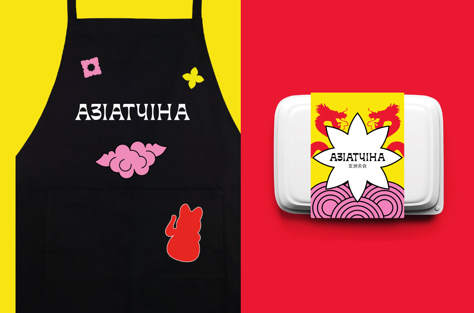
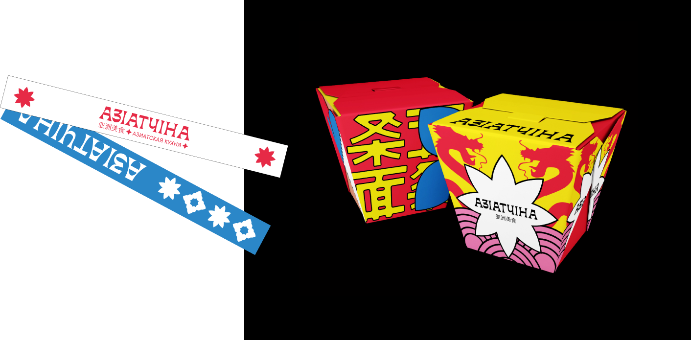

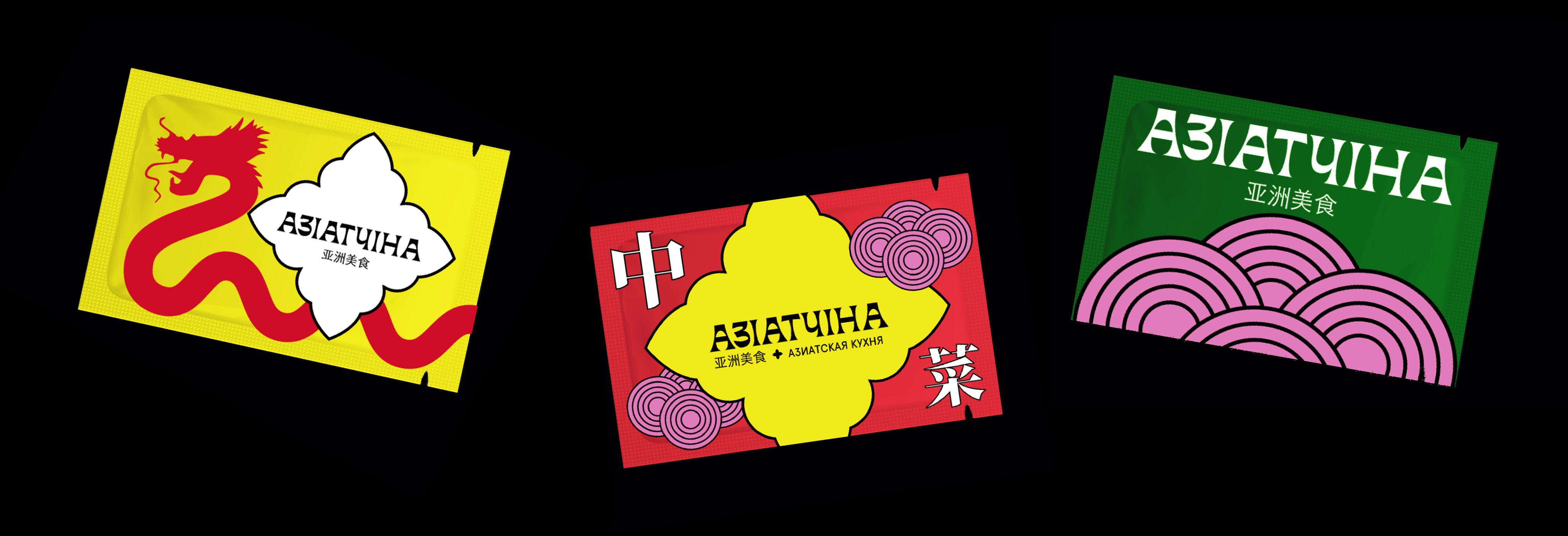
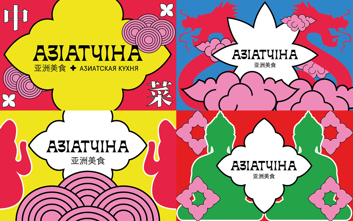
Palette background + the main character of contrasting color + different color decorative elements. In the center of an ornamental die with a logo. We have made the system easy to use even for novice designers.

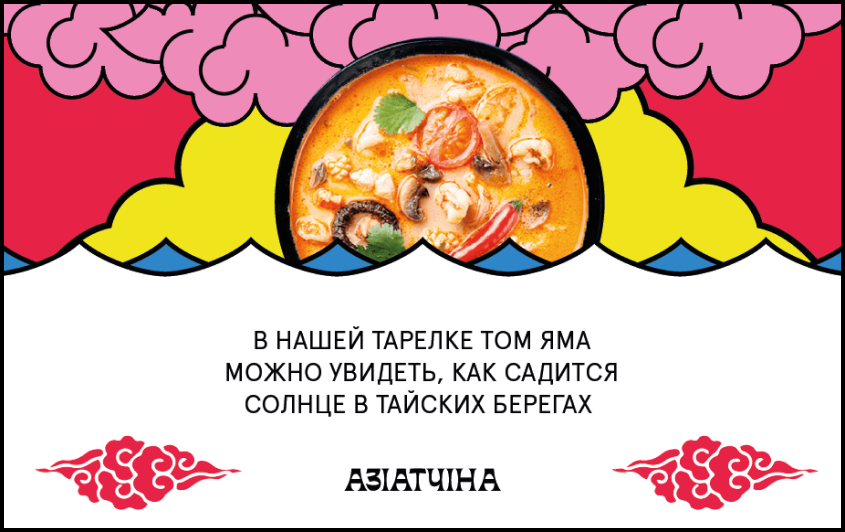
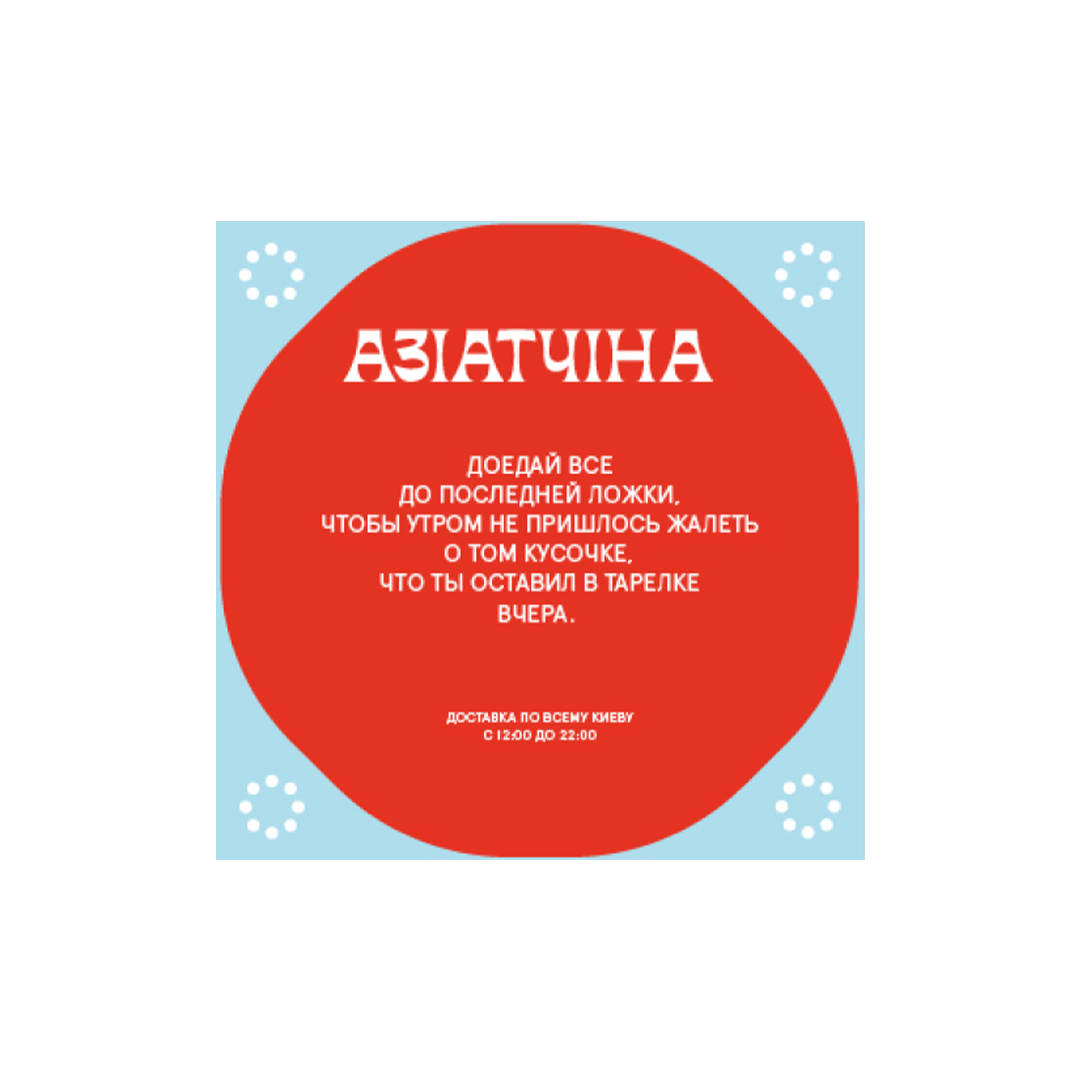
For cases where the graphics are complemented by text and photos, you can get any composition. The main thing is the rhythm and integrity of the elements, avoiding the generated spots.
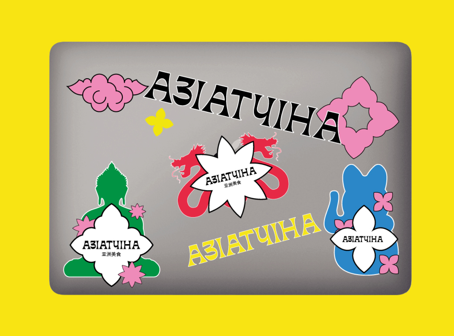
The system also works for sticker bombing. In this case, the elements of identity work separately and can be used randomly.
Communication is built using Apercu pro regular and centered wherever possible.
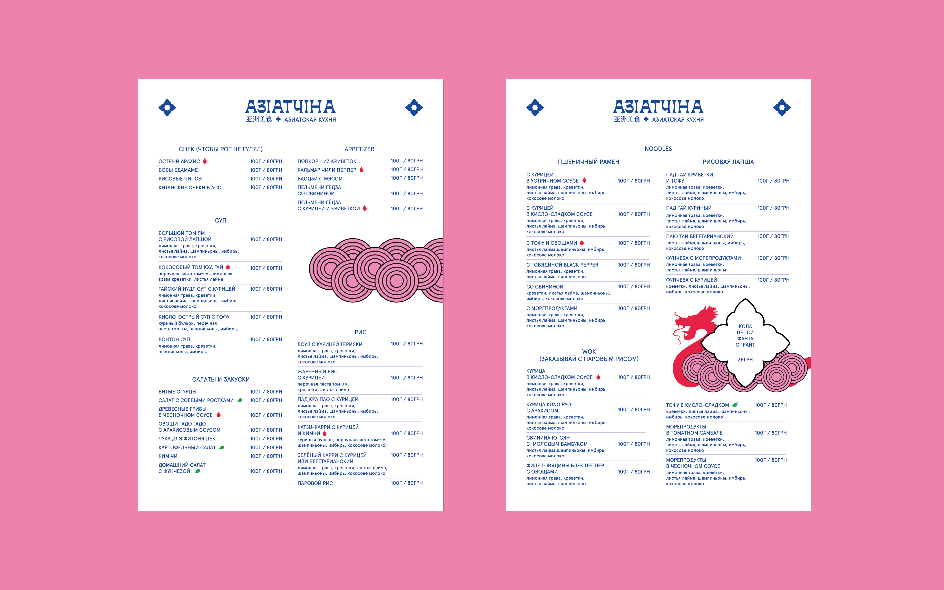

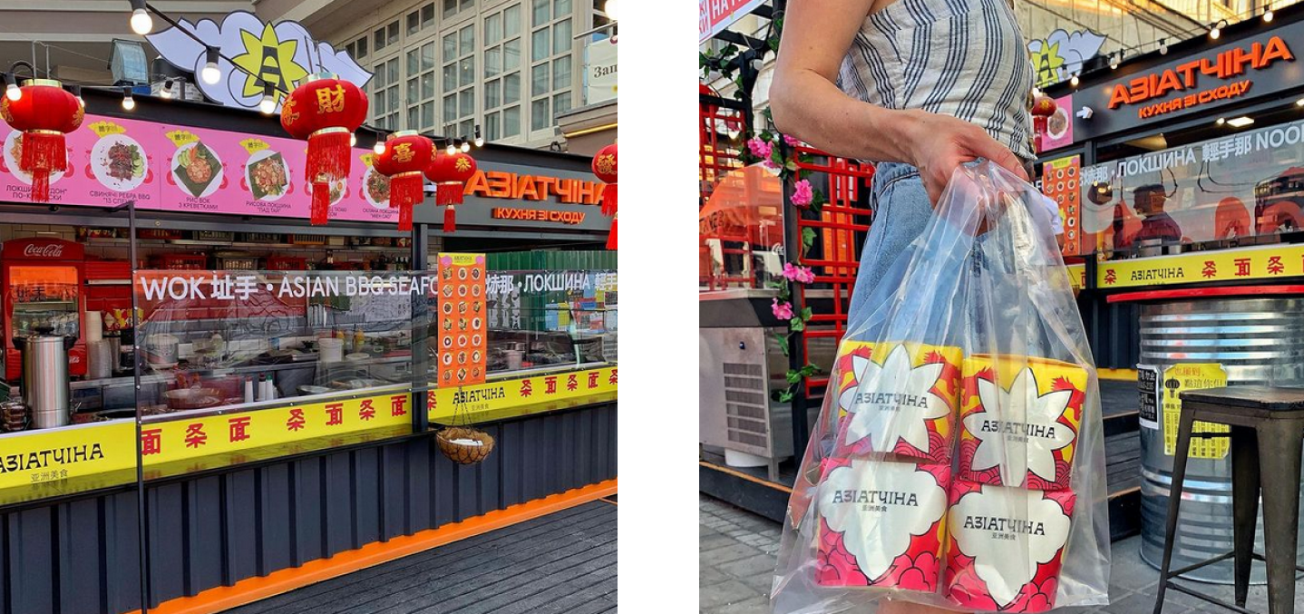
Inconsistent and spontaneous implementation of the new identity limits its potential. The concept is currently physically competing with manifestations of foreign design elements: font and palette. The greatest contrast is felt in the exterior design of the institution.
In digital, the main manifestation of visual identity was packaging. Its bright design can really act as a connecting element in photos. However, this technique is additional. In the struggle for attention, more noticeable elements of graphics designed specifically for communication should win.
A big cheer for the Asiatchina team! And we are optimistic about the opening of new establishments in the network, where the visual system of the brand will reveal its full potential!

