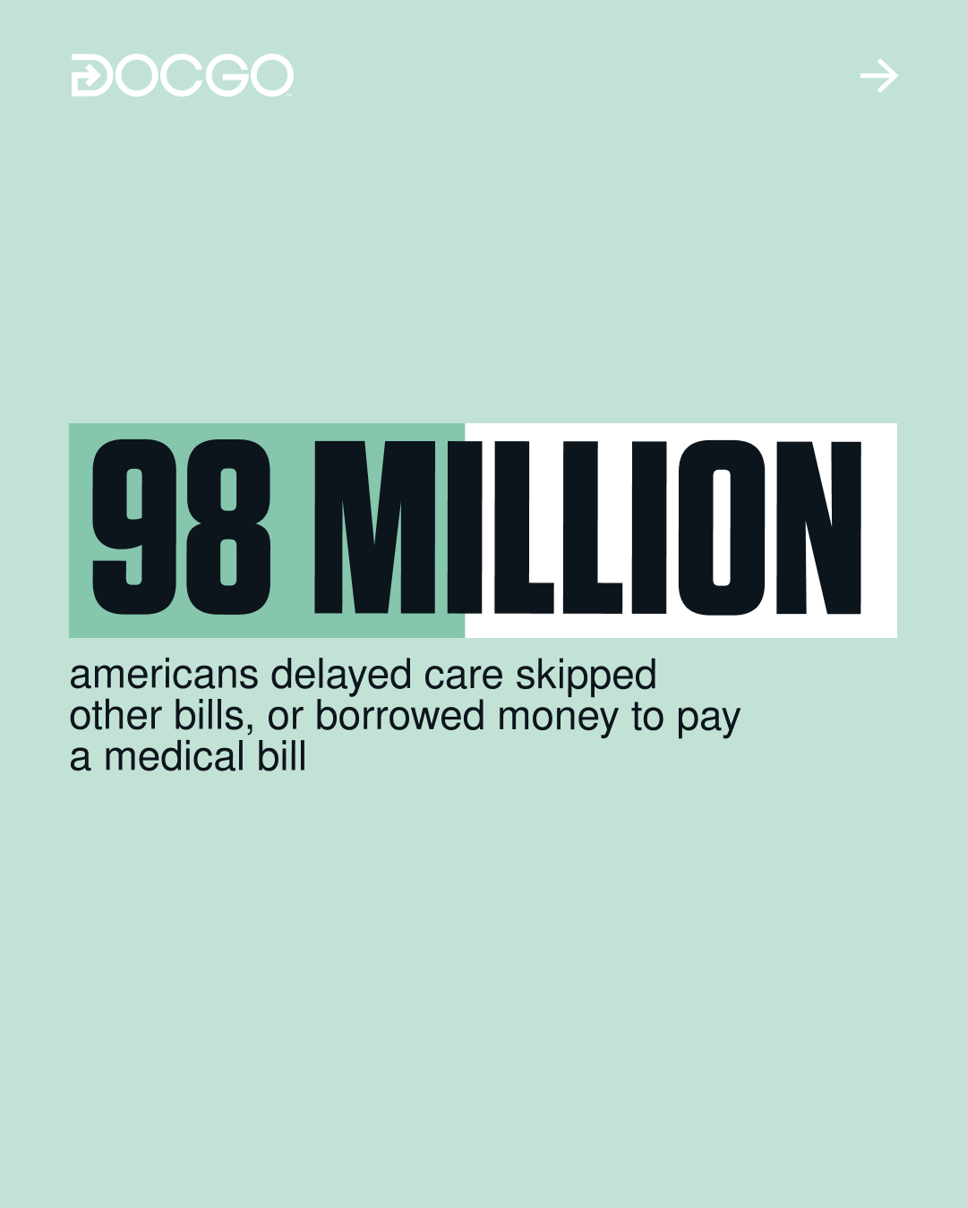
DocGo is a large American publicly traded medtech company with a workforce of 6000 employees. The brand requested a refresh of its style, emphasizing its modernity and technological advancements.
Working with publicly traded companies is a challenge in itself. In our case, DocGo’s preparation for a major investor event added even more responsibility, as it would impact the company's stock value.
Engaging with the company's diverse audiences posed another challenge, as there are four distinct segments: patients, partners, investors, and prospective employees, each having specific needs and user journeys.
Our task was to create a design system for DocGo, with an important presentation looming—a chance to make an impression and debut with a refreshed style. We built a new visual communication system, developed a new website, created a pitch presentation, and organized the scope into guidelines for future work.
We built a new visual communication system, developed a new website, created a presentation for pitching, and systematized it into guidelines for further work.
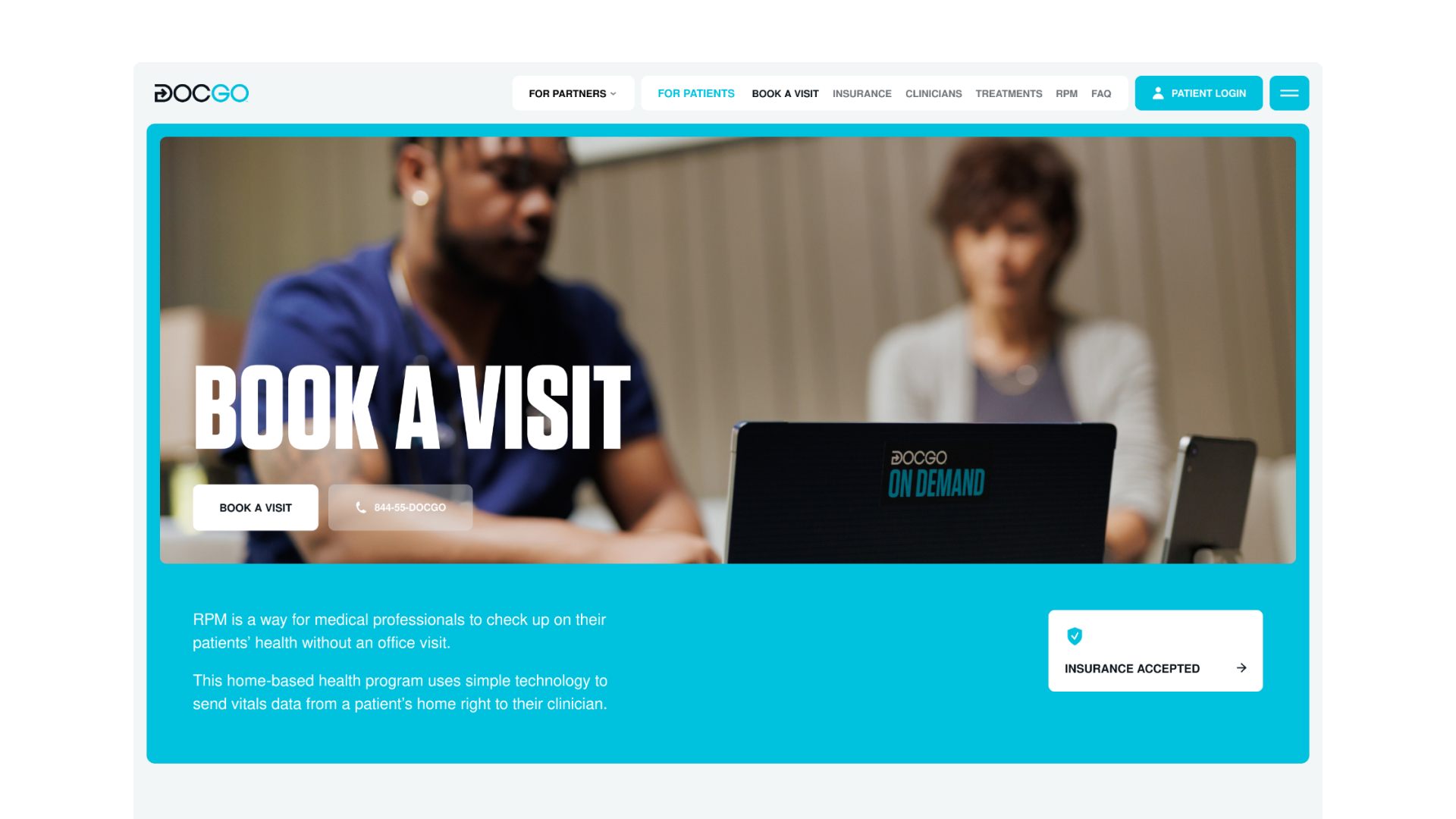
The company's website was the focal point for our work on the entire design system. While DocGo already had a website and brand identity, its functionalities were rather decorative than practical.
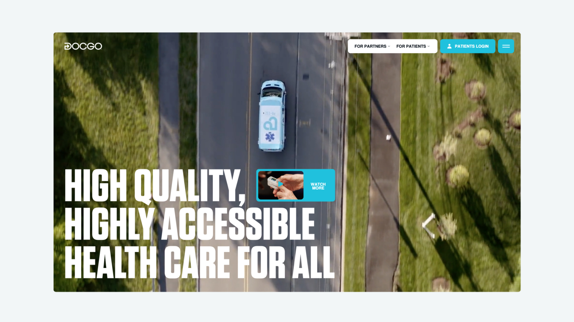
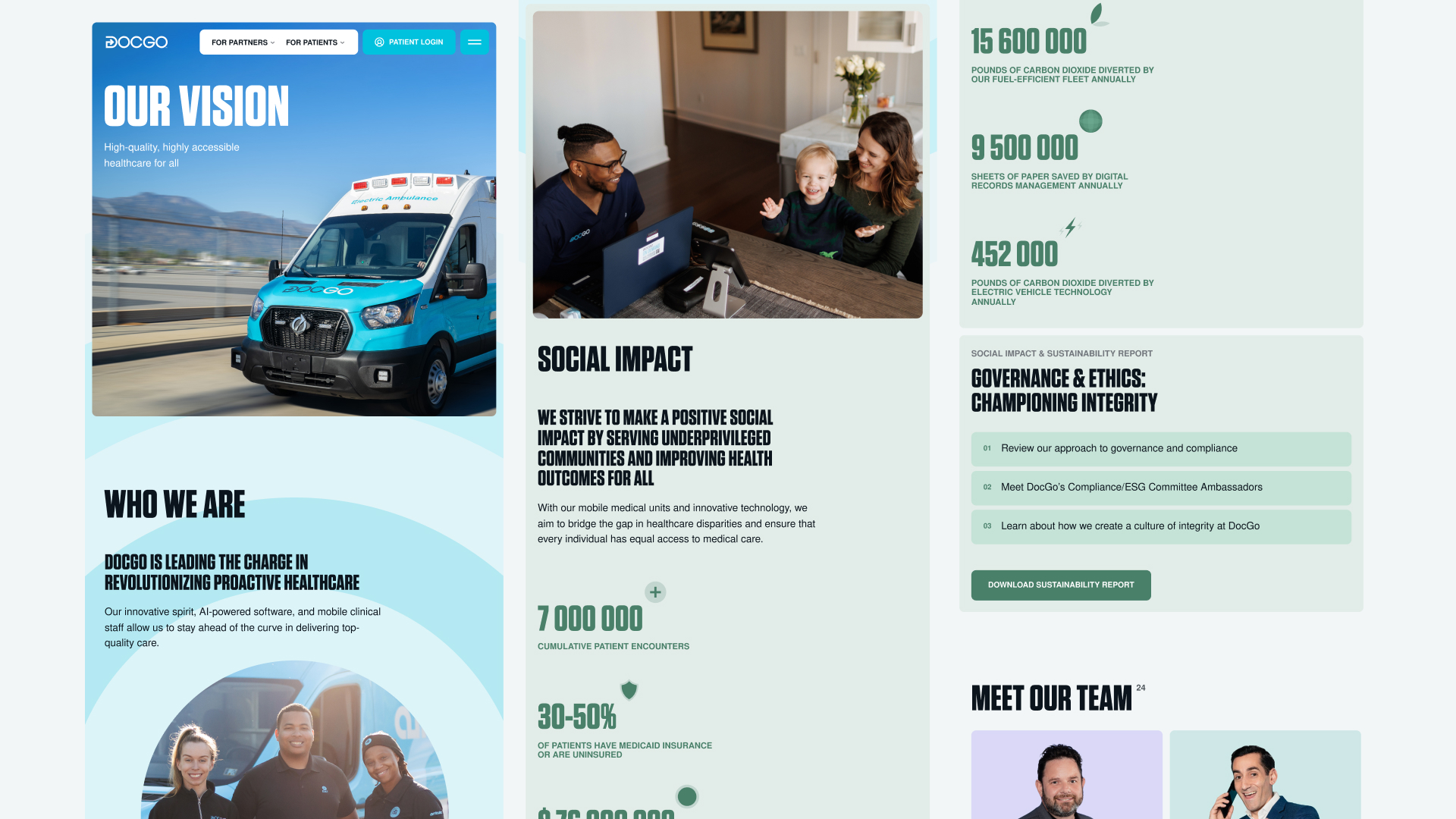
Thus, we focused the design system on its usability. its usability. We didn't just aim to change the site’s appearance; we worked on all user scenarios, fundamentally redesigned its UX, and prepared the site for easy scalability in the future.
As a result, we created a system and navigation that catered to all segments of its visitors, making finding information on current openings as easy as requesting urgent assistance on the site.
The website is now less overloaded with information, it features a more systematized navigation by categories, simpler flows, and a modern look. We expanded the range of graphic techniques, established a clear visual text hierarchy, and refined the appearance of buttons and interface elements.
This updated design system for the website naturally extends to other mediums while maintaining DocGo's refreshed style.
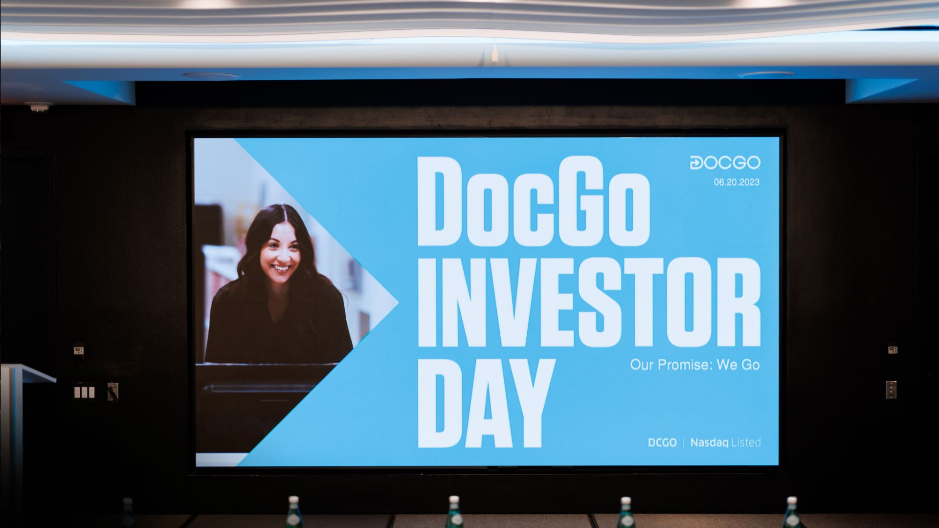
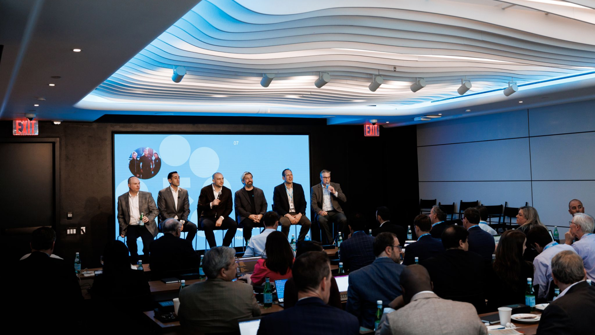
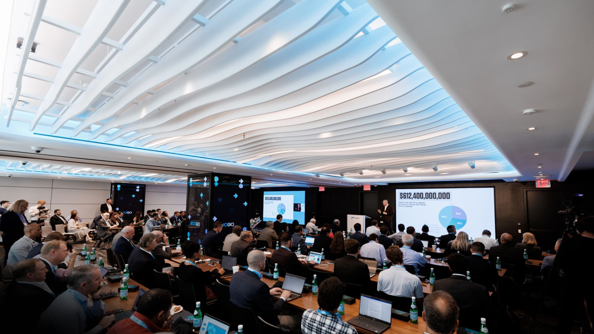
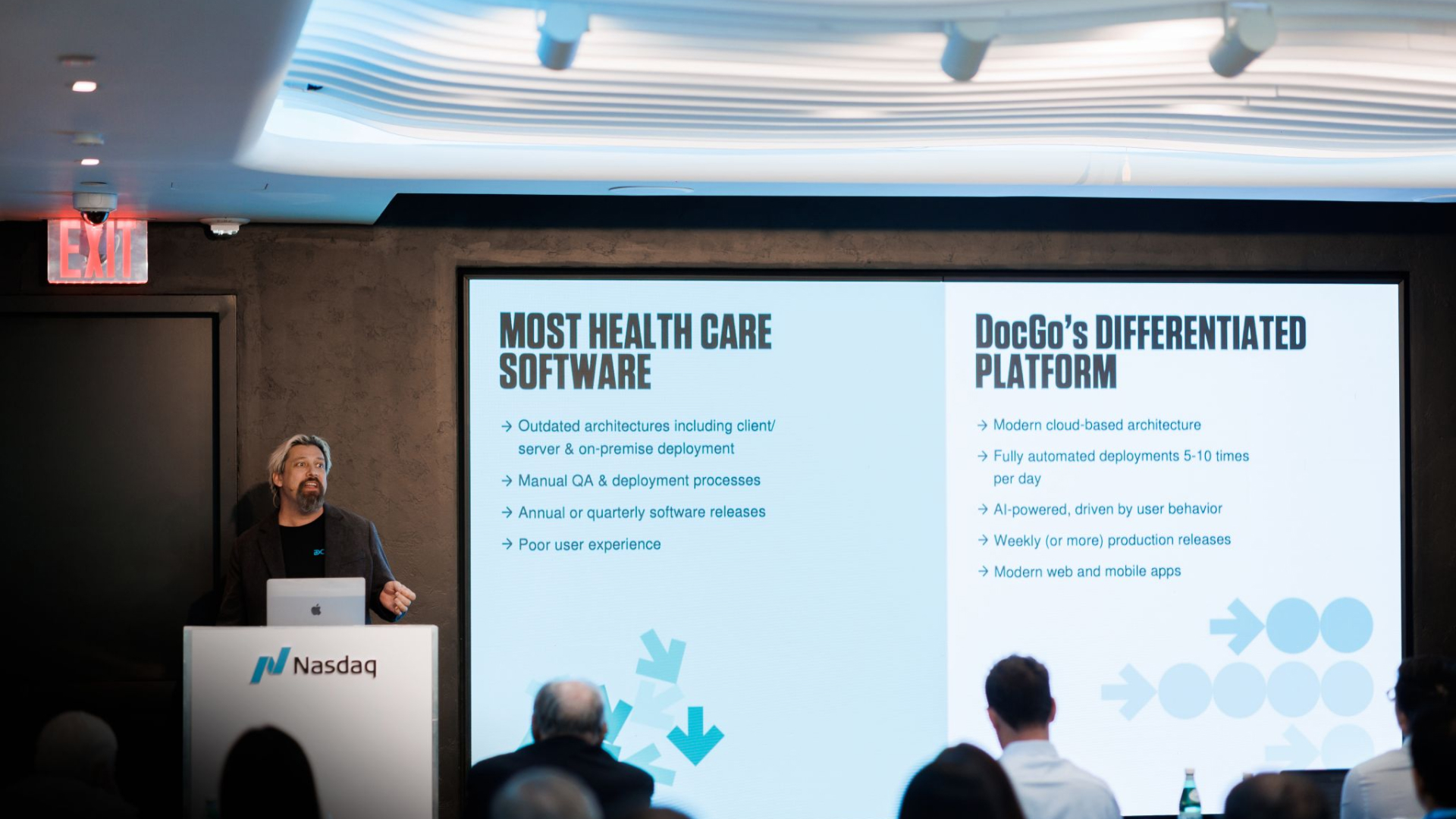
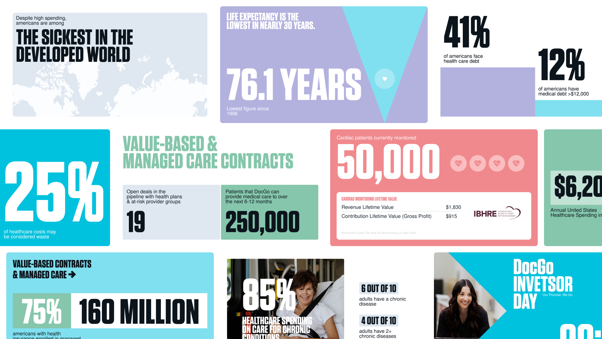
The NASDAQ event was a milestone for our activities, as it determined the fate of investments for DocGo. The company entered the pitch with a new visual style: our team prepared a presentation of over 100 slides, which echoed its aesthetics with the website and featured its main design elements: visual language, forms, and animation.
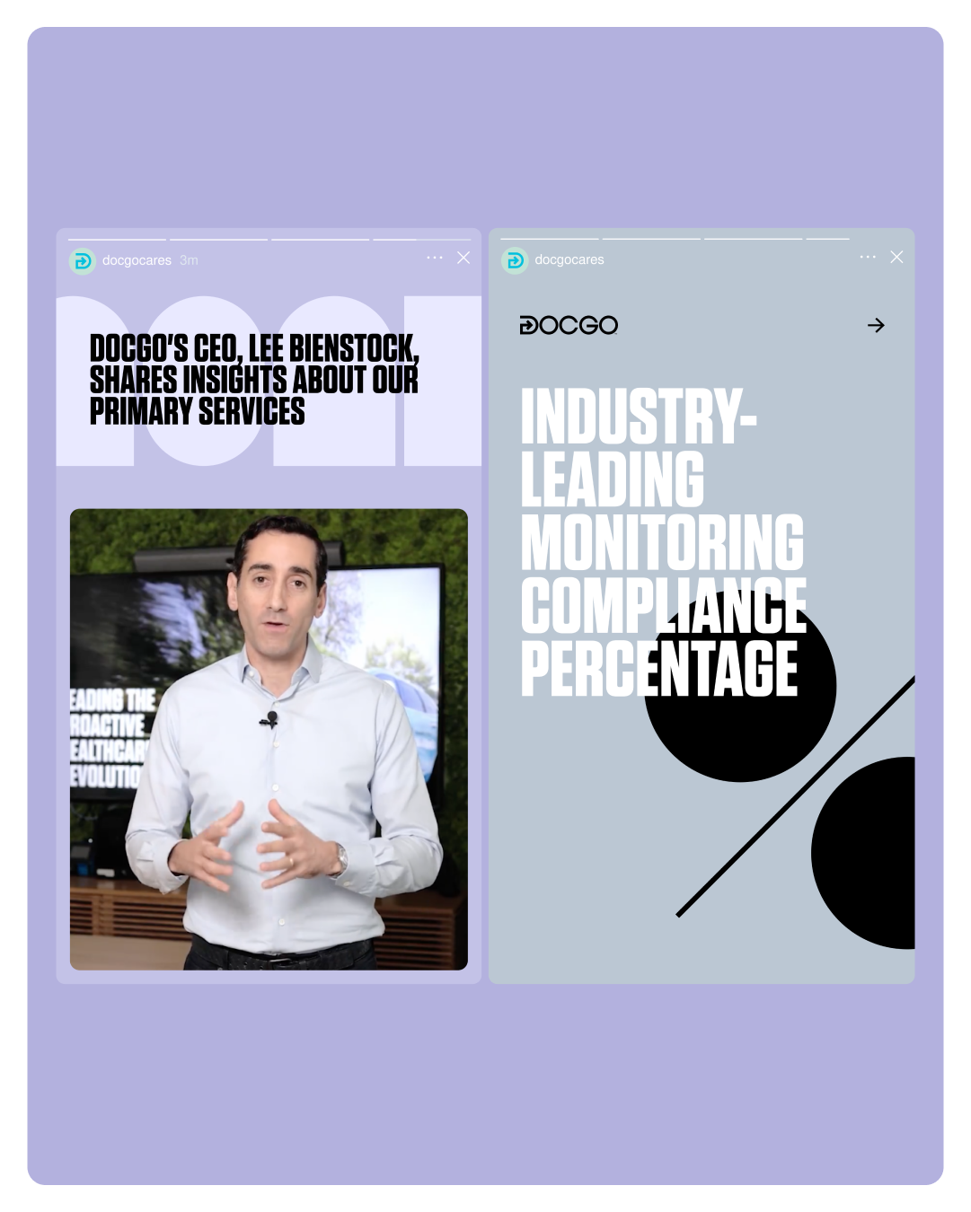
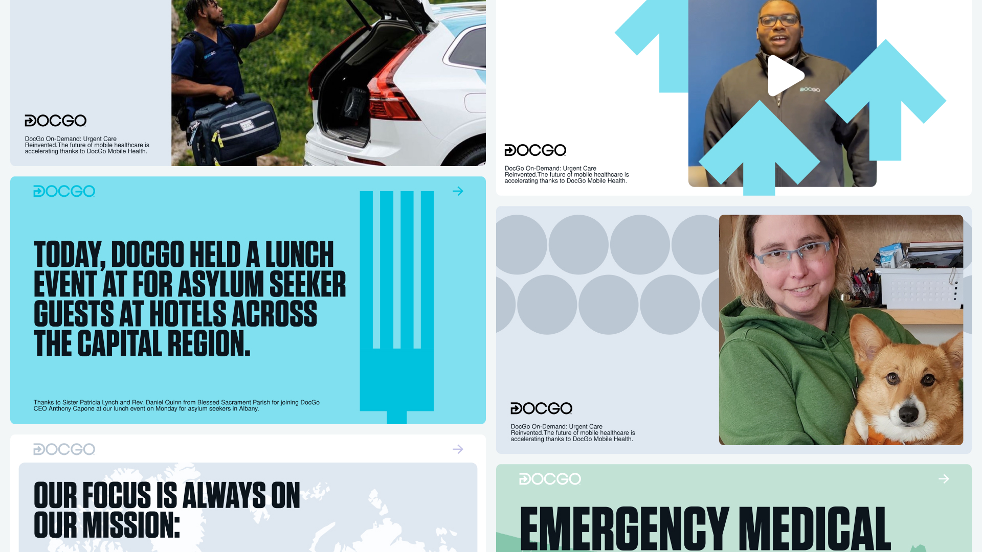
Another element of DocGo's new visual communications was video content. For the major investor presentation, we created a series of branded videos. The main sizzle video serves as the brand's business card, as it reveals its values and purpose, while three product videos showcase DocGo's processes in its main departments.
Through comprehensive work with the design system, we found a particular approach to animation. It resonates with the brand's previous aesthetic through simple geometric shapes, but we provided a new context for their use in the website's modular system, presentations, and other brand manifestations.
DocGo's new design system is a rebirth of the previous brand style, retaining its recognizable elements: logo, certain colors, and fonts.
The whole visual system was built on a modular structure, which simplifies the work with large amounts of text and adds it specific product vibe. Plus, this system makes it easy to layout and update the website, which is crucial for large technology companies.
In addition to the modular framework, the design system now has contrasting color distribution and more space, which simplifies the perception of information and navigation within it.
Fonts have a special place in this system too. We didn't change the brand's current font but added variations to facilitate text perception and place correct accents in communications. In addition to the headline font, we use a set of Helvetica fonts for text blocks. Its familiar look and small size communicate the brand's technological nature.
We updated the design system graphics with widgets, buttons, and footnotes, which are also important in cohesive brand manifestations. And all principles of visual communications are laid out in guidelines, with which the brand will work in the future.
Creative director — Alex Twista
Art directors — Masha Bystrova & Pasha Karelin
Project managers — Darina Panisheva & Ana Partyn & Vika Kuzminova
Creative Copywriter — Yaroslav Lerman
UI/UX Designer — Anton Hrechinskyi
Front end developer — Yuryi Peregudov
Back end developer — Petro Shlemko
Graphic Designers — Pasha Karelin, Lina-Maria Shlapak, Vika Germanenko
3D & motion — Yurii Khomovskyi, Sergii Irkhin
Sound designer — Kolya Tolstyh
Chief Executive Officer — Lee Bienstock
Chief Marketing Officer & Chief Public Information Officer — Aaron Weiner
Director of Brand Strategy — Julia Kolodkina
Chief Product Officer — Aaron Severs
![薇閣薇恩 – [Wēi gé wēi ēn]](https://twid.studio/wp-content/uploads/Untitled-1.png)