HAIQU is a deep tech startup that created a solution for improving the quality of quantum computer performance. We were challenged with developing a visual identity and design system that would present the company as a breakthrough innovator and pioneer in its field.
Quantum computers are the game changer that can drastically change the landscape of our world. However, this technology is currently in the early stages of development. These computers are quite cumbersome, and the outcome of their work is extremely noisy, which in many cases makes it impossible to work with the obtained data.
HAIQU helps improve the quality of quantum computers' work outcome by literally 100 times and tame the noise. HAIQU paves the way for this technology in its field.
The key challenge was finding the balance between an inspiring brand feel and the fact that HAIQU had to radiate confidence to its customers, which technology giants like IBM, Microsoft, Google should be. We also had to lay down a toolkit that would allow us to simply and effectively visualize the complex processes of quantum physics.
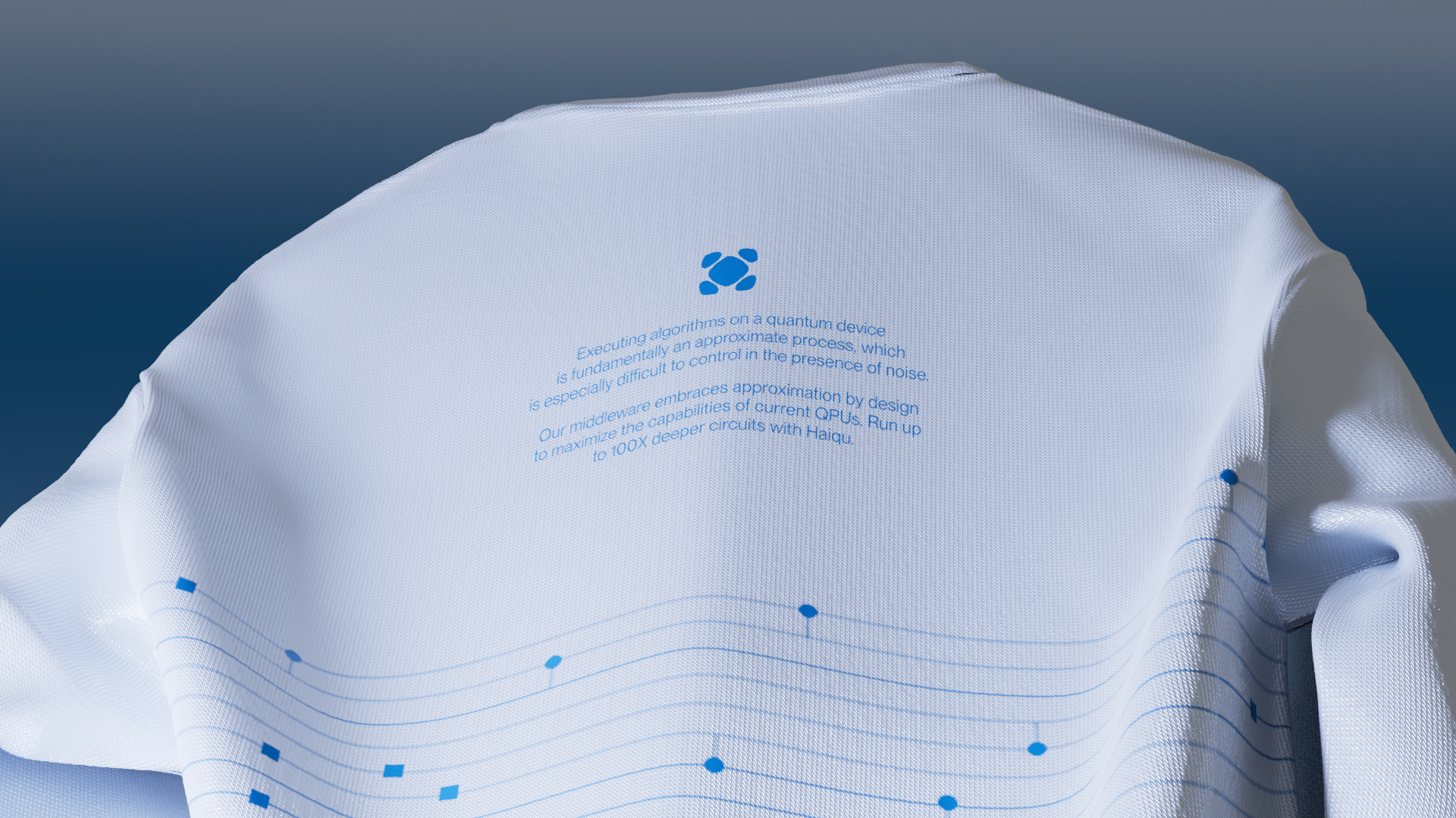
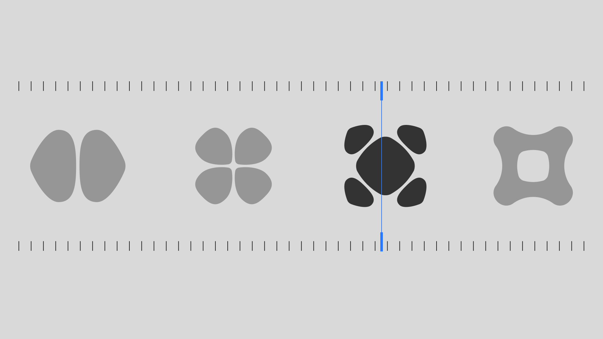
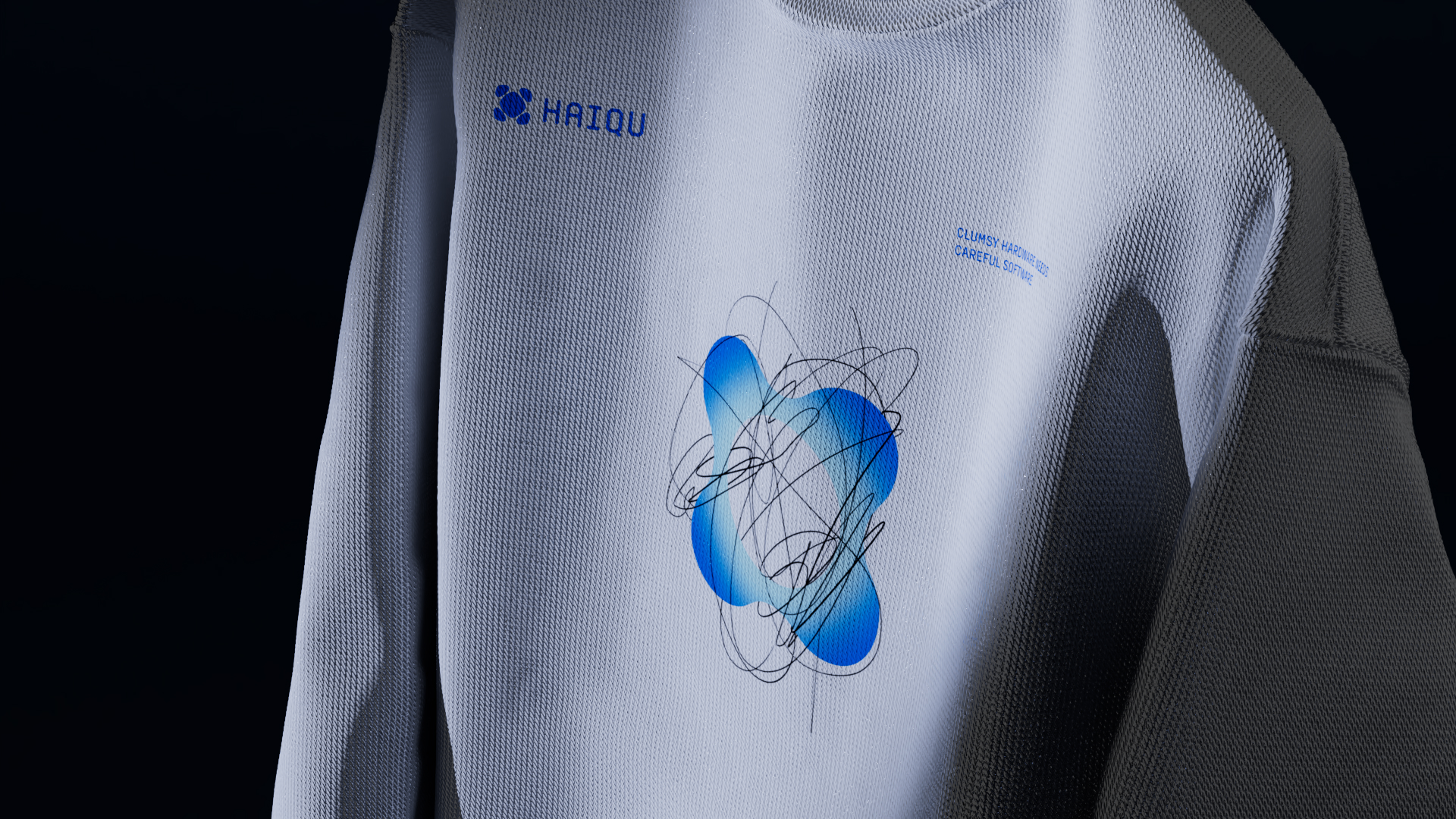
In our work on the visual identity, we focused on the spirit of invention and the scientific vibe. Thus, the logo was inspired by images of Chladni plates, which were used to visualize noise and demonstrate the principles of quantum computer operation. These are patterns formed from small particles, such as sand, on vibrating plates. The logo is especially well-manifested in the animation when its dynamics clearly visualize the phenomenon.
The typeface for the logo is a monospaced font with rounded edges, which references the markings on computer chips.
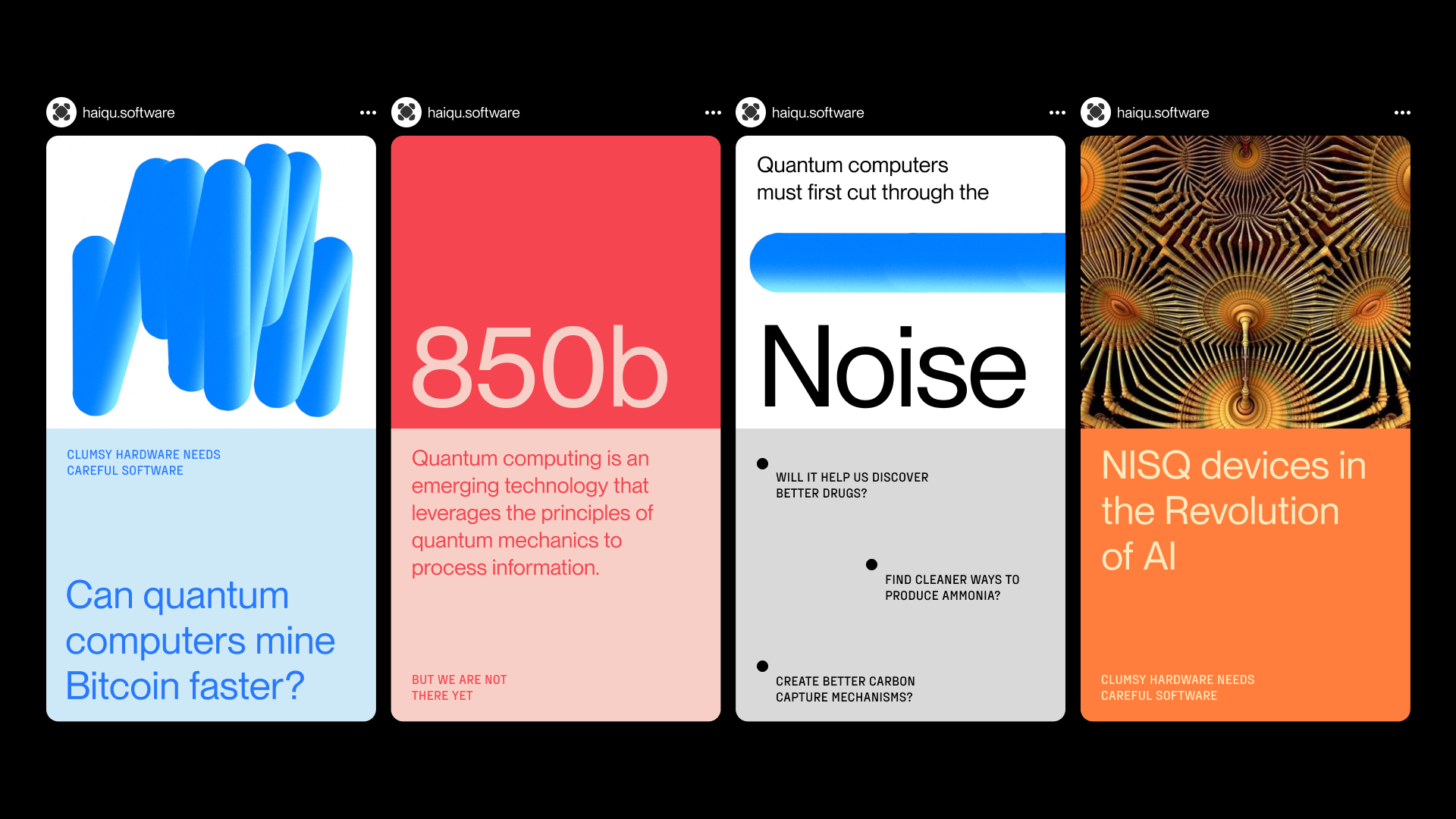
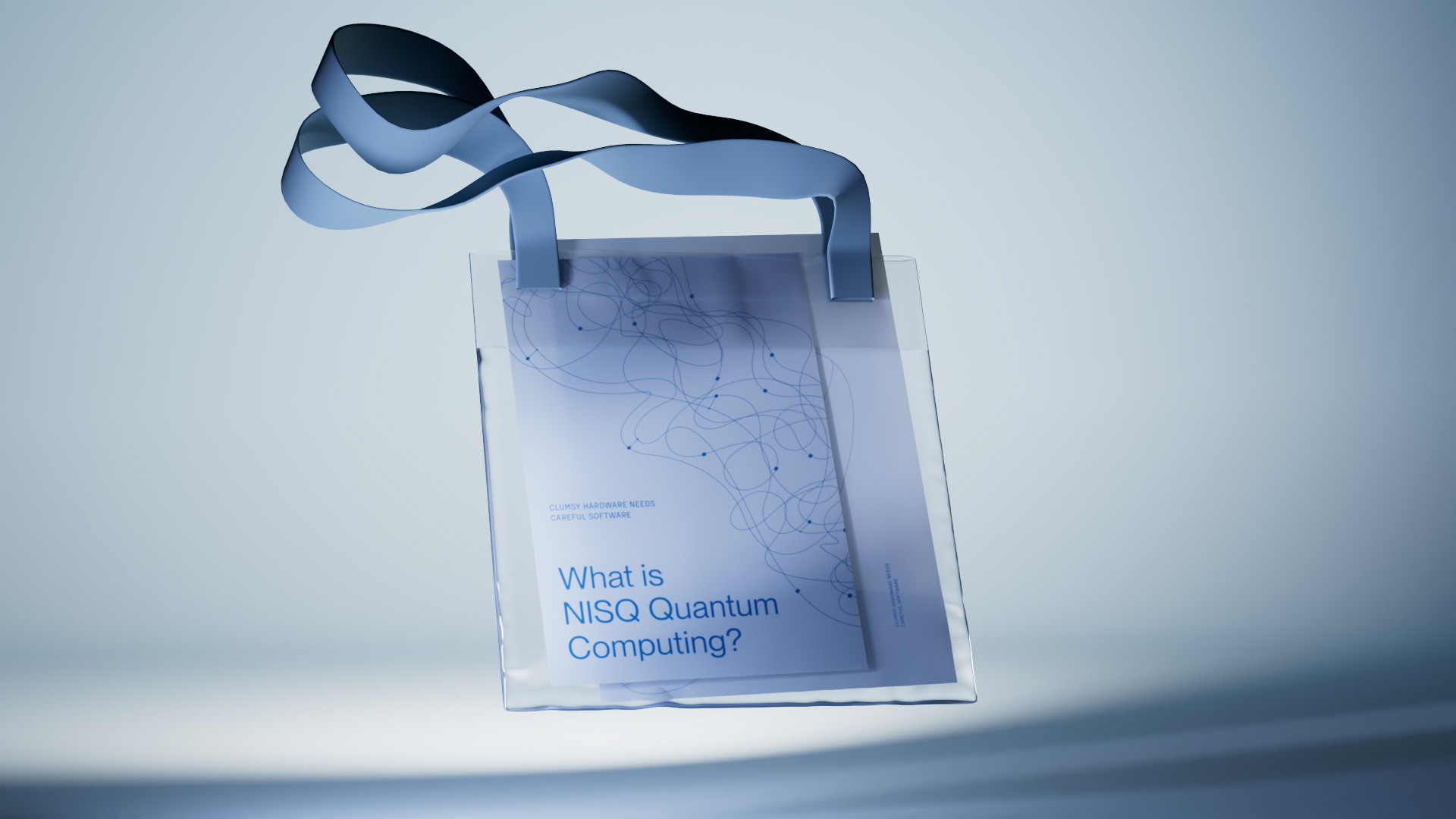
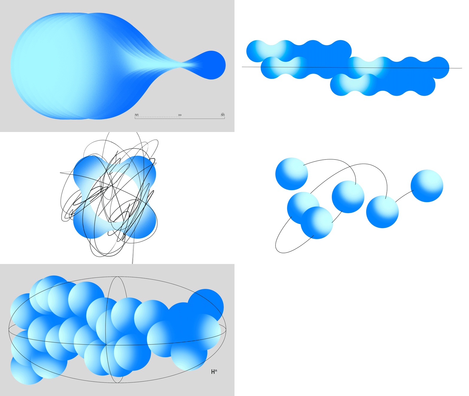
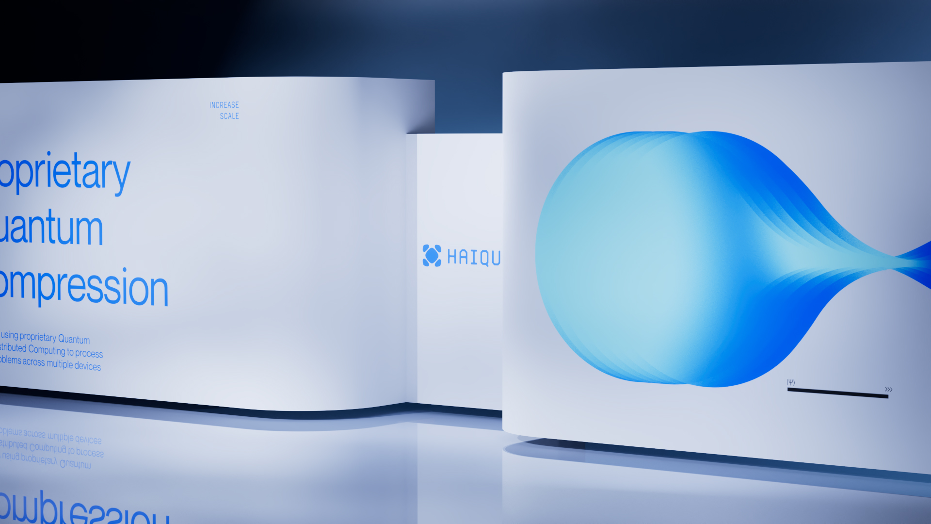
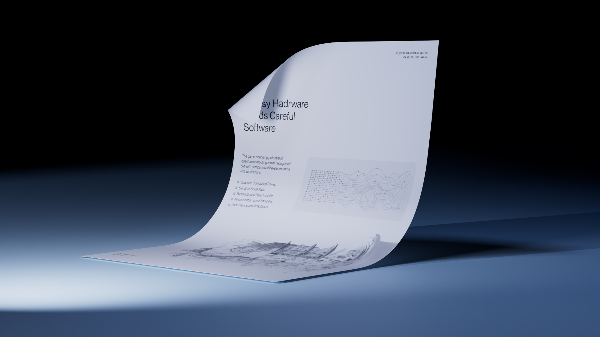
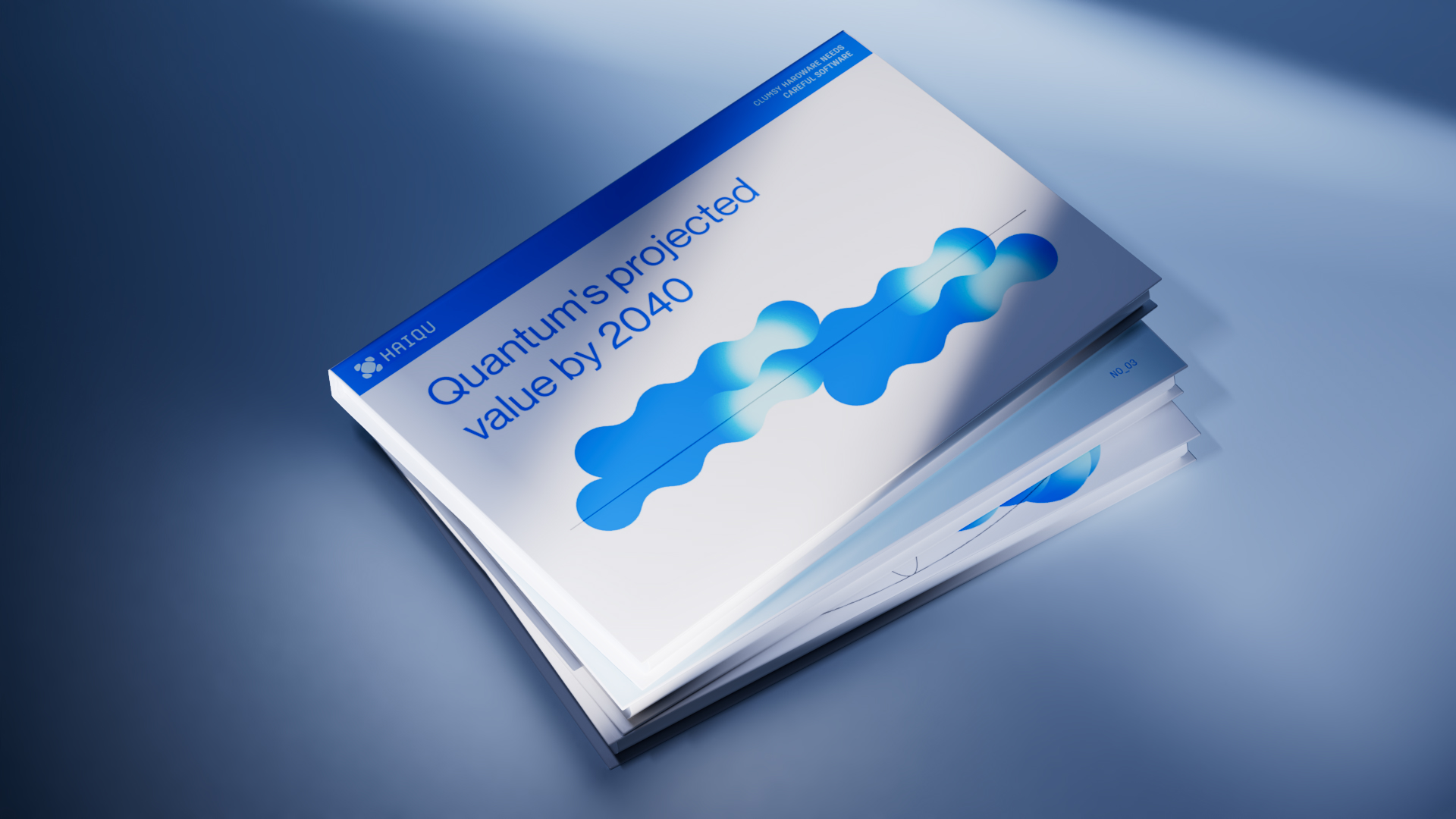
Another key component of the design system is the approach to illustration, which alludes to scientific textbooks—most of the illustrations present spheres as qubits, which quantum computers operate on. The stories in them often combine contrasting noise and clarity, which is a perfect metaphor for the essence of HAIQU as a product. The use of typography and space adds the final touch to the overall vibe.

Music was the ever-present theme of this project. It inspired and provided the source of the key imagery, including the logo. And the special place among them is Johann Sebastian Bach and Miles Davis.
HAIQU recently managed to raise $4 million in investment. And now they are rapidly developing their technology and business.
Creative director – Alex Twista
Design Director – Masha Bystrova
Designer – Alexander Protsenko
Illustrator – Sima Shpin’
Web Designer — Evgen Zavyshynets
Front-end developer – David Shamiev
Back-end developer – Petro Shlemko
Motion — Kyril Andryuschenko
Project manager – Vika Kuzminova
Co-founder, CTO – Mykola Maksymenko
Co-founder, CEO — Richard Givhan
Head of Growth — Sam Kearney

