The PinchukArtCentre aimed to significantly increase its digital presence and then use this platform to promote contemporary art in Ukraine, help people understand it, spark interest, and even inspire some creativity. The Centre's social media networks were number one for this objective. Thus, we were tasked with developing a design system focused on SMM that would enable frequent and informative communication about art, helping to attract new followers.
The style of PinchukArtCentre has never been designed to grab attention due to its minimalism and certain restraint. It was clear to us that adding something radically new would be out of place, as the focus had to remain on each specific piece of art, rather than on the individuality of the Centre. Hence, the set of techniques on our hands was significantly limited.
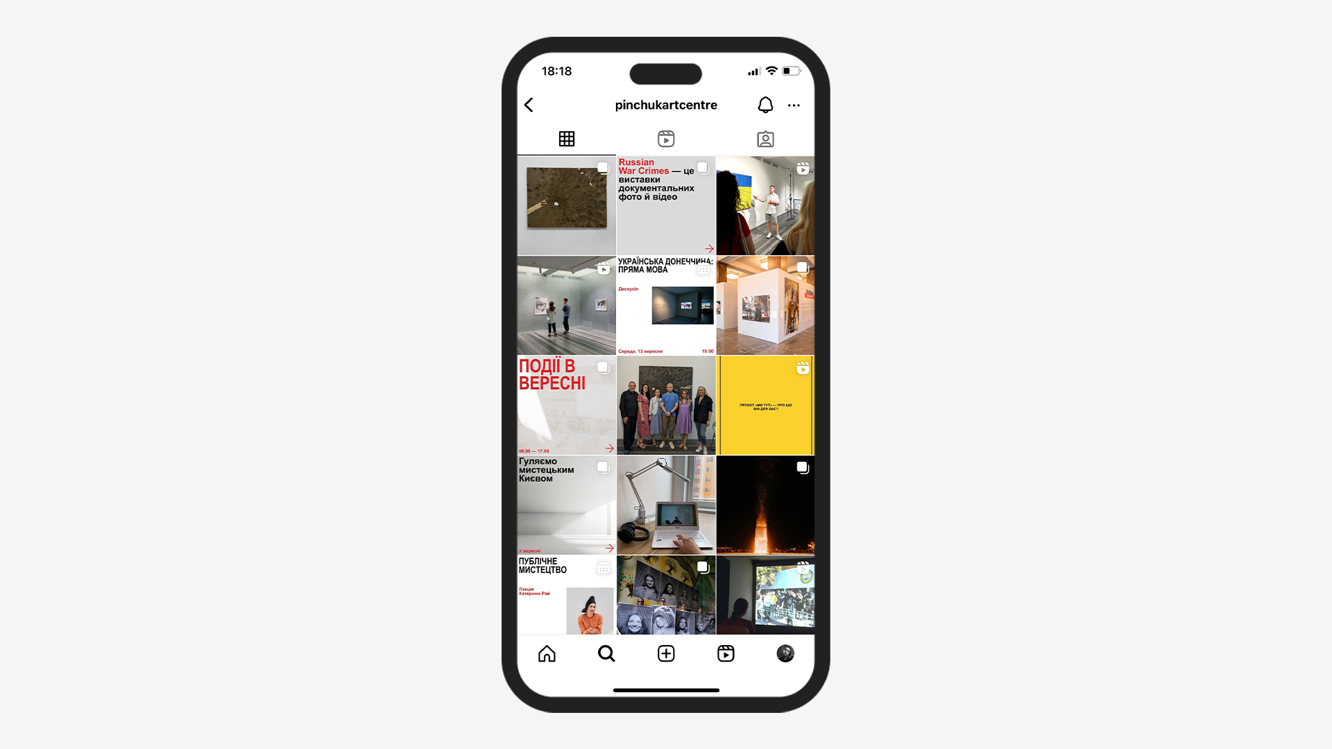
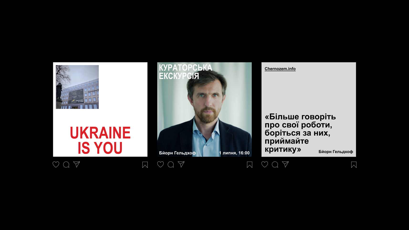
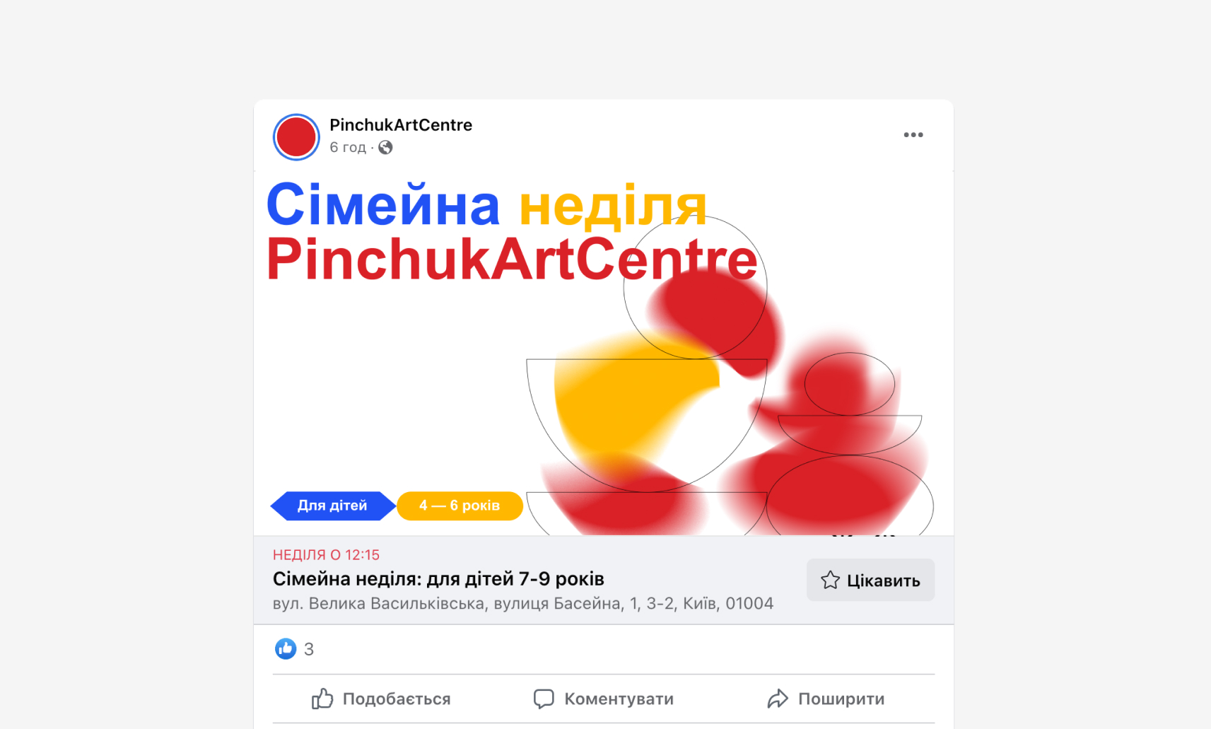
We built the design system on the idea of emergence, a principle by which separate elements of the system can be different but find new common properties within the system. Similarly, PinchukArtCentre encompasses many independent directions: exhibition space, research center, artist competitions, education, library, etc. Each of them has its unique features, and all are united by one purpose - to give people access to relevant contemporary art.
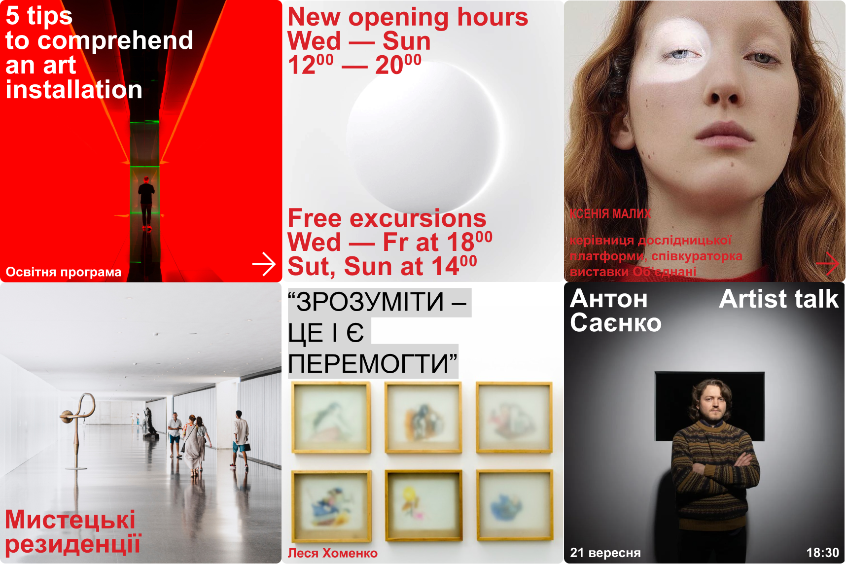
Design-wise, the Arial font became this common element, as it was once used for the PinchukArtCentre logo. We decided to further emphasize the Centre's minimalism and fundamentality by building the system around only this font but introducing many different techniques for working with it. Thus, varied information pieces related to different functional directions of the Centre have a wide range of manifestations. The focus on content remains unchanged.
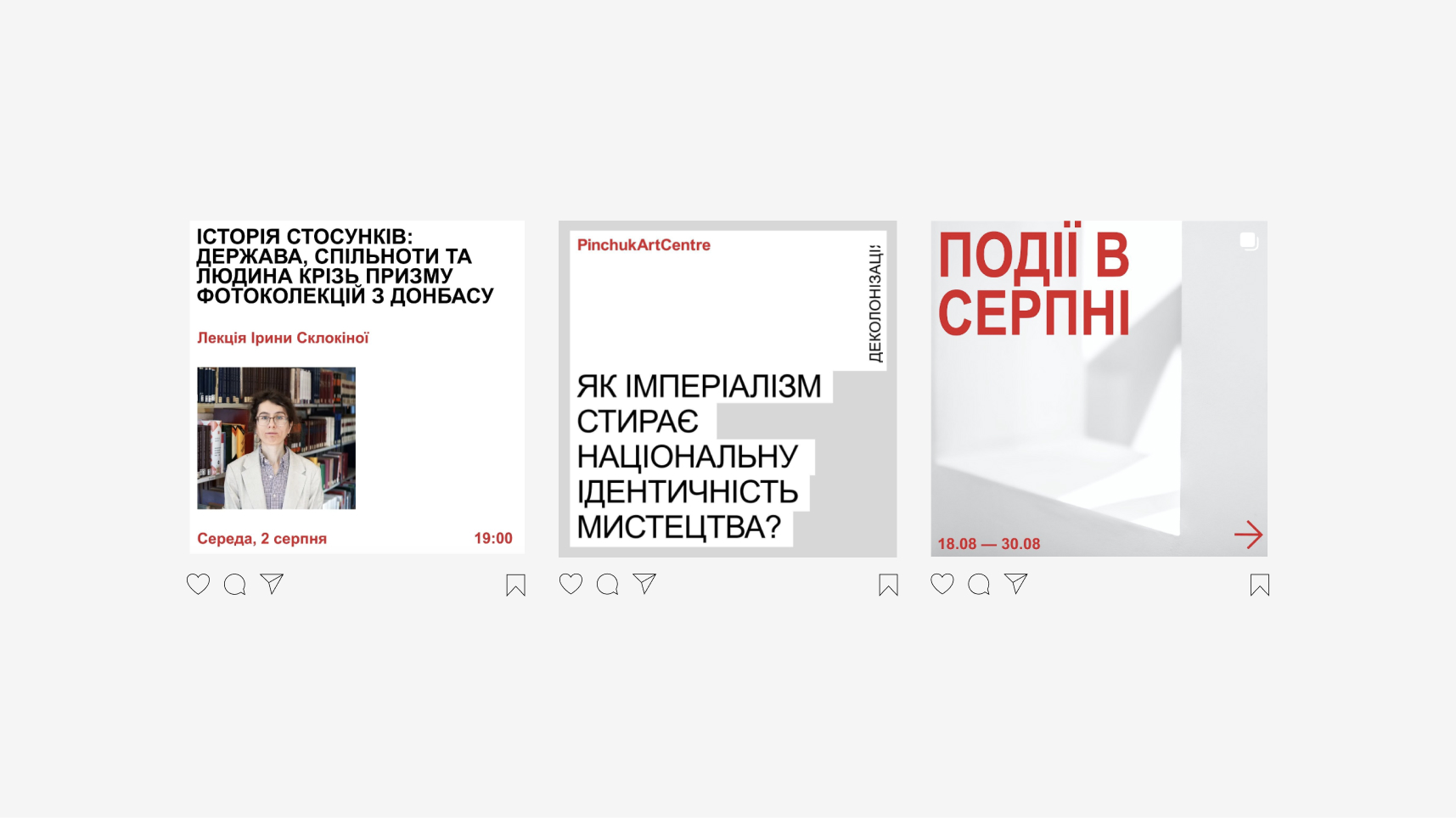
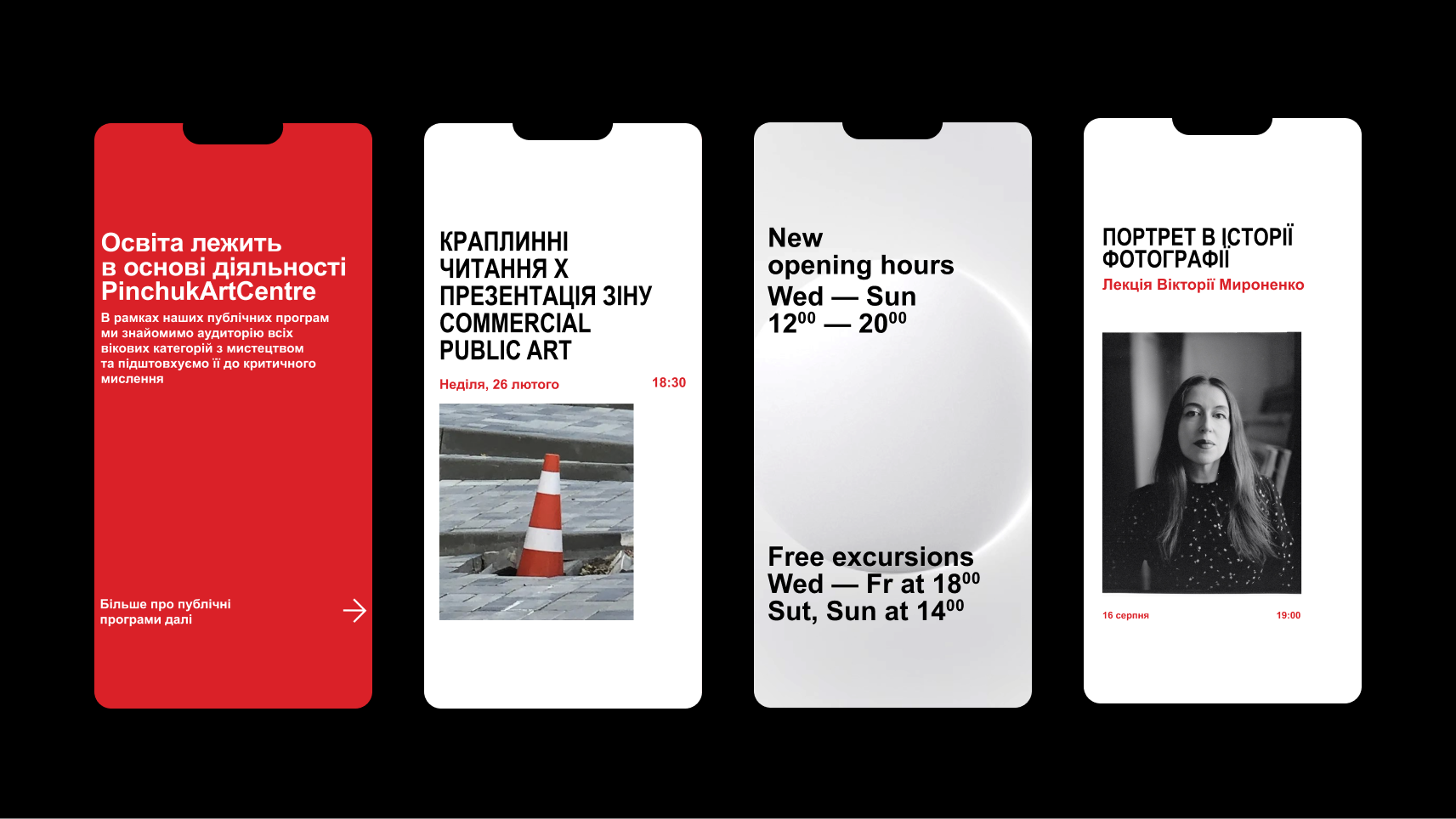
The metaphor of light became an additional layer in the Centre's representation. Ideologically, PinchukArtCentre’s purpose is to shed light and place focus on the most resonating problems and manifestations of contemporary society. The approach to building the lighting system for exhibitions at the Centre is truly focused and individualized for each separate hall and piece. The light aspect of the design system is quite subtle in its manifestations. It is reflected in the approach to photographing people, in background footage storylines, and in the use of free white space.
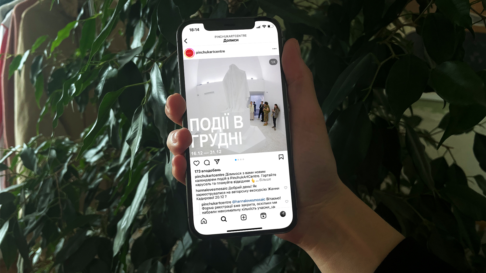
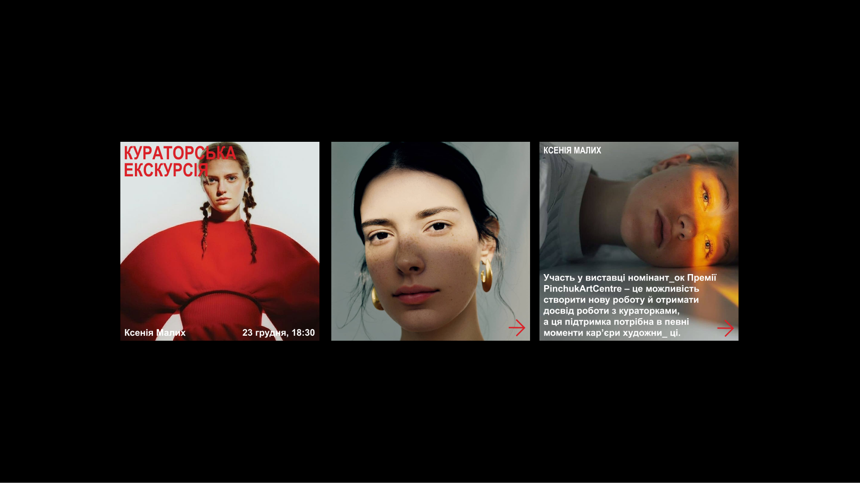
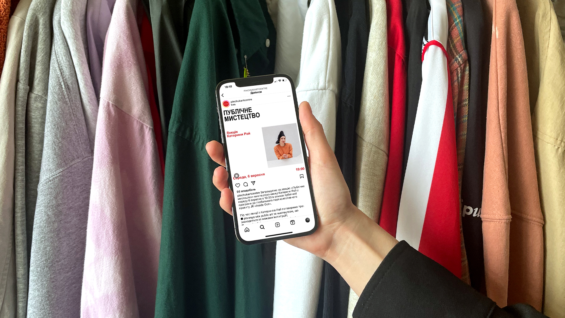
Now we have the opportunity to evaluate how the design system performed over more than six months of the centre's operation after its implementation. Even in terms of the content type, the changes are significantly noticeable. The social accounts of PinchukArtCentre have turned into a genuinely useful source of information on what is happening in the contemporary world and Ukrainian art. This content promotes a deeper understanding of individual pieces, feeds curiosity about the artists' intentions, encourages participation in various events, and keeps the crowd in the loop about interesting is happening in the art scene of Kyiv. The Centre's team has very embraced all the innovations hands-on and is an example of how to implement the design system creatively yet consistently.
Creative director - Alex Twista
Design director - Masha Bystrova
Art director - Anatolii Todorov
Project manager - Daryna Panisheva
Graphic designer - Lina-Mariia Shlapak